S-AR by Savvy
Opinion by Richard Baird Posted 15 June 2012
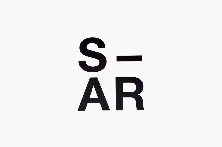
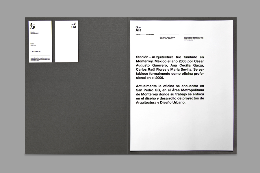
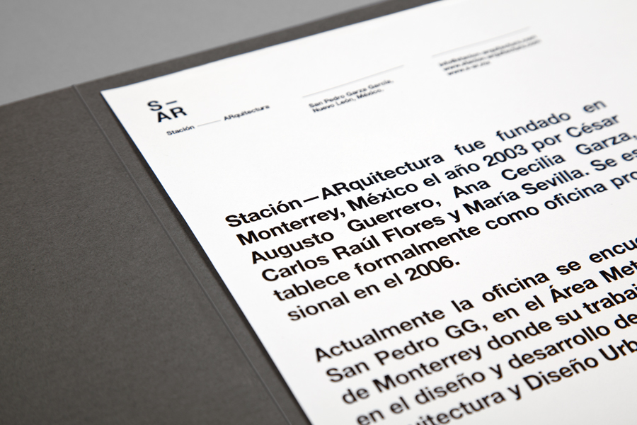
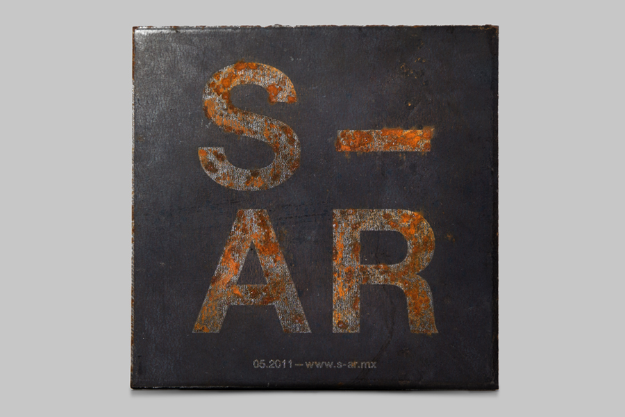
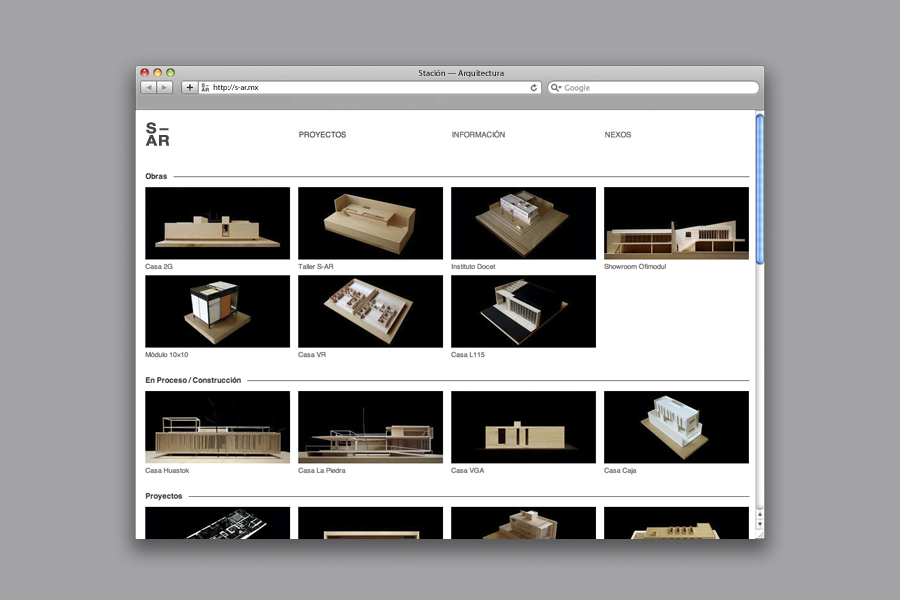
Stación-ARquitectura (S-AR) is a Monterrey (MX) based architectural and urban design firm established in 2003 by Cesar Guerrero, Ana Cecilia Garza, Carlos Flores and Maria Sevilla. Based around a simple sans serif logo-type their new visual identity, created by multidisciplinary design agency Savvy, confidently brings together Helvetica, grid based print and on-line layouts, a monochromatic colour palette and uncoated substrate to unify pragmatism and structure with a subtle art and craft twist.
“Since 2003 Stación-ARquitectura has been working on innovative architecture and urban design projects in Mexico. The brand identity for this forward-thinking studio is based on their own design philosophy, which centers on creating clean and uncomplicated architectural environments that solve complex problems in simple ways, allowing the studio to concentrate their energy in generating functional, ample spaces.” – Savvy
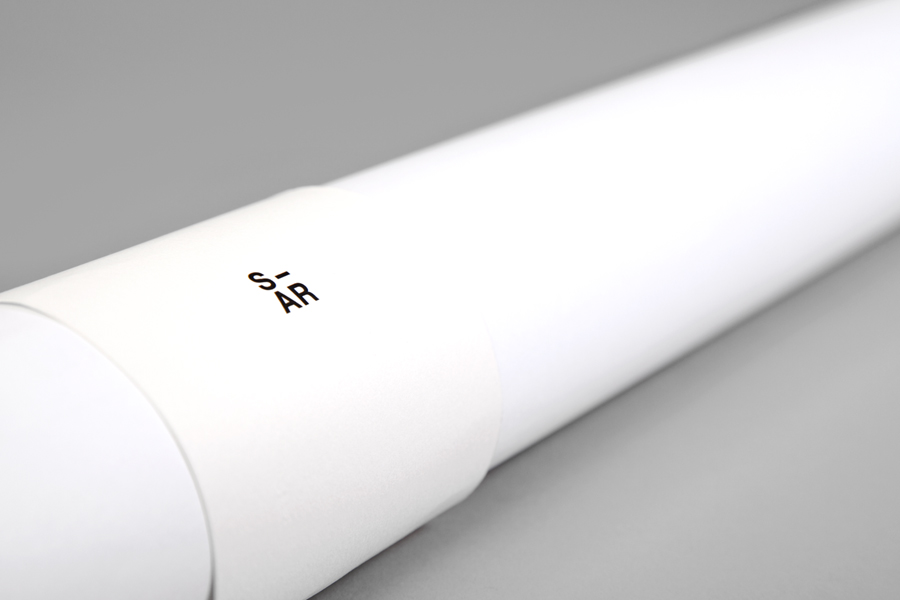
The stacked, geometric characters and plan-like execution of Helvetica offer a neat structural and modernistic representation of architectural practice, classic design principles and a pragmatic approach while its square composition (and the triangular weight of the SAR) reflects the elemental components that underpin contemporary construction and engineering. The type’s heavy weight, uppercase format and generous spacing deliver a bold but restrained sense of authority (knowledge and experience), reliability, stability and an understanding of internal and external space that is ideal for a firm working within the built environment. These ideas are carried through a simple grid based collateral and on-line layout, a black and white colour palette (the light and shadow that provides objects and buildings with their three dimensional qualities) and the steel-like cool grey of a textured, uncoated substrate that subtly infuses the identity with a truth to materials and an appreciation for art and craft.
