Burnish & Plumb by FÖDA
Opinion by Richard Baird Posted 25 June 2012

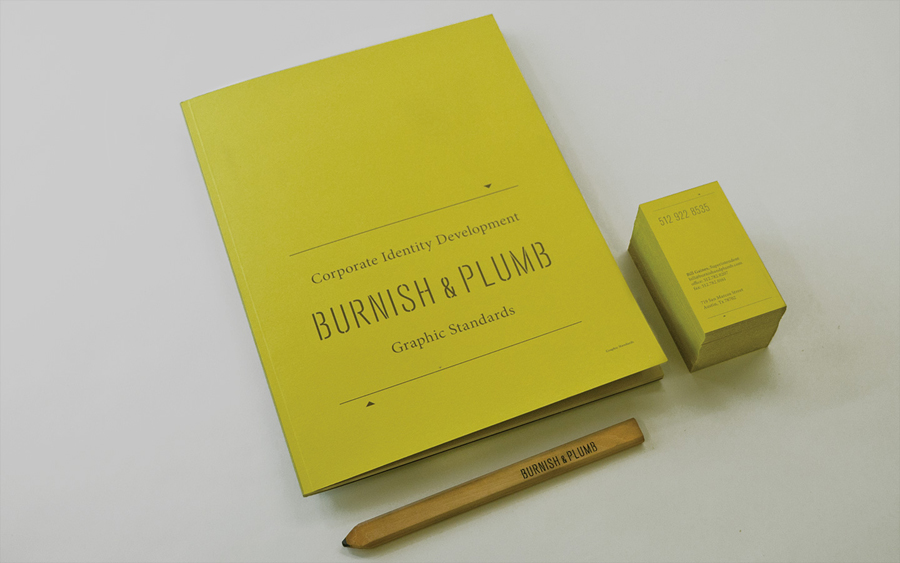
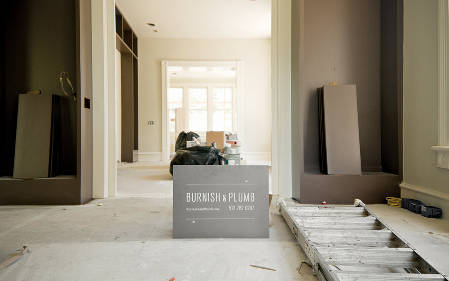
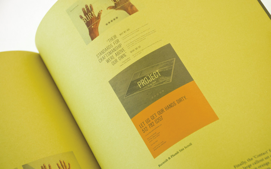
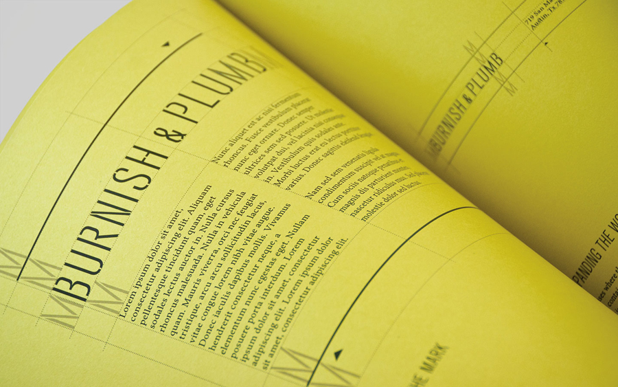
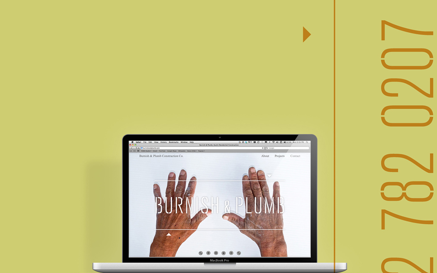
Burnish & Plumb is a Austin (US) based construction firm with a care and craft philosophy. Their visual identity and website, designed by brand consultancy FÖDA, mix the utilitarian and pragmatic aesthetics of a stencil cut logo-type with the organic and personal qualities of hand photography conveying a hardworking and honest business practice.
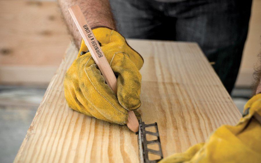
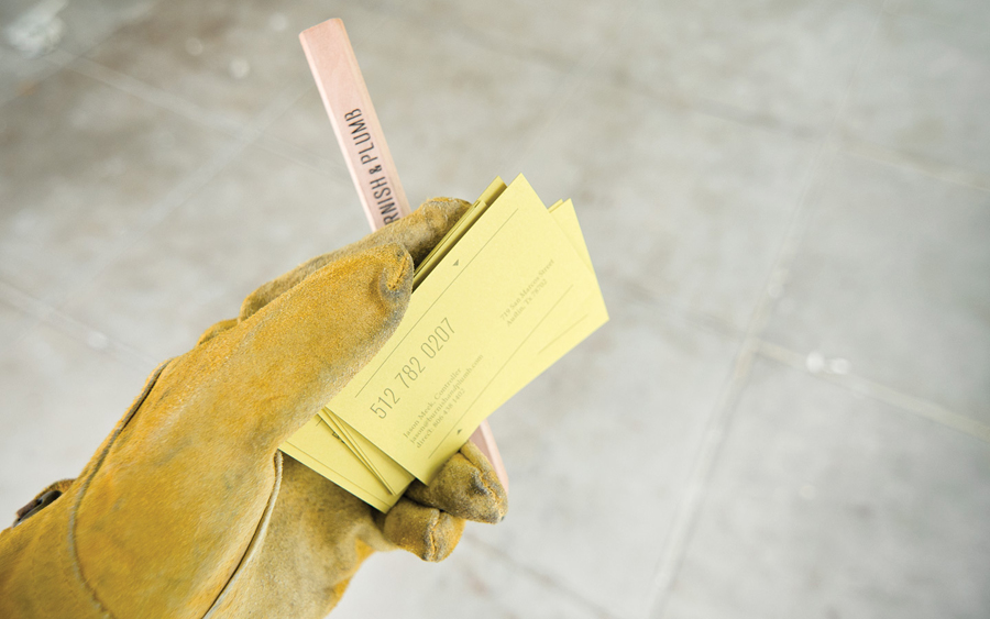
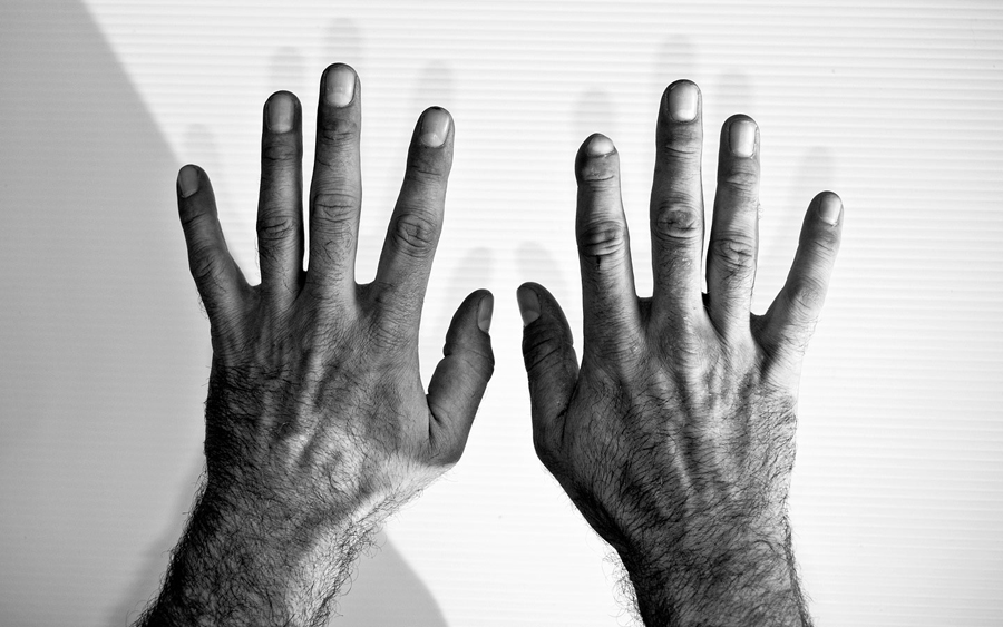
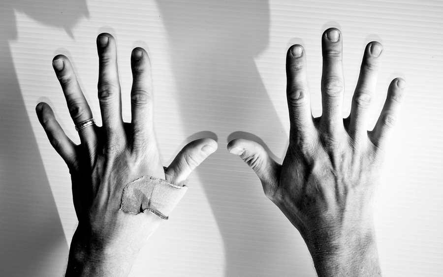
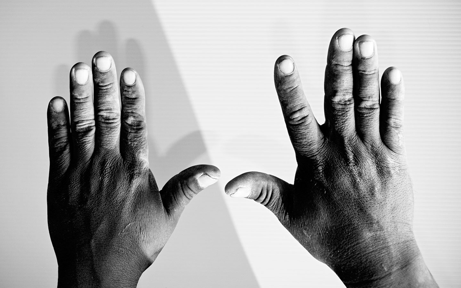
“Local, level, loyal; with a custom stencil and dapper name, Burnish&Plumb is ready to get their hands dirty on your behalf. This work-a-day identity stands in contrast to its unique, sophisticated name. The distance between these two ideas mirrors the distance between the filthy, intense, “from scratch” in situ nature of construction and the actual completed product. From dirty hands come fine finishes. Under damaged boots lie spotless floors. Through weathered tools come burnished fittings. Level, plumb and true. FÖDA shot the hands of the job site crews instead of faces, documenting them as the lead slideshow on the website. These battered hands are the story, these are how the job gets done.” – FÖDA
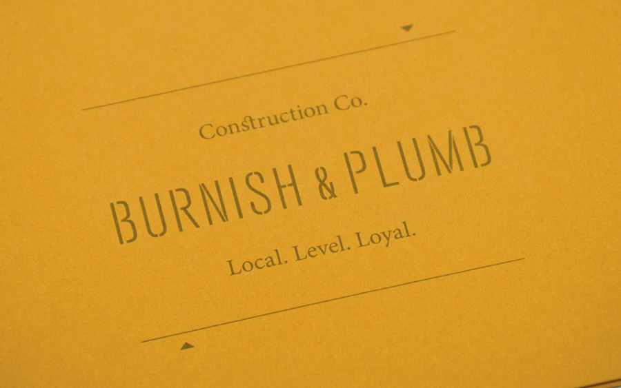
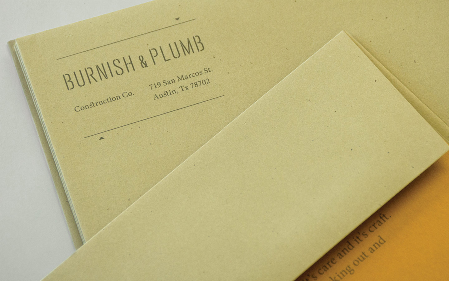
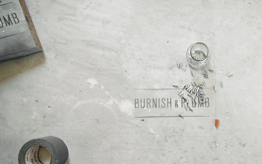
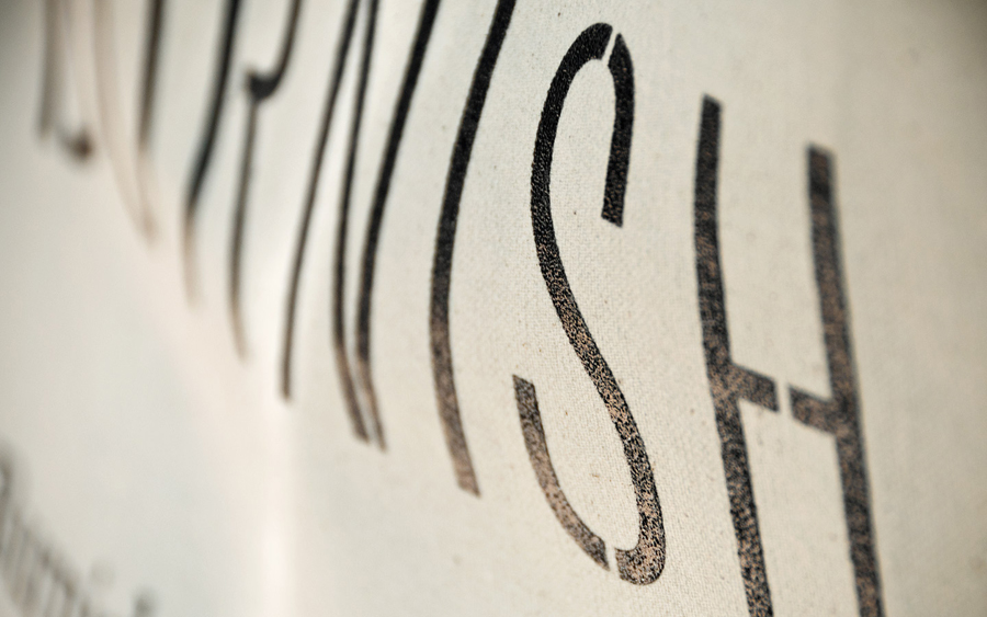
Built from broadly spaced, tall, geometric and stencil cut uppercase characters, the logo-type is fairly straightforward in its representation of practicality, functionality and steadfast reliability. Its thin strokes, the ‘st’ ligature across ‘construction’ and the utilisation of an accompanying serif add detail and craftsmanship while the arrows and expanding fine line borders deliver balance, technicality and an underlying sense of pragmatism.
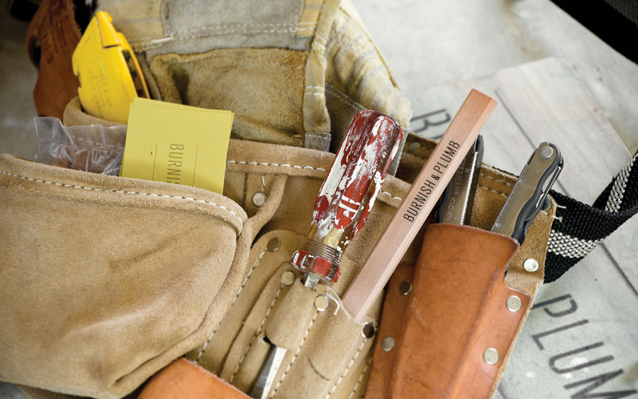
In contrast the organic nature of the photography offers a very human quality and a strong sense of honesty, openness and integrity. The very personal nature of the images (the impact of manual labour is clearly evident) is a very compelling (and almost intimate) piece of communication that, along with the language of the website, builds on the idea of perfection emerging from the imperfect.
The colour palette’s unusual mix of pale green and orange looks contemporary and distinctive but with a subtle retrospective quality reflective of the traditional craft values of the past. The use of uncoated, elemental and raw trade textures throughout the website and collaterals builds on the idea of truth established by the images and captured in the bare functionality of the type.
The utilitarian aesthetic, an increasingly saturated representation of heavy industry and construction, has been given an unusual photographic richness and depth that neatly contrasts the stoic and the personal, conflicting ideas that should not really work but do, delivering a much needed sense of responsibility to a industry occasionally marred by the perception of poor standards.
