Minke Design Store by Studio Lin
Opinion by Richard Baird Posted 27 June 2012
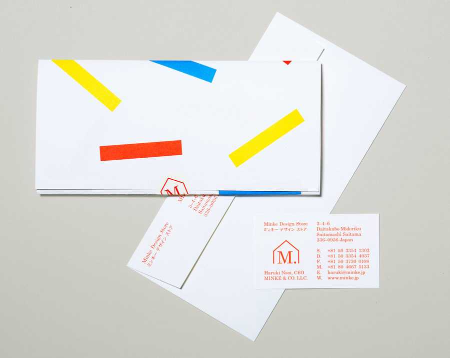
Minke is a Tokyo homeware store that stocks hard to find designer objects and furniture. The store’s identity, created by New York based design firm Studio Lin, neatly resolves the classic and the contemporary, the structured and the anarchic, creativity and practicality through a union of bold serif, modernistic structure, random geometric detail and a bright but restrained primary colour palette.
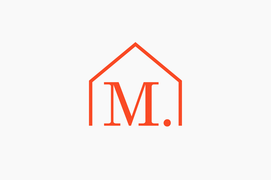
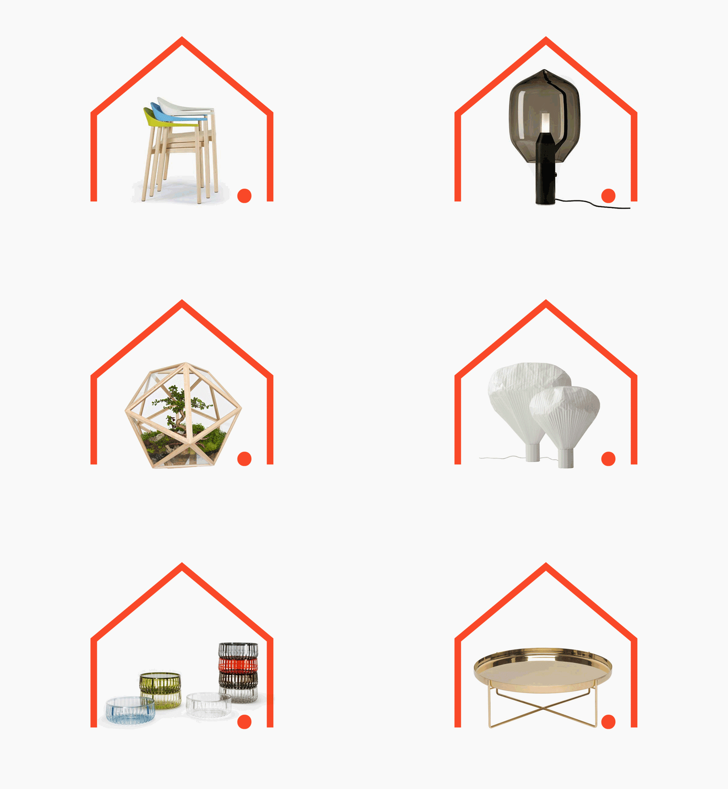
The contrast of serif detail, mixed strokes and curved brackets of the ‘m’ set within the consistent single line weight and clean junctions of the house, tied together through shared geometry, proportions and plenty of internal space, is a really neat way of representing designer products from different periods for the home. The full stop and monogrammatic resolution cleverly delivers confident finality (unmatched knowledge and experience) and a sense of personal and individual service expected from a retailer of specialist furniture.
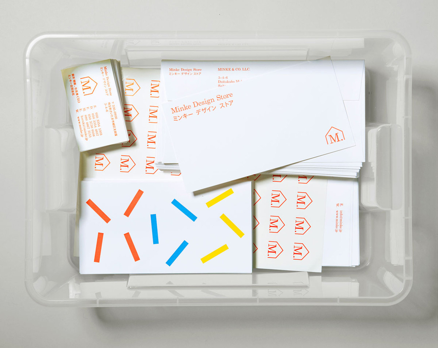
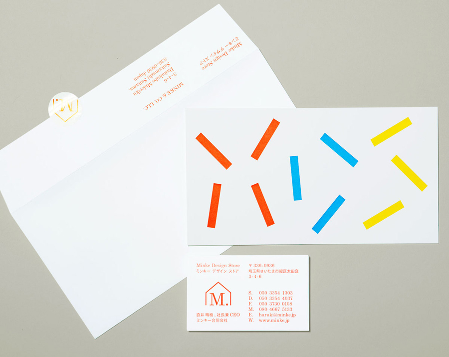
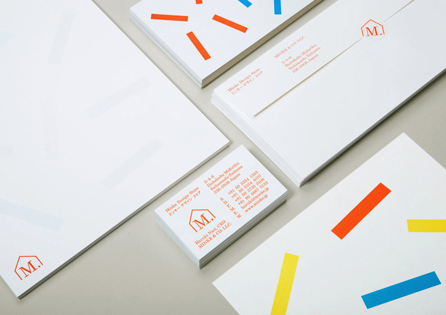
Like the monogram the stationery’s grid based layout, light, single colour typography set alongside the anarchic placement and contrasting weight of brightly coloured geometric bars and sticker print treatment, offers an interesting juxtaposition of creativity, self-expression, energy and enthusiasm with technical, pragmatic considerations and an underlying craft-like quality and sense of practicality.

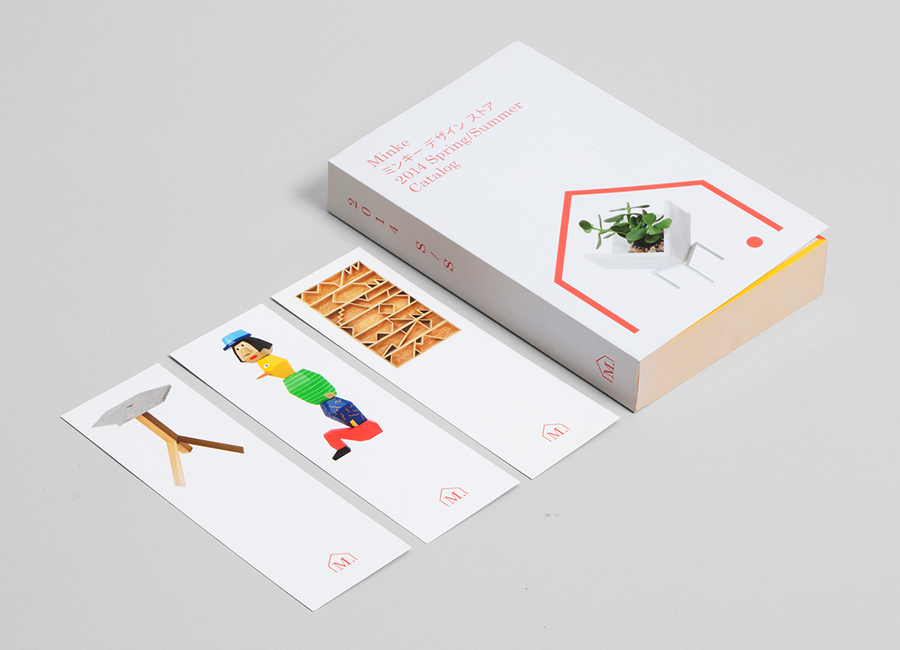
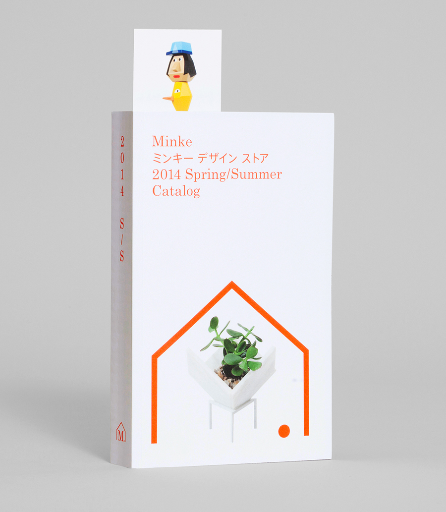
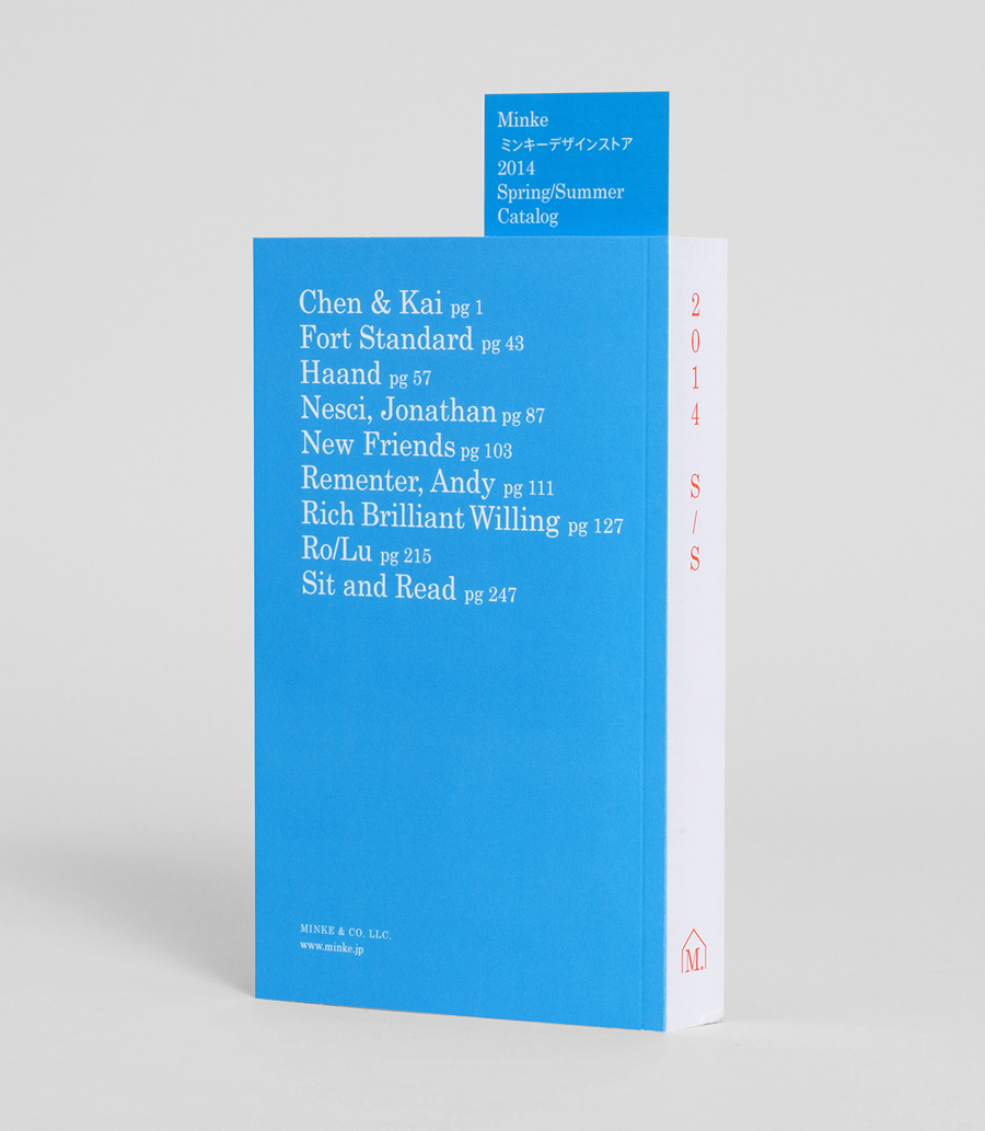
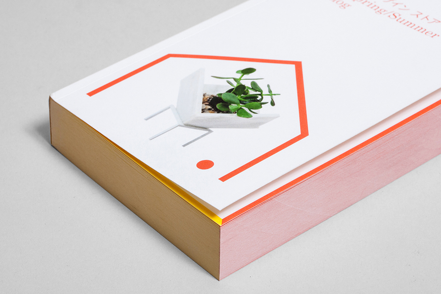
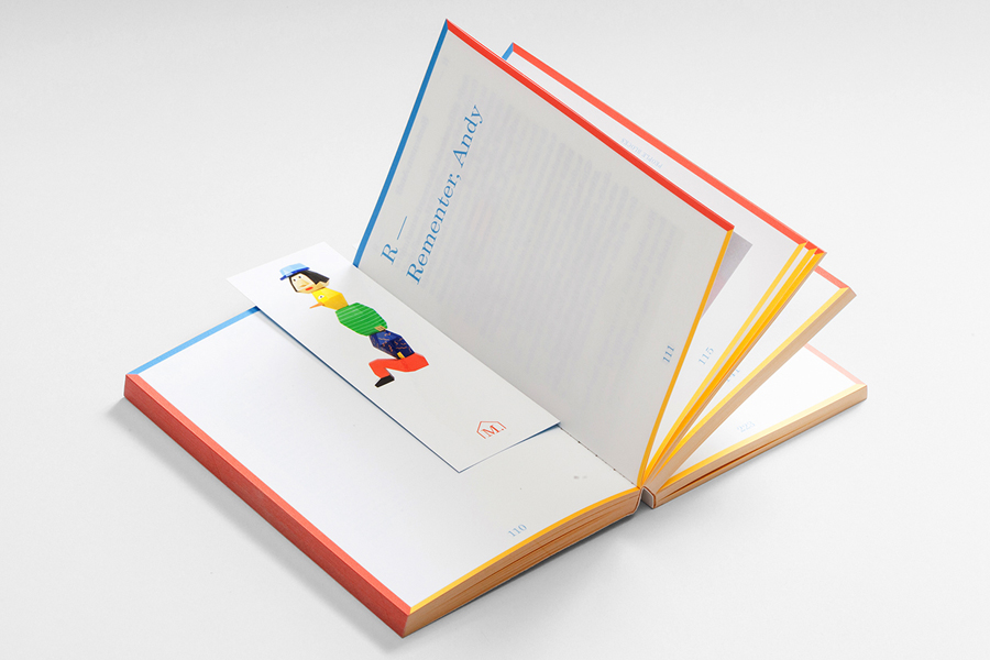
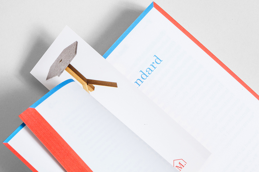
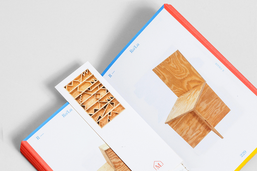
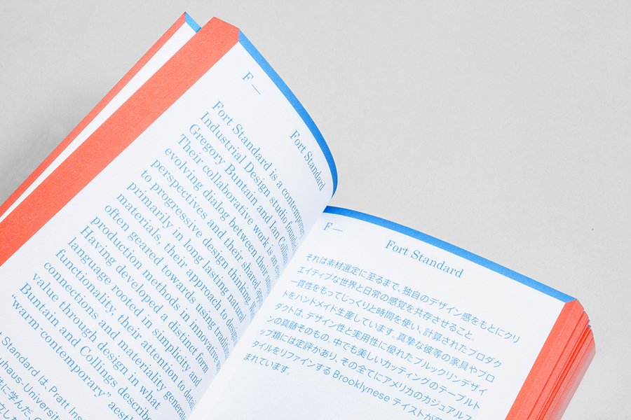
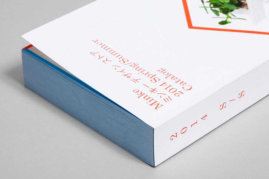
A catalogue was created to feature and call out different designers carried at the Minke Design Store. This was printed digitally and on demand with bespoke bookmarks created for specific clients.
