Reuben Hills by Luke Brown
Opinion by Richard Baird Posted 17 July 2012

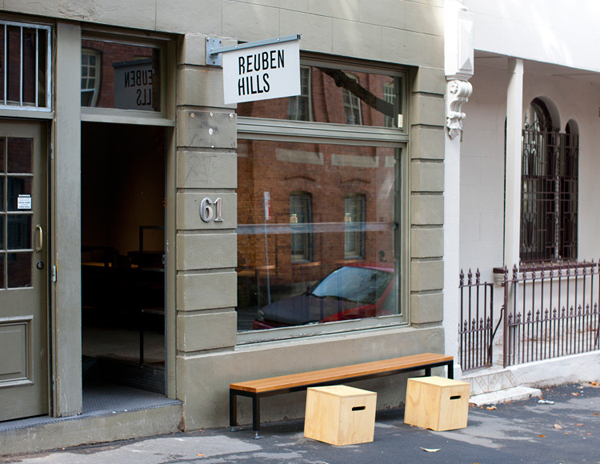
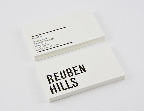
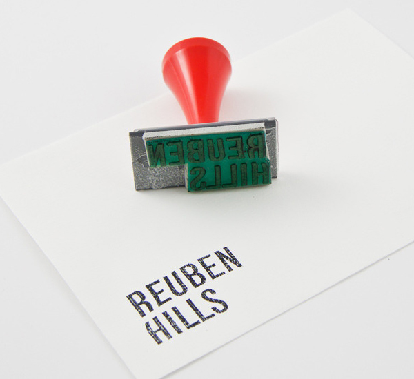
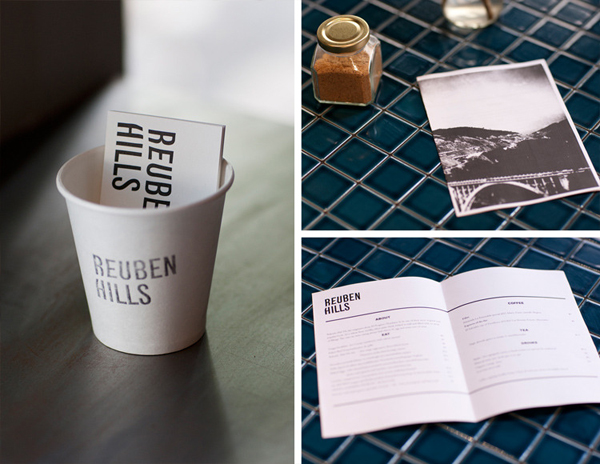
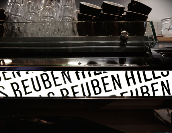
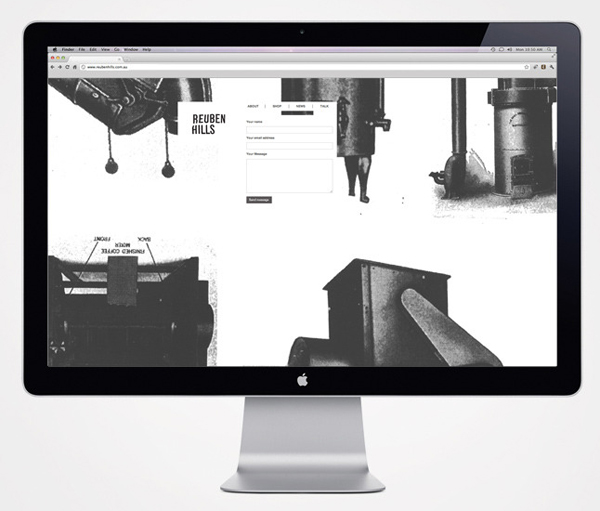
Reuben Hills is a coffee roastry and cafe located in the Surray Hills region of Sydney, Australia. The cafe’s identity, designed by multidisciplinary creative studio Luke Brown, is an interesting monochromatic mix of bold but breezy sans serif typography, vintage photography and stamp-based print treatment.
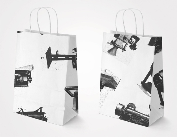
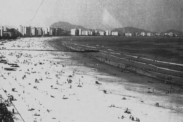
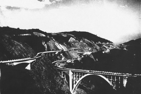
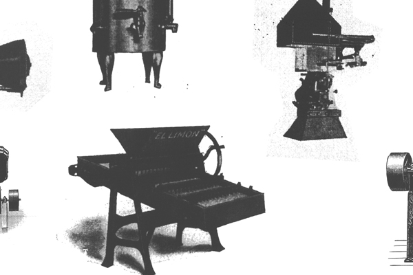
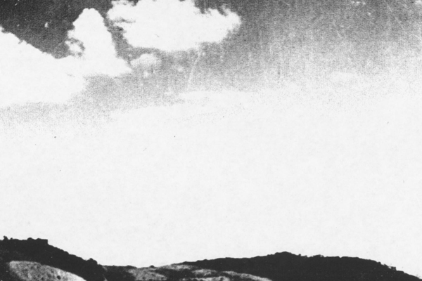
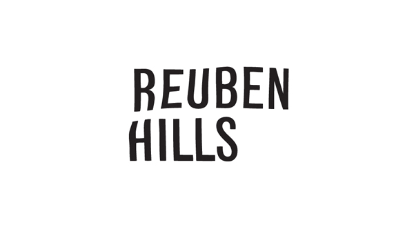
Although the san serif logo-type’s tall height and heavy weight is fairly straightforward in its presentation of knowledge and experience, its flag-like proprietary twist and generous character spacing manage to infuse it with a lightness, dimensionality and a subtle movement that works really well to capture the healthy breezes attributed to the area. A monochromatic colour palette and a really nice mix of vintage photographs (old machinery and diverse landscapes) alongside uncoated substrates and stamp detail conveys classic quality, regional history and traditional values that add depth to the contemporary services conveyed through the logo-type. It is a simple but layered solution that makes the cafe appear local, personal and professional.
