Paul Loebach by Studio Lin
Opinion by Richard Baird Posted 18 July 2012

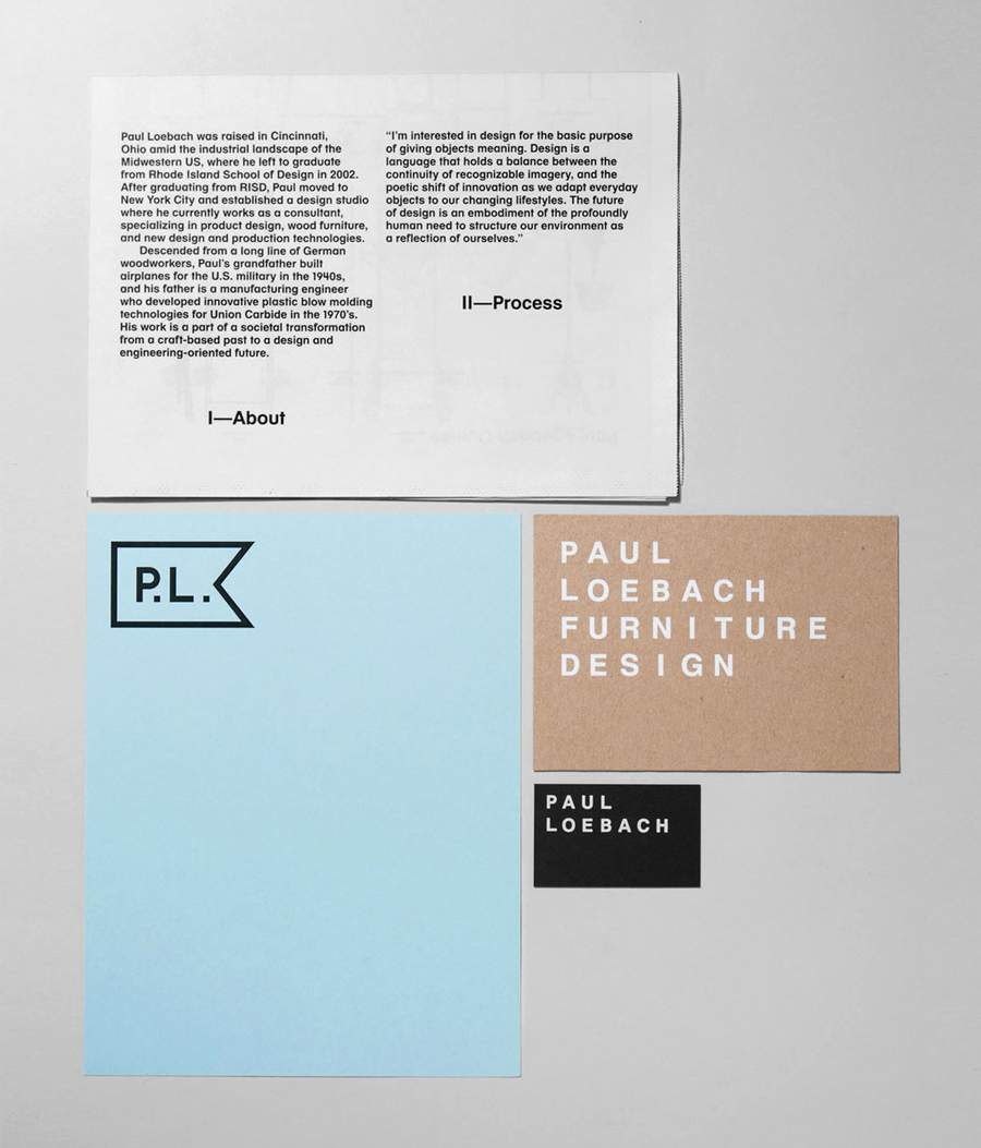
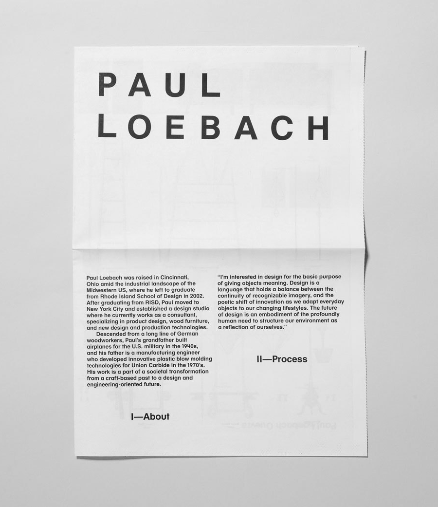
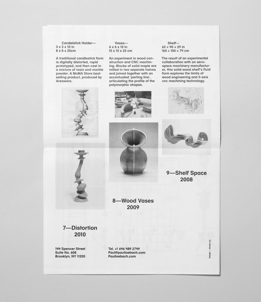
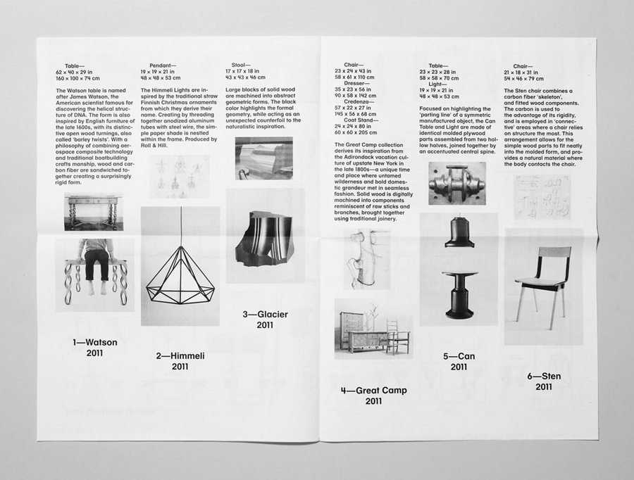
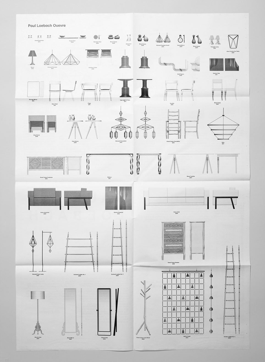
Paul Loebach is a Brooklyn based three dimensional designer who specialises in product, furniture and emerging manufacturing technologies. His new identity, developed by Studio Lin, is a wonderful union of craft, structure, space and geometry that neatly reflects his use of both traditional materials and contemporary processes.
“Descended from a long line of German woodworkers, Paul’s grandfather built airplanes for the U.S. military in the 1940’s, and his father is a manufacturing engineer who developed new plastic molding technologies for Union Carbide in the 1970’s. His work is a part of an idealistic transformation from a craft-based past to a design/engineering oriented future.”
“I’m interested in design for the basic purpose of giving objects meaning. Design is a structured language that holds a balance between the continuity of recognizable imagery, and the poetic shift of innovation as we adapt objects to our changing lifestyles. The future of design is an embodiment of the profoundly human need to structure our environment as a reflection of ourselves.” – Paul Loebach
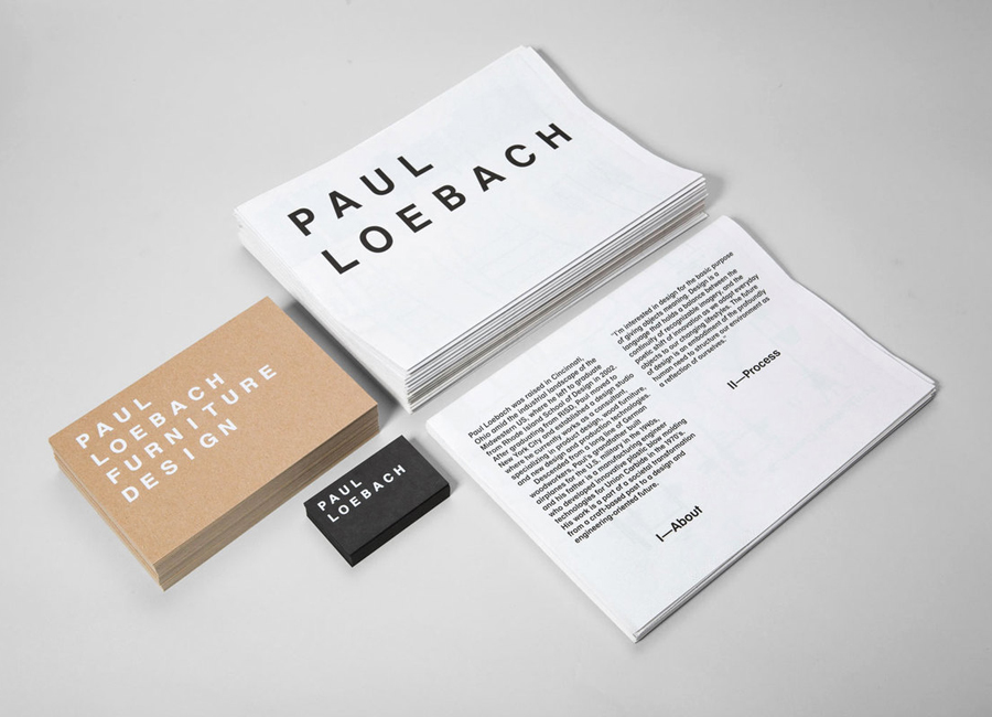
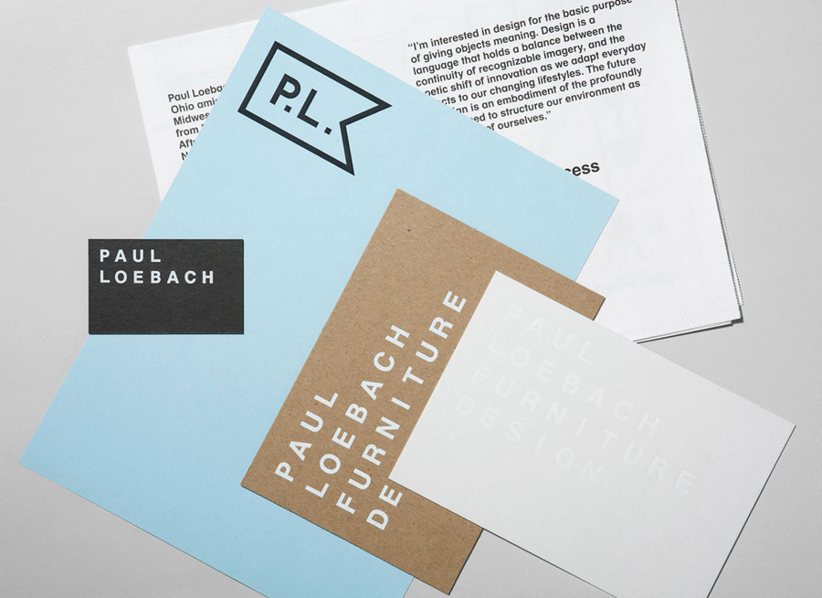
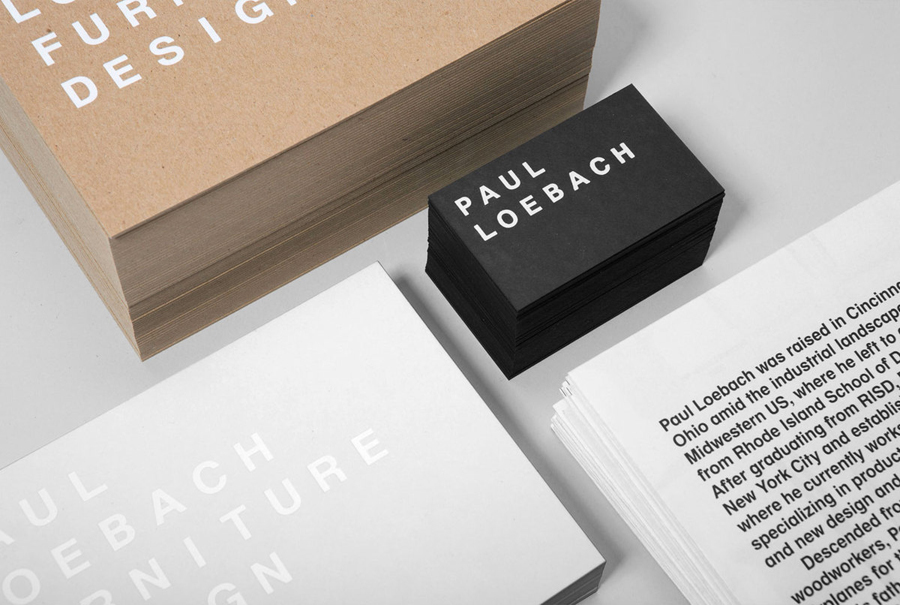
This is a fantastic piece of work but for me the strongest aspect is its clever mix of colour and material. A craft blue, uncoated and unbleached substrate, monochromatic abstraction of light and shadow (also reflected through a white foil treatment across a white board) feels perfectly suited to a business that works within the field of three dimensional design and utilises both handmade and machined approaches.
A simple and generously spaced sans serif logo-type and logo-mark deliver a sense of utility, practicality, functionality and neutrality that appropriately frames a diverse portfolio of work, is reflective of a rich engineering heritage and Paul’s personal philosophies. The consistent single line weight of the type and geometric form of the mark alongside the catalogue’s simple grid based layouts, use of space and monochromatic finish is a smart resolution of a pragmatic approach with subtle architectural sensibilities that deliver a machine-like precision and sense of high quality throughout. The unapologetic over-sized application of the logo-mark across the headed paper is an unusual but bold direction that suggests confidence and authority, something a lot of designers would feel uncomfortable doing but looks spot on here.
