Algu by Francesc Moret
Opinion by Richard Baird Posted 13 September 2012

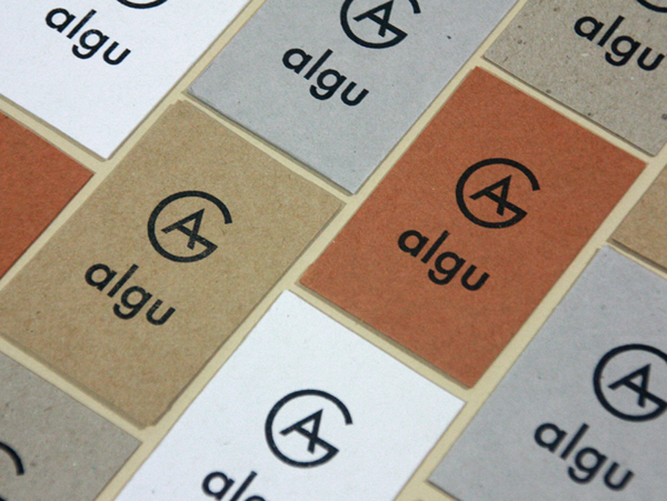
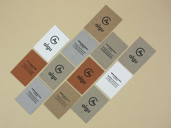
Algu is a Spanish architecture and interior design studio founded by Natalia Alonso Roger Guitart. Their identity, designed by independent freelance designer Francesc Moret, represents the collaborative and combined knowledge of the studio’s founders alongside the themes of craft and modernistic architectural practices through a simple monogram, lower-case logo-type, mixed fibre business cards and hand-stamped print treatment.
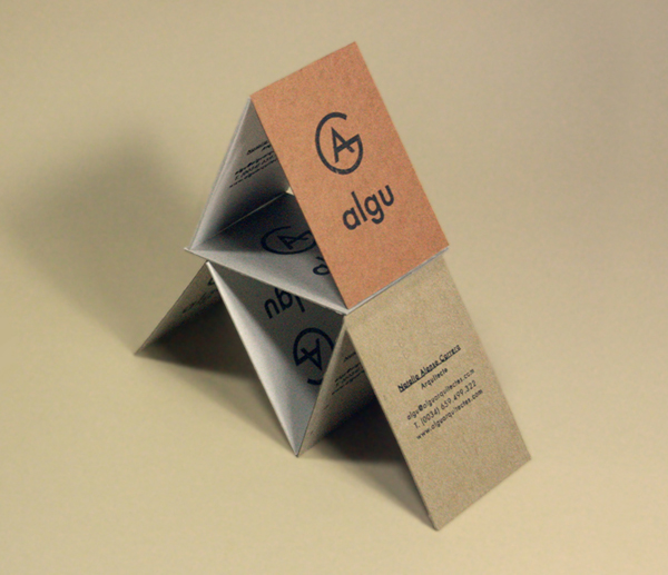
I am a firm believer monograms should be left to businesses that provide very personal or individualised service but have never consider it as a way of representing an integrated approach or combined knowledge. And while the monogram is undoubtably a re-emerging trend where there is a propensity for fancy and frequently forced ligatures, Franscesc has managed to craft a solution that looks incredibly natural and benefits from the lucky architectural combination of elemental structure and internal space the two characters create.
There is an interesting and unusual juxtaposition between the uppercase letter-forms of the monogram and the lowercase construction of the logo-type. United by a consistent single line weight and plenty of space they manage to mix the personal and professional while perhaps also hinting at modernistic ideals and practices through the Bauhaus principle of non-hierarchical language.
A variety of earthy mixed fibre uncoated business cards communicate a truth to materials, environmental and sustainable considerations while the colours suggest creativity and diversity. The simple hand-stamped treatment introduces a humanist and handcrafted quality to the modernistic and geometric sensibilities of the type.
