Victor Martinez by Face
Opinion by Richard Baird Posted 20 September 2012
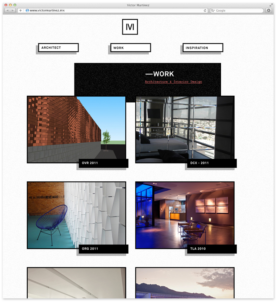
Victor Martinez is a MX based architect and studio founder described by client Carlos Caballero as having a ‘great sensitivity to aesthetic balance’, ‘spatial intelligence’ and believes that ‘function rules over all things’. Supermodernist design bureau Face recently developed a new visual identity for the studio which combines a structural monogram, a personal and practical hand-stamped print treatment and the raw tactile and architectural textures of an uncoated substrate choice.
“Victor Martinez is not your typical architect. He had been working in the filed for more than a decade, and he, teaming up with Face, came up with the basic and coherent idea to name his brand as himself. This because of his personal style and stamp across his projects. We call him the eclectic basic. We developed an identity that reflects not only his personality, but also the shape and constant evolution of his work, always basic, always simple, always functional and aesthetic.” – Face
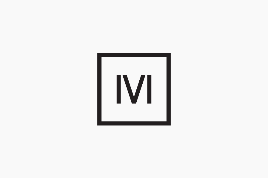
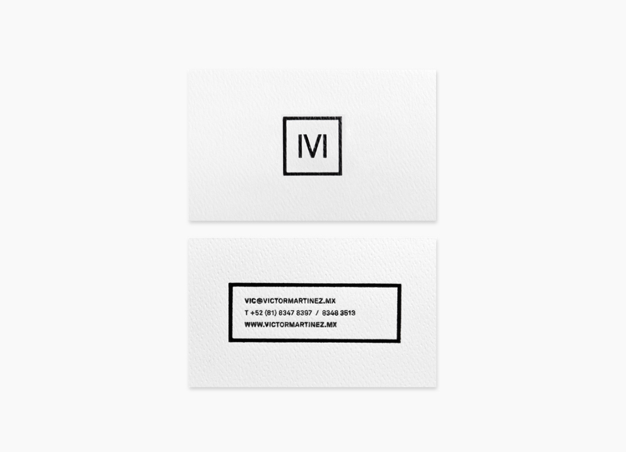
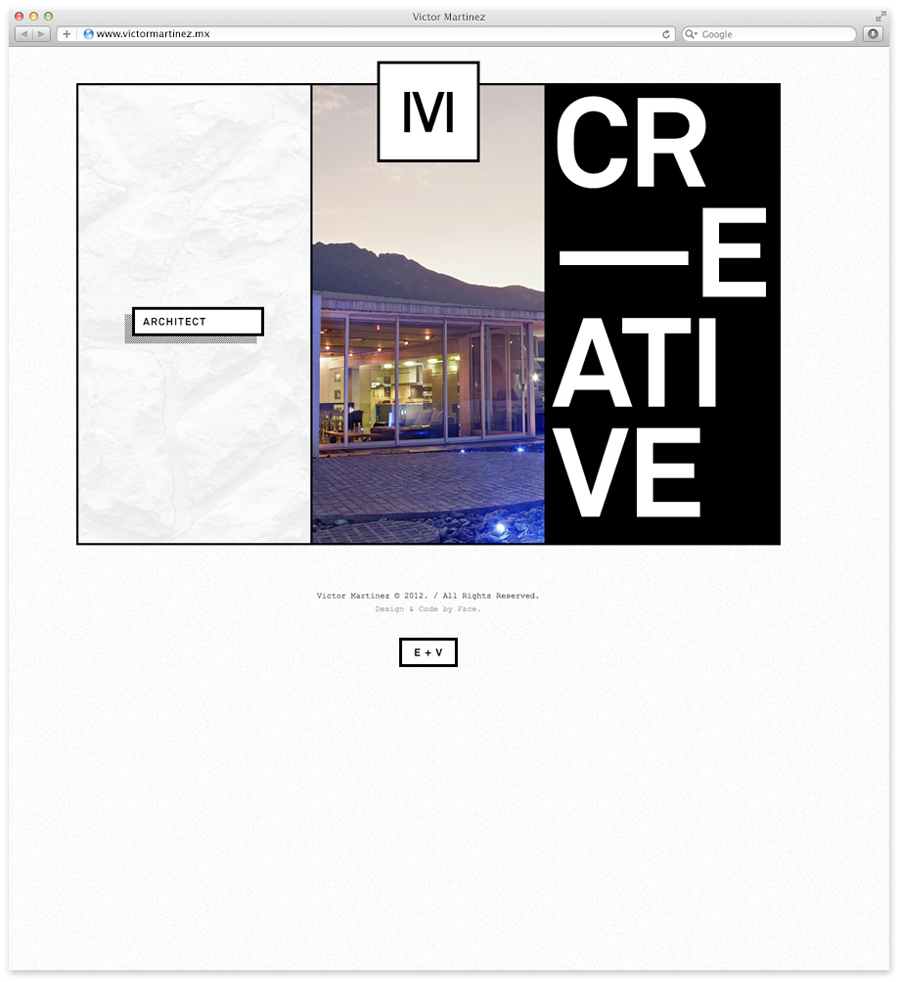
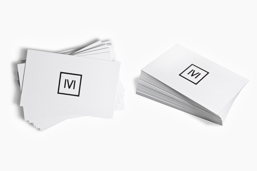
Based around a simple MV monogram built from four simple strokes, a consistent line weight, elemental geometry and a utilitarian stencil cut detail, Face’s solution has an effortlessness simplicity and functionality that makes the most of the structural qualities inherent to the letterforms and neatly resolves the personal philosophies of the studio’s founder and the architectural nature of their work.
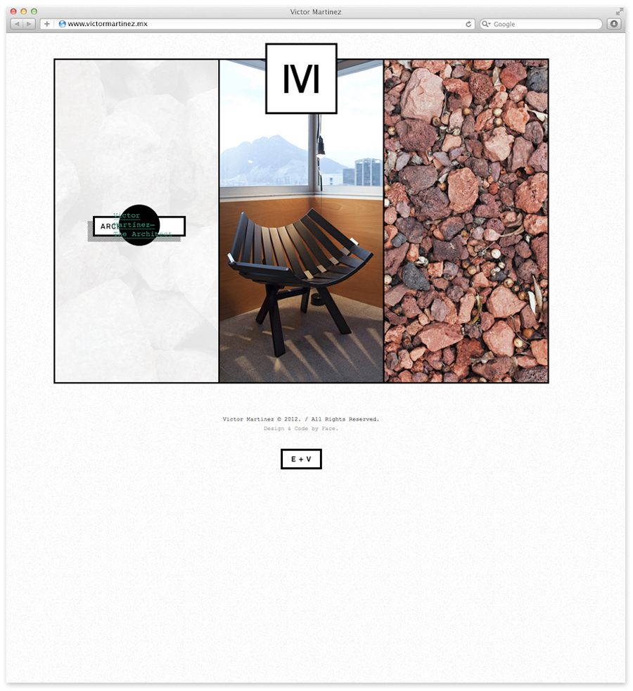
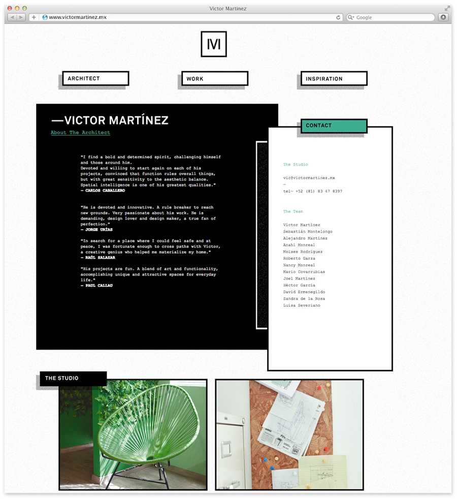
Like a lot of identities created for the built environment a monochromatic colour palette delivers an abstract representation of light and shade, the physics that give objects their three dimensionally appearance, alongside heavy borders that capture a sense of interior space, plan-like views and a technical sensibility.
A straightforward business card design expands on the monogram’s union of functional, practical, personal and architectural values with a hand-stamped print finish across an uncoated, textured substrate, balancing craft, fine detail and a truth to materials. The absence of a conventional logo-type adds an interesting reductionist dimensionality by avoiding the repetition of information (contained within the URL) while an all uppercase typographical choice introduces a bold, confident, formality.
It is a familiar combination of personal, professional and architectural cues but ones that remain clear, communicative and very well executed.
