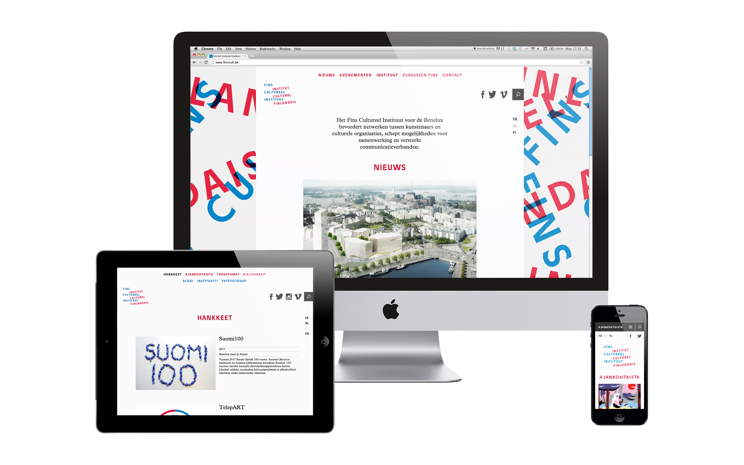
The Finnish Cultural Institute by Kokoro & Moi
Opinion by Richard Baird Posted 27 September 2012
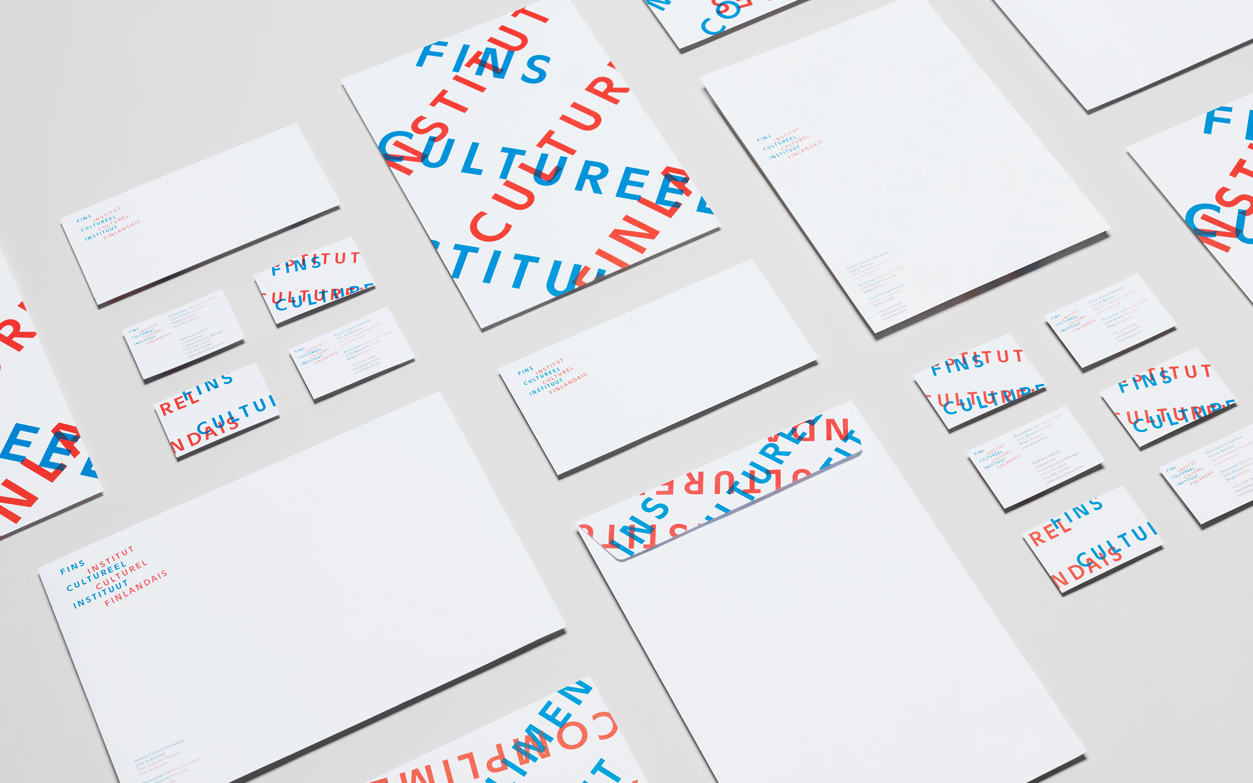
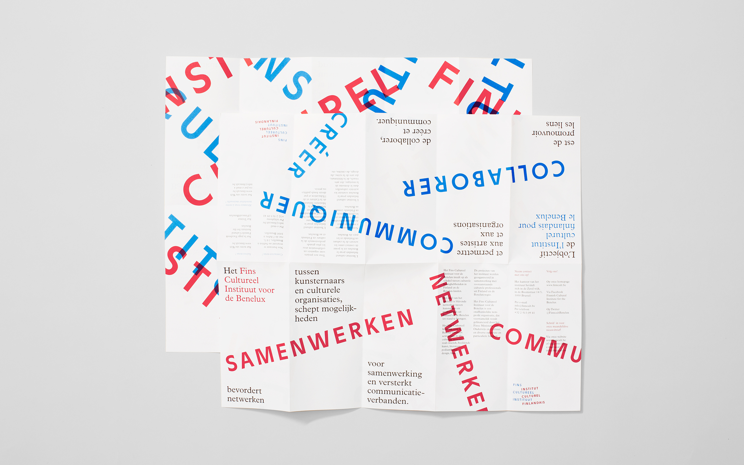
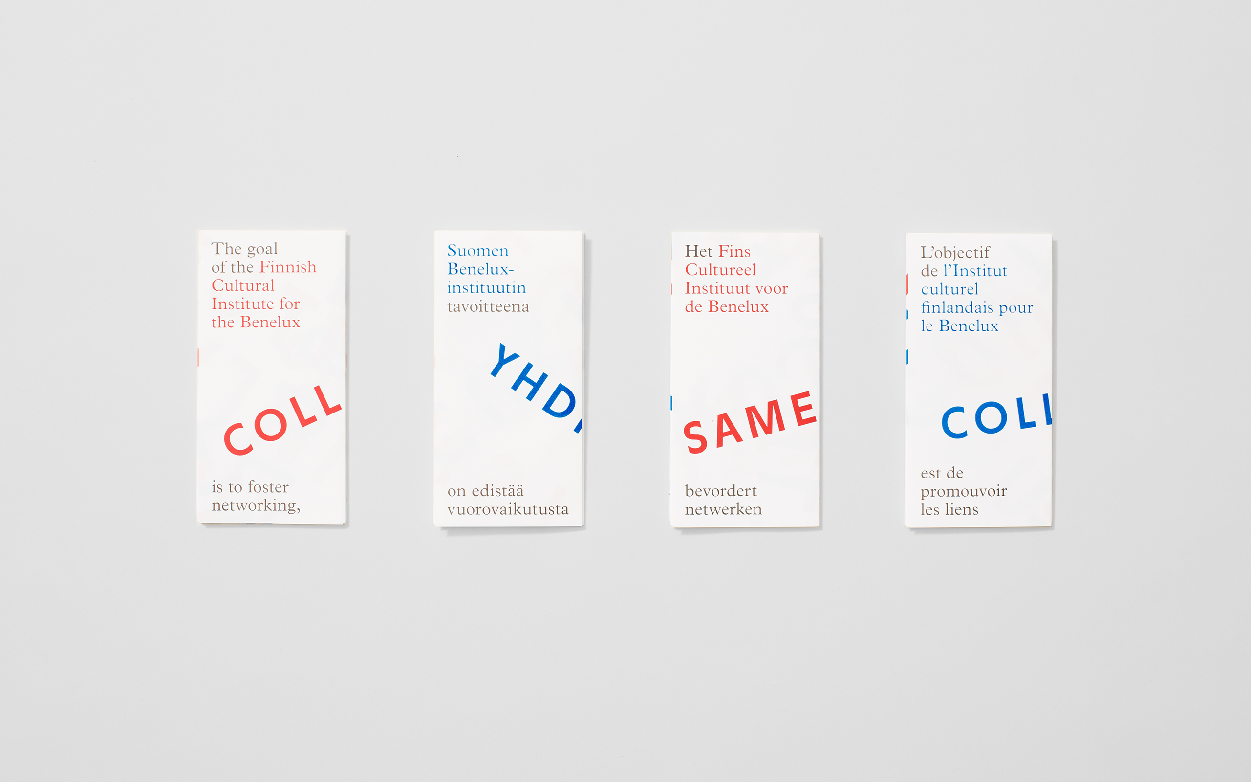
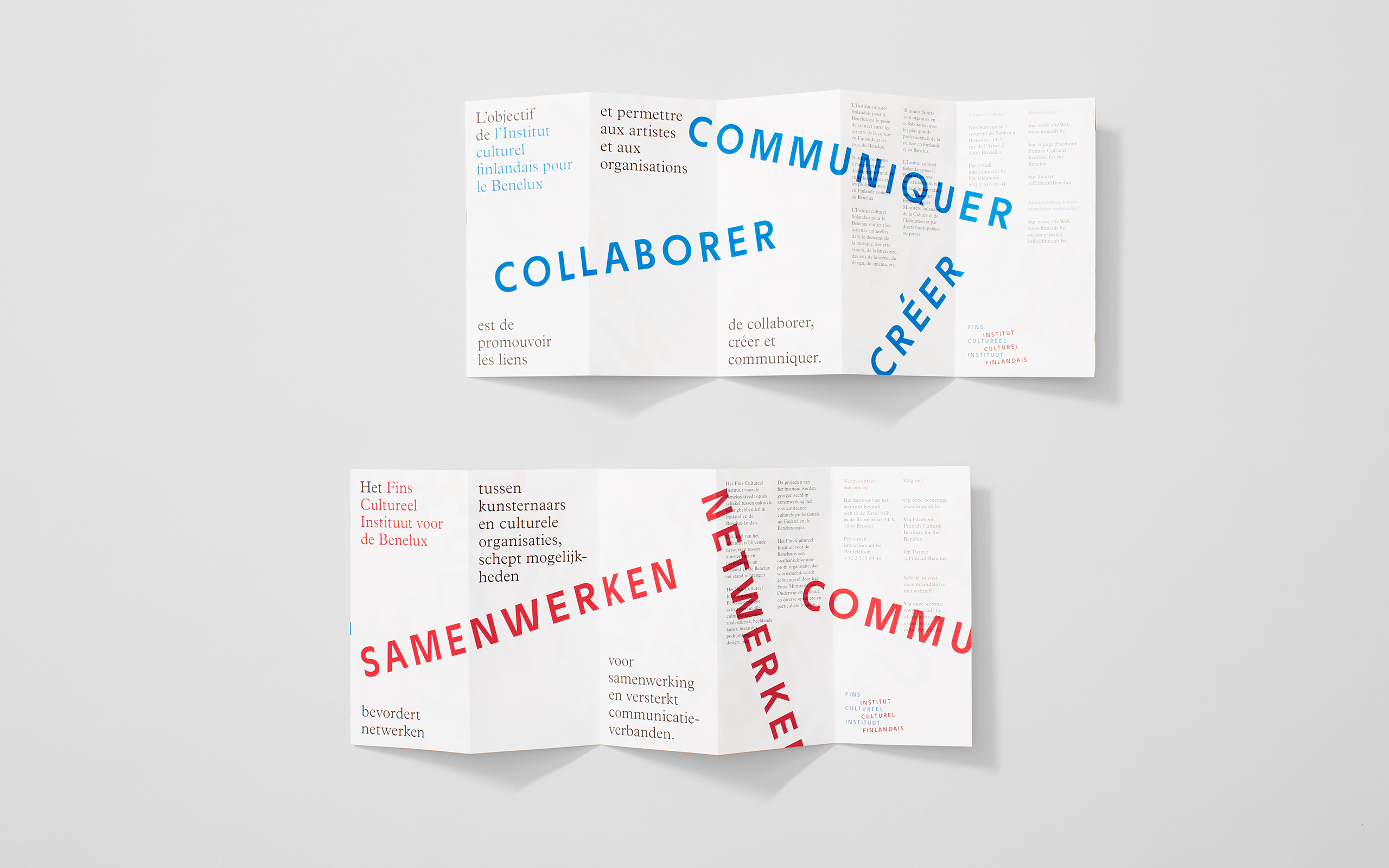
The Finnish Cultural Institute for the Benelux (Fins Cultureel Instituut, Institut Culturel Finlandais) is a non-profit organisation that promotes Finnish arts and culture to the Benelux countries of the Netherlands, France and Belgium, with the intention of fostering collaborative opportunities for artists and organisations within the fields of music, literature, design, cinema and the performing and visual arts. The institute’s visual identity, designed by creative agency Kokoro & Moi, juxtaposes the horizontal, modernist formality and contemporary professionalism of a broadly spaced, uppercase and geometric sans serif execution of one language with the slanted, stamp and craft-like treatment of another.
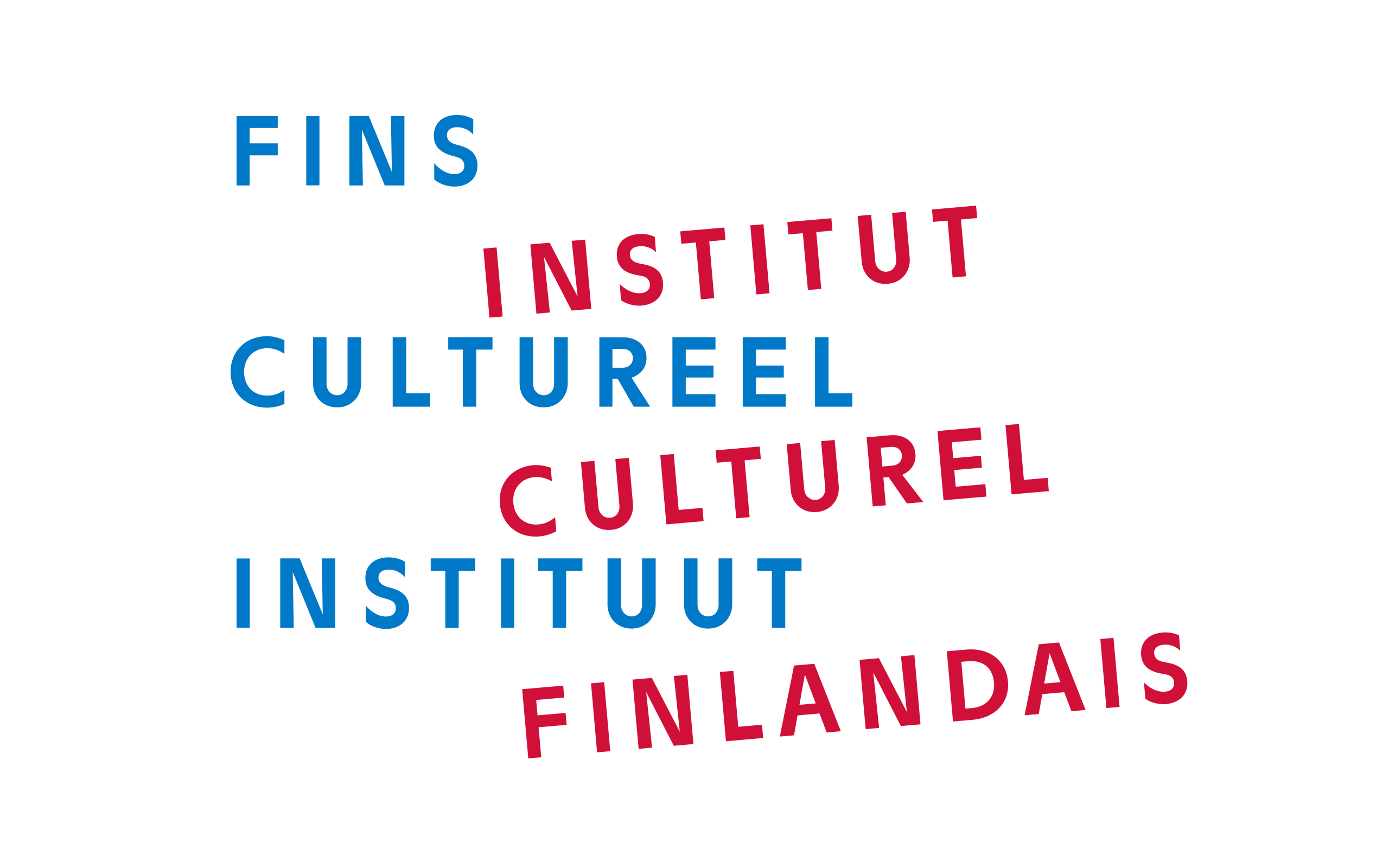
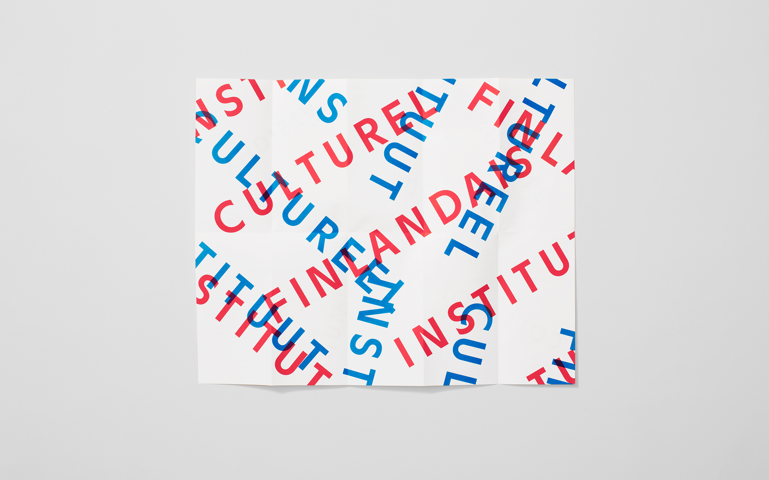
It is a fairly simple typographical contrast but one that appropriately draws together the themes of artistic and linguistic spontaneity and interaction, the intended union between countries but also a sense of academic integrity and experience. Kokoro & Moi have managed to extract quite a lot of visual equity from the logo-type through an expressive over-sized, over-printed and subtle remixing of the words across the collaterals that neatly resolves the physical performance and linguistics, the transfer of knowledge and the collaborative remit of the institute. The blue and red colour palette, half of the Benelux flag, alongside a non-format typographical treatment infuse the identity with a vitality, energy and sense of motion which is slightly but relevantly tempered by a gallery-esque style use of ample white spacing.
