Healgel by Pentagram
Opinion by Richard Baird Posted 9 October 2012
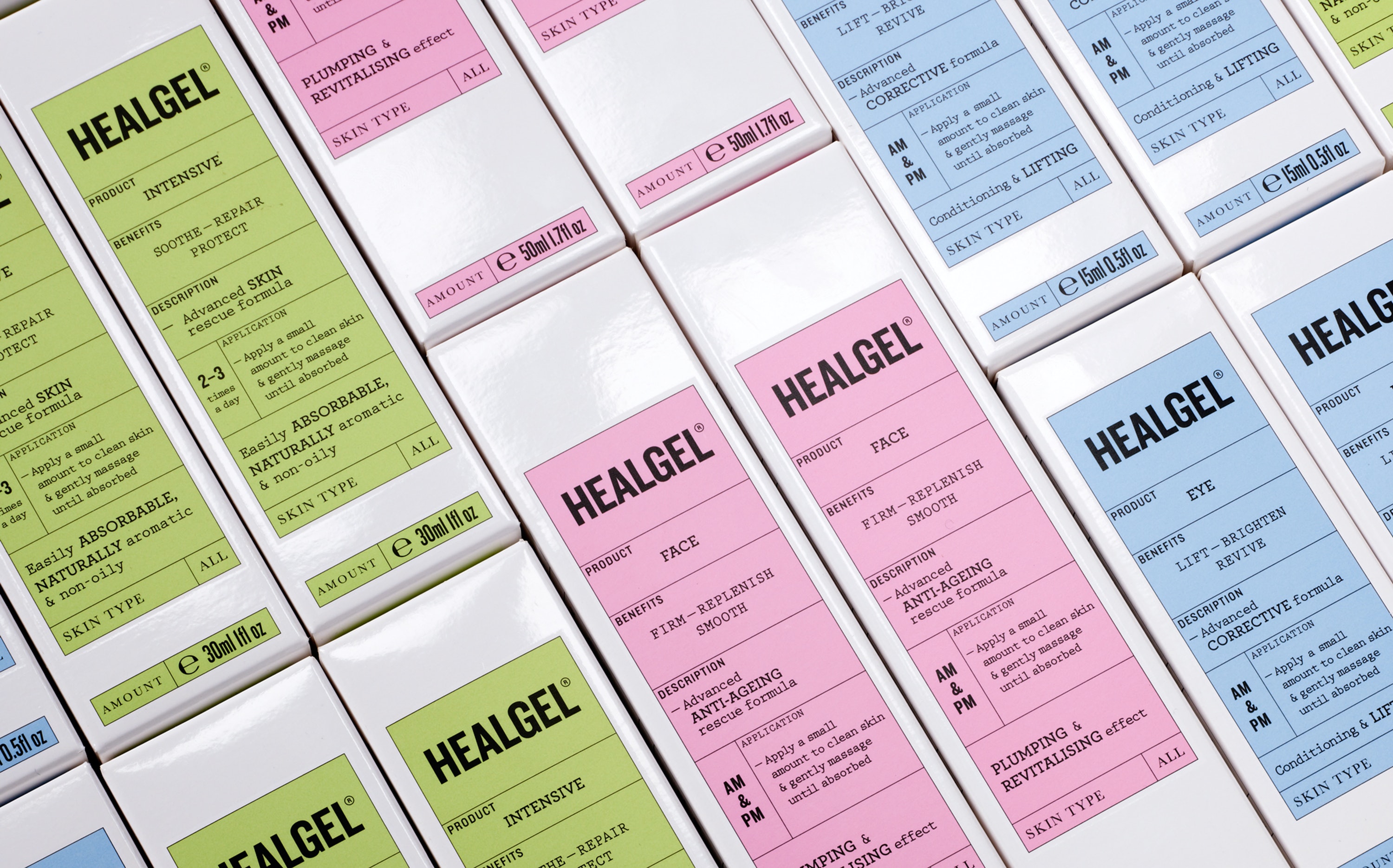
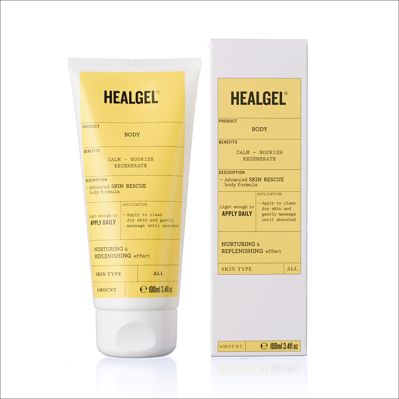
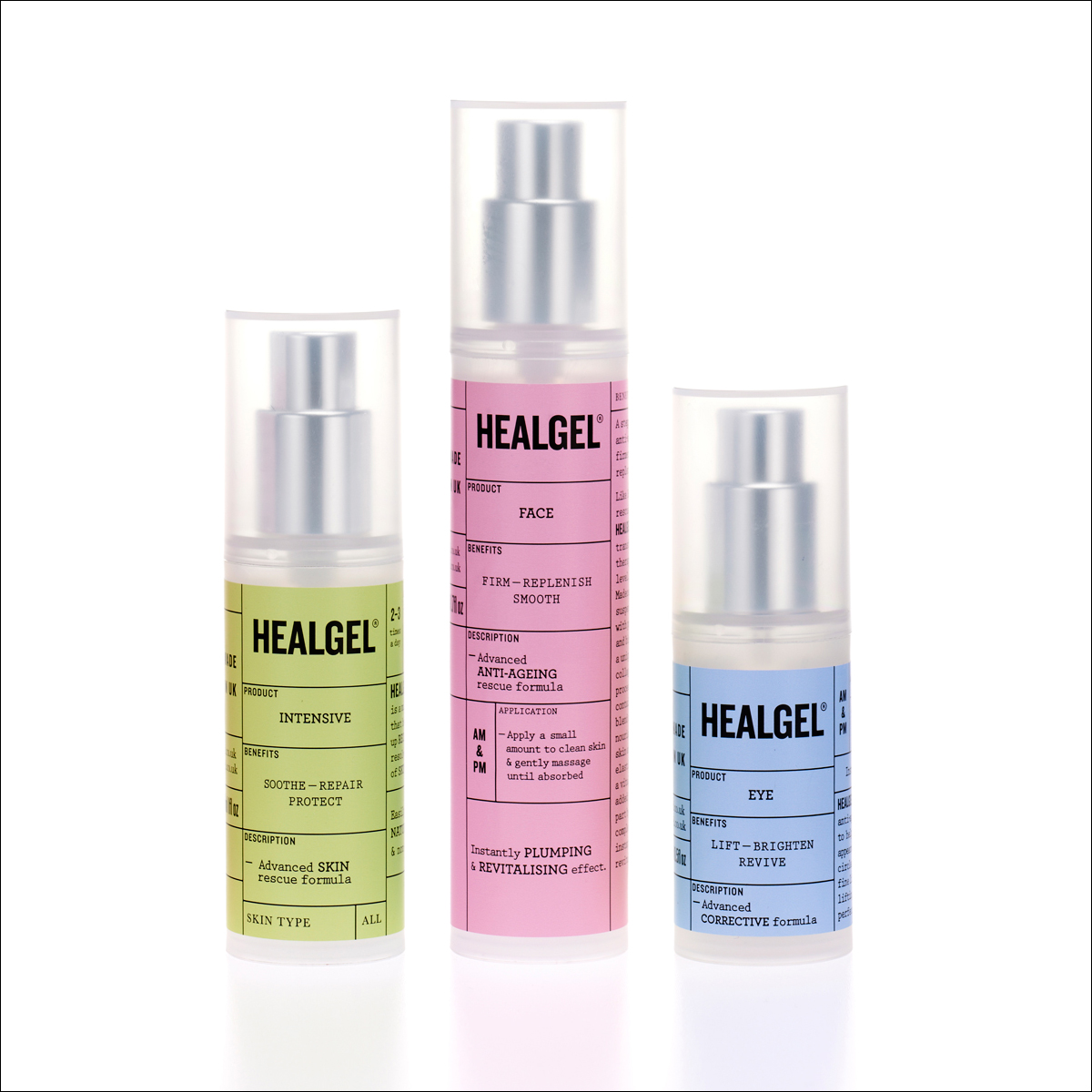
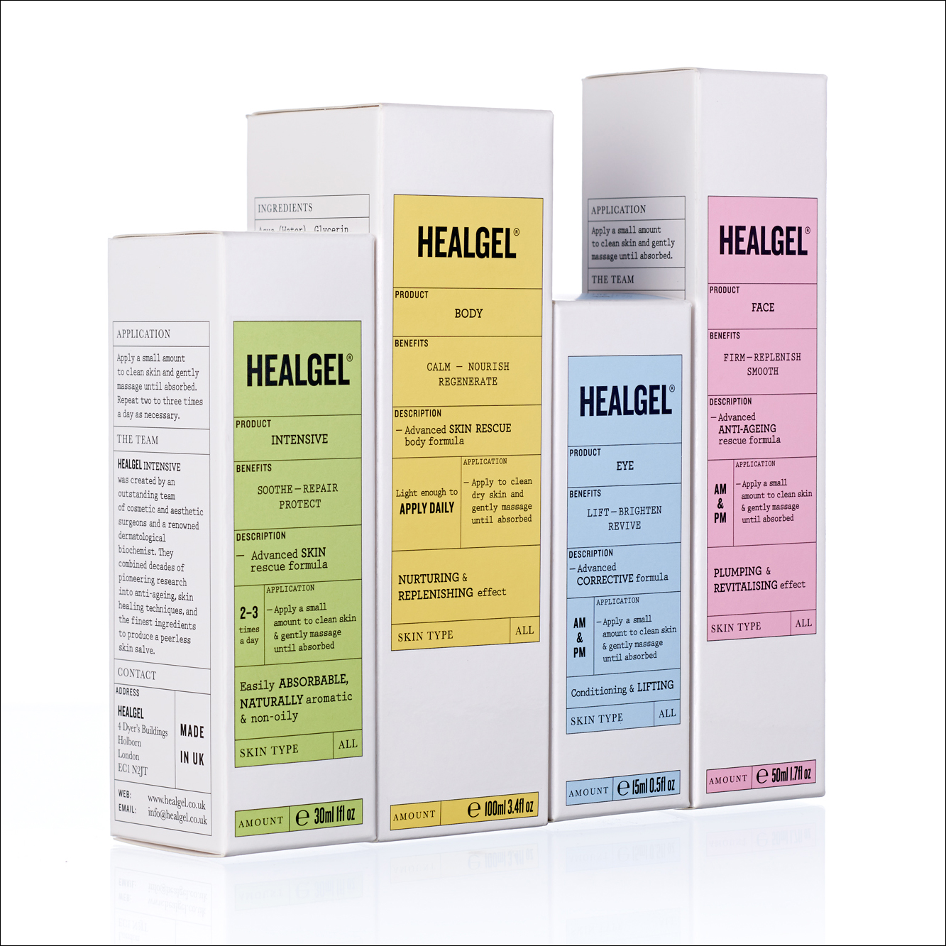
HealGel is a range of high quality skin care products, originally created to aid the repair of post-operative scarring, developed by actress Natascha McElhone – a dermatological biochemist – and a team of cosmetic surgeons. Taking its cues from what looks like medical forms and stat charts, international design agency Pentagram, led by Domenic Lippa, developed a new packaging treatment that delivers a sense of ‘pure information’, fact and clinical effectiveness through grid-based layouts, boxes, a geometric sans serif and slab serif combination softened by a pastel colour palette across a white substrate. It is a distinctive and unique design solution that avoids cosmetic conventions in favour of hard science, a direction that manages to resolve the themes of technological and scientific systems, medical processes and everyday routine with a reductionist, communicative and utilitarian functionality.
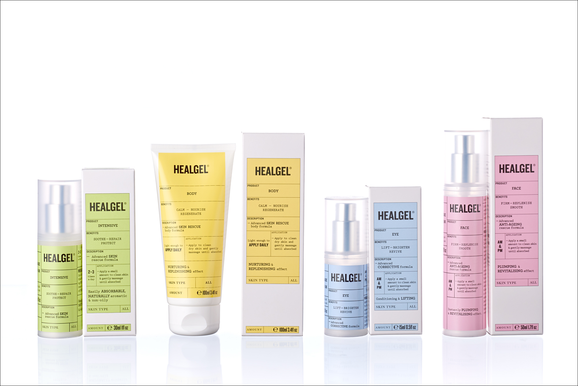
“The challenge for Lippa and his team was to evolve HealGel’s look and feel using elements of the existing identity while also staying true to the brand’s origins. Its basis in science was reflected in a minimalist design, using typography alone – no imagery or photographic direction – to allow the product to speak for itself. And its beauty credentials were emphasised with the use of warm pastel colours to soften and feminise the overall look. That balance between science and beauty, which lies at the very heart of this project, comes through even on the packaging’s finish, where a contrast between matte and gloss denotes a product that is both functional and tactile.” – Pentagram
