Sébastien Bertrand Gallery by Neo Neo
Opinion by Richard Baird Posted 17 October 2012
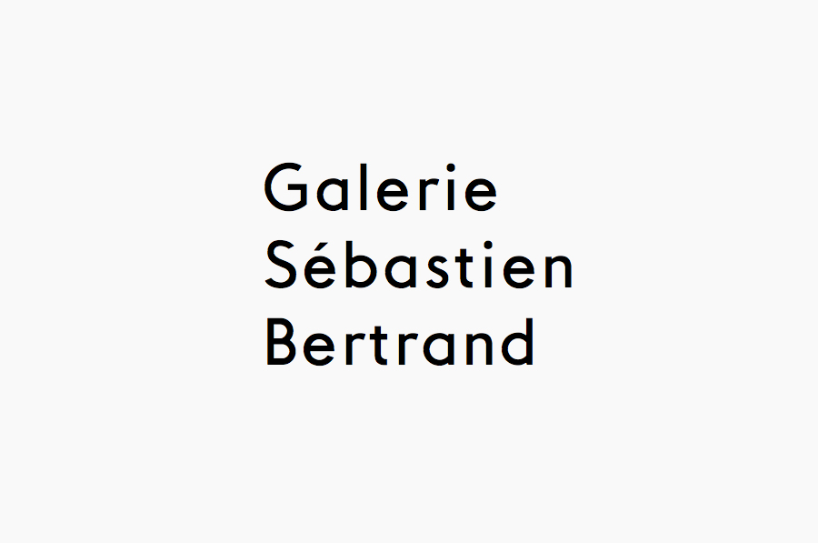
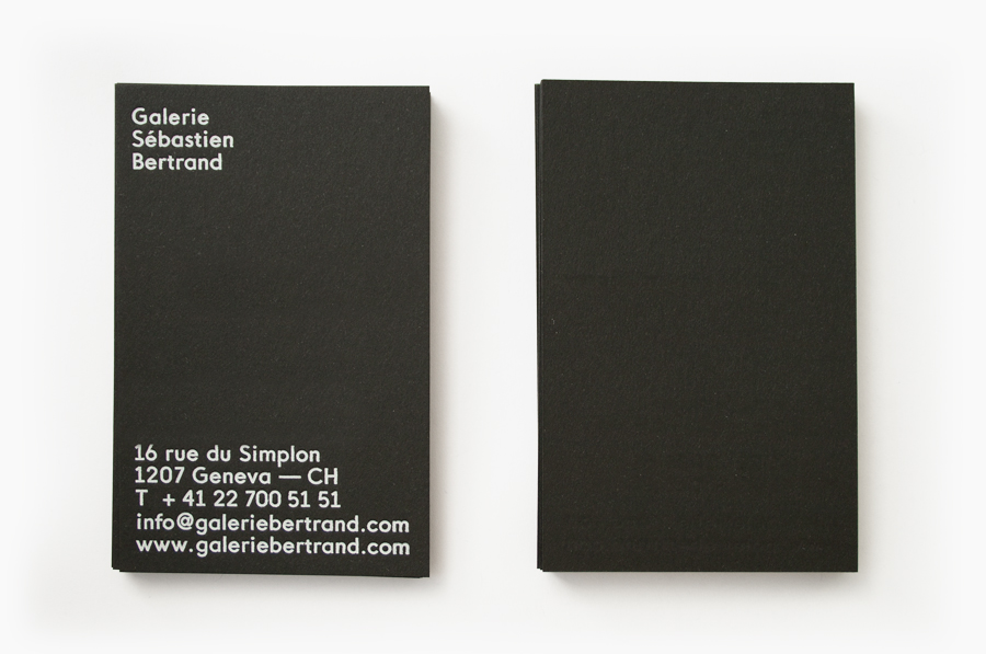
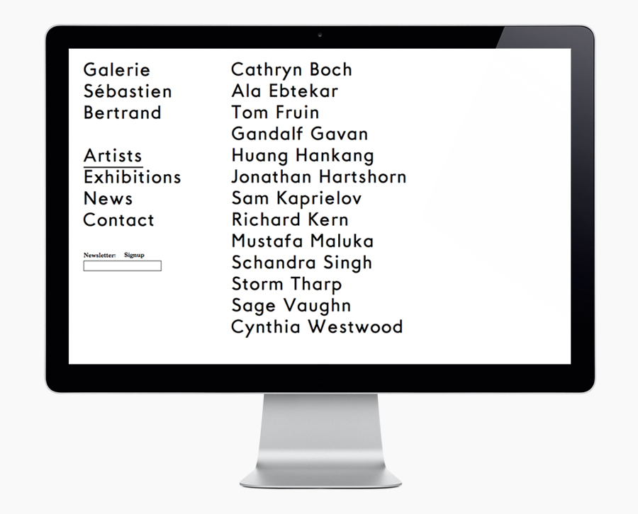
Sébastien Bertrand is a contemporary art gallery – located on Geneva’s Rue du Simplon street – that has curated work from artists such as Cynthia Westwood, Sam Kaprielov and Tom Fruin. The gallery’s identity, designed by visual communications and graphic design studio Neo Neo, mixes a humanist sans serif logo-type built from a bespoke web font, a monochromatic colour palette and uncoated substrates to achieve both a contemporary arts and crafts sensibility and on-line functionality.
I have recently noticed an increasing convergence of logo-types and web fonts, that is to say logo-types which can be both coded and constructed in a similar way on-line and in print. And while that often means slight variations in spacing between applications (print tending to appear a little neater) there is the added web-based functionality.
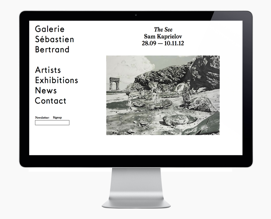
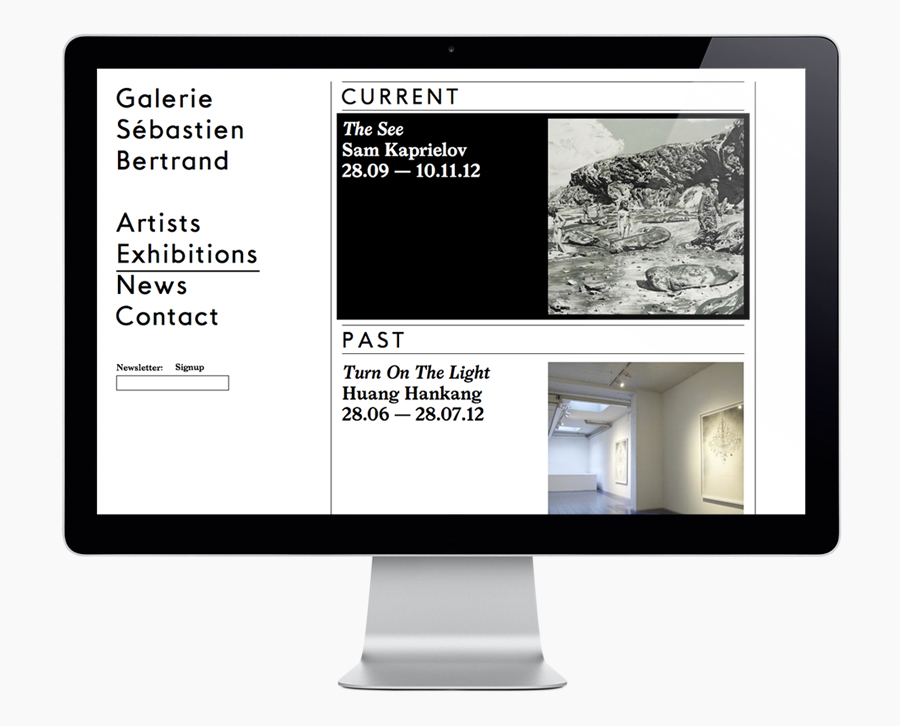
Neo Neo’s identity work for the Sébastien Bertrand Gallery is a great example and one that I think works quite well. Their utilisation of their own bespoke typeface Geoxe – a humanist mix of slim and broad characters, square terminals, slight changes in line weight and small details such as extended hyphens, an interesting junction across the W, single story a’s and slab across the base of the 1’s – deliver a distinctive fusion of craft and functionality. There are slight inconsistencies between the spacing on-line and in print but for me, in a design world obsessed with typographic perfection, these add character and a sense of period authenticity.
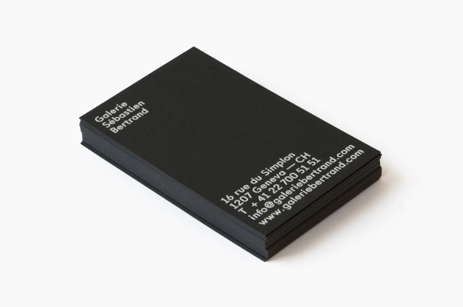
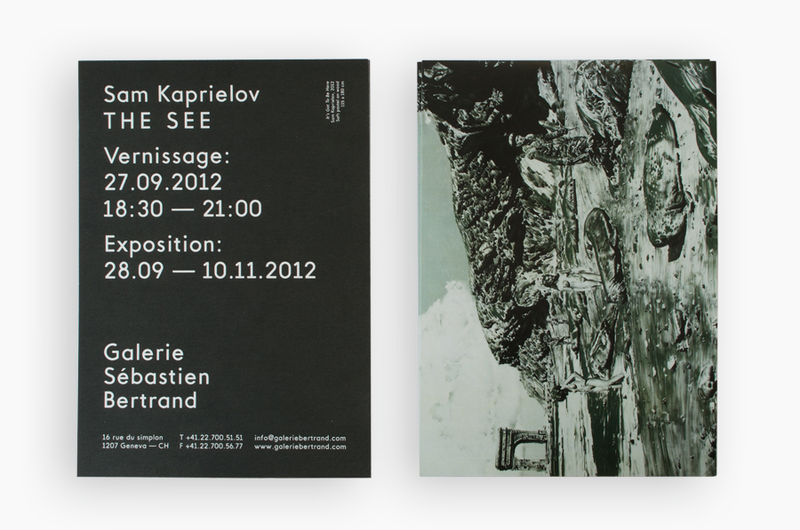
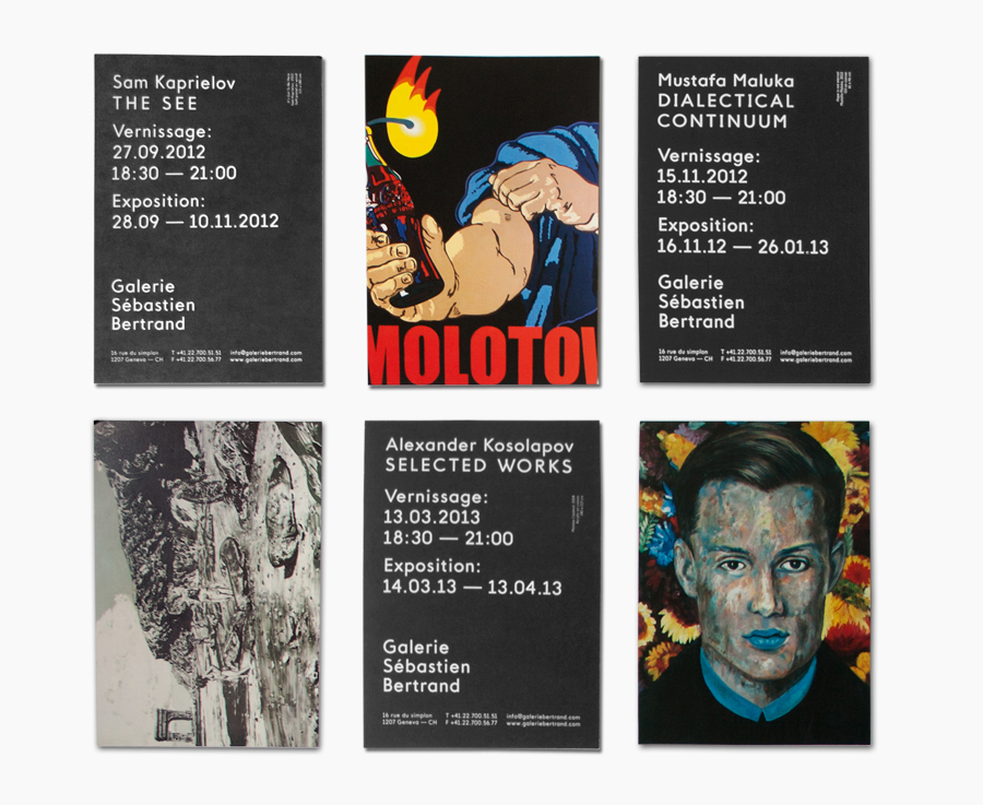
The business card’s white print across a black, tactile uncoated substrate, vertical layout and consistent type-size introduce modernistic non-hierachical concepts while the invitation’s large headlines alongside smaller copy, broader letter spacing and full bleed image creates a little more of an editorial feel. In contrast the website confidently mixes over-sized type and plenty of white space to frame the richness of the artwork with a gallery-like simplicity.
