Top 5 Packaging Projects of 2012
Opinion by Richard Baird Posted 30 December 2012
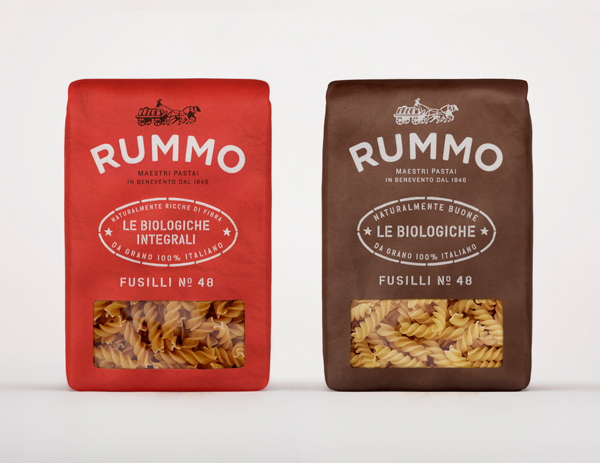
Italian pasta manufacturer Rummo have recently launched a new visual identity and packaging solution created by London-based independent communications firm Irving & Co. The solution conveys rustic charm, a sense of local quality and heritage through a craft colour palette, visual texture through fine detail, tactile materials and print finishes set alongside a script and contemporary sans-serif combination over a classic, etched illustrative background.
Read the review here
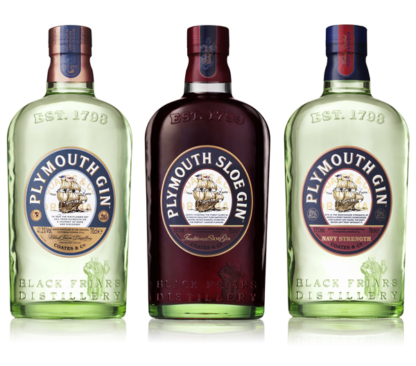
Owned by the Pernod Ricard Chivas Brothers and regionally protected, Plymouth Gin is a ‘super-premium’ product produced since 1793 at The Black Friar’s Distillery, a former monastery and the oldest distillery in England. In response to a growing and diversifying artisan market the brand approached independent and international creative agency Design Bridge to develop a solution that would replace the art deco styling of the previous packaging in favour of a more authentic and genuine solution drawn from and inspired by the distillery’s archives.
Read the review here
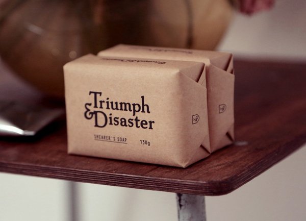
Triumph & Disaster is a new male skincare and accessory range created by Dion Nash that aims to unite the traditional grooming experience with the high quality, natural and scientifically formulated expectations of today’s market. The range’s packaging, developed by New Zealand based design studio DDMMYY, references and confidently brings the type-heavy, heraldic, structural and material choices of the past into the present with a contemporary consistency and a distinctive white on black colour palette.
Read the review here
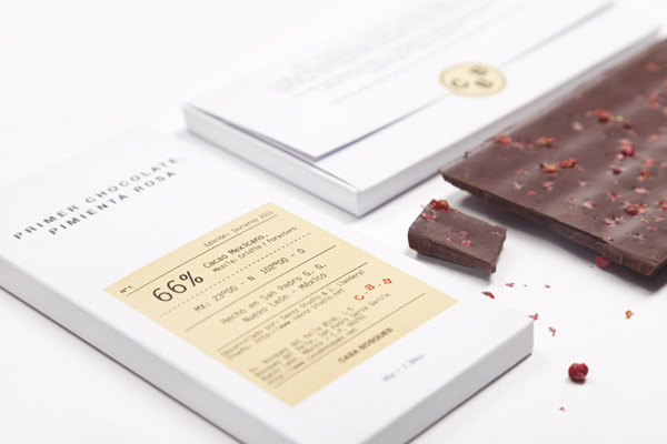
Casa Bosques is an initiative, founded by Mexico based design studio Savvy, to develop a variety of seasonal and sustainable products through a collaborative process across multiple disciplines. The initiative’s first product line, a range of 12 chocolates inspired by the months of the year, were created by master chocolatier Jorge Llanderal using high quality Ecuadorian cocoa fused with spices selected by experts.
Read the review here
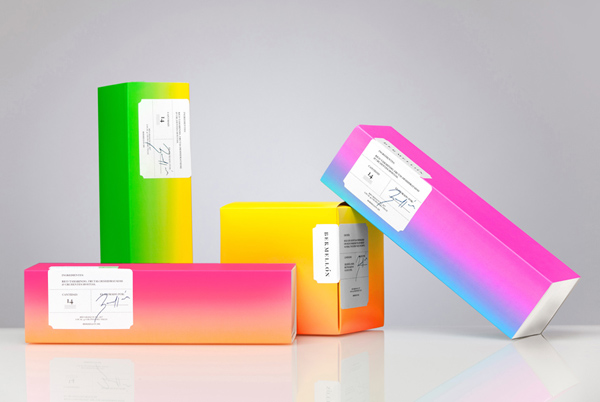
Bermellón is a Mexican confectionery shop that specialises in the premiumisation of traditional spicy treats typically sold on street markets. The shop’s identity and packaging, designed by Anagrama, fuses a bold and intense fluorescent colour palette with the fine detail and craft qualities of an adhesive label.
Anagrama’s confident and unapologetic re-appropriation of a colour palette arguably lost to cheap products executed alongside the typographical and print cues you might expect to find on a wine or aged whisky label nails the top spot for 2012. Its unusually bold but equally restrained sensibilities appropriately balance spice and celebratory spirit with a sense of handcraft and high quality.
Read the review here

