Marwood by Everything In Between
Opinion by Richard Baird Posted 28 January 2013

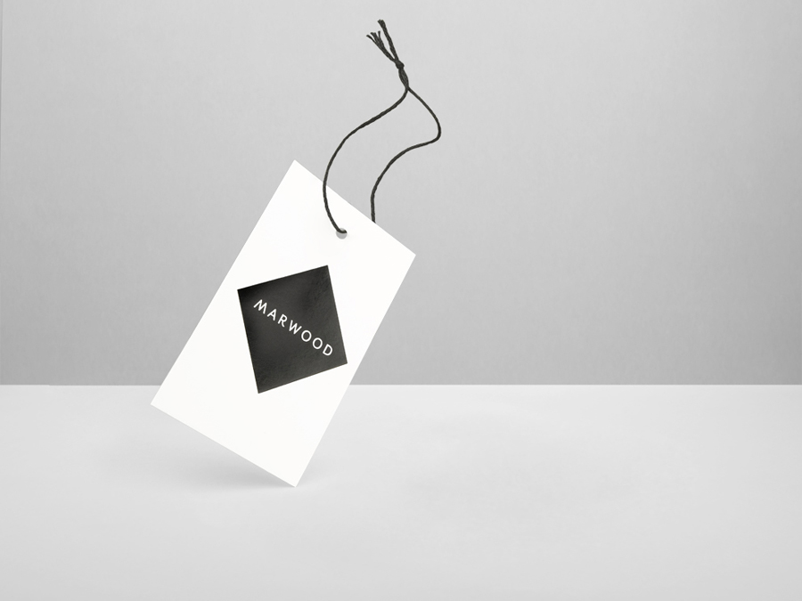
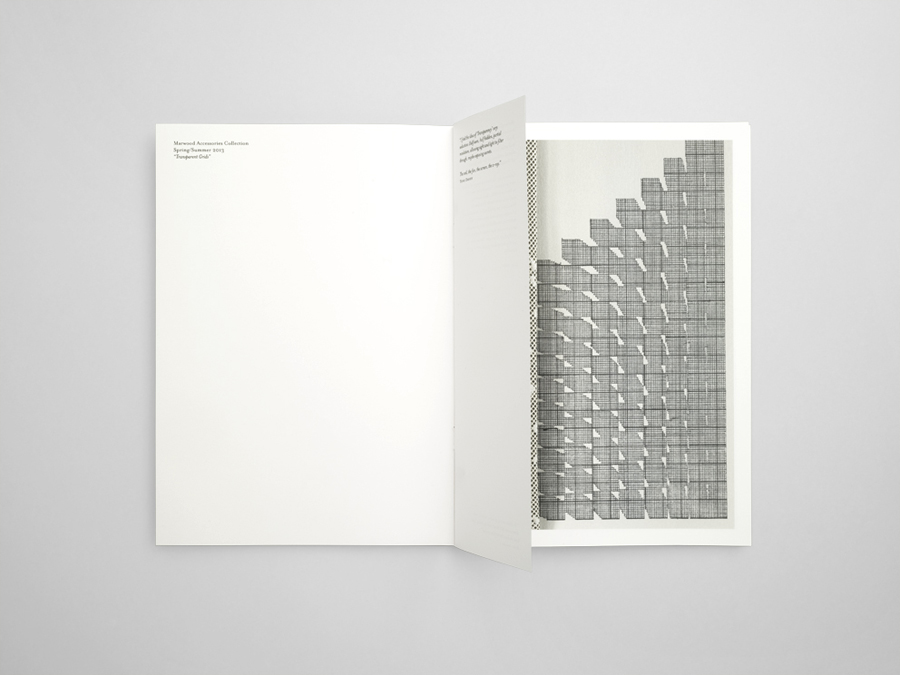
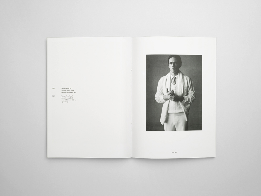
Marwood is London-based tie and neckwear brand founded in 2010. Its collections, handcrafted from British lace and cloth, are sold internationally to boutique stores such as Barneys New York, Tomorrowland Tokyo, Liberty London, and through online retailer Mr.Porter. Multi-disciplinary design studio Everything In Between (EIB) recently developed a new visual identity, label and packaging solution for Marwood that shares the tactile qualities of the product – through material choice and texture – but also delivers sharp professional contrast in their use of geometric form, type and a glossy black ink treatment.
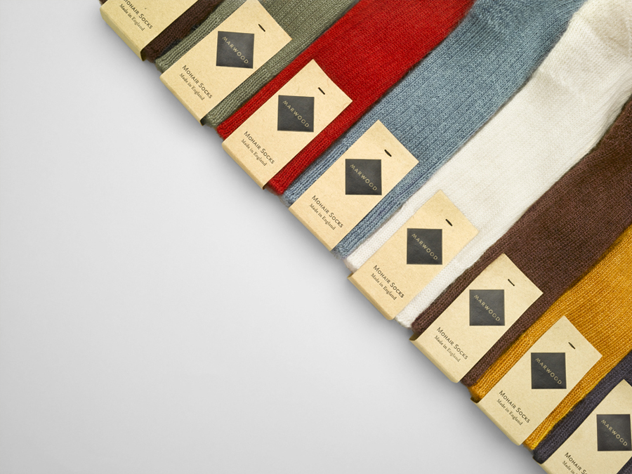
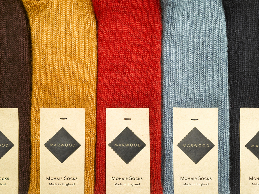
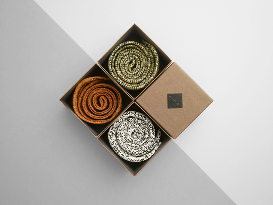
The most obvious aspect of EIB’s solution is its restraint. Appropriately placing material colour, texture and handmade quality at the very forefront of communication through the utilisation of an unobtrusive, unbleached, recycled, mixed-fibre tag and the complementary implementation of what looks like a linen emboss across the earthy brown of the box.
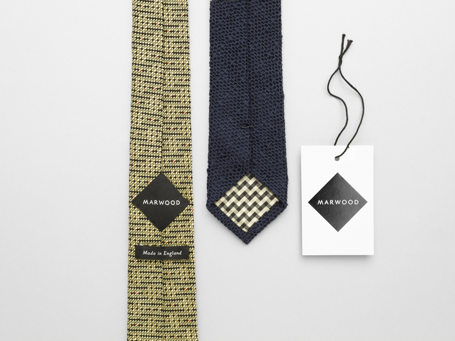
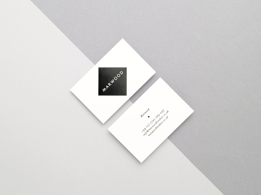
The logo-type’s broadly spaced, uppercase letter-forms – built from a contemporary single line weight, reoccurring diagonal strokes and the subtle extension and flourish of the R, set within the bold monochromatic fill of a diamond container (perhaps a reference to the fold and stitch on the reverse of a tie) – introduces significant contrast, amplified by a gloss black ink treatment, which works really well to cut through the organic detail of the product and add a sense of fashion, consistency and business professionalism to the theme of expert craftsmanship. The result is simple and consistent, rather than diverse yet coherent, a choice that suits the open and confident display of quality and rich detail.
