Jamsheed by Cloudy Co.
Opinion by Richard Baird Posted 4 February 2013

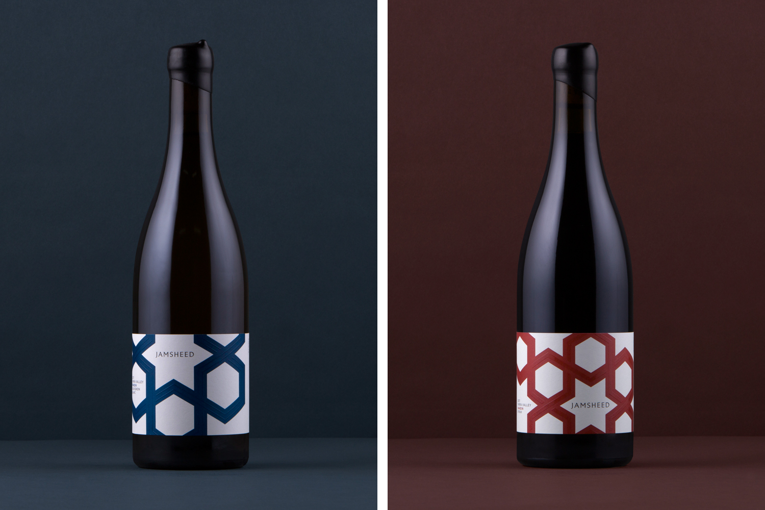
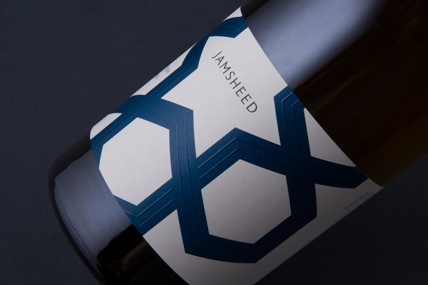
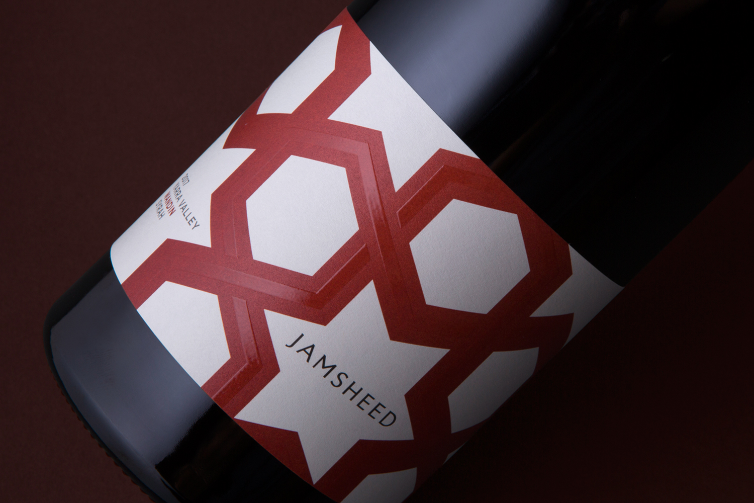
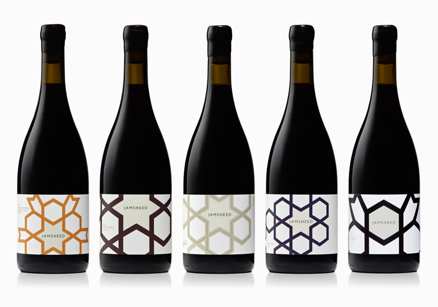
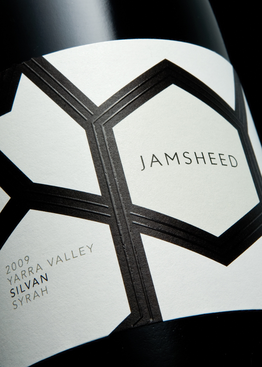
Melbourne-based design studio Cloudy Co. have recently developed the labels and visual identity for Yarra Valley boutique wine label Jamsheed, ‘named after a Persian king who according to ancient writings had a fondness for storing fresh grapes in jars, thus leading to the discovery of wine’. The packaging solution expands on the name and communicates a sense of bold flavour and craft through geometric, Persian pattern work executed with a heavy, contemporary, single and consistent line weight, the high quality and tactile detail of a lovely thermographic ink treatment and a simple variation in crop and colour dividing each variety.

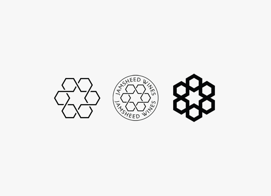
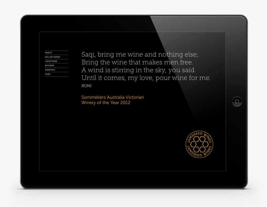
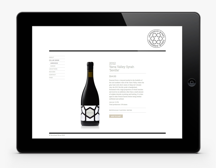
The identity fuses the angular illustrative elements of the bottles with the more recent but traditional circular sensibilities of a wine maker’s seal, creating a distinctive thematic and visual contrast. The mark has been well rendered with plenty of internal space and a sans serif typographical choice that mixes an uppercase professionalism / authority with the subtle flourishes of a slight variation in stroke width. The result, although aesthetically very simple, manages to leverage and cross pollinate the mathematical creation, artistic appropriation and historical richness of Persian patterns to convey the handcraft and desired perfection of wine production.
