Minke by Atipo
Opinion by Richard Baird Posted 14 February 2013
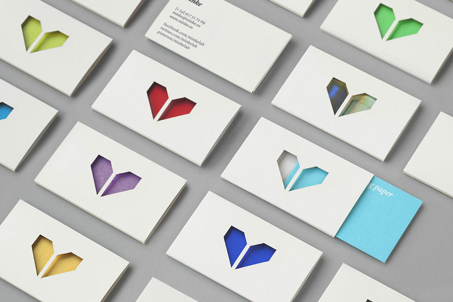
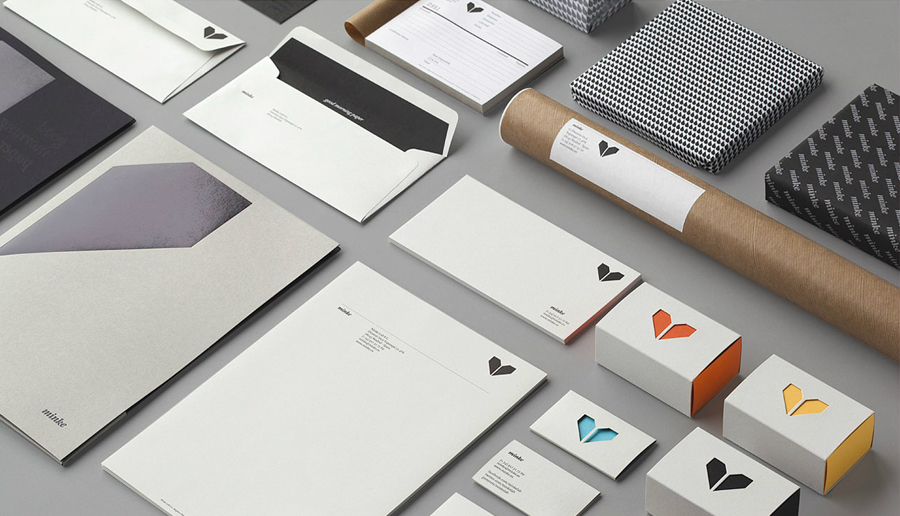
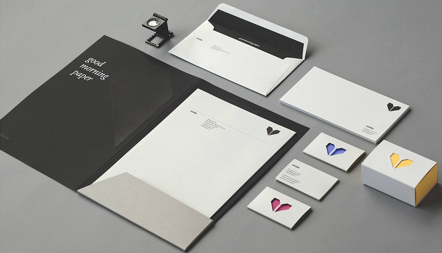
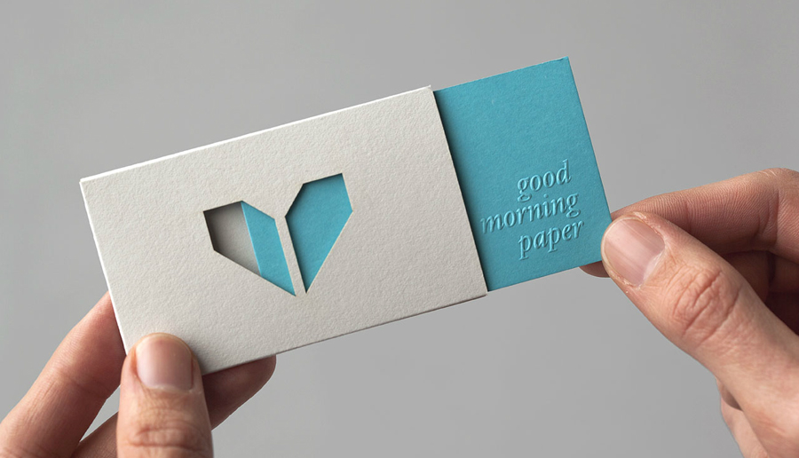
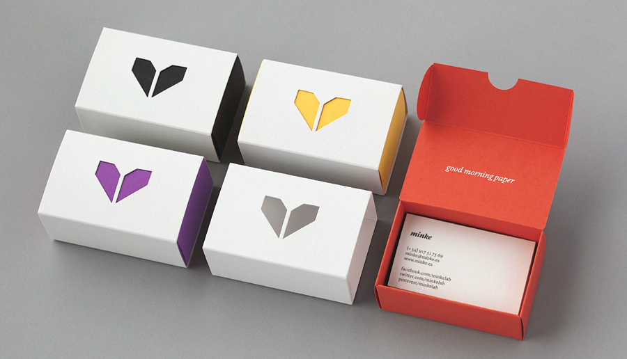
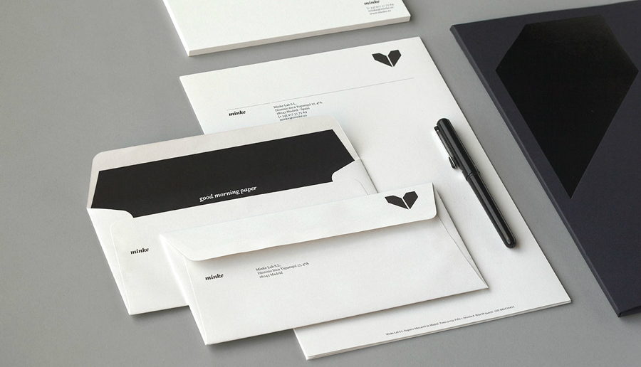
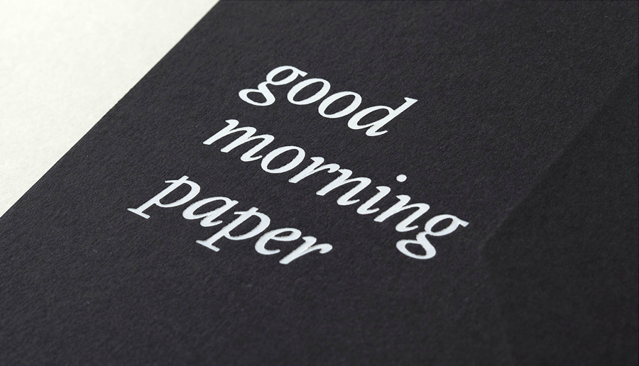
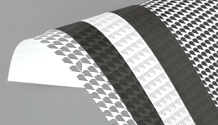
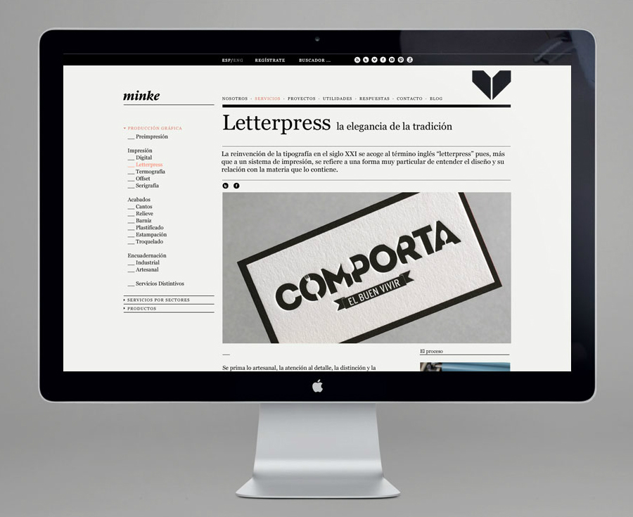
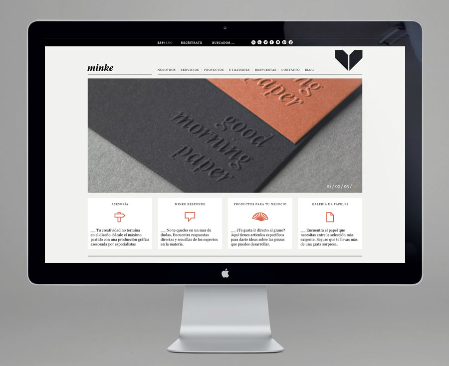
Minke is a Spanish print production studio that favours ‘analogue splendour’ over mass manufacture, providing its clients with a variety of small-scale, mechanical and handcrafted processes. Their visual identity, developed by multidisciplinary design studio Atipo, reflects these services, processes and philosophy through a union of traditional and contemporary detail that exists across type, colour, material texture, print finish, pattern and die cut elements.
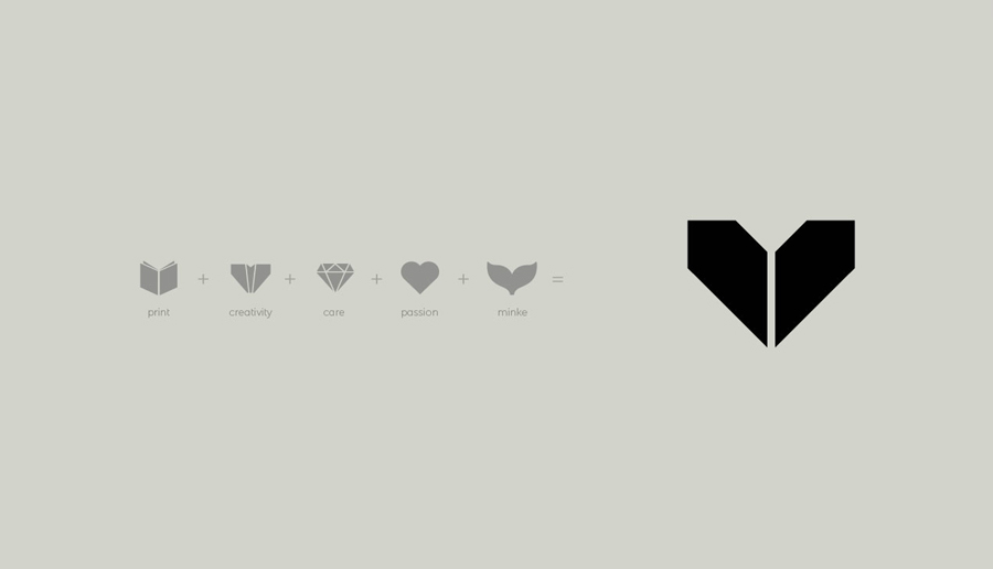
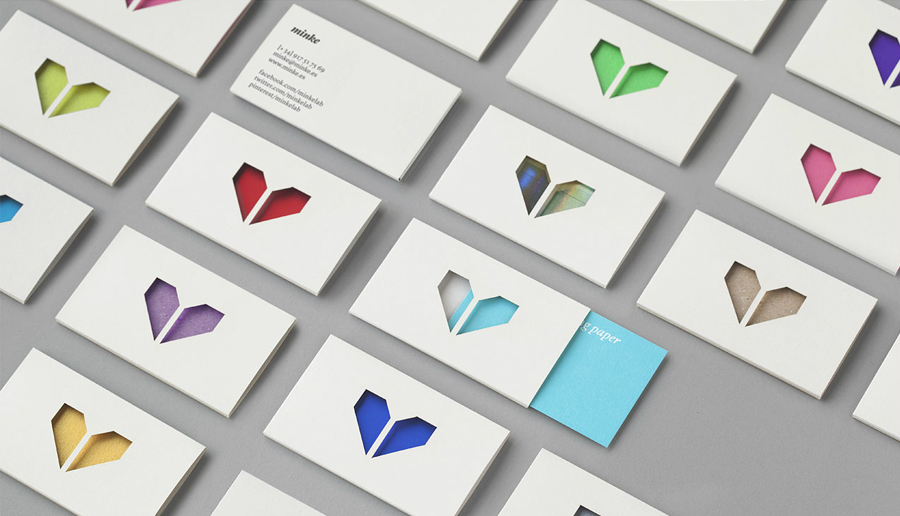
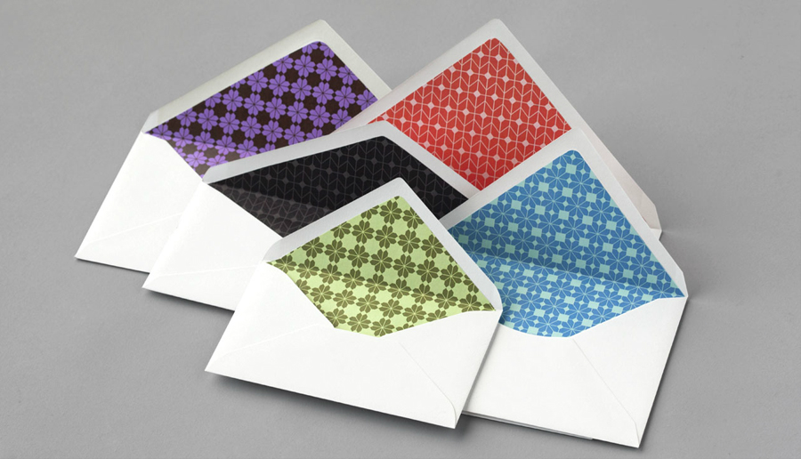
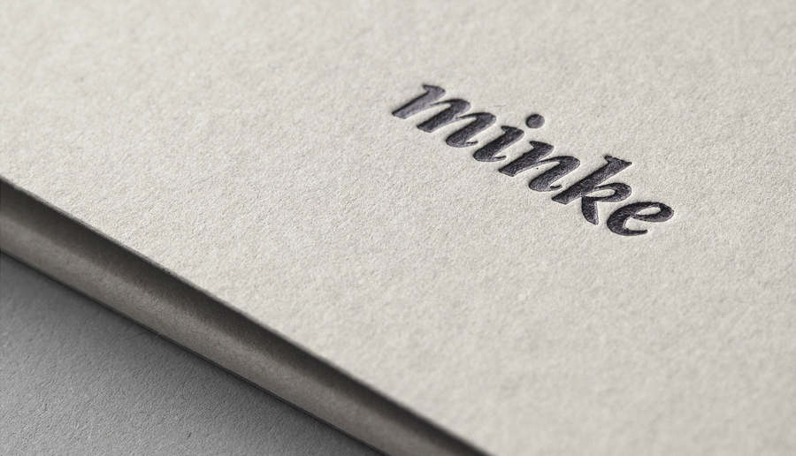
Contrast is used to great effect, blending classic and contemporary elements. These include, but are not limited to, a juxtaposition of abstract geometric mark alongside the editorial flourish and friendly informality of an all lowercase italic logo-type, the technological sensibilities of the iconography and elements of repetition set against handcrafted flourishes. The colour palette, again and fusion of past and present, unites these assets through the restraint and timelessness of black and white, and the more recent energy of bright highlights drawn from a variety of paper stocks.
The result is a simple but well resolved union of contrasting type, form, colour and texture that communicate paper and print finish quality, suggests a consistency in reproduction but with a creative enthusiasm and personality.
