Fogg by Bunch & Kurppa Hosk
Opinion by Richard Baird Posted 19 March 2013

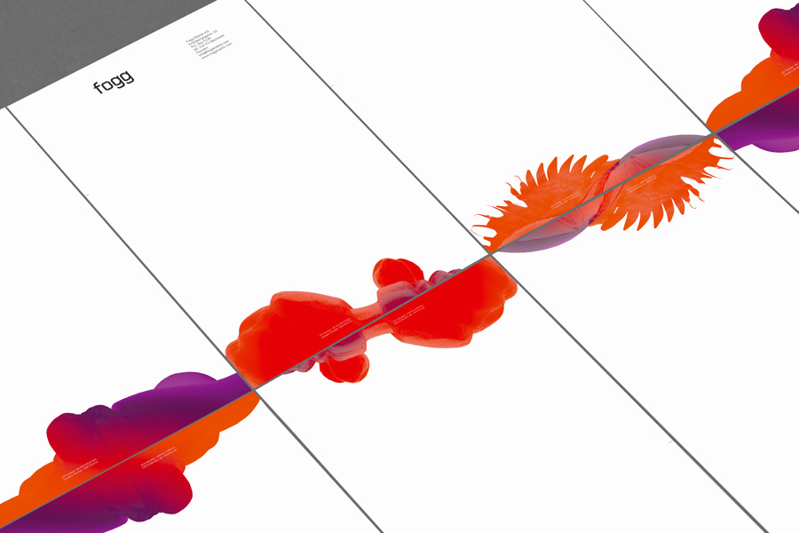
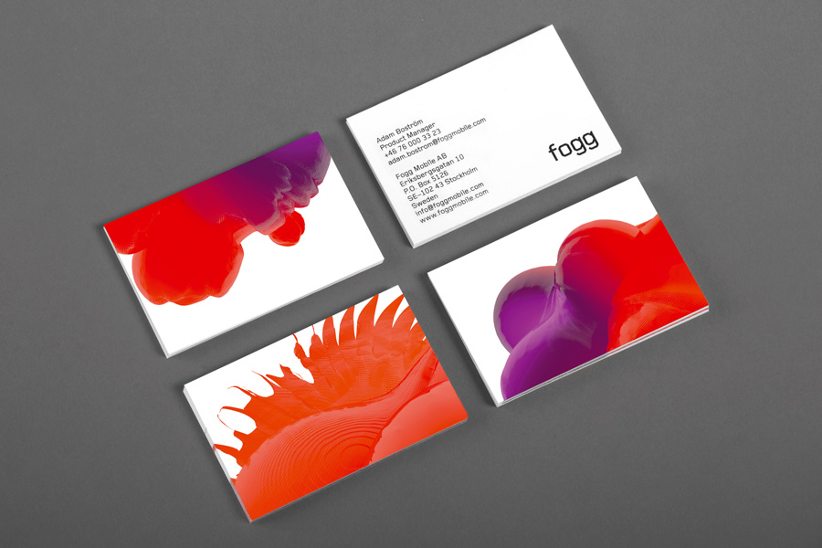
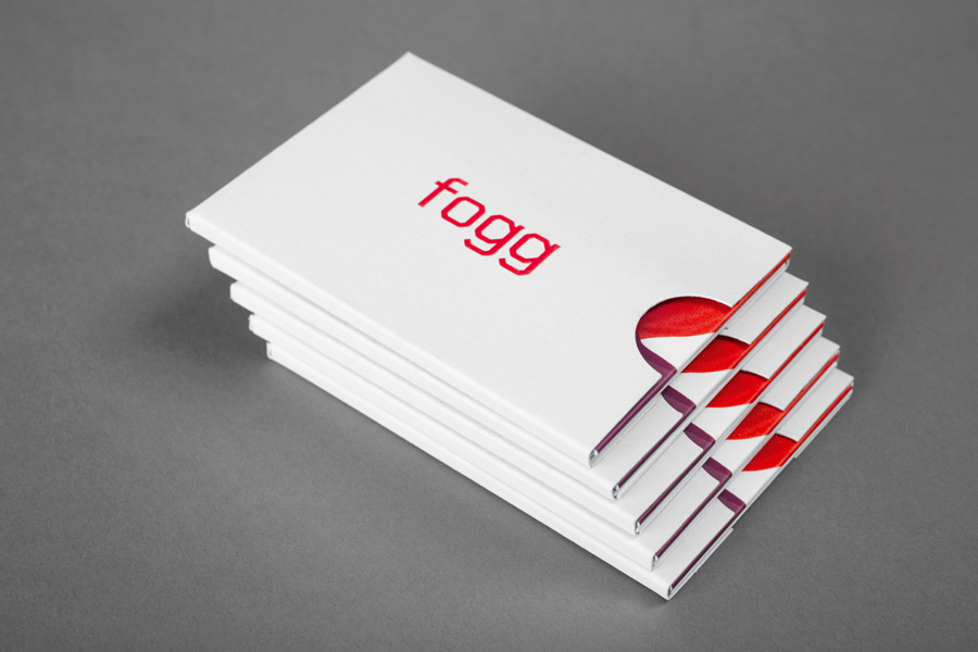
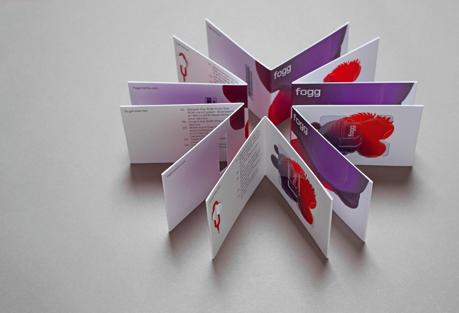
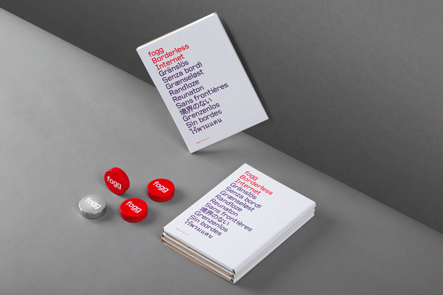
By purchasing overcapacity from international telecom networks, Fogg Mobile provides a fixed cost mobile data traffic service for people who want to avoid unexpected roaming bills when travelling abroad. Through the animate and evolving qualities of computer generated imagery and a combination of unbleached paper, stitching, flat coated colour and silver polypropylene, Fogg’s visual identity, created by Kurppa Hosk and developed by Bunch, delivers an interesting physicality and travel utility to a digital service alongside the more conventional technological cues of recurring geometric typographic form.
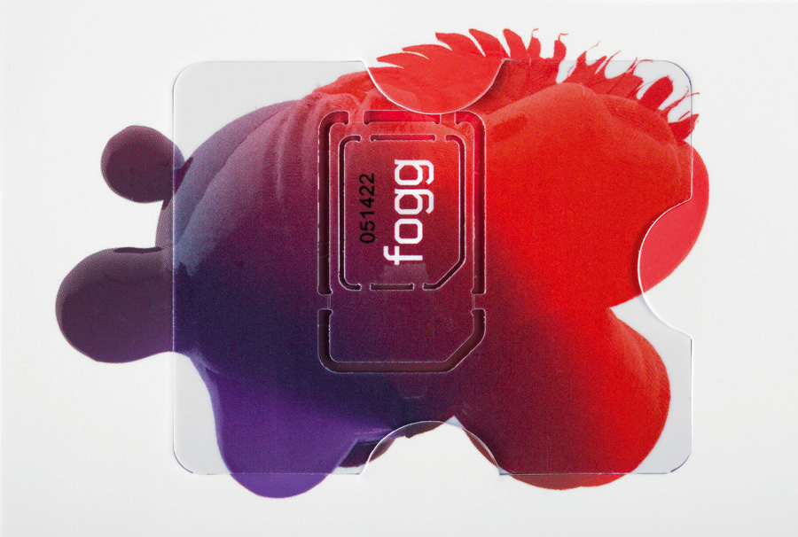
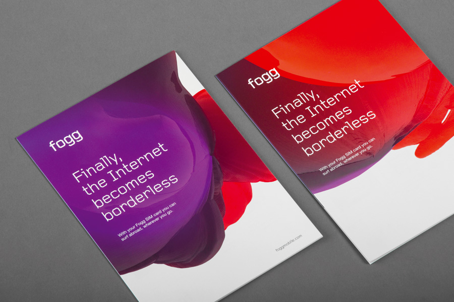
Bunch developed the identity based on the brand directions that were inherited from the superb Kurppa Hosk. A stark and somewhat technical visual foundation is complemented by an inspiring blob – while digital in nature, its 3D model carefully combines light, texture and space which brings depth in both print and digital format while maintaining its poetic essence.
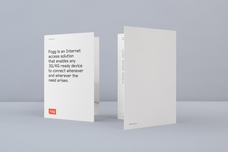
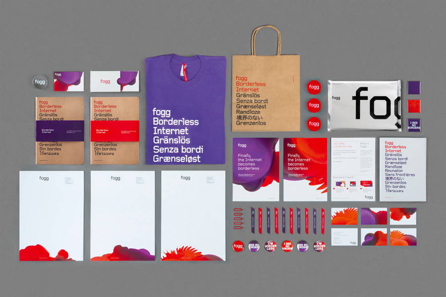
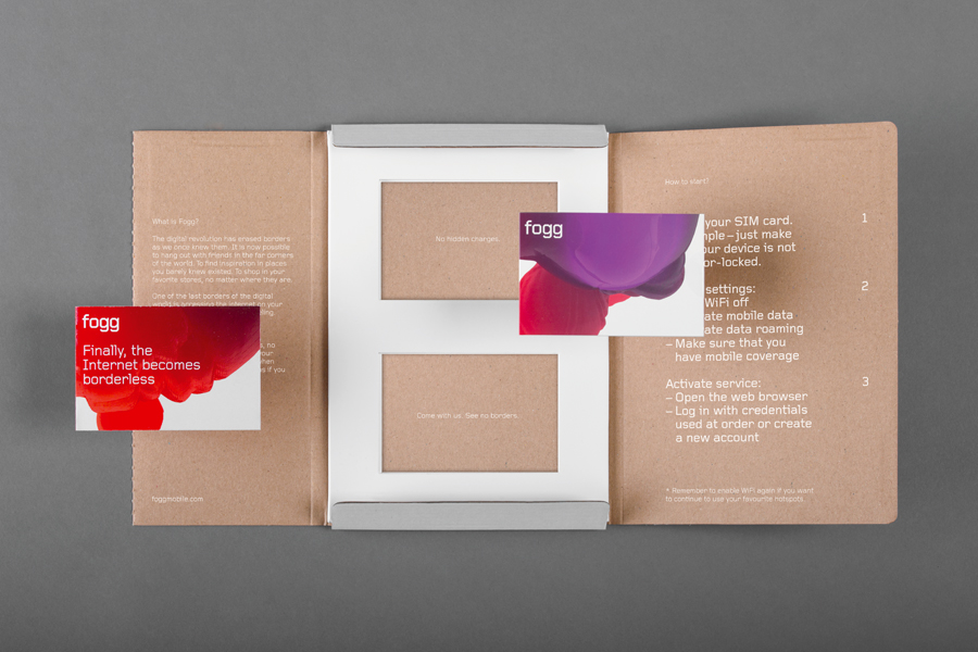
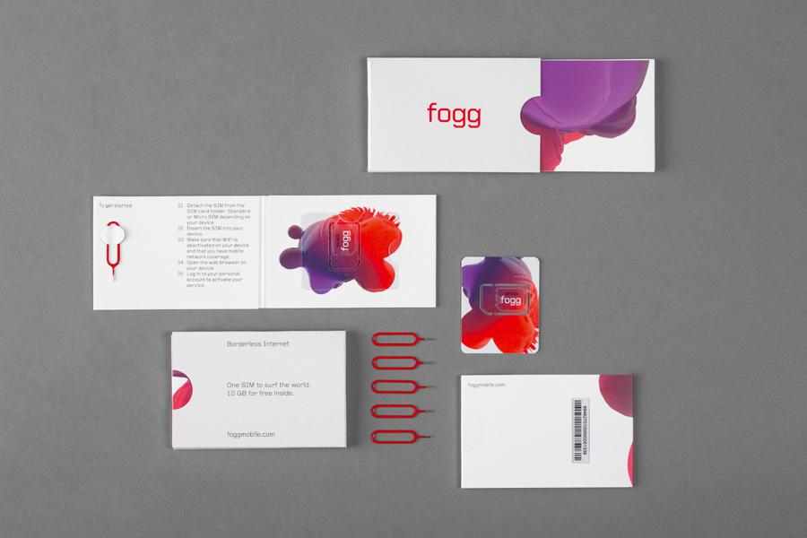
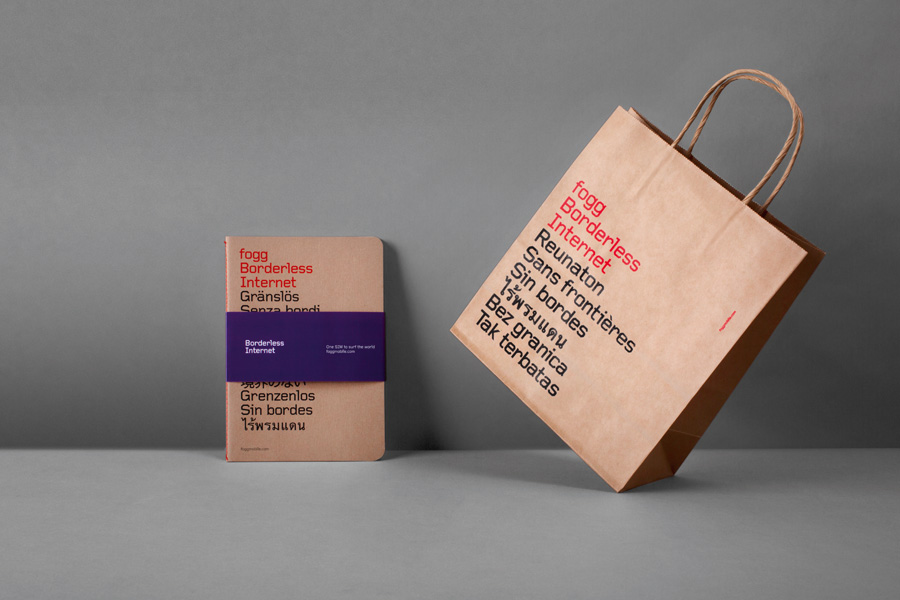
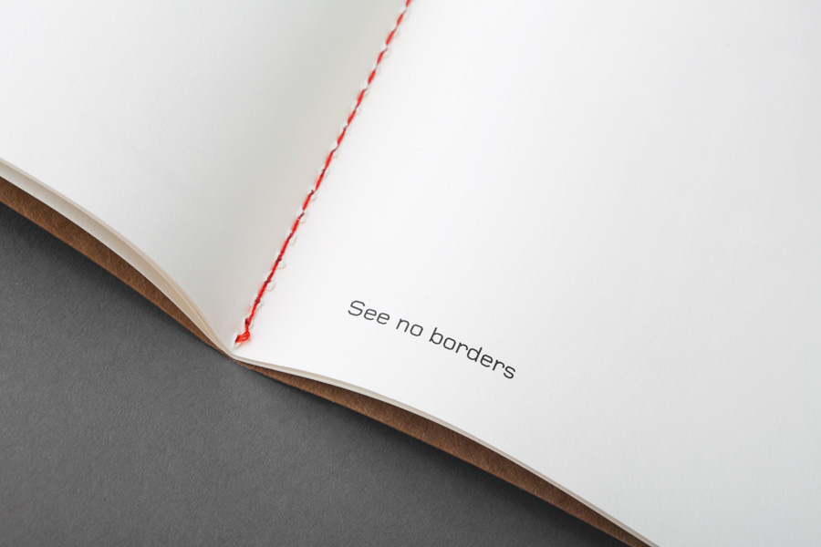
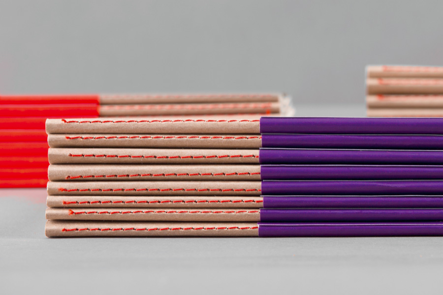
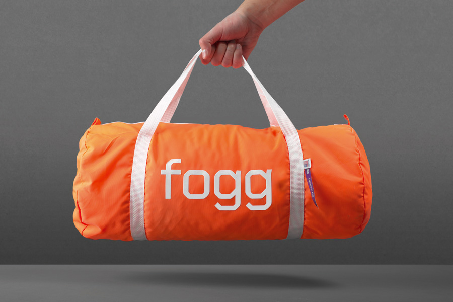
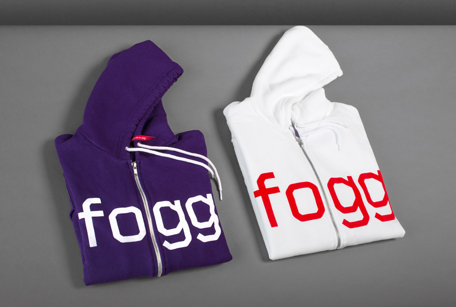
A wide range of print and digital applications were bespokely developed including stationery, SIM packaging, direct mailers, presentation templates, launch stand system and promotional materials such as flyers, t-shirts, hoodies, bags, notebooks etc. Also in charge of print production, Bunch was able to produce materials with great attention to detail, where the “borderless” theme is explored not only through typography and visuals but also materials, print processes and finishes. – Bunch
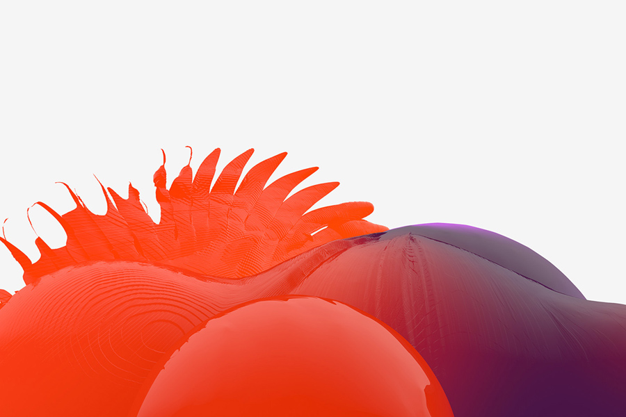
The impact of this identity clearly lies with the digital imagery. Its combination of ripples, facets, sharp and gelatinous topographical detail – enhanced by a gloss surface treatment – creates a really nice organic yet digital fluidity and diversity that has the potential to convey a multi-dimensional brand personality but also the unlimited data-led nature of the service and perhaps global aspirations. Its radiating red to purple gradient feels distinctive and contemporary, with an accessible warmth that really stands out against the ample white space of the website and stationery.
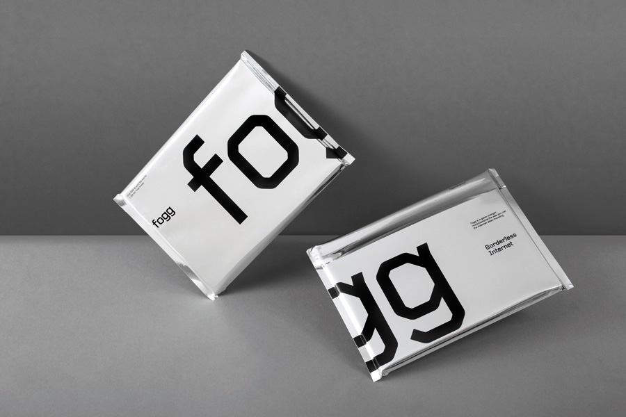
The irregularity and changing shape of the imagery is bound by the consistent technological utility of a logotype built from well-spaced, lowercase characters with a single consistent line weight, diagonal cuts and subtle curves. As an extended typeface applied as a mix of over-size logotype crops and smaller content it shares the impact and finer detail of the 3d work but with a flat white quality that cuts right through the colour choices.
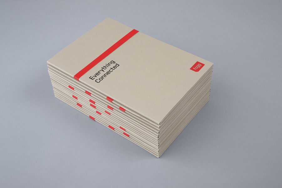
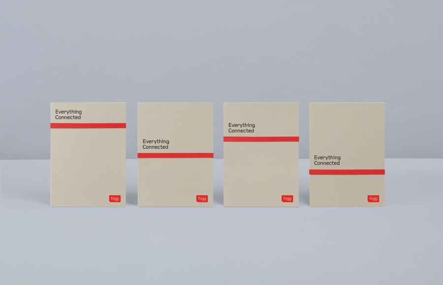
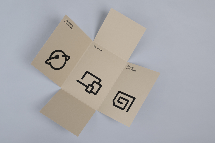
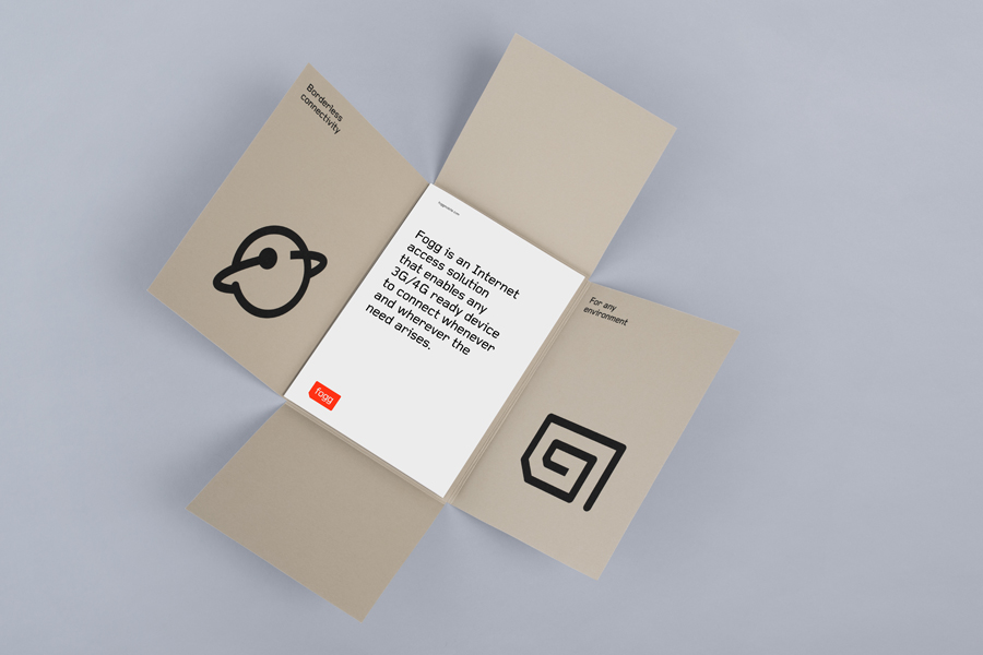
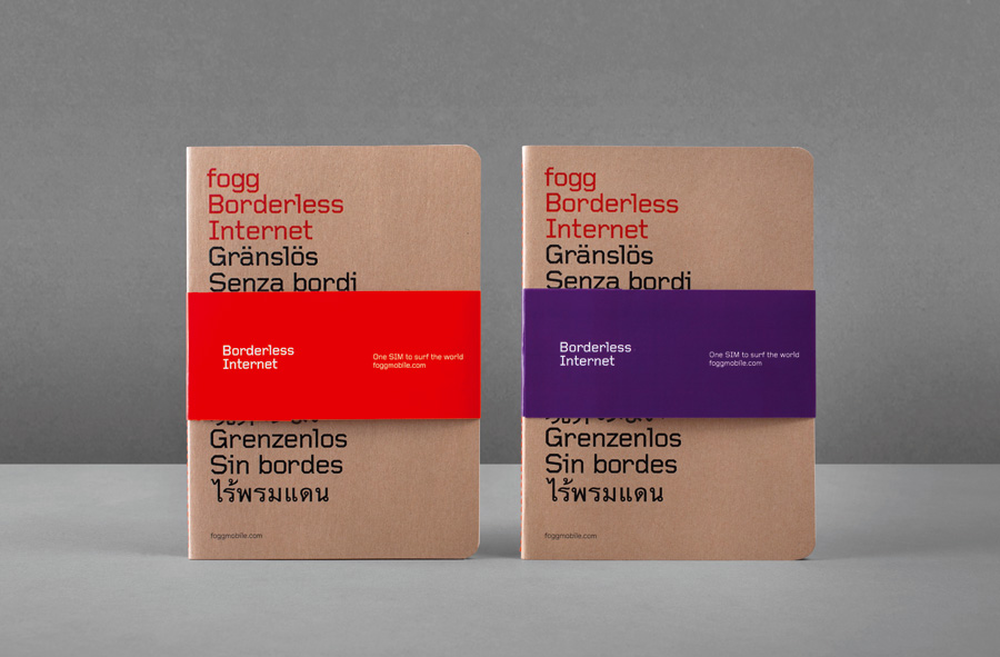
The print work is a wonderful contrast of substrates. The earthy, unbleached, uncoated board and stitch detail of the jotter, its coated, single spot colour sleeve, the reflective shine of the envelope, the white of the manuals and the robust screened printed bags deliver an interesting craft, tech and travel triality – with a good eye for material quality and print finish – that reflects today’s international explorer.
Design: Bunch & Kurppa Hosk. Opinion: Richard Baird. Fonts: Gridnik.
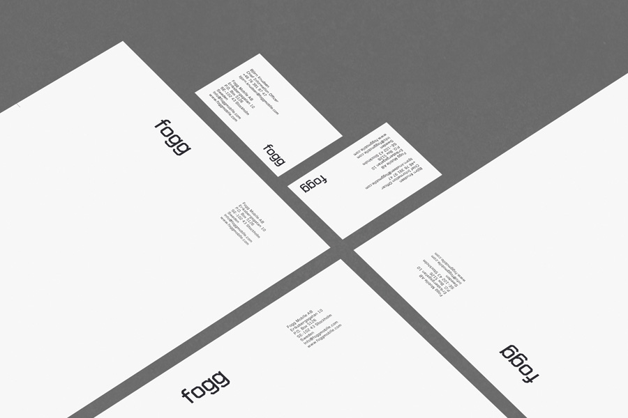
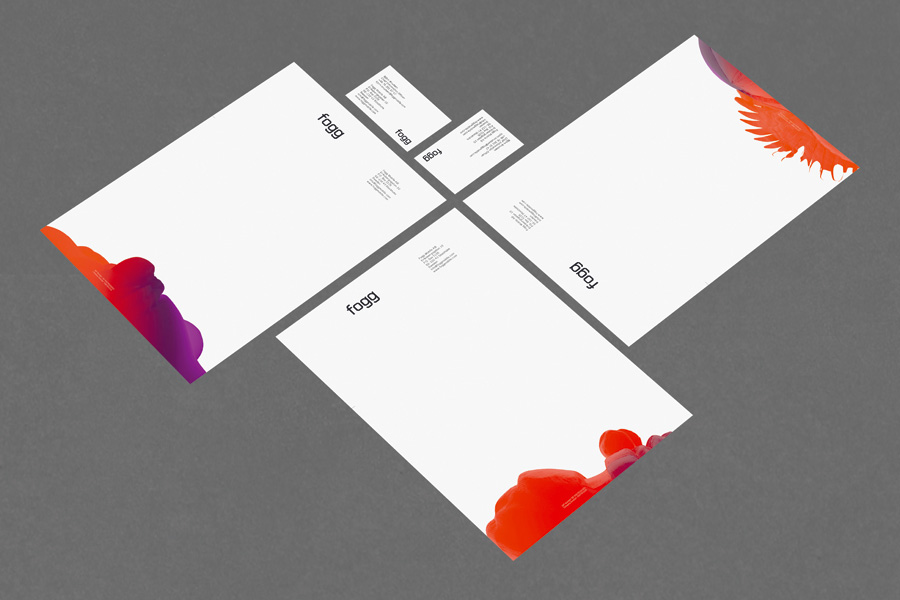
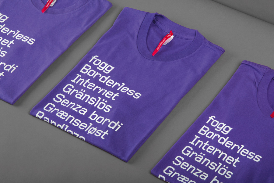
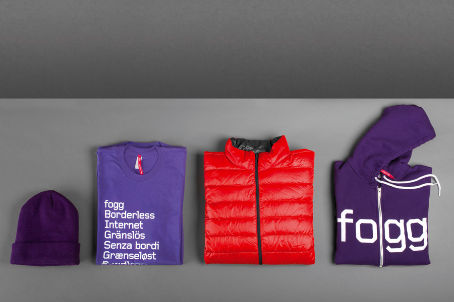
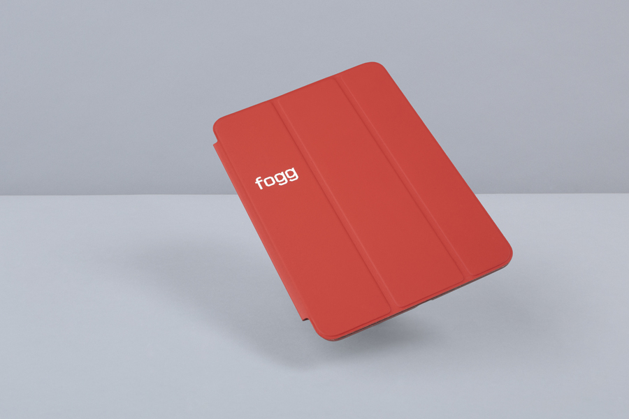
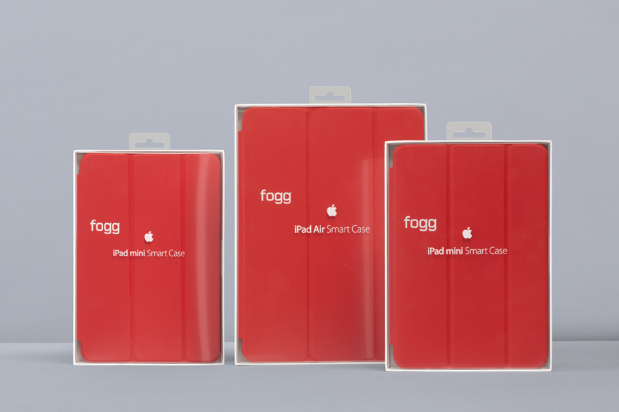
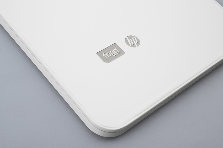
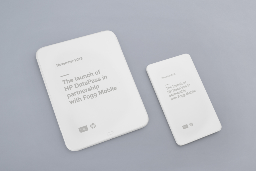
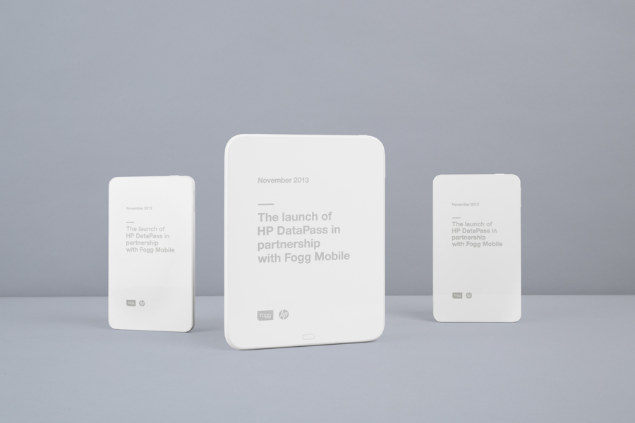
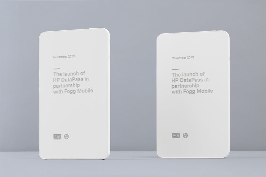
Bunch continues to build on their brand identity work for Fogg with assets for their new service Datapass developed in collaboration with Hewlett Packard. To commemorate the launch of this service Bunch painted a set of original HP tablets white and laser-engraved them as well as creating further print work that contrasts uncoated, unbleached boards with bright red highlights.
