The Town Mouse by A Friend Of Mine
Opinion by Richard Baird Posted 3 April 2013
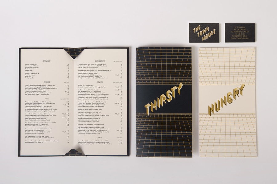
The Town Mouse is a new Melbourne-based bar and restaurant owned by Christian McCabe and located in the space formerly occupied by the Embrasse Restaurant. Developed by A Friend Of Mine, the bar’s new brand identity delivers impact through the ‘big city’ and slightly retrospective dimensionality of tall, slim, skyscraper-like, uppercase characters of the logotype set within and alongside the grids of the collateral. A local crafted quality through the shared, brushed surface relationship between digital artwork and the physicality of gold painted window signage. And a daytime night-time duality – perhaps a reference to the bar/restaurant proposition – of a black and cream colour palette, enhanced by the really neat use of photo-luminescent ink across their business cards.
“In a neighbourly setting behind Lygon Street in Melbourne, this new bar/restaurant sets out to feel as like it was opened in any decade. We deliberately eschewed fable references of ‘The Town Mouse and the Country Mouse’ in favour of a less literal approach. Inspired by the town grid our custom drawn typography is based on an isometric birds eye view of buildings. Skyscrapers are also referenced in the menu designs where perspectives are toyed with.”
“Through the details of our execution painterly highlights hark back to a bygone era of hand-crafted signage adding warmth, while the jaunty angle of the typography and glow-in-the-dark business cards allude to the party atmosphere in the bar. The signpainted doorstep, and windows gilded in shades of gold leaf, will wear with age and grow in character — and we’re sure The Town Mouse will do the same.” – A Friend Of Mine