Daniel Hopwood by Two Times Elliott
Opinion by Richard Baird Posted 9 April 2013
Daniel Hopwood is a small bespoke London-based multidisciplinary design studio – working within the fields of architecture, landscape architecture and interior design – that offers its clients a creative, practical and personal service.
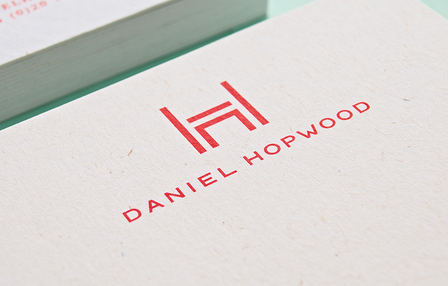
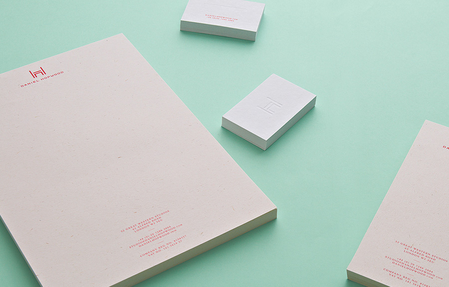
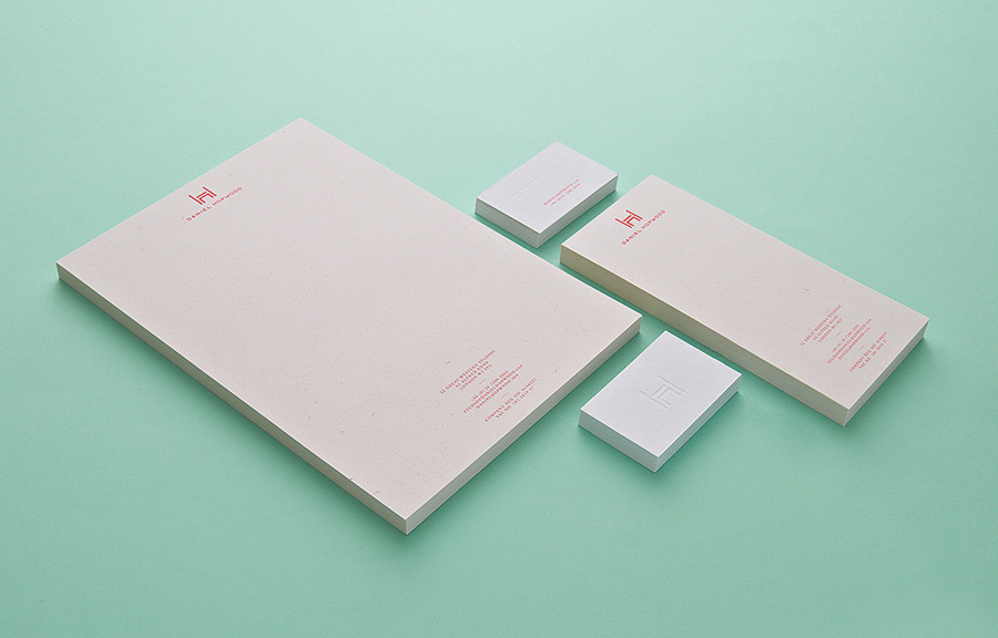
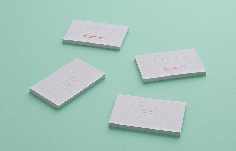
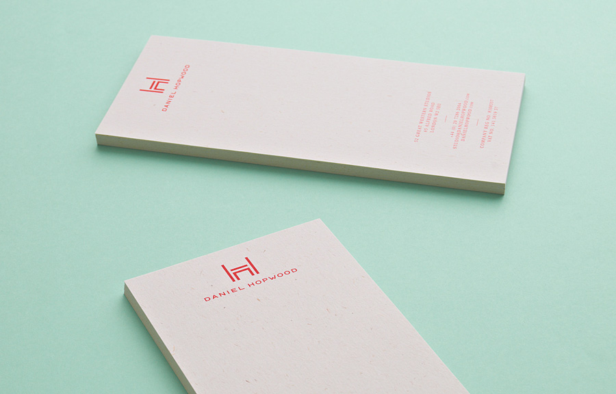
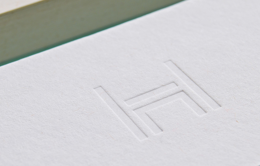
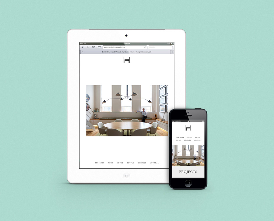
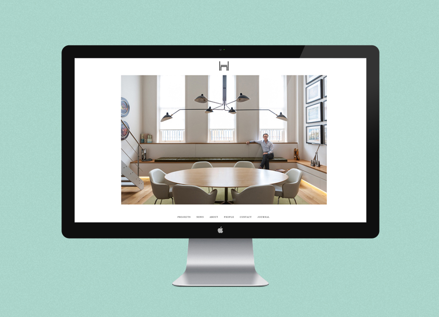
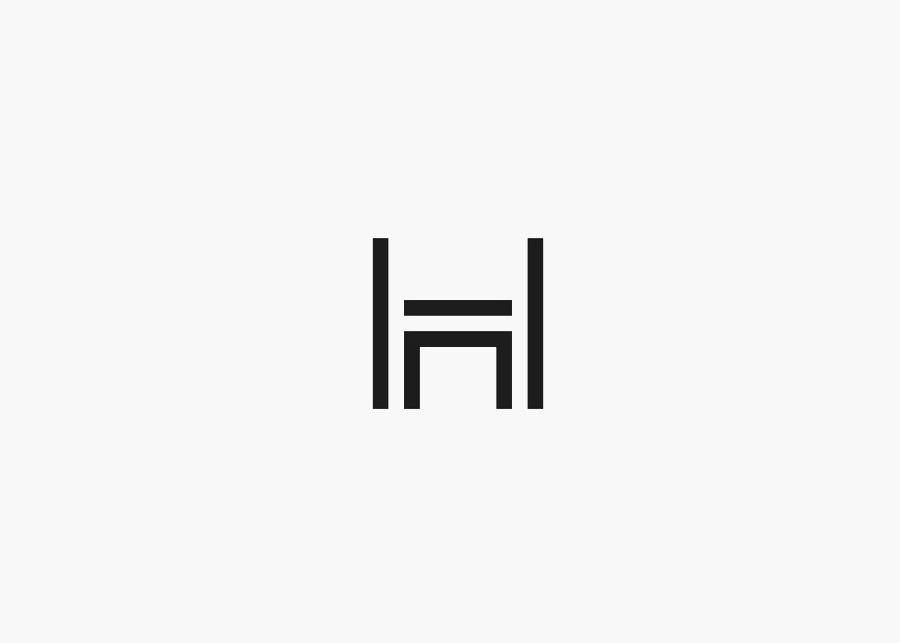
The studio’s identity, created by Two Times Elliott, takes the often ornamental detail of monograms of the past—a traditional distillation of a craftsman’s pride in product quality and individualised service practice—and gives it a very contemporary, geometric resolution with a solid sense of structure— through a simple consistent line weight and negative space—and a duality that mixes an H with what looks like a table and chair pictogram. Set alongside the broad, generously spaced characters of a sans-serif logo-type and a striking economical single red spot colour, the identity achieves a nice but subtle thematic union of layout, build, furnishing and functionality while the use of an uncoated, mixed-fibre, recycled substrate and a blind deboss across the collateral add a crafted, sustainable undertone that conveys an appreciation for material and material texture.
