Romero+McPaul by Anagrama
Opinion by Richard Baird Posted 8 May 2013

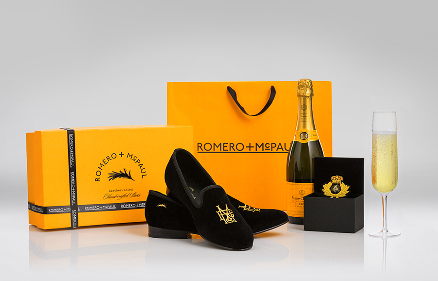
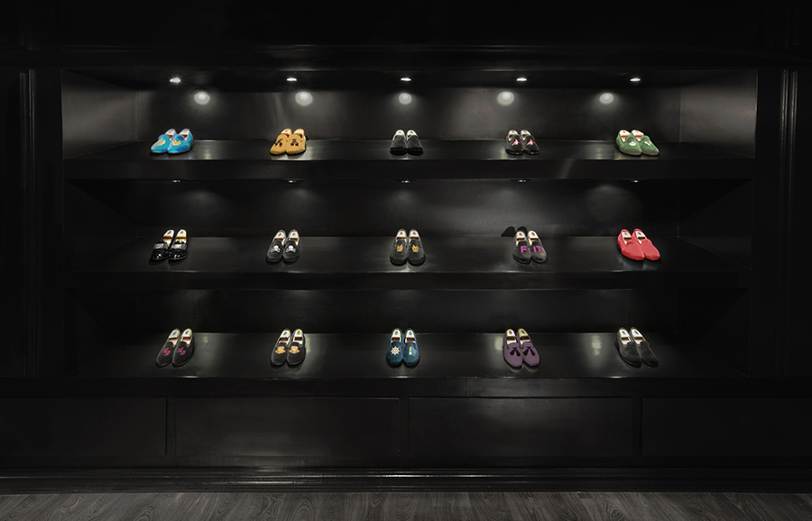
Anagrama have just completed the branding of Romero+McPaul, an English-style velvet slipper manufacturer and retailer established by Italian shoemaker Mr. Migliori that produces bespoke lines handcrafted by artisans with a ‘trendy twist’.
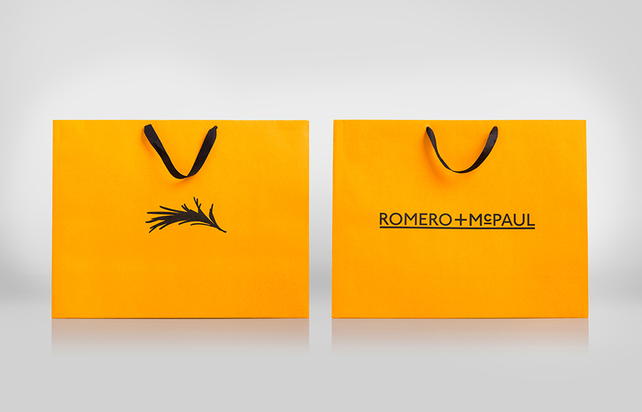
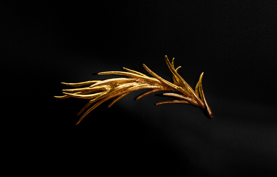
“For this project, our inspiration was heavily drawn from traditional English types and coat of arms mixed with the over-the-top luxuriousness of The Hamptons and it’s sailing and yacht club maritime lifestyle. With the intention to speak of the product’s duality, we created a storyline based on two characters, Romero and McPaul. Romero is the mischievous heartthrob, representing the product’s playfulness, warmth and latino heritage, while mMcPaul is the serious, traditional man, embodying the product’s ancestral and upscale British nature. We gave the brand the rosemary (or “romero” in Spanish) not only as a wink to its name but also as a reference to this herb’s curious nature, as it only grows close to the sea.” – Anagrama

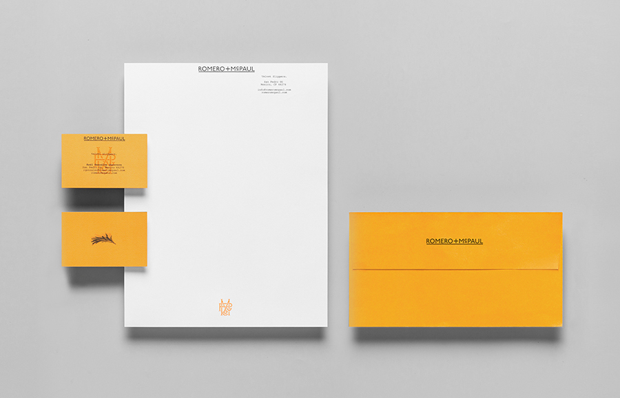
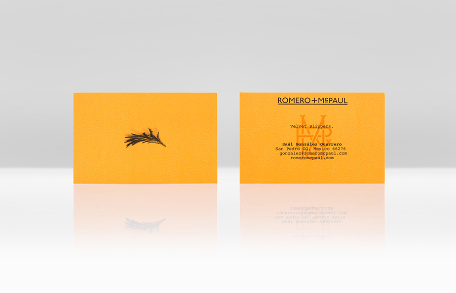
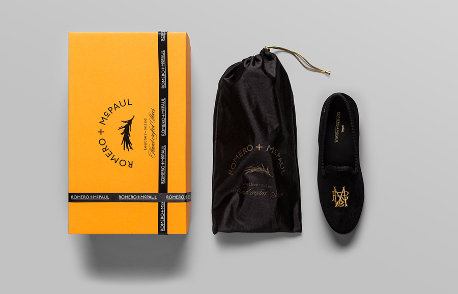
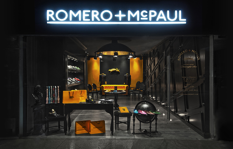
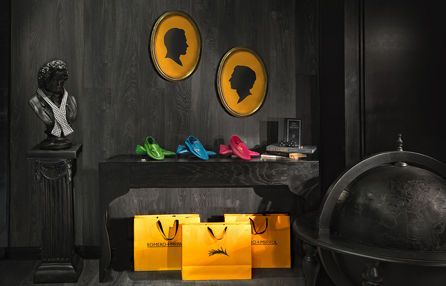
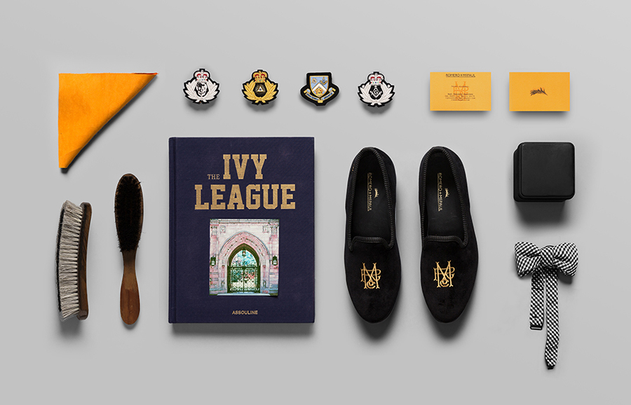
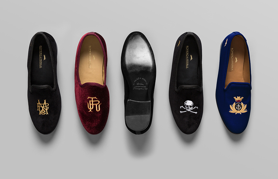
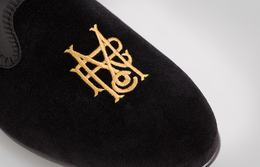
The traditional, personal and heraldic ornament of the monogram, the material textures, gold stitching and luxury of the interior, set alongside the more progressive but period qualities of a logotype built from an efficient contrast of wide and slim, well spaced, uppercase sans-serif letter-forms, raised and underlined detail bound by a consistent single line weight – elements reminiscent of Victorian signage – makes for an interesting conceptual and aesthetic duality. One of flourish and functionality that relates really well to the individual crafted nature of products with a clear practical purpose, the name and divided personalities of the characters behind it, and the period and country from which Romero+McPaul draws its inspiration. These retrospective elements are neatly enhanced by the more contemporary sensibilities of broad unprinted regions across the collateral, the utility of a typewriter slab-serif and the restraint but impact of a bright orange and black colour palette.
