Apolosophy by BVD
Opinion by Richard Baird Posted 20 May 2013
Based around their philosophy of health and well-being, Swedish drug store chain Apotek Hjärtat have launched Apolosophy, a new, carefully formulated cosmetic line that includes products from the skin and hair care, makeup and sunscreen categories.
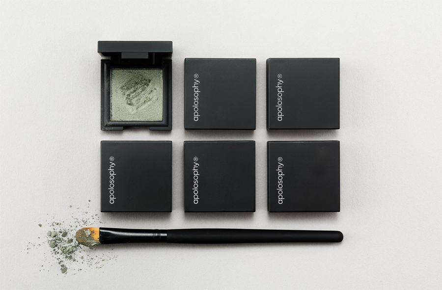
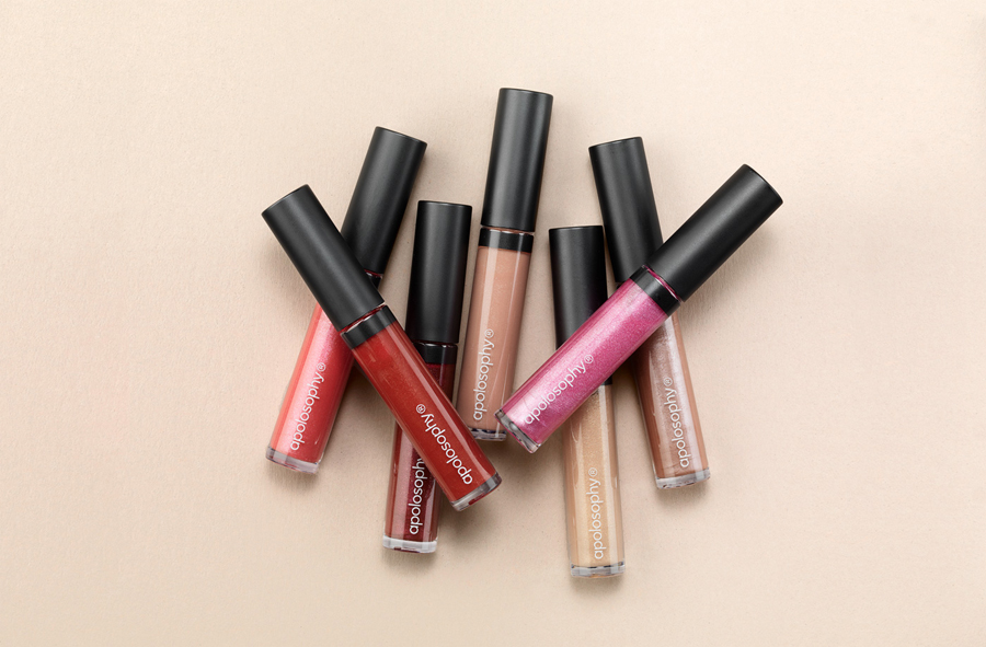
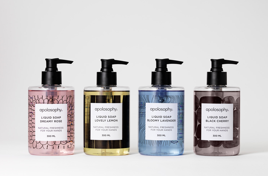
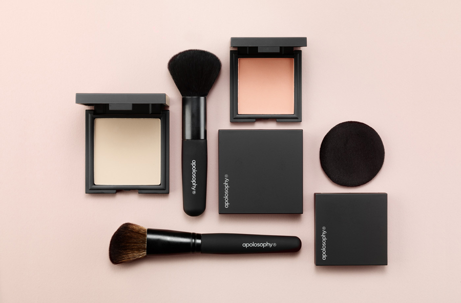
The range’s visual identity and packaging solution, created to be perceived as tactile, timeless and trustworthy by design agency BVD, unites the on-trend accessibility of a near consistent single line weight, soft curves, rounded terminals, all lower-case and well spaced letter-forms and a simple repetition of form through the ‘a’, ‘o’ and ‘p’, with the classic sensibilities of a black and white colour palette, the quality of a matt surface texture and the restraint of a logotype only solution across the packaging. The result, while pared-down, really emphasises, complements and unites the colours and textures of the products with a subtle utility often associated with professional grade cosmetics.
