Fisix by Mucho
Opinion by Richard Baird Posted 23 May 2013
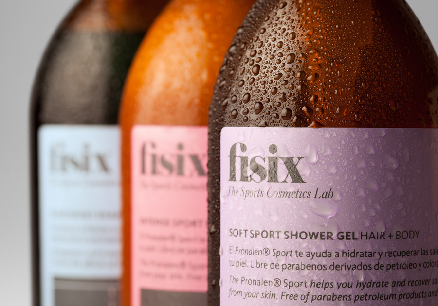
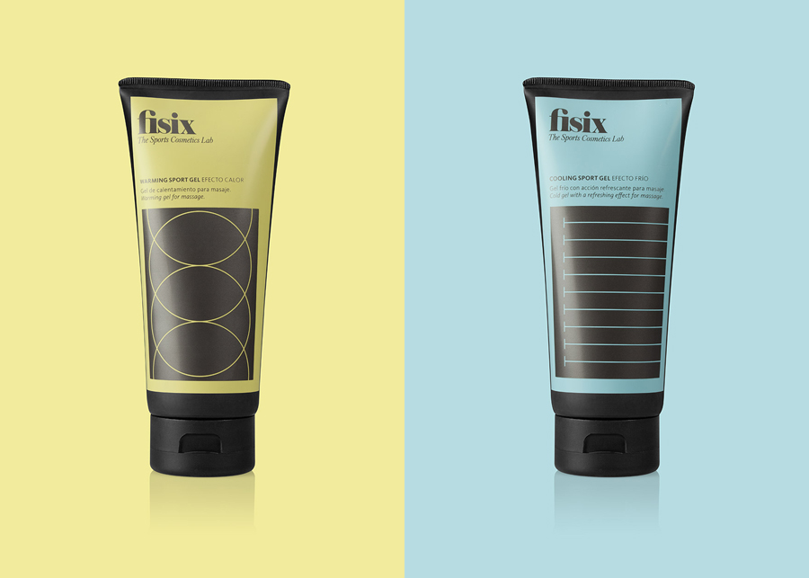
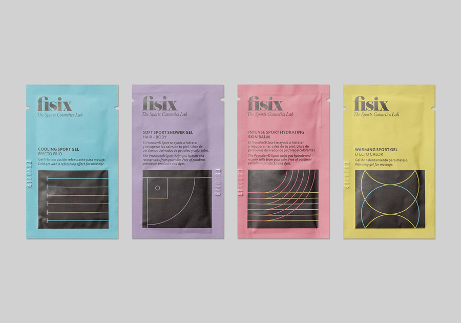
Fisix is a line of cosmetic products that includes shower gels, shampoos and hydrating skin balms, developed by four marathon running friends who ‘couldn’t find a range that met their needs as sportsmen’, branded and packaged by multidisciplinary design agency Mucho.
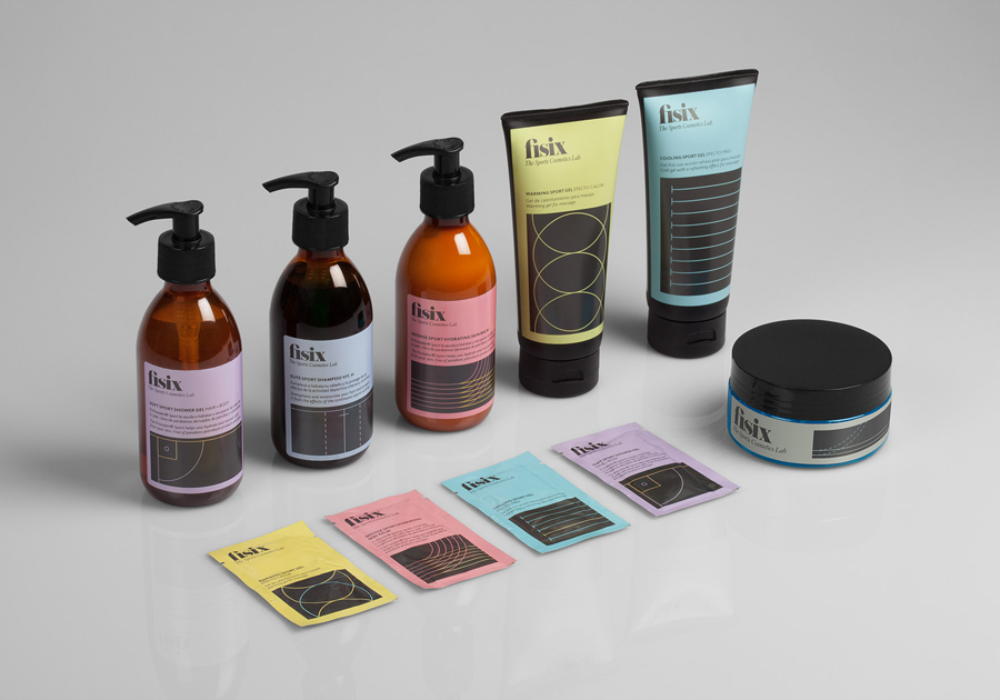
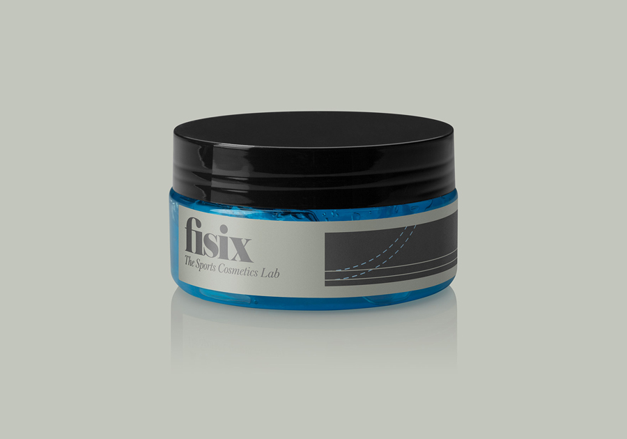
“The initial phase was to create a name that reflected a contemporary way of practicing sports that would appeal to sports men and women. We then generated a visual system that differentiates each product by using the lines that appear in courts or limits of sporting fields. By cropping and reinterpreting these lines we created liberating abstract shapes. We utilized a mixture of pastel colours with a dark gray as well as elegant typography in the logo to appeal to both a masculine and feminine audience.” – Mucho
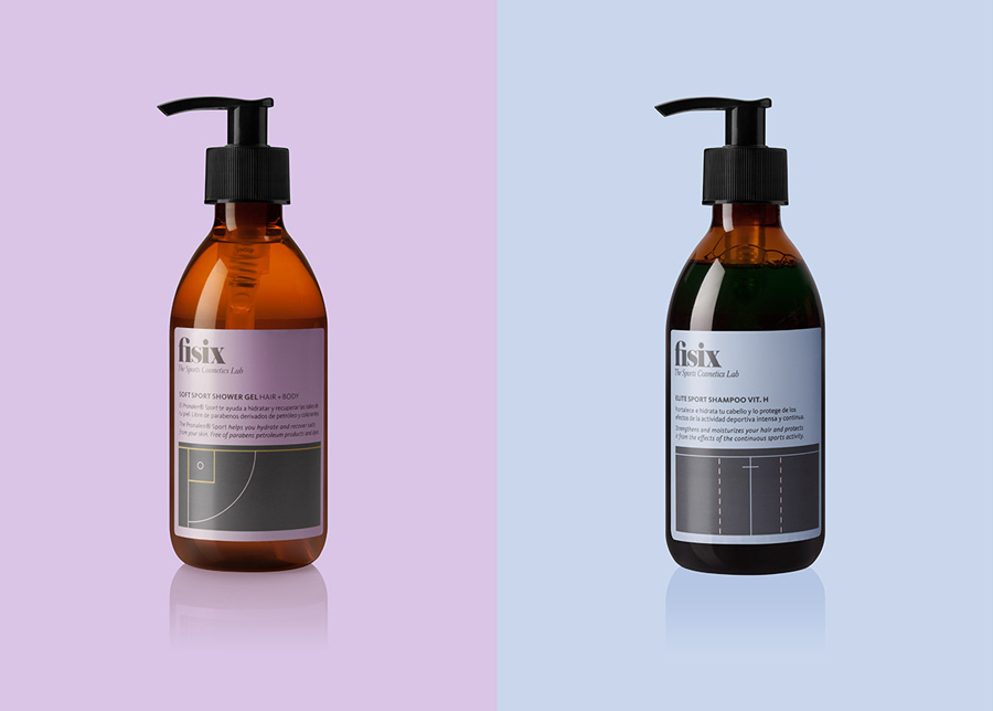
Mucho’s design solution unties the diagrammatic, geometric forms and typographical, sans-serif utility and neutrality of the pharmaceutical and sports science industries with the subtle fashion and on-trend design sensibilities of a tightly spaced, lowercase serif logotype, italics, and a flat, economical, unisex grey and pastel colour palette. A smart balance of formulated effectiveness and the more exclusive, restrained qualities associated with high fashion and professional cosmetics.
Design: Mucho
Opinion: Richard Baird
Fonts Used: FF Kievit & Austin
