Sample Brew by Longton
Opinion by Richard Baird Posted 3 June 2013
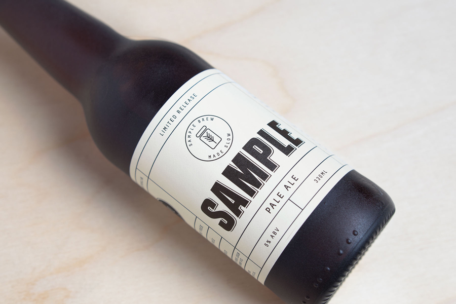
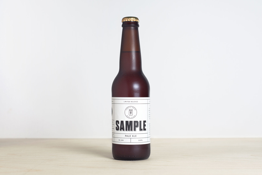
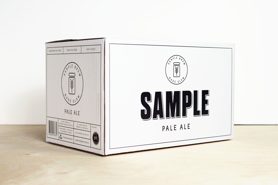
To standout in an increasingly saturated market, boutique brewer Sample commissioned Melbourne-based design agency Longton to brand and package their American-inspired pale ale, slow brewed to the standards of the 1516 German purity law.
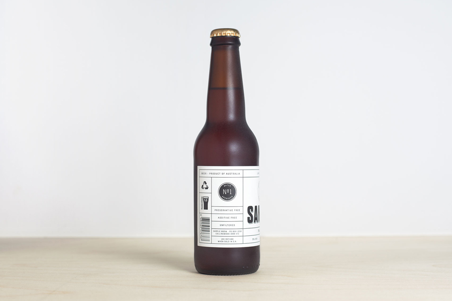
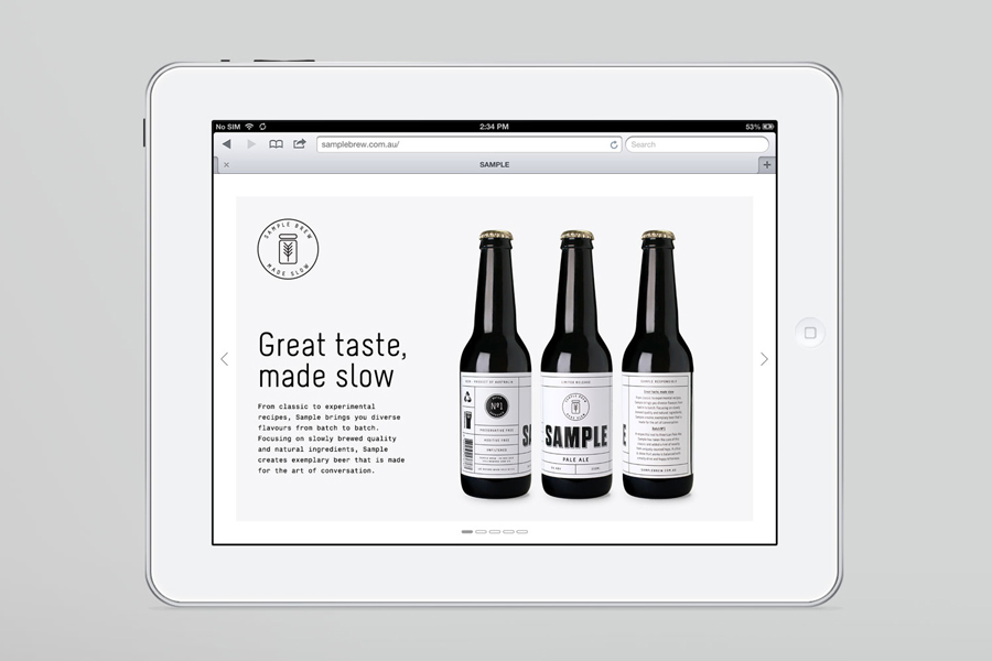
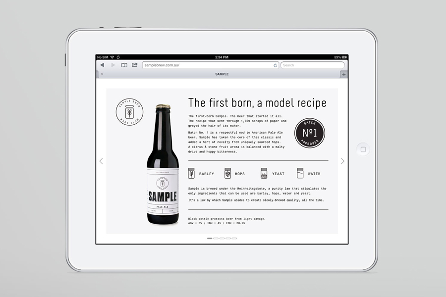
Longton’s solution reflects this approach, a purity of ingredients and the brewery’s name with a distinctive and reductionist ‘sample pack’ aesthetic that balances a sense of small-scale, traditional batch production with a contemporary and on-trend utility through a contrast of type-block, grids, single line weight illustrative detail, generously spaced uppercase sans-serif typography, a monochromatic colour palette, the tactile qualities of a rough glass surface treatment, the website’s fusion of modern and responsive design practice and the functionality of Courier New. It is simple but well resolved with very little superfluous detail and a focus on communication, and while it is perhaps bordering on what some might describe as hipster, this feels appropriate for the craft beer market.
