Popchips by Marx
Opinion by Richard Baird Posted 18 June 2013
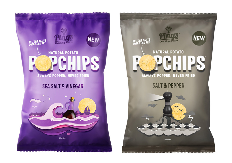
Popchips is a four flavour range of potato chips from Ping which have been popped—much like popcorn—rather than backed or fried to create a healthier snack. New Zealand-based Marx Design were responsible for developing a new mascot for Ping that could work across multiple products in the snack food category and a packaging solution for the Popchips brand that would “avoid the clichés of traditional chip packaging in order to achieve cut-through.”

“The very name ‘Popchips’ led us to create a diorama execution in which the elements ‘popped’ off the page with light and shadows. This then became a running theme for the brand that extended to point-of-sale in the form of pop-up books and displays. One of the rules we set ourselves was to make sure the diorama scenes always carried an idea. For the Salt & Pepper variant we created a storm setting out of layered card. The scene resembles a storm of flavour ‘putting a bit of zip in your chip’. Consumers will identify the variant with the pepper grinder as it resembles the variant name.”
Marx go on to explain that the “whole production process was something that could not be replicated on computer alone. The paper diorama work, which took more than 500 hours to complete, was photographed, taken to the computer for print production and then printed using a gravure printing process.”
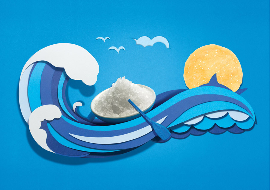
Marx’s approach to graphic design, one they describe on their website as “firmly anchored in the present with a style that is less ‘traditional’ and more ‘modern & crafted”, is clearly evident in their branding and packaging solution for Ping. While layered paper is a familiar aesthetic, it is rare to see it entirely executed by hand within the context of fast moving consumer goods—a result perhaps of the time, expense and difficulty associated with doing it right and capturing the true crafted nature and detail of the images effectively across thousands of packs.

The texture, looser edges, imperfections and shadows of the real-world, effects hard to match digitally in conjunction with a high quality printing process, are clear and make for an authentic quality that appropriately leverages what might be considered a wholesome and traditional craft activity to bring an honest, natural and healthier set of values to the snacking category but with a contemporary eye for layout and colour.
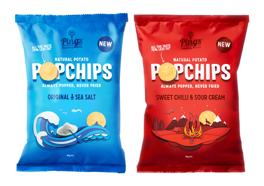
The combination of sculpted letters, layered paper and imaginative ingredient photography achieve a nice balance of care, flavour profile and subtle narrative with a lovely sense of motion and the cohesive mystery of nighttime scene-setting that provides both a distinctive and communicative aesthetic which is playful but never childish, an aspect that is suitably reinforced by the use of modern tones and generously spaced, uppercase sans-serif typography with small underline details and condensed characters


