Willow Tree by Bunch
Opinion by Richard Baird Posted 26 June 2013

Willow Tree, one of London’s leading business consultancies, worked with graphic design studio Bunch to develop a new but traditional-looking visual identity with an attention to detail.
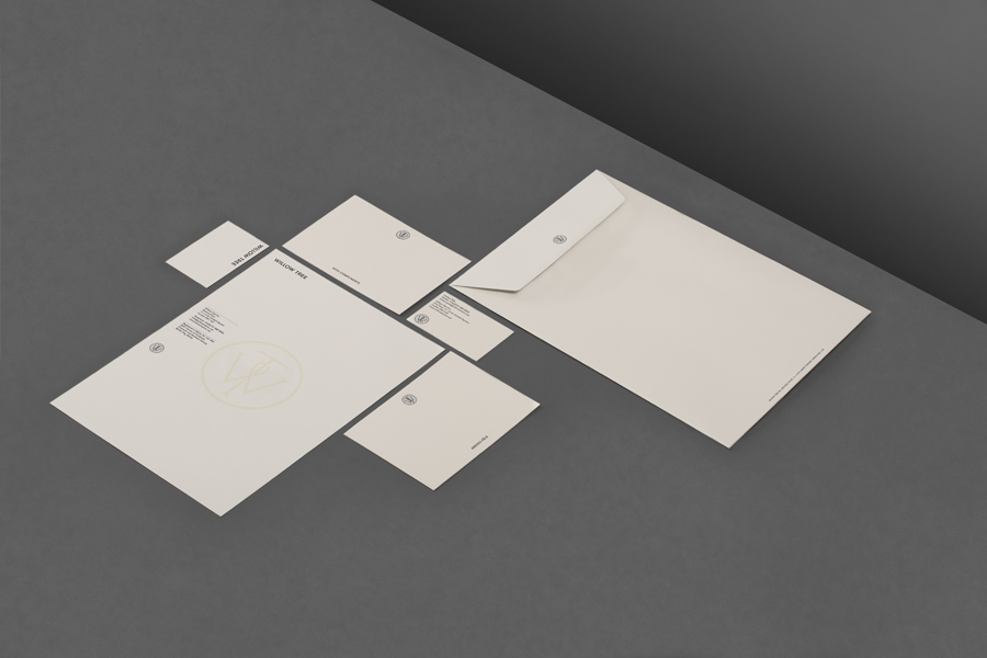
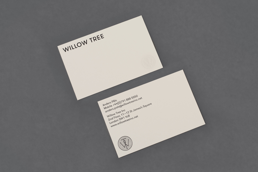
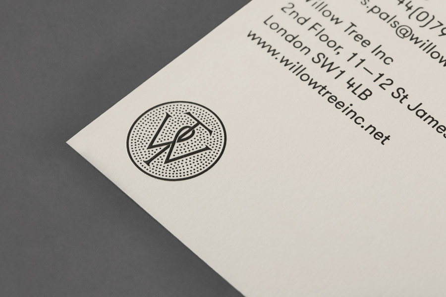
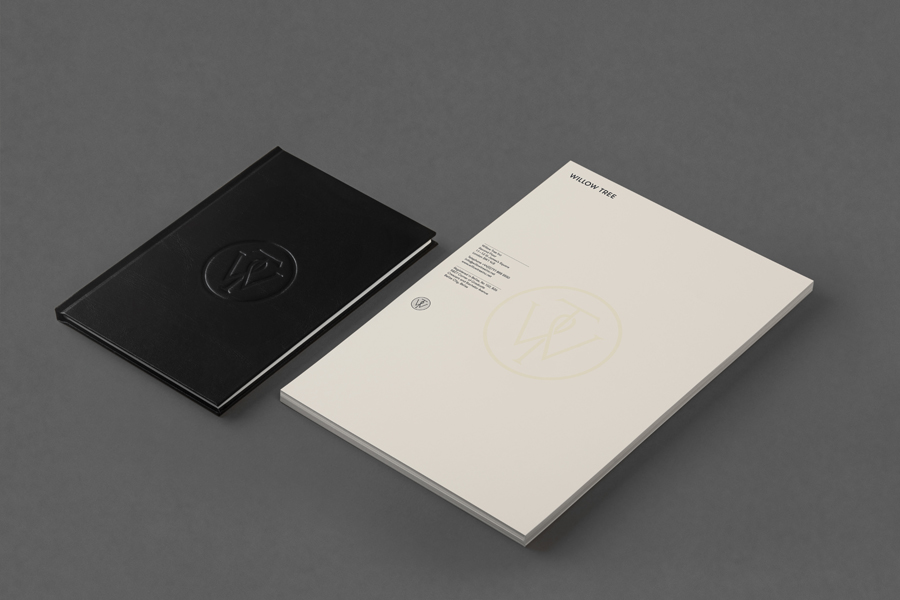
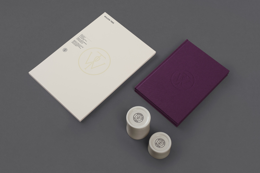
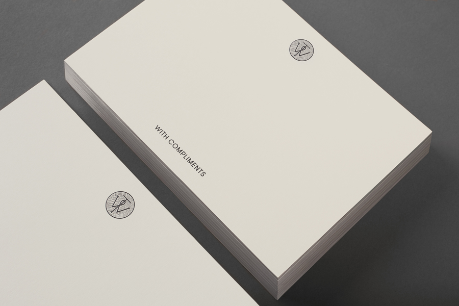
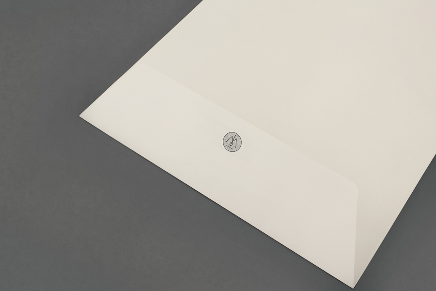
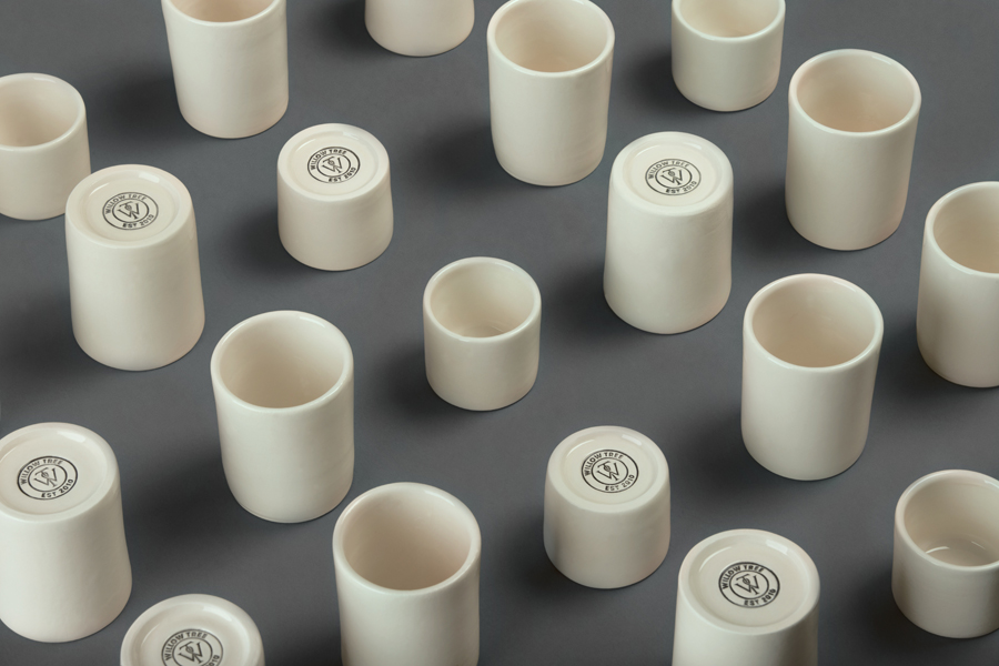
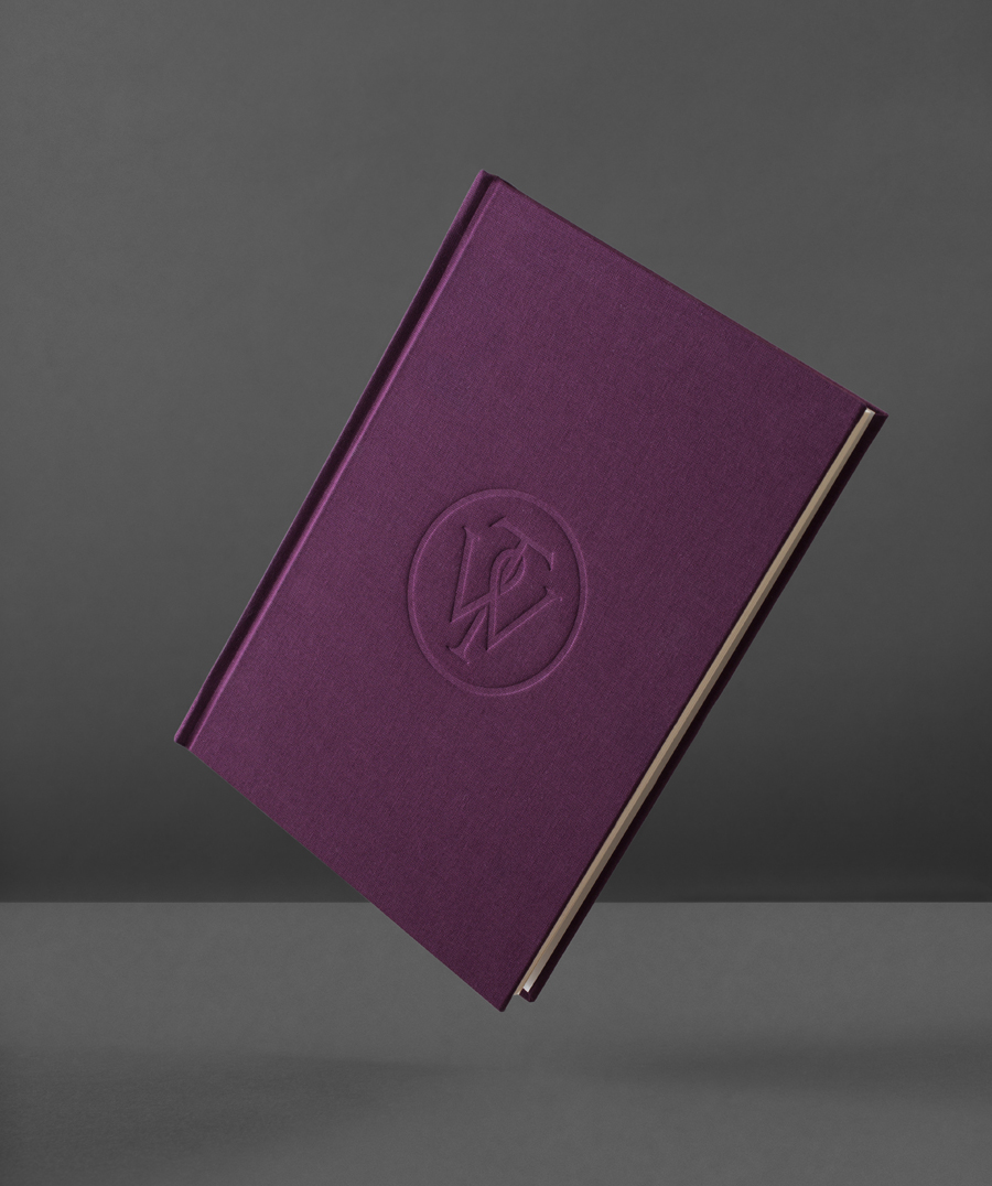
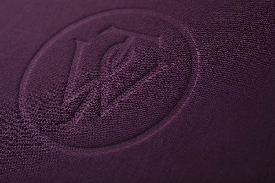
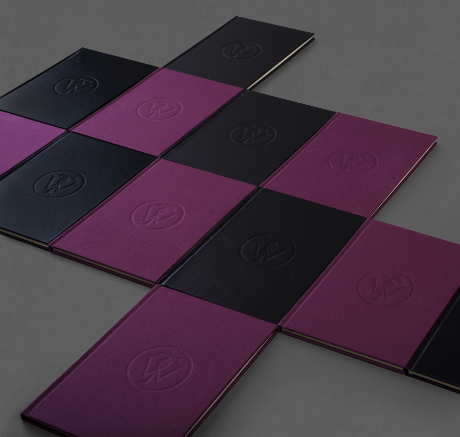
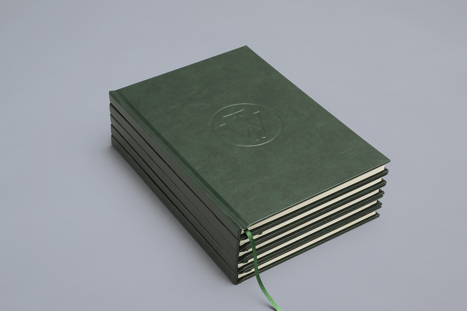
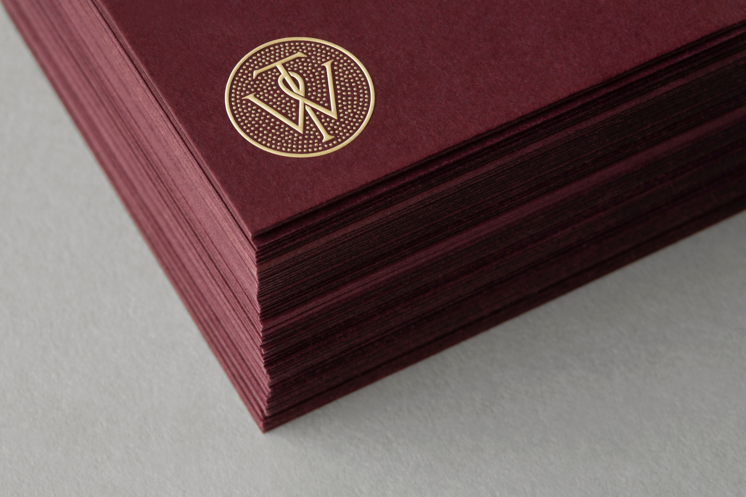
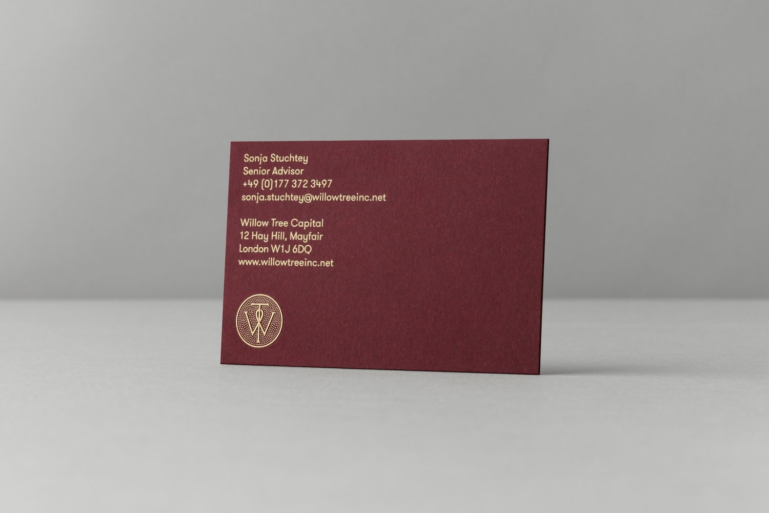
Based around a WT monogram, created by typographer Spencer Charles, utilised as a mix of embosses, carved in seals and simulated watermark, and using purple cloth, black leather, cream paper and handmade coffee pottery, Bunch’s solution embraces a strong crafted quality alongside a more contemporary use of space and type.
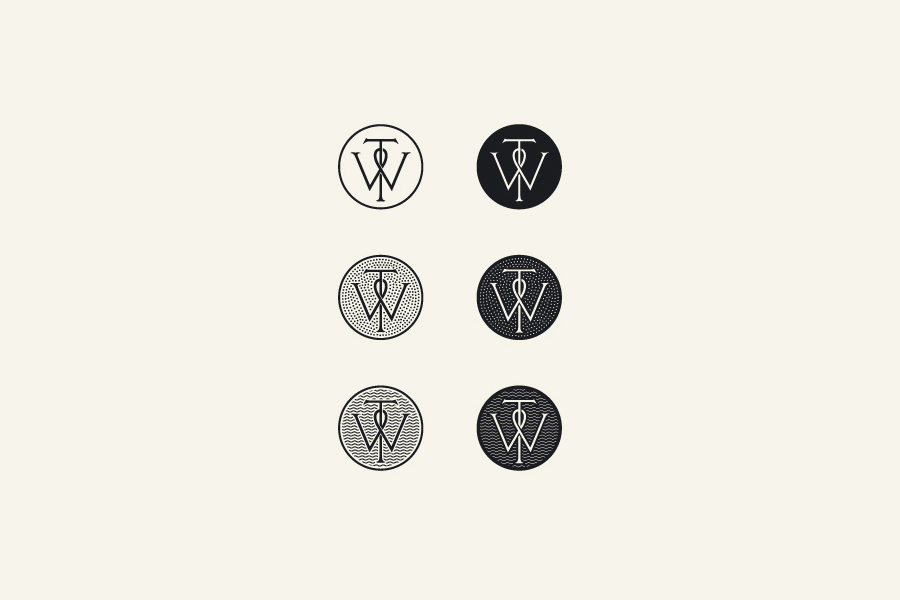
Although this project is clearly far more about high-quality material choices and print finishes than graphic design, the mark functions well as a distinctive, well-illustrated and uniting element that appropriately utilises the traditional crafted origins of the monogram to convey a more personal and individualised business practice.
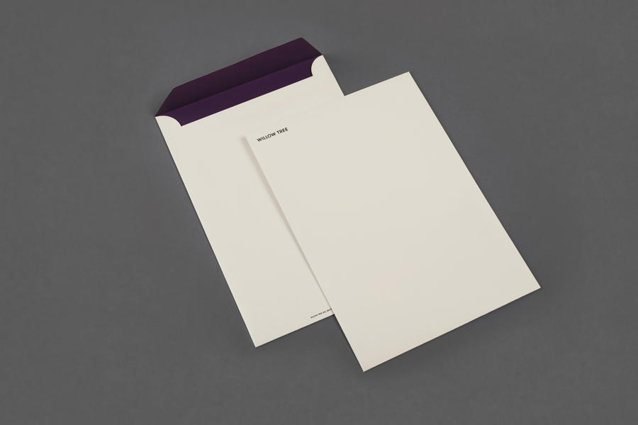
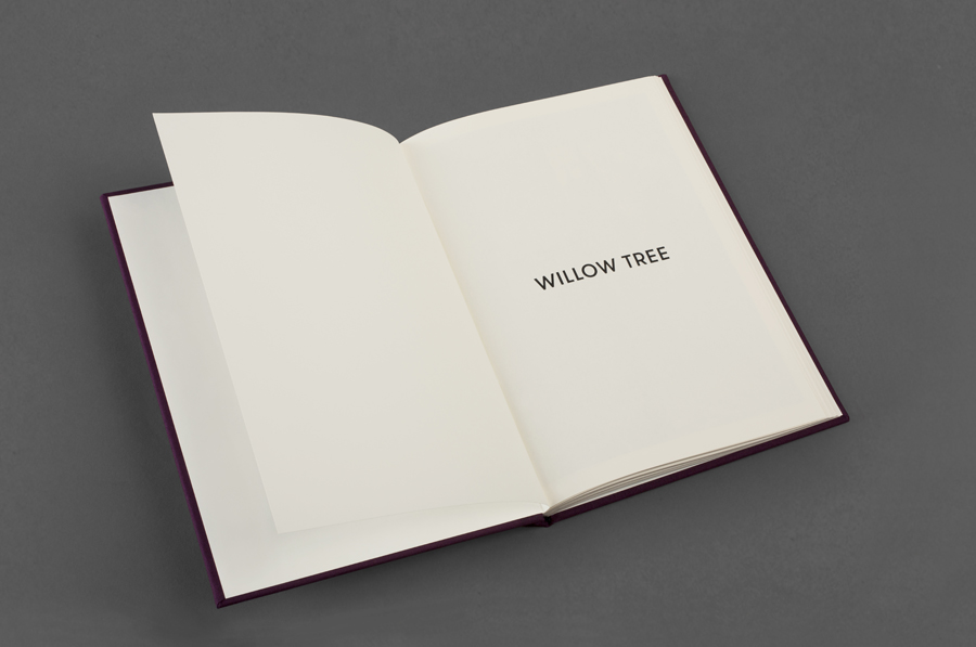
The relationship between the two letters, their cuts—creating a sense of entanglement—old style serifs, roundel and stipple fill. have a solid period authenticity, which is enhanced by the use of cloth and leather bound notebooks and what Bunch describe as a slightly structured Fedrigoni Sirio Color Sabbia paperstock.
These choices manage to convey a sense of experience and heritage, while the use of ample space and the small and over-sized applications of the monogram.
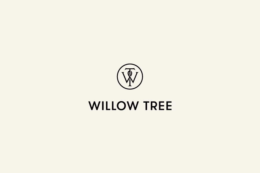
A well-spaced uppercase sans-serif logotype, built from Grilli Type’s Walsheim, introduces an authority and a subtle, contrasting, corporate efficiency to the monogram through its single line weight and geometry whilst retaining a hint of the traditional in its blend of slim and broad characters and the low waist of the R.
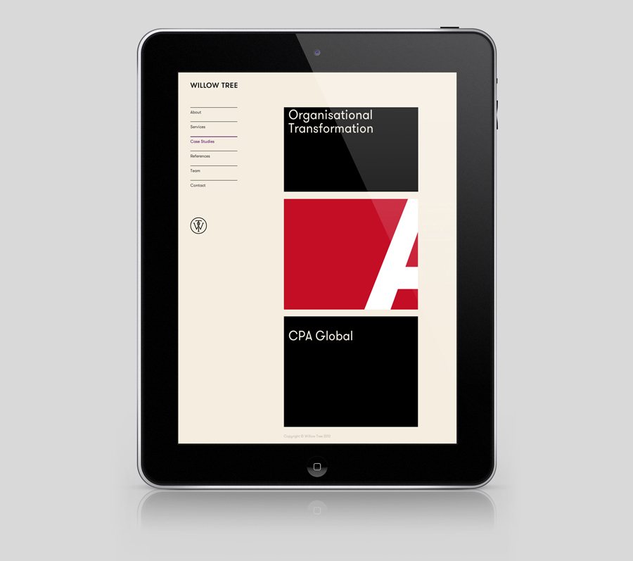
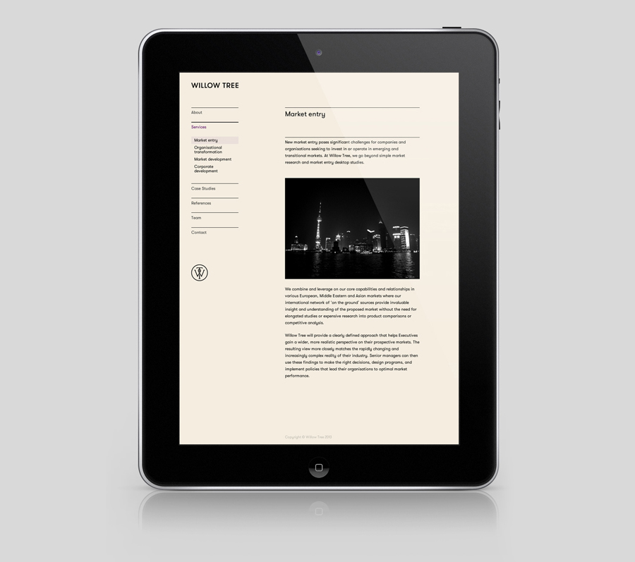
The solution feels distinctly reductionist, with each element having both an individual and collective communicative value that manages to balance modernity and tradition without appearing contradictory which continues online.
Design: Bunch. Monogram: Spencer Charles. Opinion: Richard Baird. Fonts Used: GT Walsheim.
