BTP by BTP
Opinion by Richard Baird Posted 5 July 2013

BTP, formerly Beyond The Pixels, is a Melbourne-based design studio who take an interdisciplinary approach that blends the practices of design, technology and branding to create modern interactive products, and describe themselves as having a reputation for “delivering progressive brands and websites”.
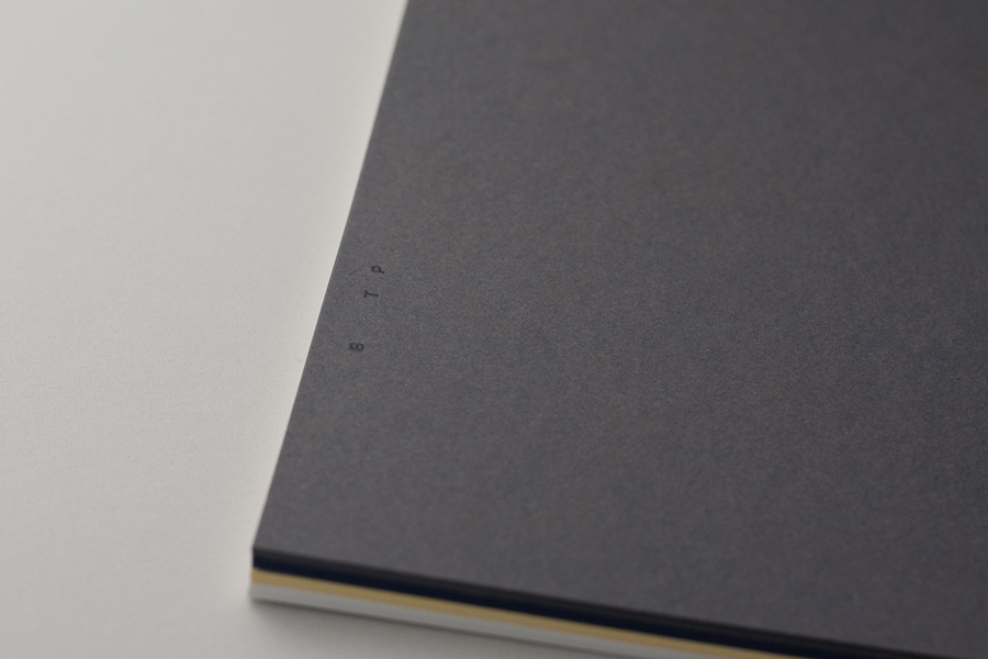
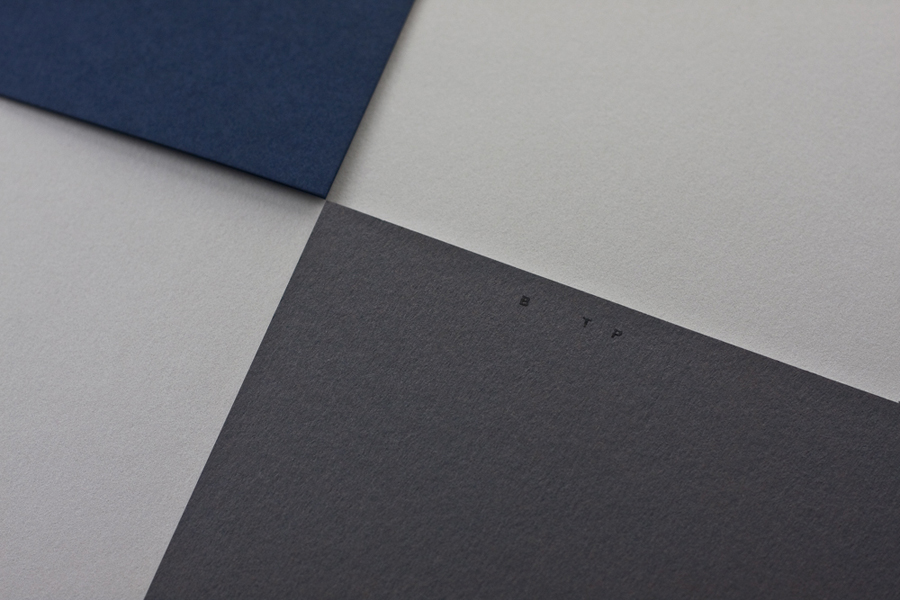
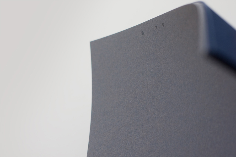
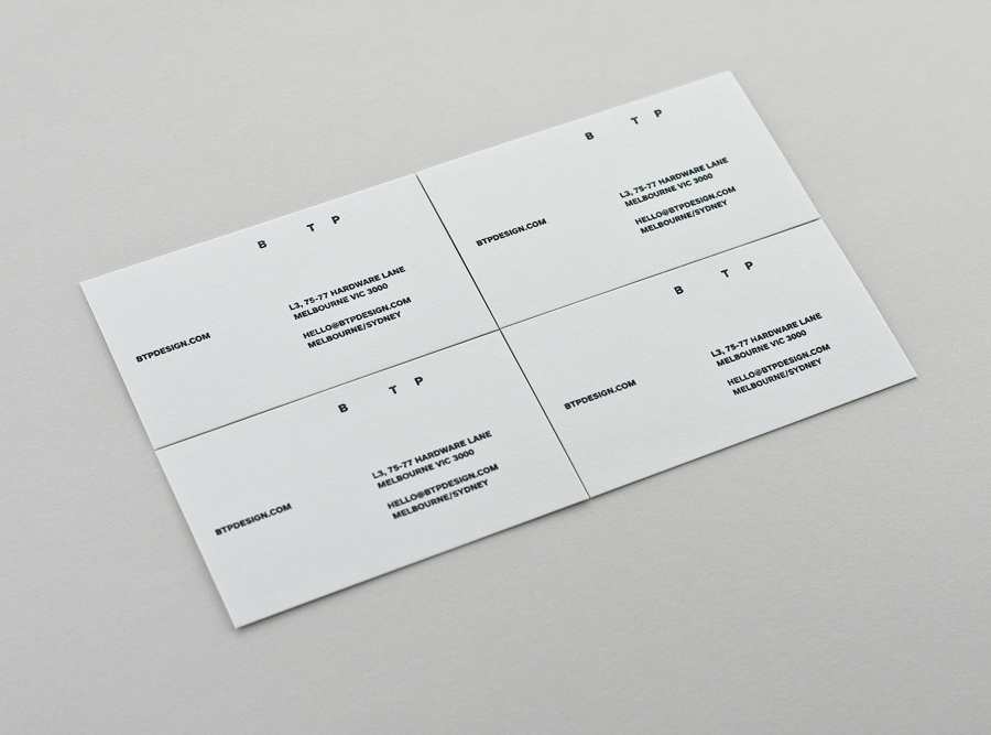
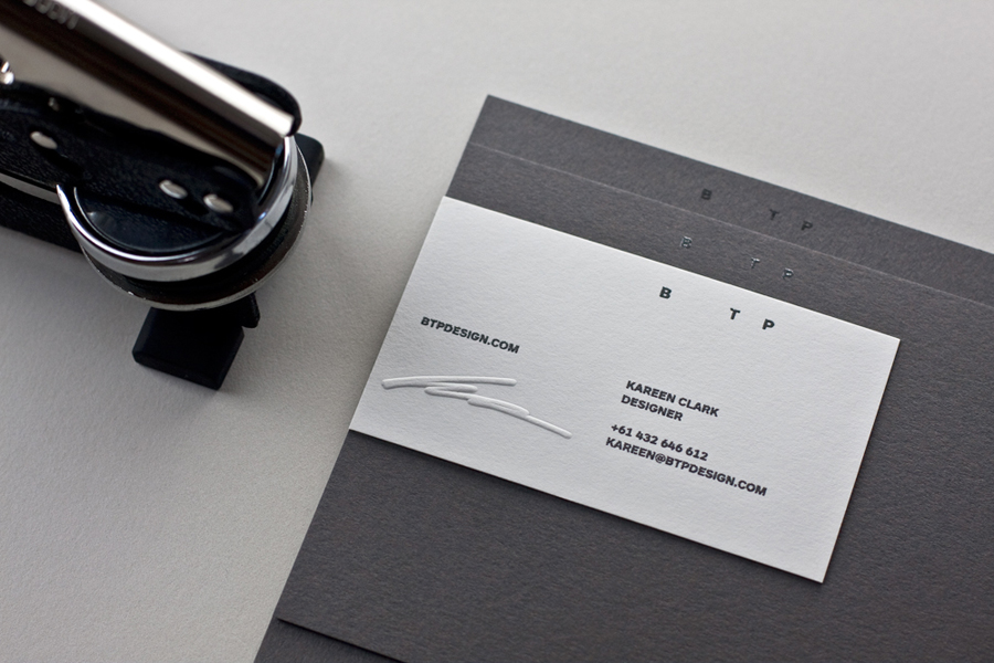
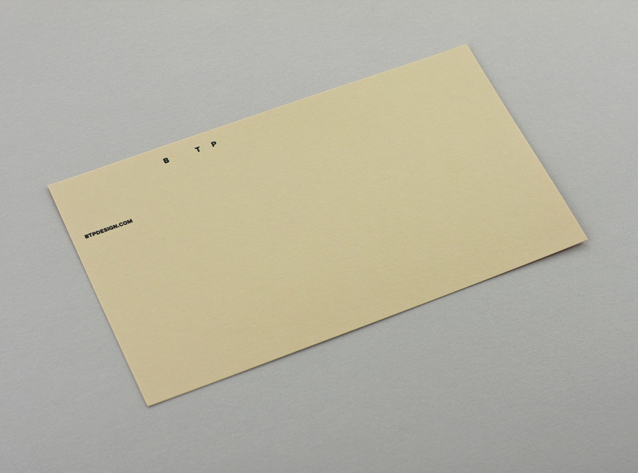
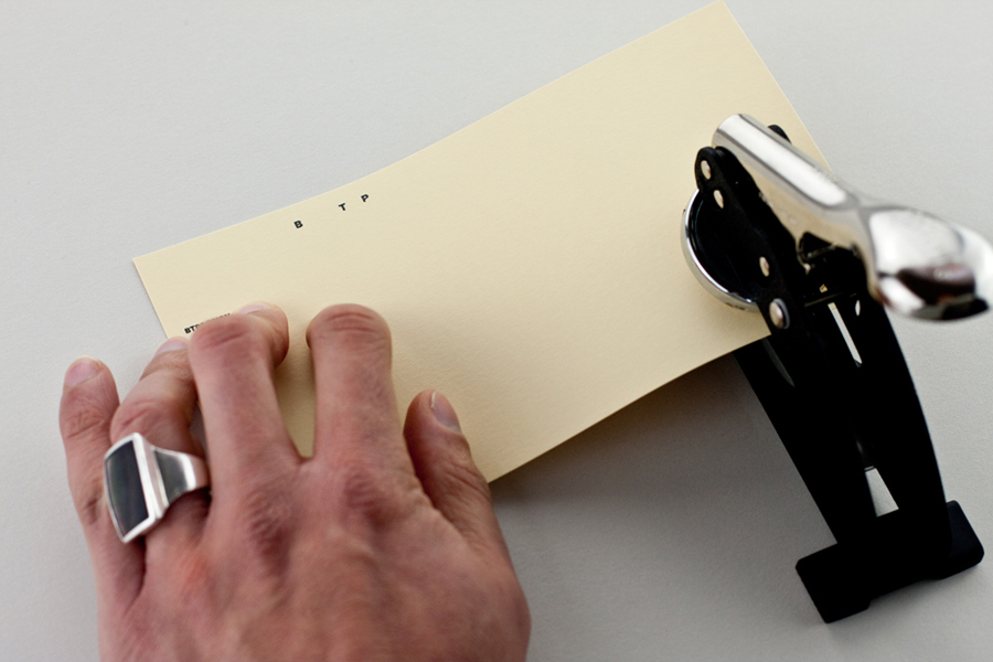
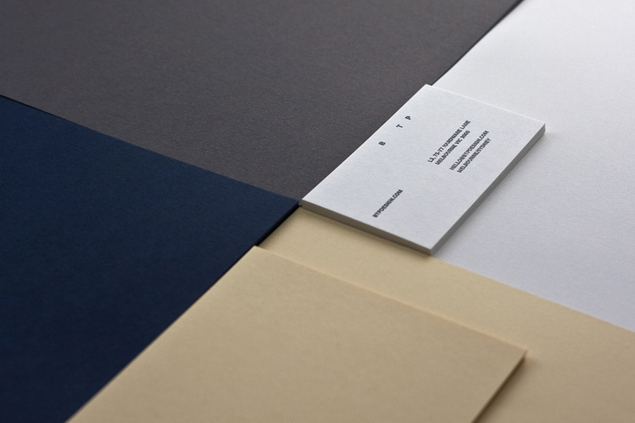
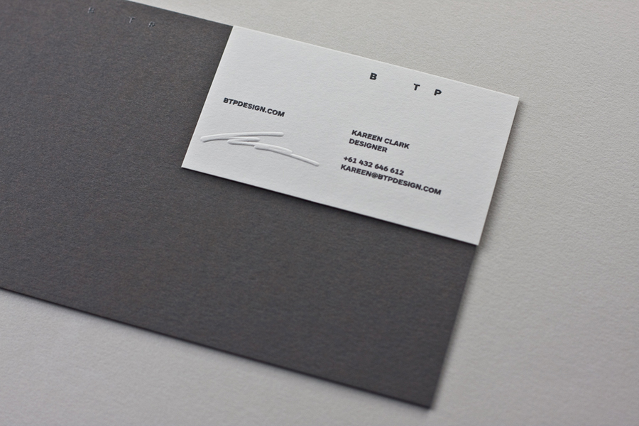
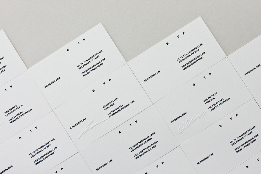
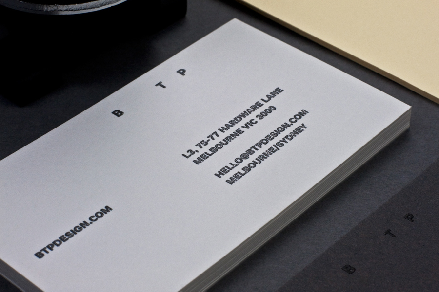
Their recent rebrand, in pursuit of a “simplified vision”, reduces their identity to a three character sans-serif logo-type set alongside embossed signature detail executed by hand and across dyed, uncoated substrates.
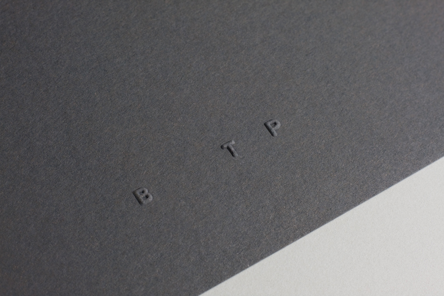
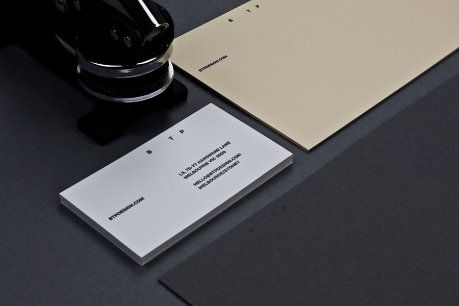
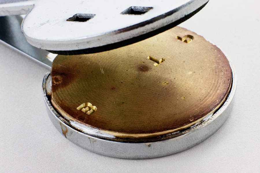
“The re-brand directly communicates the philosophies underpinning the practice. The bold Swiss style has been softened by a reduced type size and hand embossing which also personalises select items. Keaykolour, Strathmore and Tablex specialty paper stocks have been paired with PMS Black 7 and clear verko printing, resulting in a beautiful tactile finish across the entire stationery suite. The selected typeface for the identity system is ARS Maquette.” – BTP
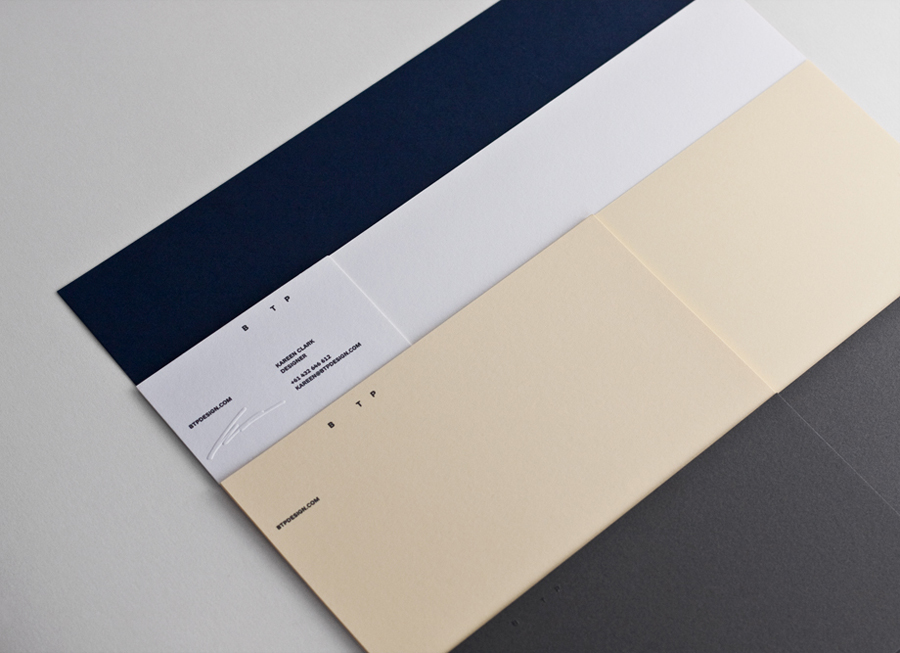
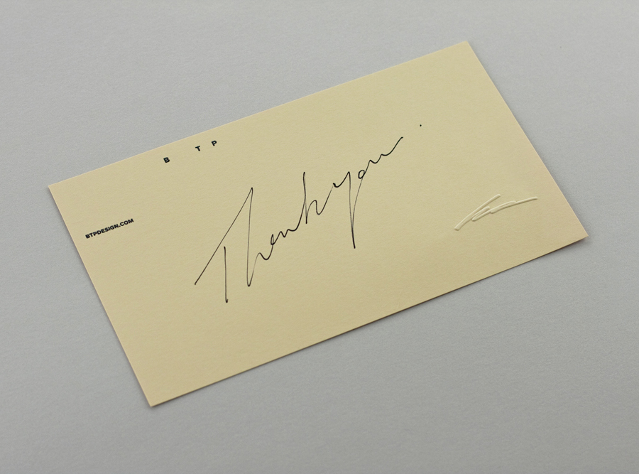
There is a familiar agency neutrality to this project in its use of detailless sans-serif typography, plenty of space and the predominantly urban tones of the substrates. The logo-type is reductionist and functional with a confident uppercase authority, an incredible restraint in its fine size within the context of the stationery and an unusual, uneven spacing that reflects the now absent characters of the original full length logo-type and gives it a slightly unusual and subtle proprietary character. In conjunction with the white and concrete grey of the material choices it feels cold and impersonal but provides a solid foundation for a second layer of detail and communicative dimensionality that is delivered through embossed signatures and a pastel yellow substrate.
This blind emboss – added by hand on a per-piece basis – manages to take the personal energy and spontaneity of a signature and give it a stone-cast permanence, unlike fading ink, that takes on the aesthetic and tactile quality of the substrate and perhaps represents how integral a personalised service practice is to BTP’s approach as much as its contemporary restraint.
The handwritten aesthetic, its hand embossed application and the use of a pastel yellow – which alongside the grey appears distinctly optimistic even in its pale shade – adds a slightly crafted sensibility to the industry of the type and the raw uncoated nature of the material choices. A direction that feels reminiscent of Bauhaus principles and moves it further away from ‘on-trend’ embellishment, resulting in a smart, considered and concise combination of elements that appear clear in their meaning and relevance to BTP. This project is very much about very fine detail so click on the images to enlarge.
