Torikorttelit by Kokoro & Moi
Opinion by Richard Baird Posted 10 July 2013
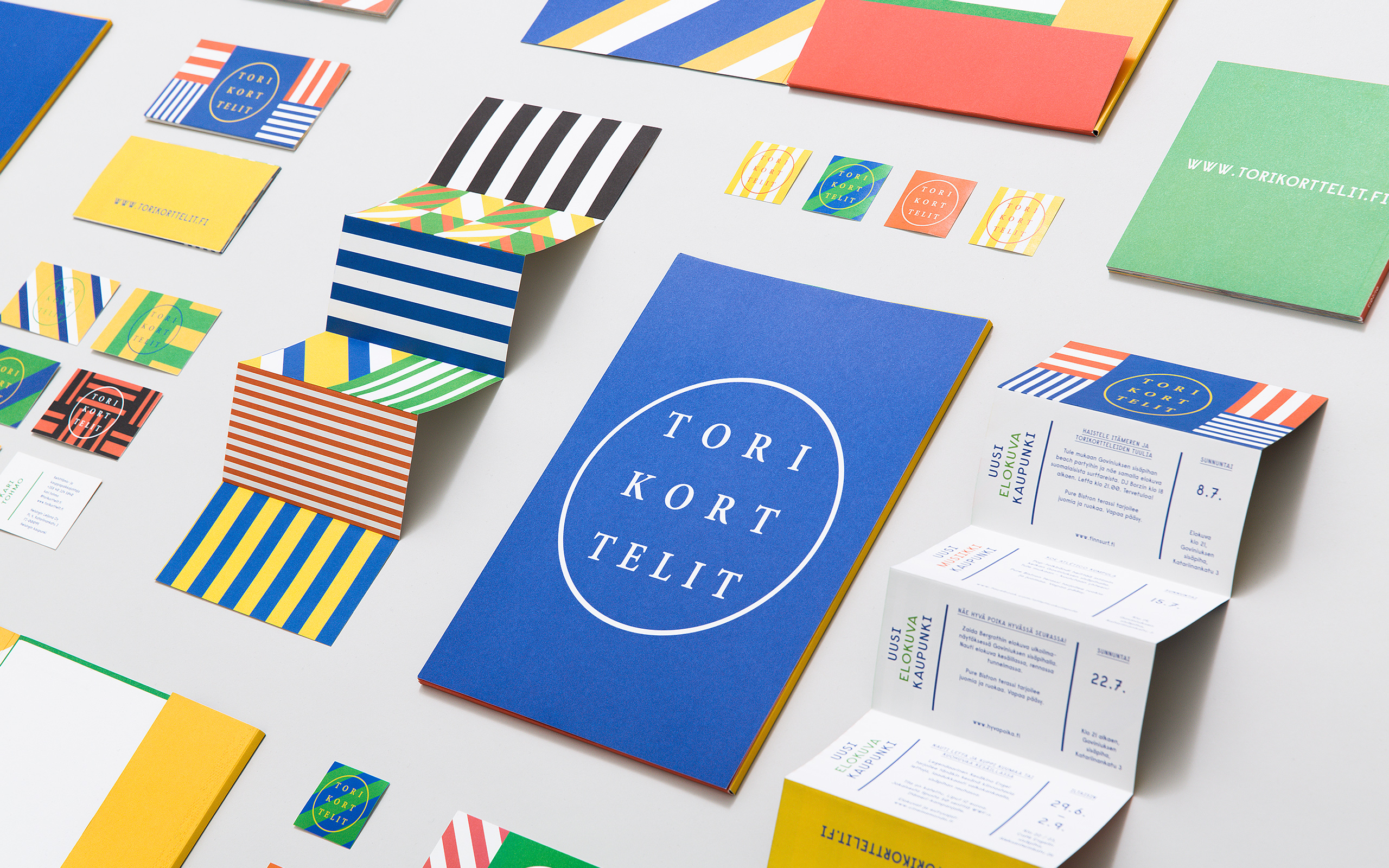
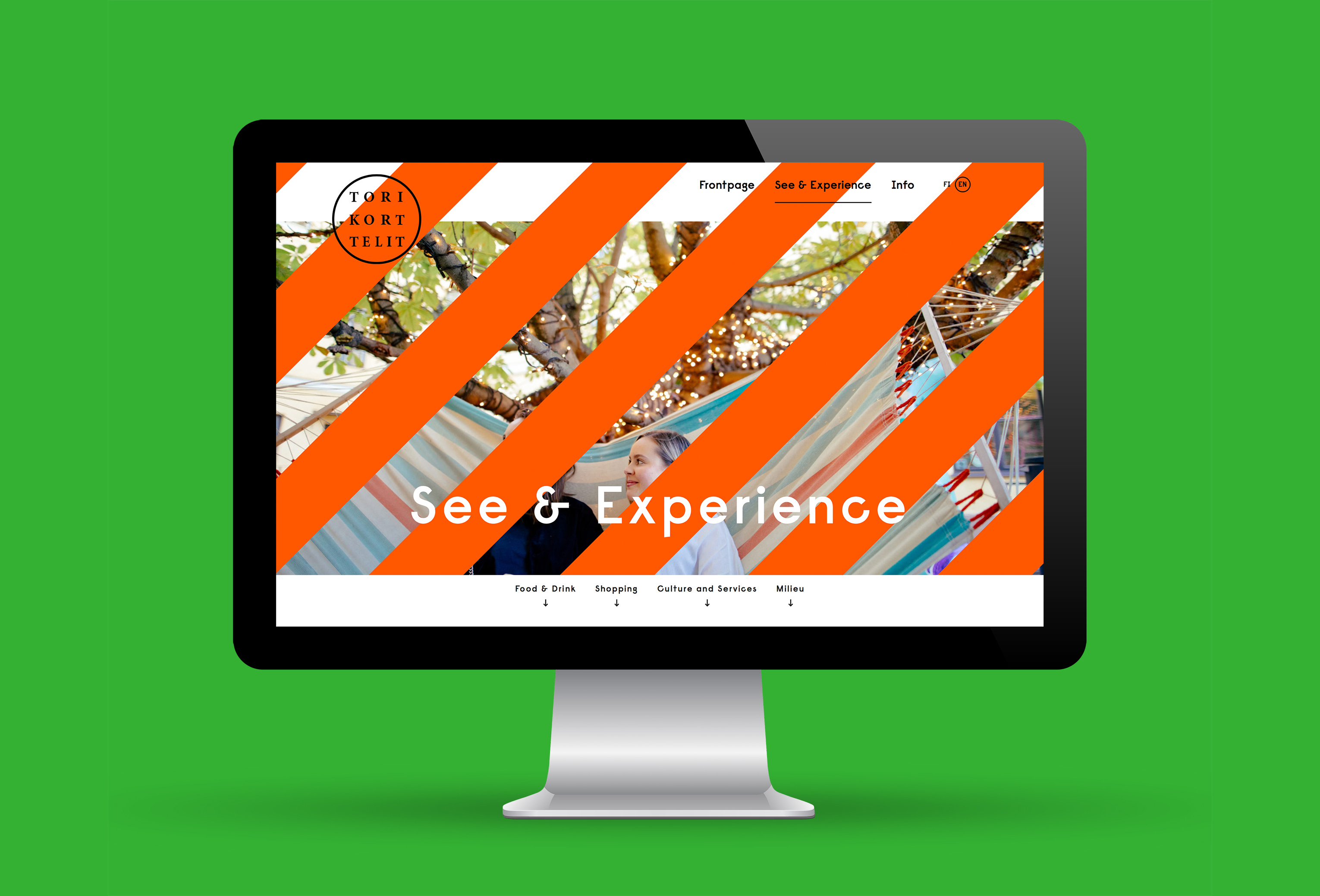
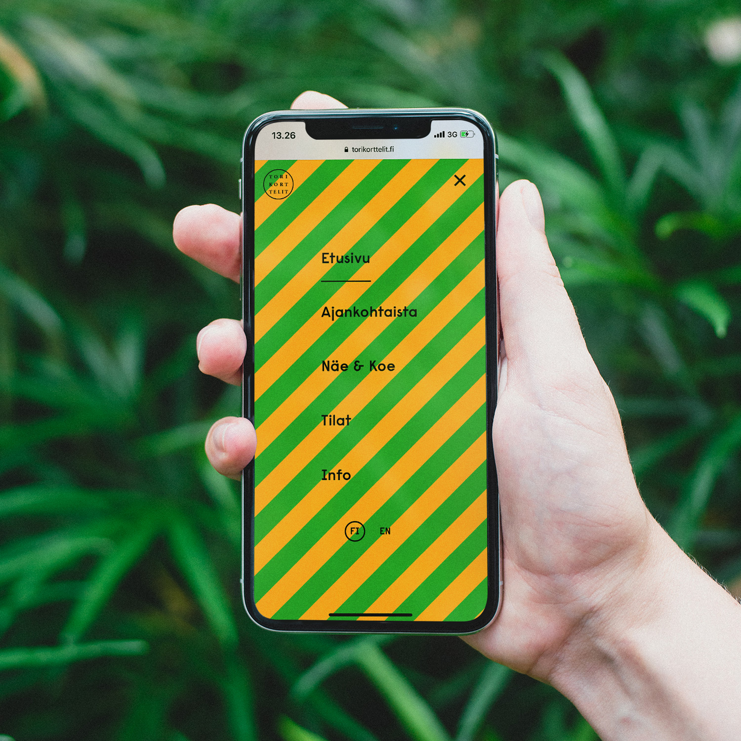
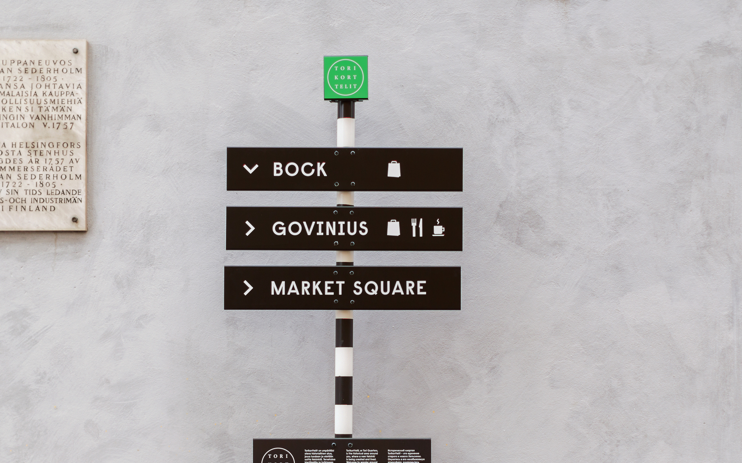
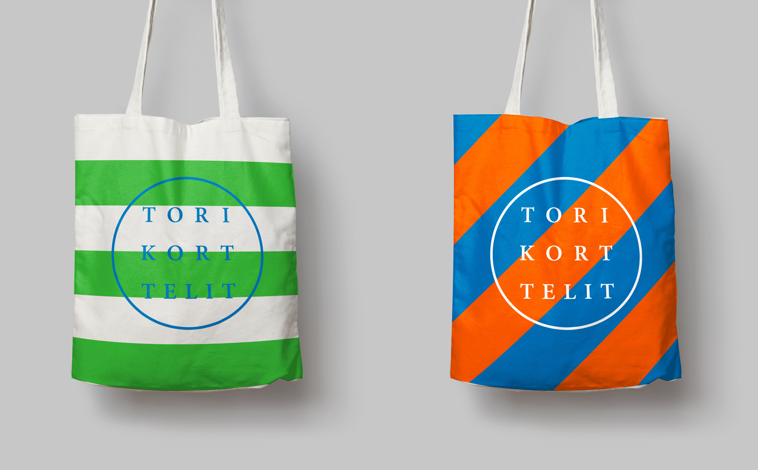
Torikorttelit is the old town district of Finland’s capital Helsinki. Its new visual identity, designed by Kokoro & Moi and based around bright colours, simple geometric patterns, a stacked typographic serif logo framed by a circle and paired with a modernist inspired secondary typeface neatly reflects the historic setting at the heart of a modern metropolis.
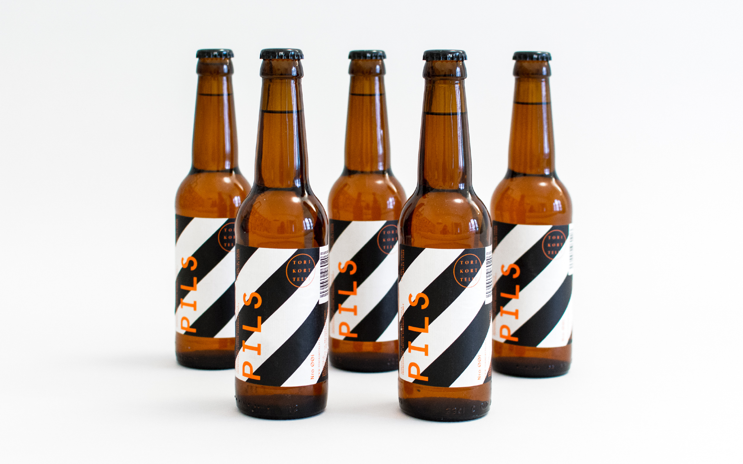
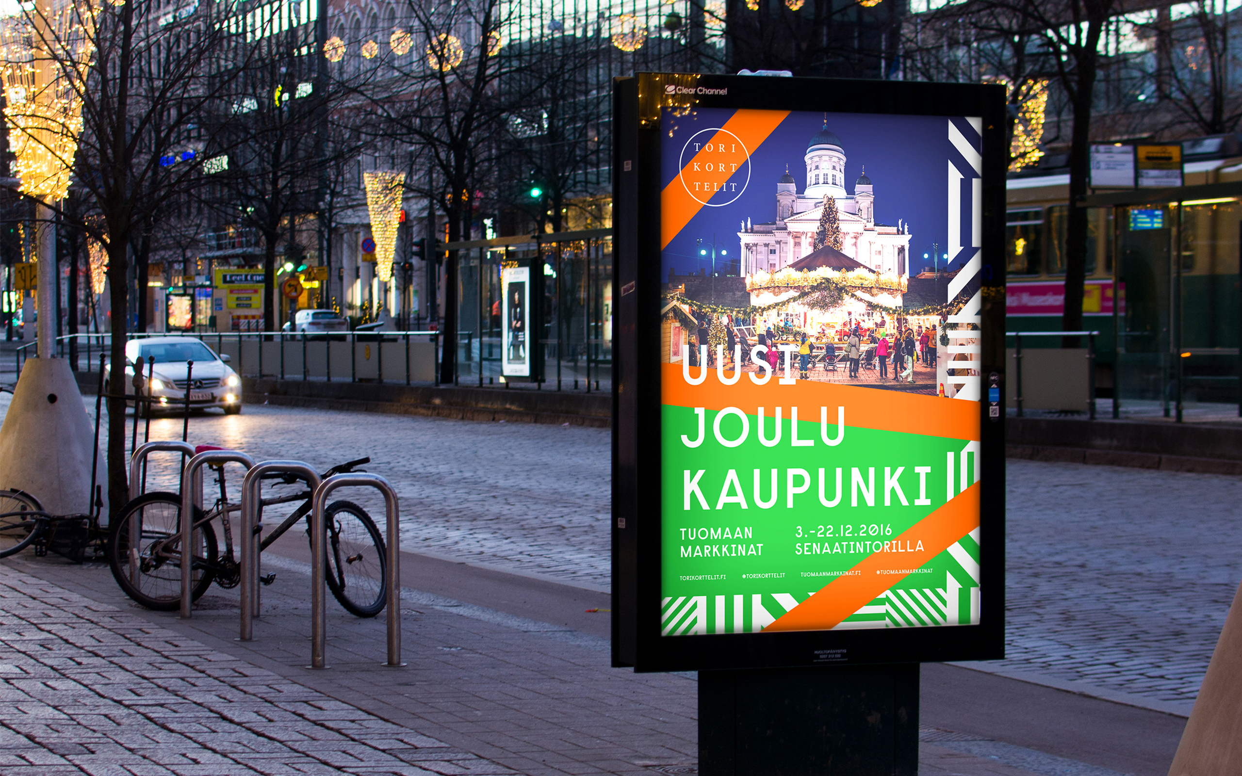
“The visual identity was designed to communicate the new vivid and diverse city. It is a combination of the history of the old merchant area, the progressive beat of the city today and visions for the future. The classic stripes and the Helsinki colour palette together with the modern typography create a bold look and feel for all communications from spatial design to marketing. The identity speaks volumes about the diversity, the layers of architecture and of the attitude with which the area is taking its place in Helsinki as a catalyst for new things to come. Its objective is to create awareness for the events, experiences and opportunities that lie at the heart of Torikorttelit.” – Kokoro & Moi
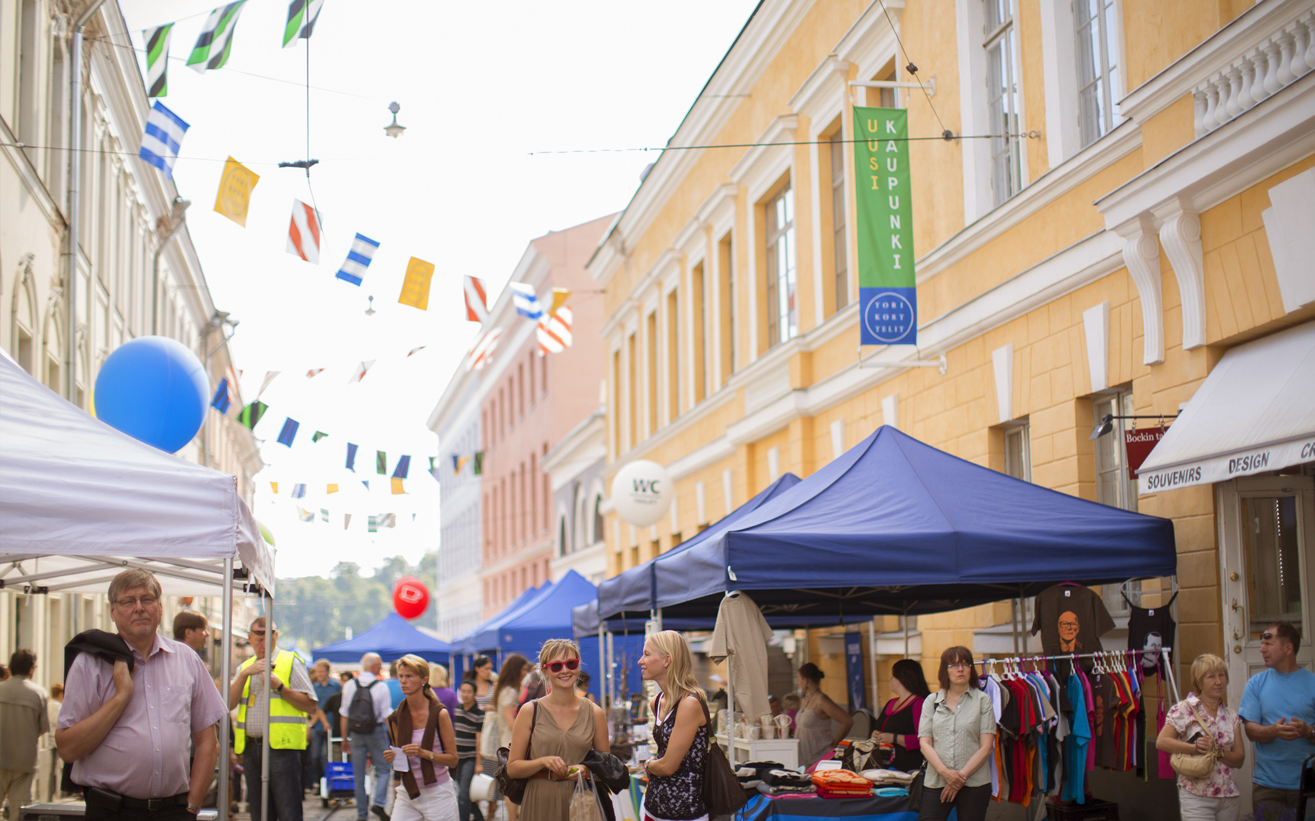
Although far from logo-centric the logotype works pretty well to establish, through the stacked layout and broad character spacing of an old style serif surrounded by a roundel—a typographic square set at the heart of a circle—, an interesting aesthetic contrast that neatly conveys both modernity and tradition, placing the old town at the centre of a contemporary cosmopolis.
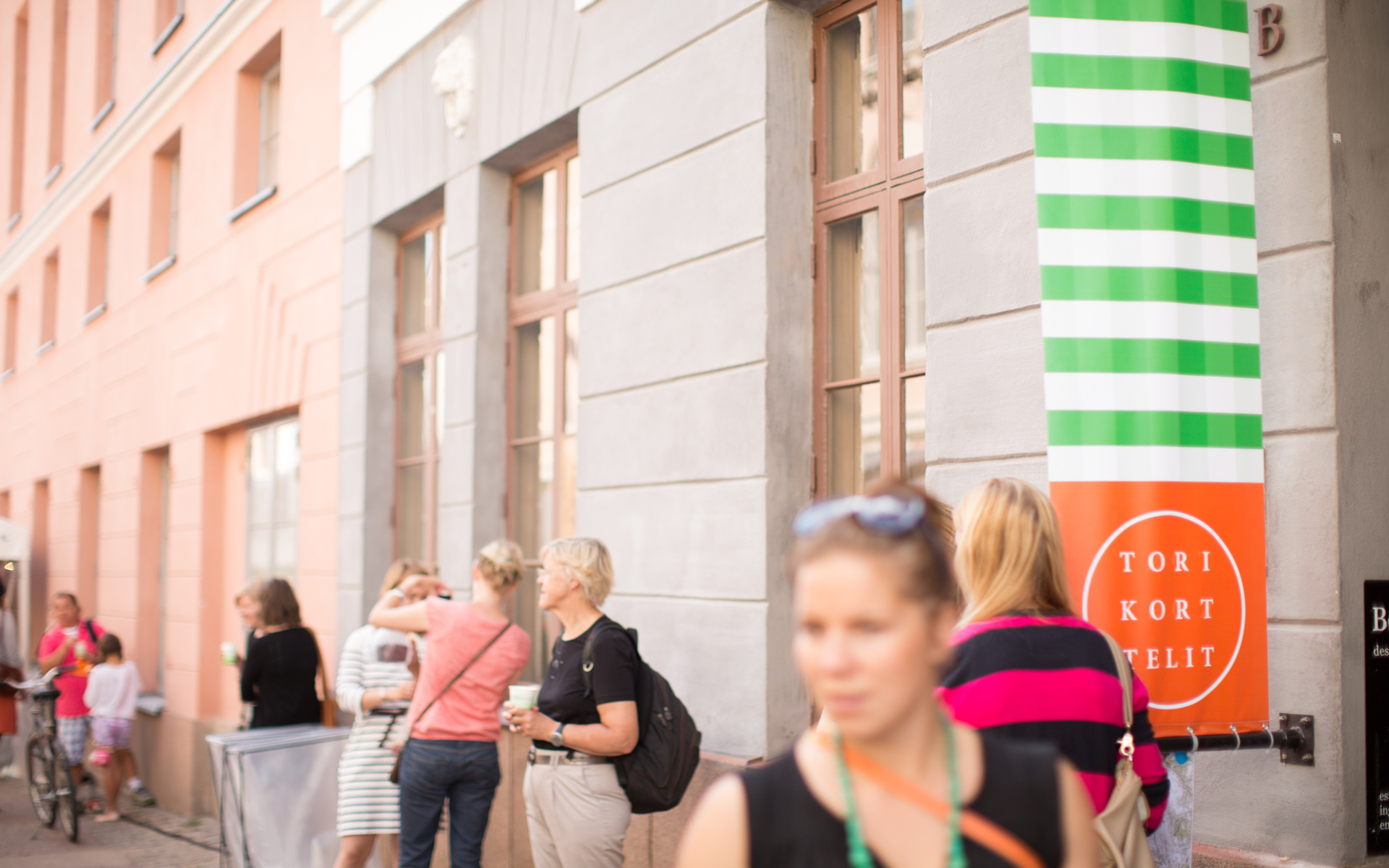
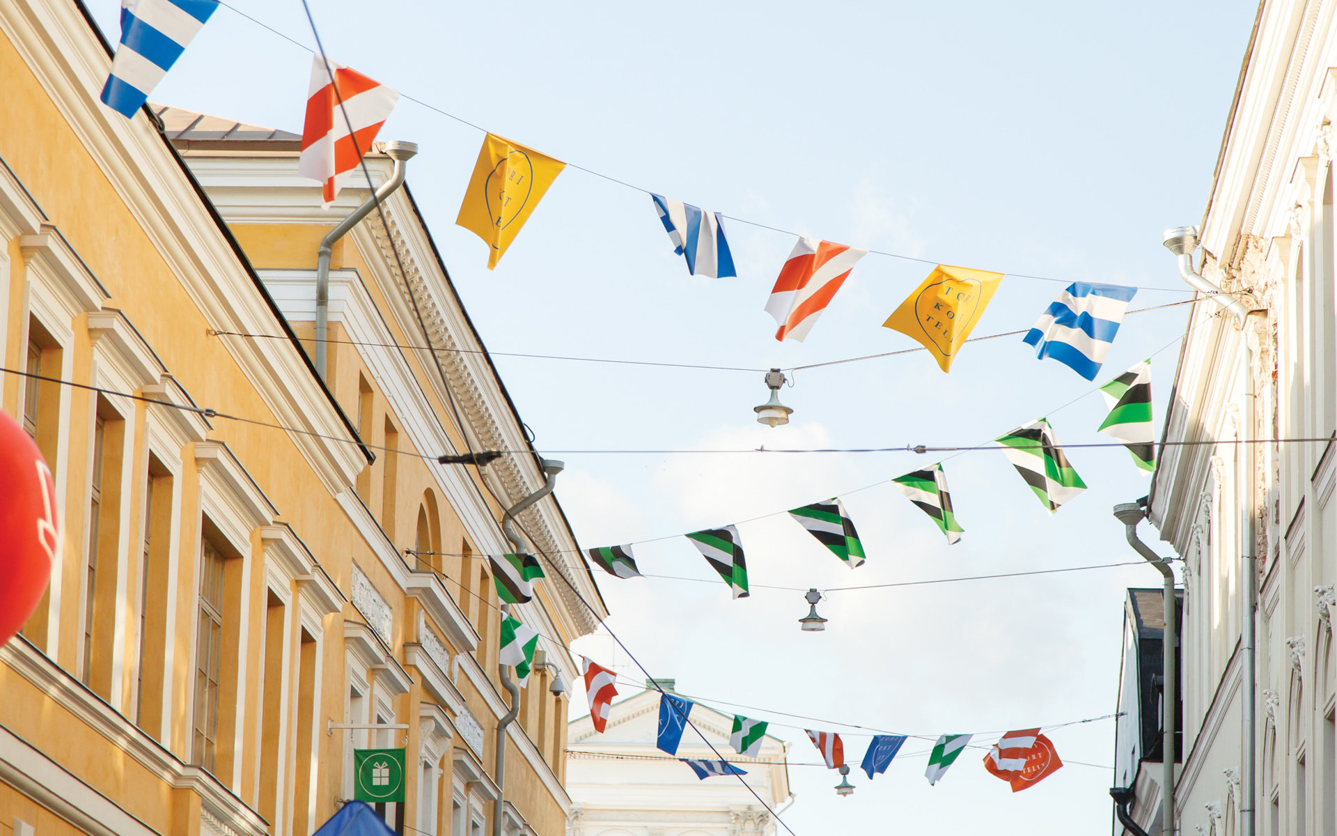
Despite the subtle and communicative value of the logo-type, it is the colour palette and pattern work that really delivers distinctive character, urban energy and a celebratory sensibility. These are bright, on-trend and appropriately enhanced by the use of white space that mixes a sense of fashion and, through simple geometric patterns and bunting, an almost nautical and market town sensibility that feels ideal for Helsinki’s position as a port and history as a trading post.

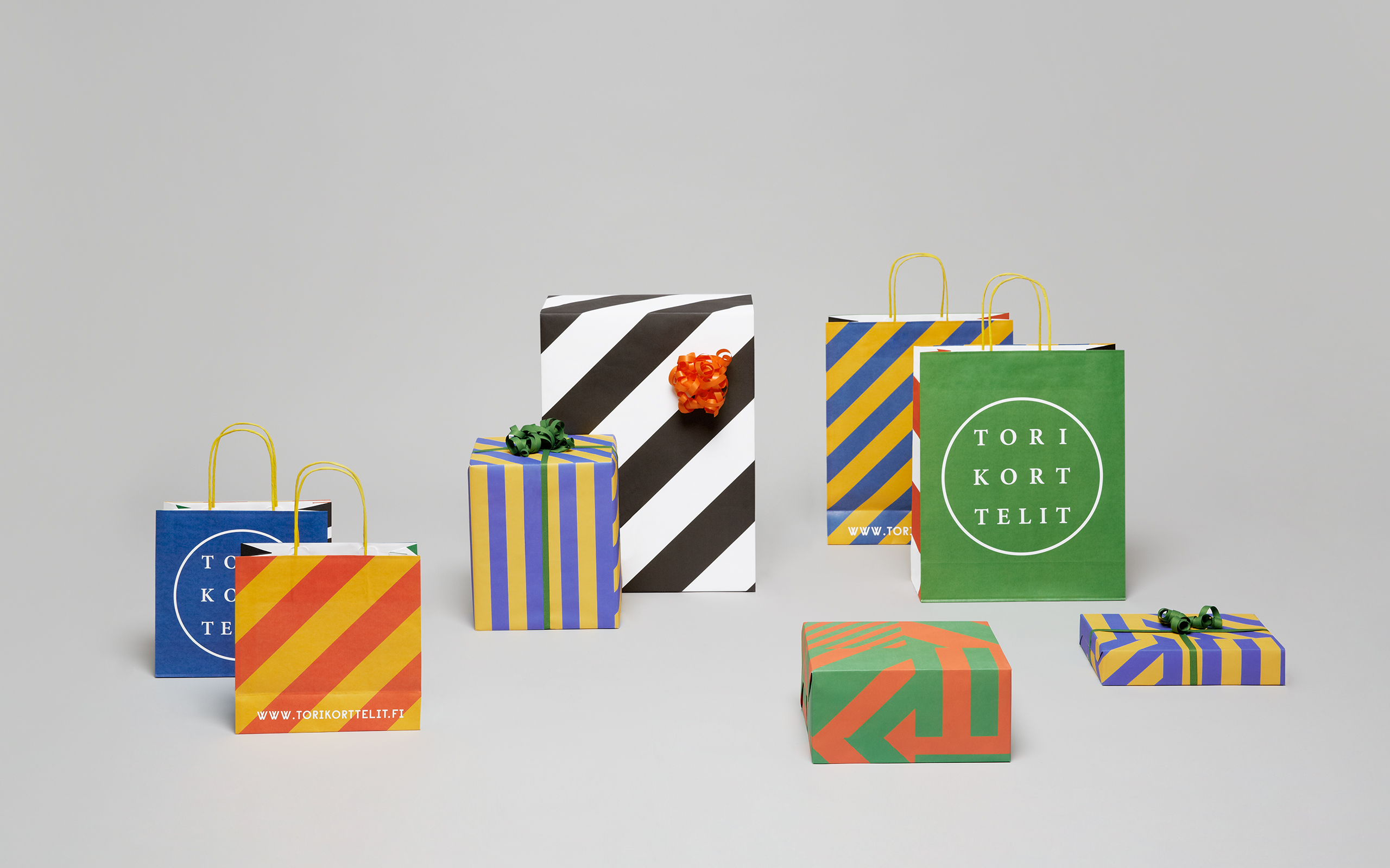
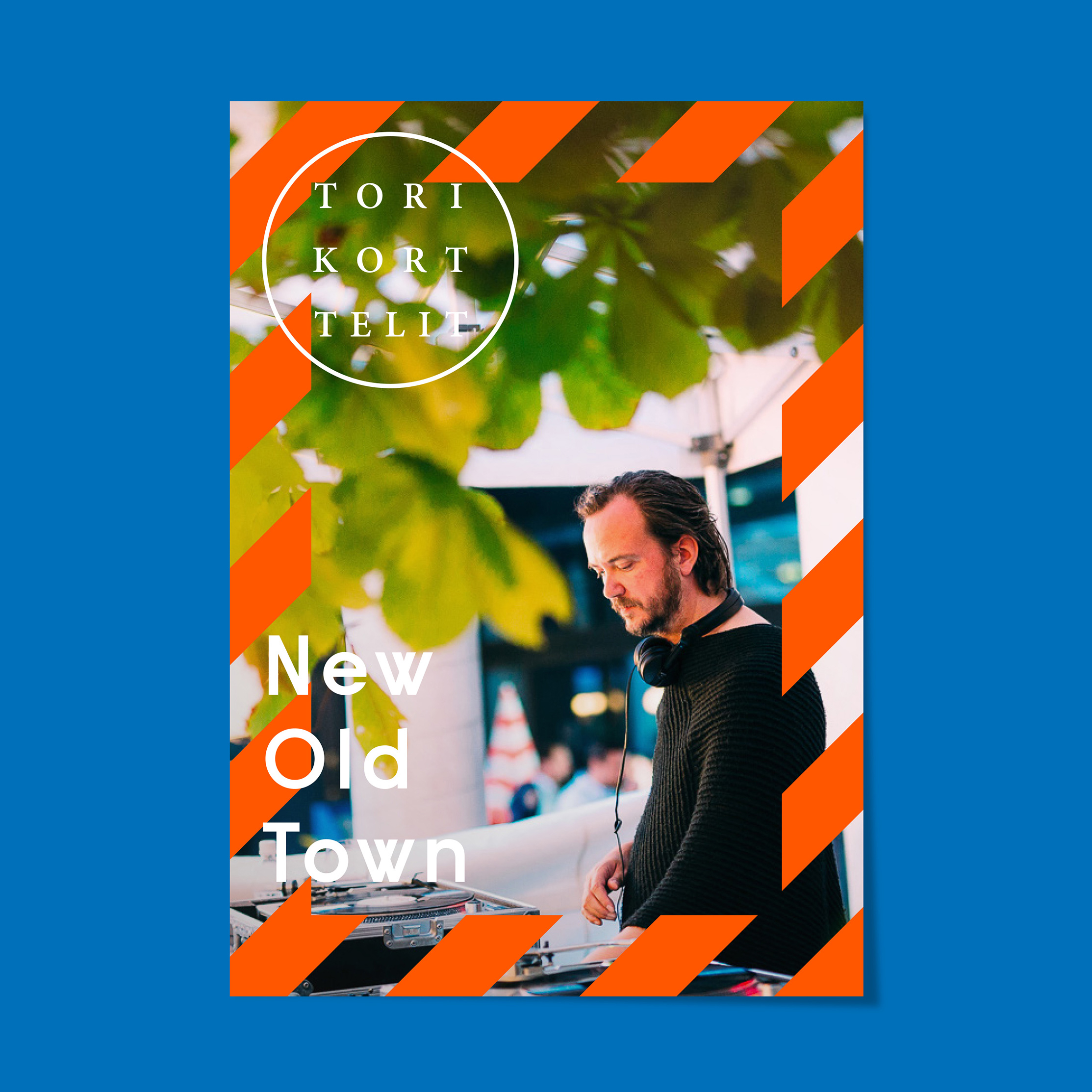
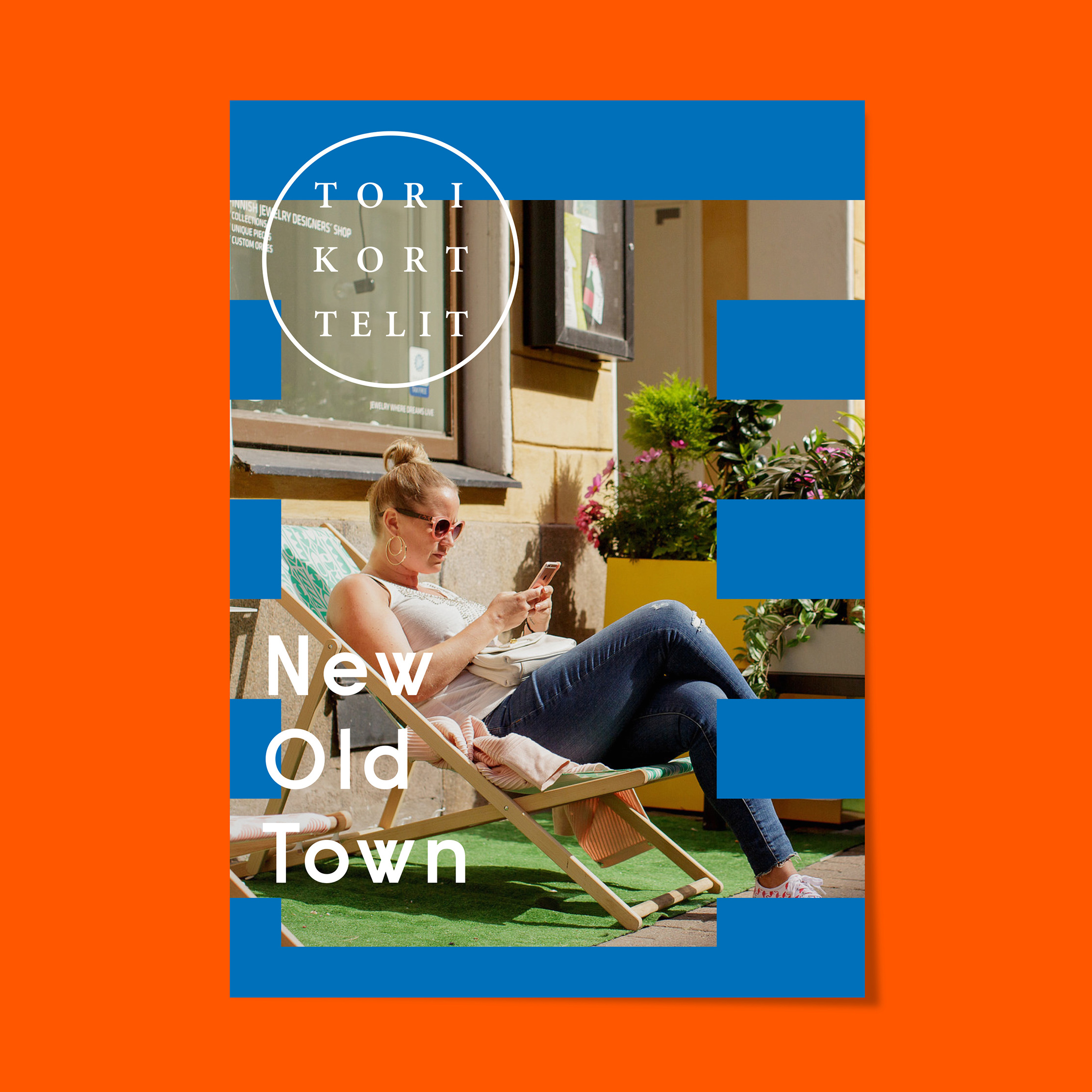
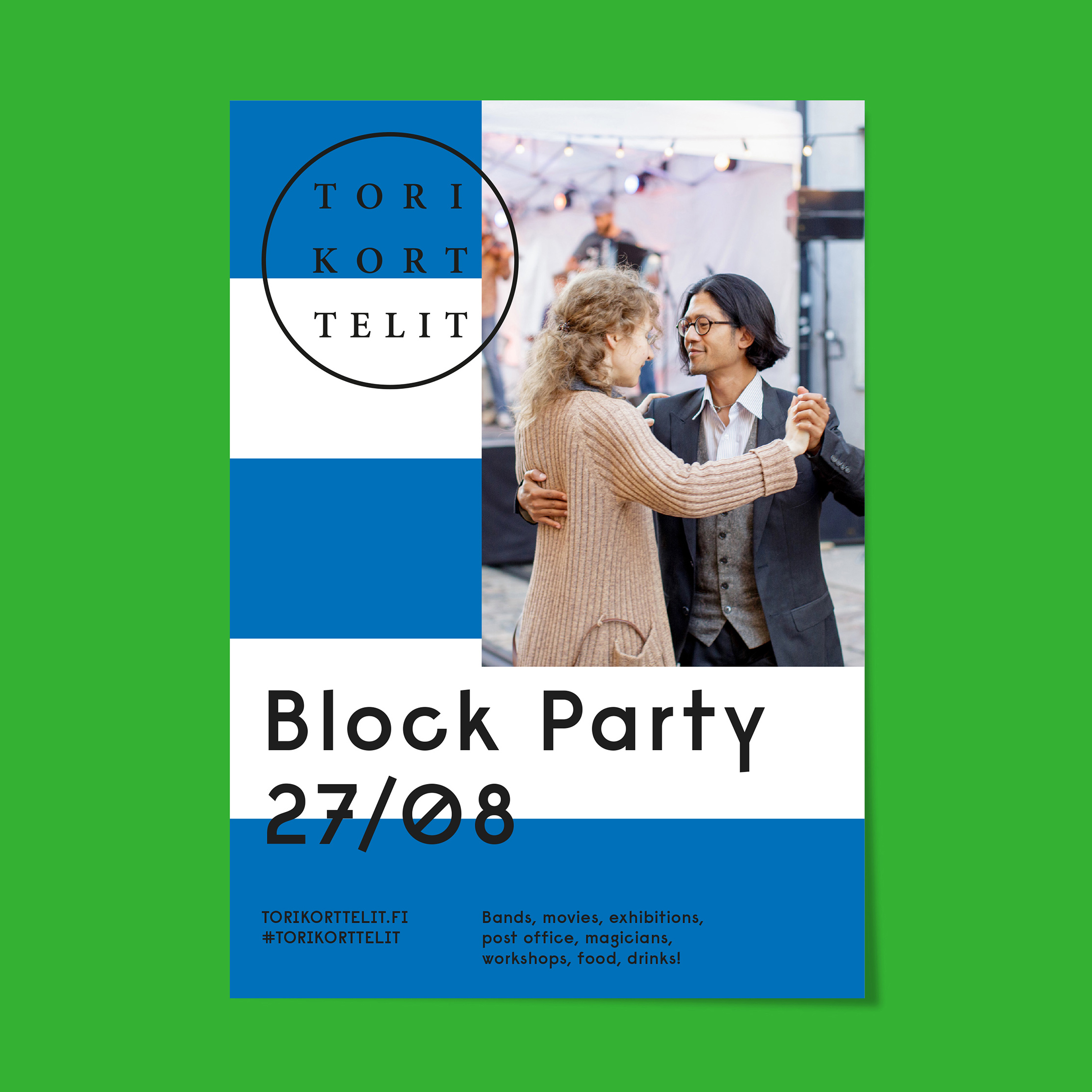
Like a lot of of Kokoro & Moi’s work there is an unusual secondary typeface utilised across the print work. Raisonne, created by Benjamin Critton and described by Colophon as “parodic-serious, intended to be a bit dumb, blunt, candid, affable—honest in the same way Modernism liked its materials”, feels like a smart progressive choice that acts as a neat counterpoint to the retrospective letter-forms of the logo-type.
