Stoats Porridge by Robot Food
Opinion by Richard Baird Posted 11 July 2013
Stoats is a Scottish oats company that began life in 2005 as a converted American hot dog sales stand serving porridge at summer music festivals around the UK, and now has a range of packed, ready to eat retail products that include flavoured porridge and porridge bars.
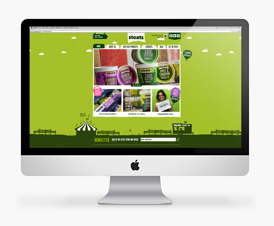
Stoats recently commissioned Leeds-based independent design studio Robot Food, as part of a complete rebranding exercise, to develop a new packaging and responsive website solution as well as uniforms, trailers, vans and marketing material that would build on the Stoats story, add vibrancy and establish a more proprietary brand image.
“The previous design didn’t reflect their passion, so we injected personality through in-house illustration, to create a brand that would leap from shelves. We started by piecing together Stoats’ history and all the haphazard stories, which have shaped the company. The outcome of that exercise made it easy for us, as the work has been so much fun. We love the product and have such belief in the people behind the brand.” – Simon Forster, Creative Director at Robot Food
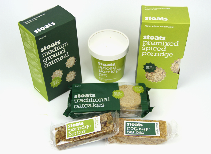
While the original packaging solution had a straightforward, grounded health-food sensibility fine for the period – achieved through an economical use of two green inks, off-the-shelf wrapper and sticker combination, the agricultural robustness of a slab-serif and star detail pulled from a local market environment – today it appears low value and largely without character, especially within a expanding market with design literate consumers that expect brands to have multi-dimensional personalities and packaging with layered communication expressing clear brand values and product proposition.
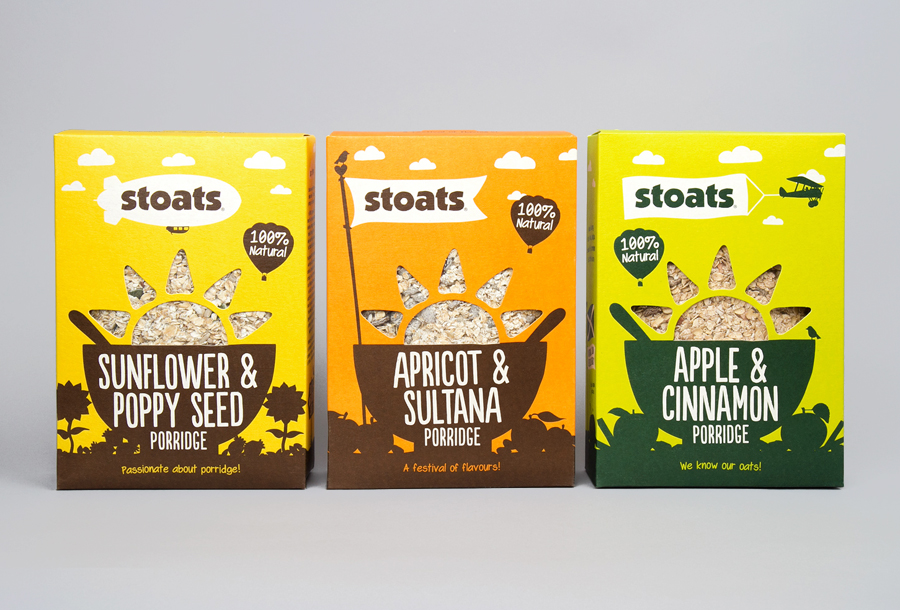
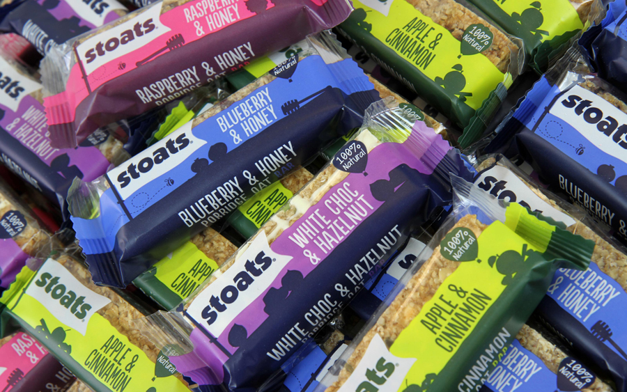
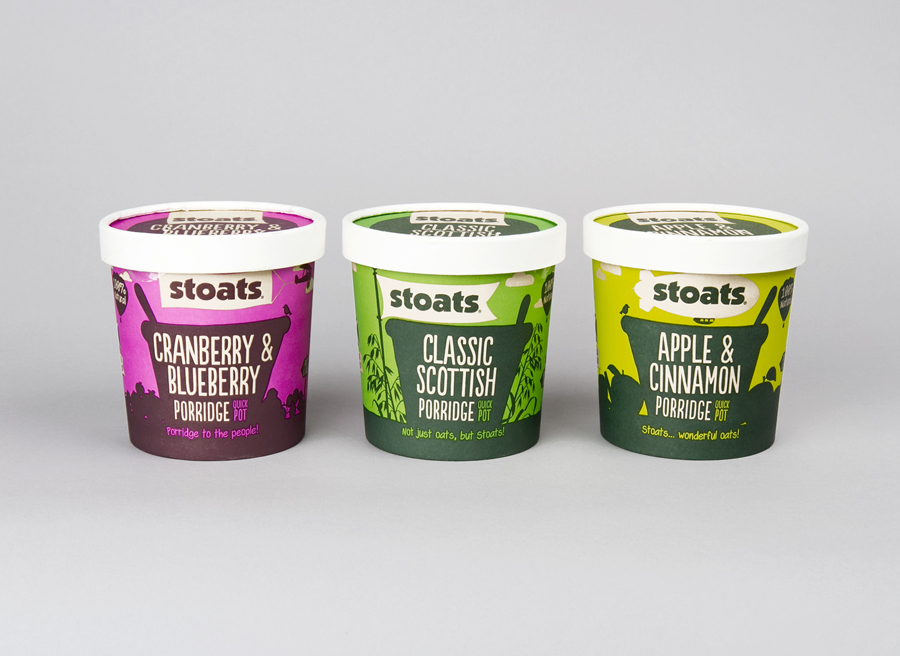
In contrast, Robot Food’s new design solution delivers numerous communicative layers through a familiar but effective illustrative resolution of warm flat and contemporary colour, simple silhouettes, loosely rendered uppercase titles, an all lowercase logo-type and a friendly, informal tone of voice and use of narrative to highlight provenance and origin.
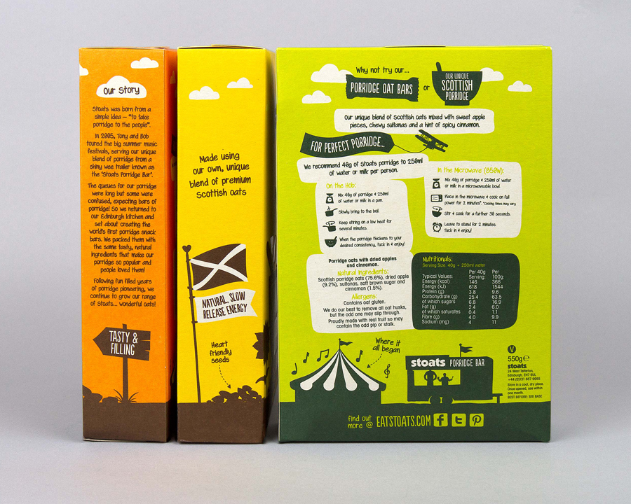
The illustrative work is solid but elemental compared to say the detail and expense of rendering something like the individual characters created for muesli brand Yoosli. That said it still manages to convey a wealth of ideas, from the rustic and traditional qualities of deep bowls and the dense texture of oats and fruit, the provenance and humble beginnings of the Scottish flag and van, the wholesomeness and related flavours of fruit, vegetables, plant life, clear skies and fluffy clouds, the locality of old wooden signs to the activity and adventure of ballooning, stunt flying, and outdoor events. It is a broad set of elements, some of which I am likely to have missed, that subtly convey the themes of brand accessibility, well-being, outdoor activity and youthful energy ideal for a natural product with health benefits.
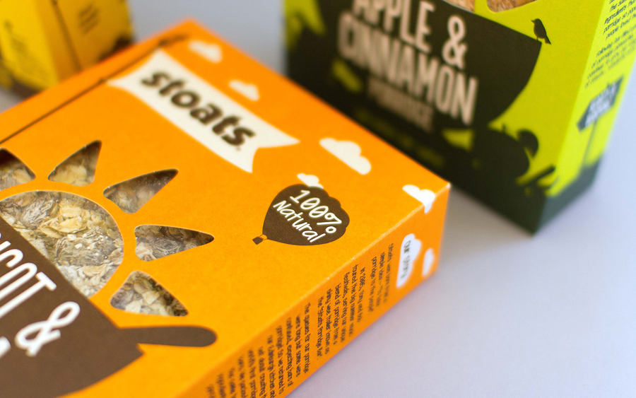
Loosely rendered uppercase letter-forms provide the packaging with a confident and loud but personal and child-like honesty that is shared by the almost paper cut nature of the illustrations, the informality and accessibility of an all lowercase logo-type, straightforward language choices, alliteration and playful annotation. It is a familiar and frequently used typographic approach but one that is clearly understood by a broad demographic.
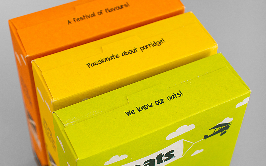
With a two ink approach across a tactile uncoated substrate the colour palette has an economy much like the previous design. These have a contemporary restraint and sense of environmental responsibility but now benefit from the energy of bright yellow, orange and lime green spot colours which are complimented and enhanced by the richer qualities of a soil brown. These choices resonate well with the themes of healthy living, earthy ingredients and an active lifestyle as well as having far more impact and brand distinction.

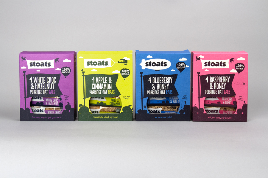
It is effective union of design cues that are familiar but undeniably appealing, competently rolled together and bound by a simple, economical shared aesthetic that is playful in parts but never childish, resonates well with both the traditional wholesome nature and energy associated with oats and cereal, the youthful nature of the comapny and deliver an engaging communicative dimensionality that should appeal to a broad range of consumers. More from Robot Food on BP&O.
Design: Robot Food. Opinion: Richard Baird. Fonts Used: Populaire (Customised) & Swagger.
