MediaCreator by Lundgren+Lindqvist
Opinion by Richard Baird Posted 21 August 2013
Media Creator is a Swedish print production and project management company that utilises a flexible web-based system that pairs a ‘intuitive computerized system’ and translation service, with ‘alert’ and ‘friendly’ staff to streamline their entire print process.
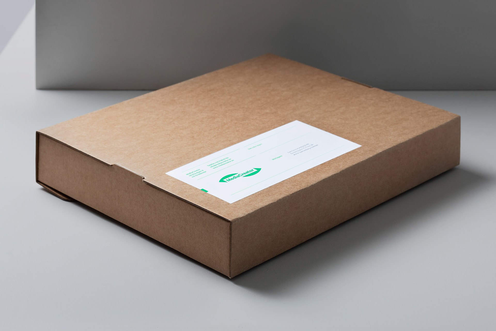
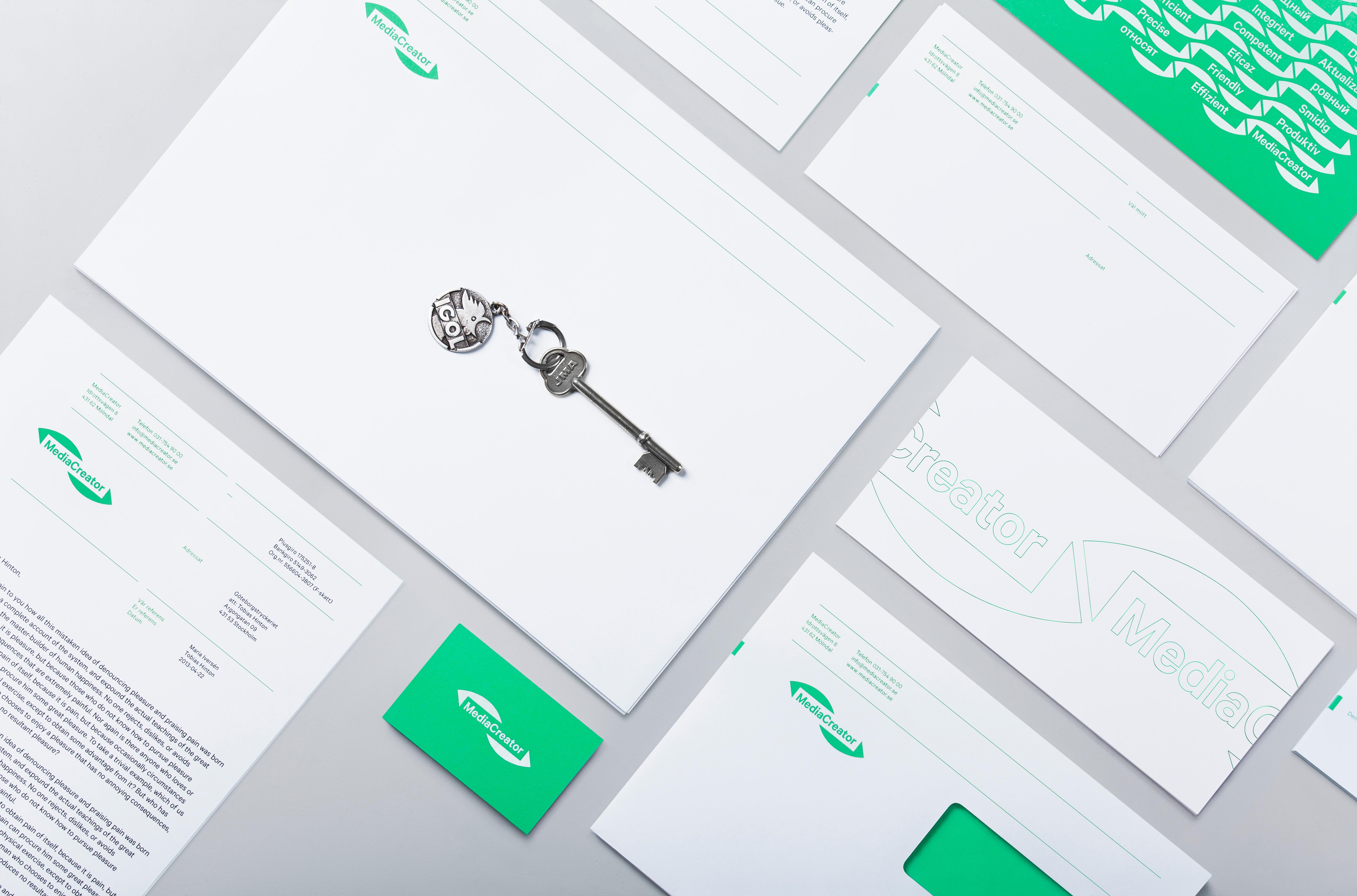
Utilising a predominantly two-tone colour palette, san-serif typography and bright contemporary illustrative detail, MediaCreator’s new visual identity, which included a new logo, stationery set and website created by design bureau Lundgren+Lindqvist, balances production efficiency with individual character and infuses it with a sense of support and accessibility.
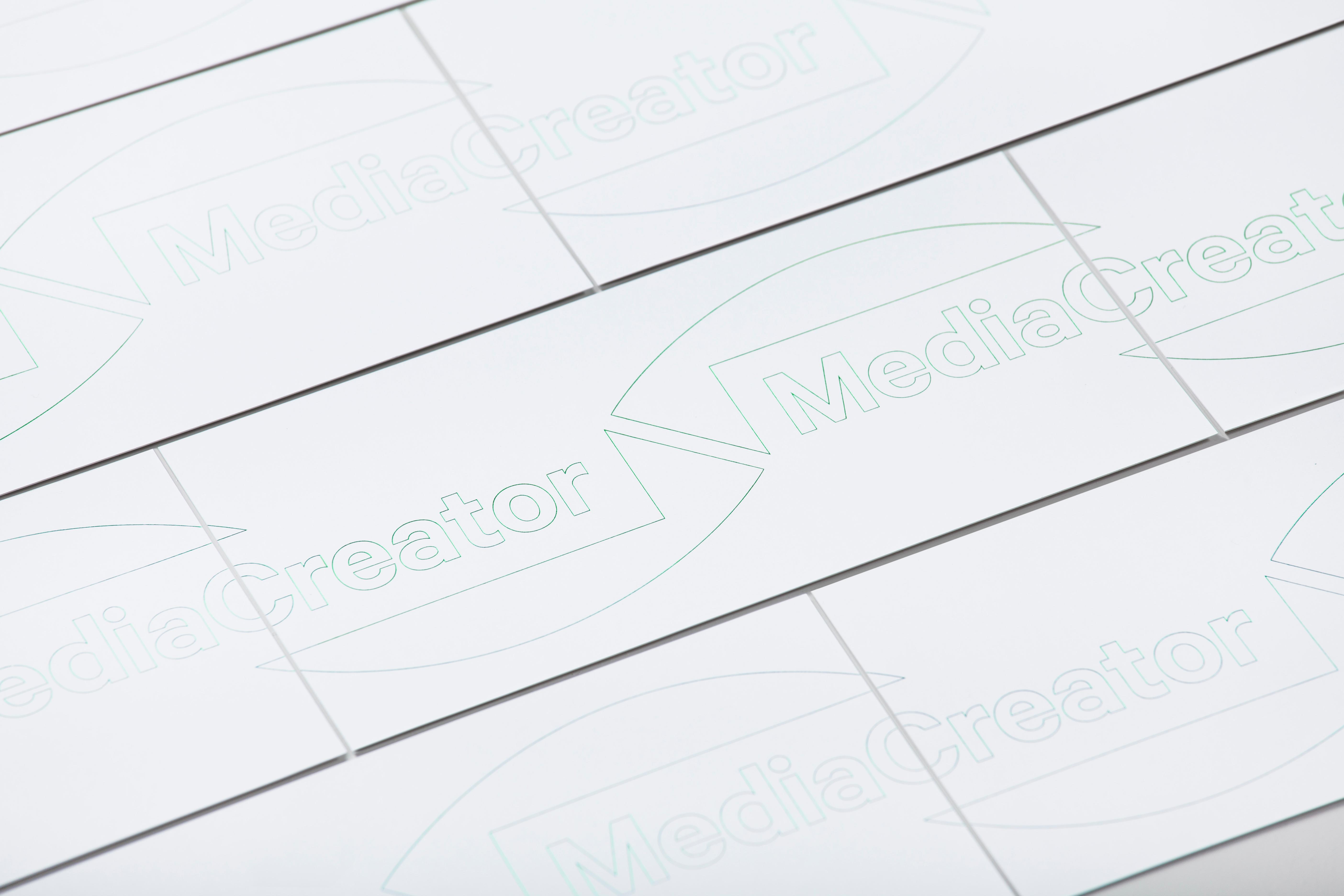
“Since MediaCreator is all about efficiency – we used the straight path as a starting point when designing the logotype. By letting a straight path block out a curved one, we managed to illustrate MediaCreator’s most important feature. A new tagline – Taking the straight path – was employed. For the back of the letterhead, we created a pattern from the logotype, replacing the wordmark with MediaCreator’s key values. These were translated into the six most frequent languages of MediaCreator’s translation service, which were mixed in the pattern and in turn foil blocked unto the letterhead.”
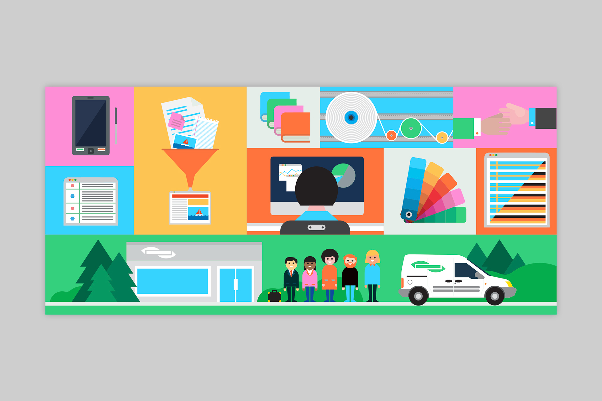
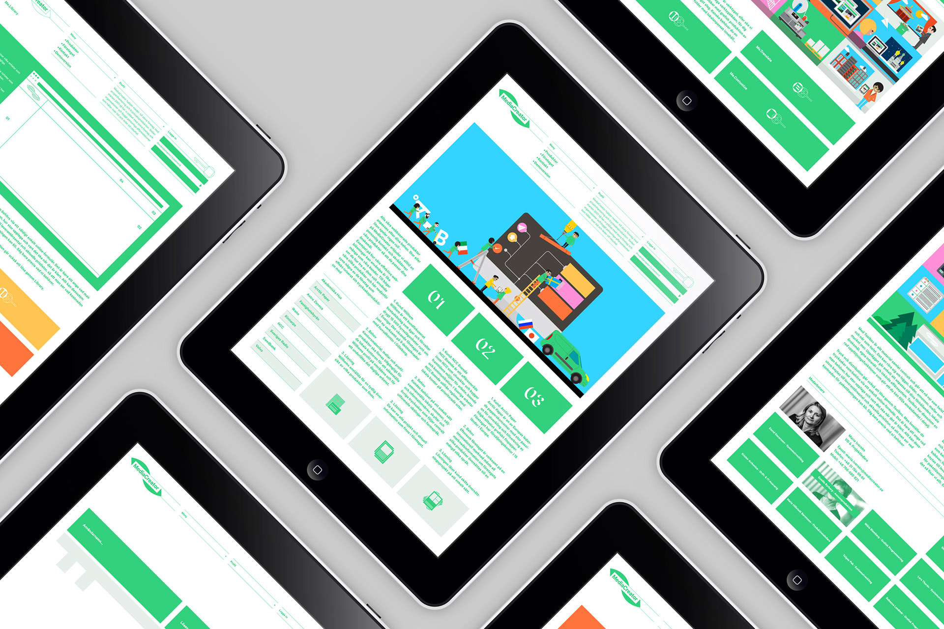
“For the website, we worked with illustrator Robert Samuel Hanson to produce a number of illustrations depicting MediaCreator’s different services.” – Lundgren+Lindqvist
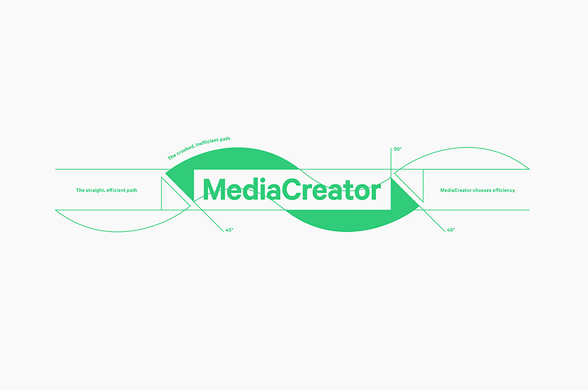
Although I do appreciate the central premises–the crooked inefficient path versus the straight efficient path–conceptually it feels far too abstract to really grasp, or infer. It does, however, function as an idea from which derive a distinctive form. Lundgren+Lindqvist’s choice of well-spaced sans-serif letterforms, the subtle character of the ‘a’, sentence case typesetting and compounded nature of the name functions sufficiently well to balance humanistic detail and efficiency, which is then is expertly expanded upon on-line. The curve and rectangular counter of the frame appears dynamic, patterns well and holds, if you look closer at the top image, a series of brand attributes.
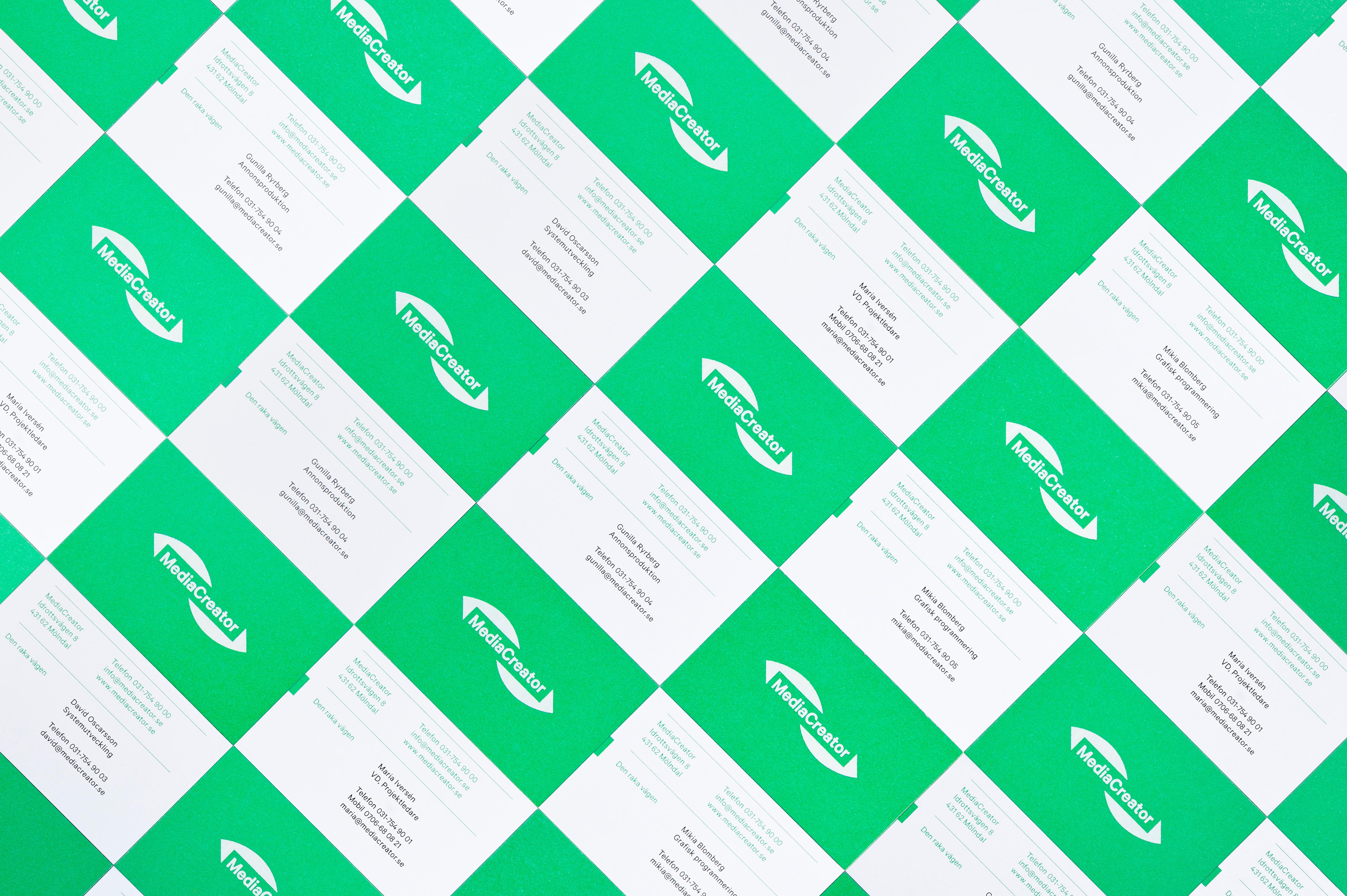
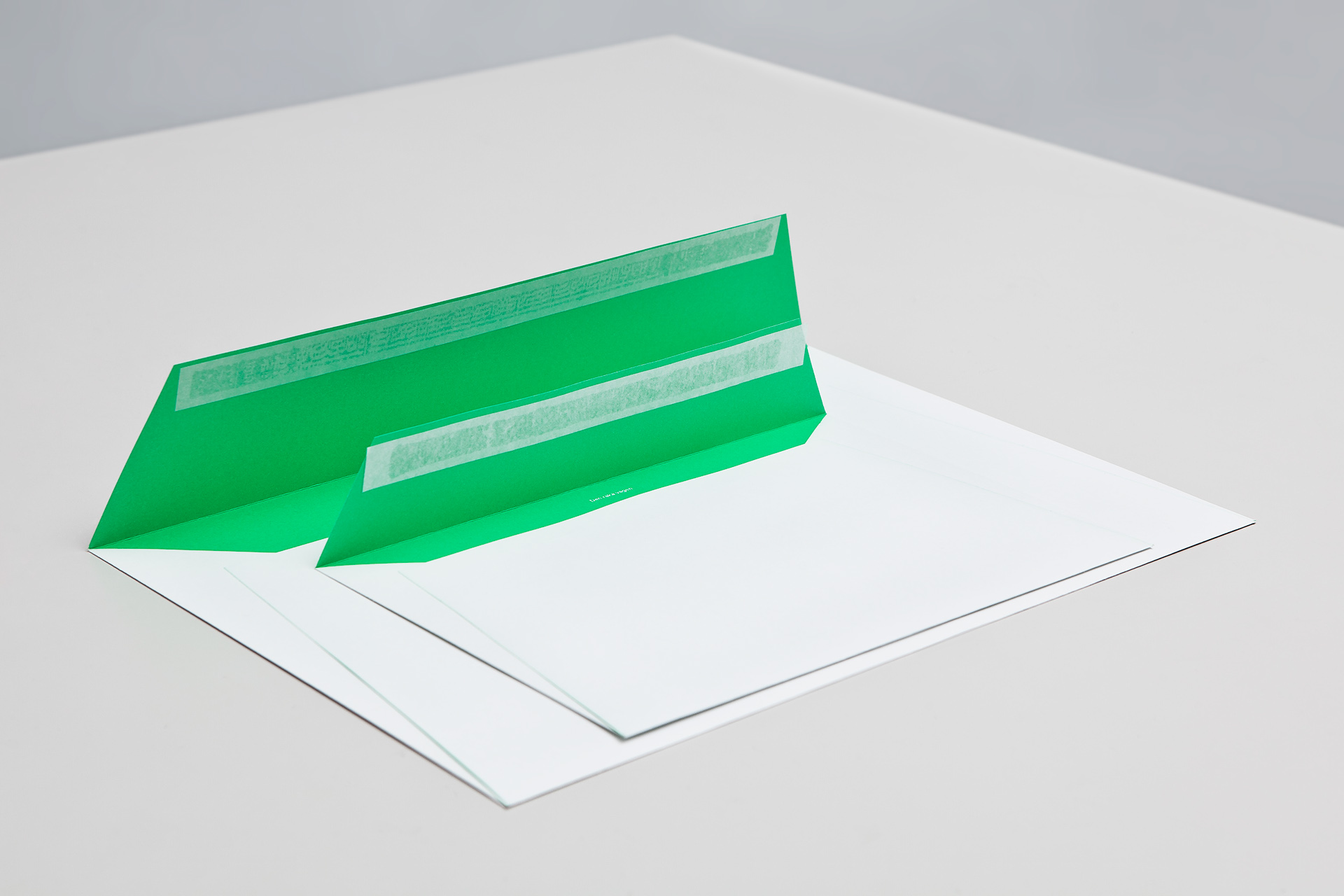
Rather than uniting a wealth of print techniques and finishes like Atipo’s work for production studio Minke, in print MediaCentre is very much about practicality, productivity and affordability neatly conveyed through the economy of a two colour solution. The high contrast fluorescent green and bright white, executed as a mix of neon ink on white paper and white ink across neon paper, feels bold, energetic and high quality with a design sophistication and restraint without appearing cheap.
This restraint is used to frame a series of bright, playful and contemporary illustrations on-line – enhanced by plenty of white space – to deliver an interesting juxtaposition of economy and detail to add depth to the visual identity. The illustrations are playful and really well rendered with some lovely colour choices and a European sensibility in the Playmobil-style of the characters that turns a very mechanical process into something far more humanistic, accessible (also ideal for translation services) and supportive without compromising their professionalism or quality of print.
Together these two quite disparate themes feel well resolved, appropriately leveraging aesthetic and communicative differences to derive distinctive and broadly understandable character.
