The Hop Review by Jack Muldowney
Opinion by Richard Baird Posted 3 September 2013

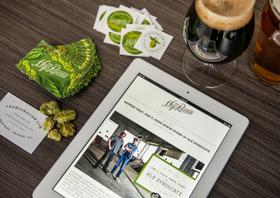
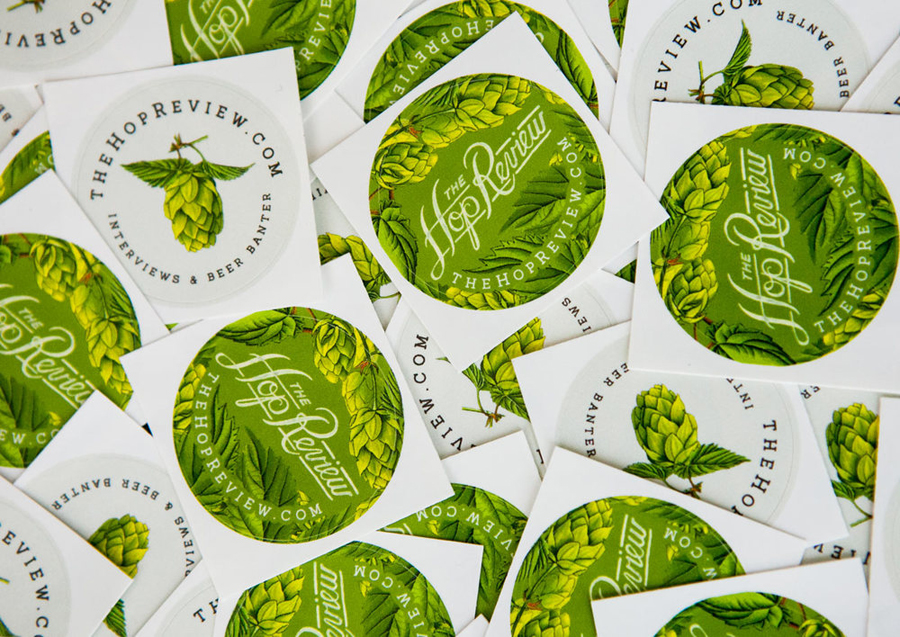
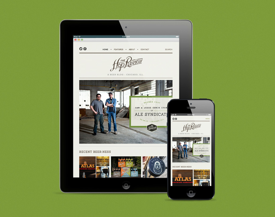
The Hop Review is a blog that brings together opinion, pictures and interviews with brewers, store and bar owners to provide readers with a perspective on Chicago’s growing craft beer industry. The blog’s visual identity, which includes a hand drawn logotype and illustrative detail created by graphic designer Jack Muldowney and executed across their website, business cards and stickers, infuses the blog format with a personal and clear craft sensibility.

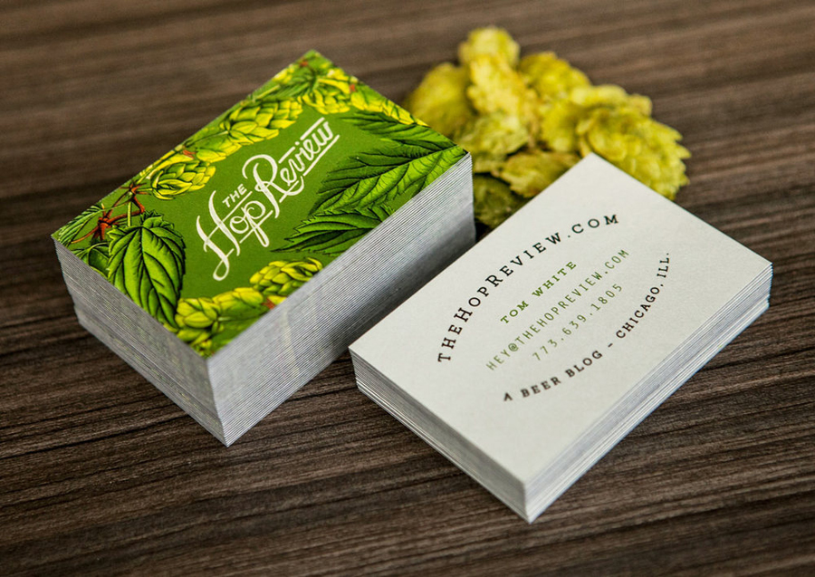
The logotype is a solid piece of script work that confidently mixes the enthusiastic loops, ligatures and flourishes of a sign painter with the human imperfections of inconsistent paint coverage, spacing and loose edges that work well to convey an individual, personal and regional quality that is ideal for a blog that places one-on-one interviews from the area of Chicago at the at heart of its content.
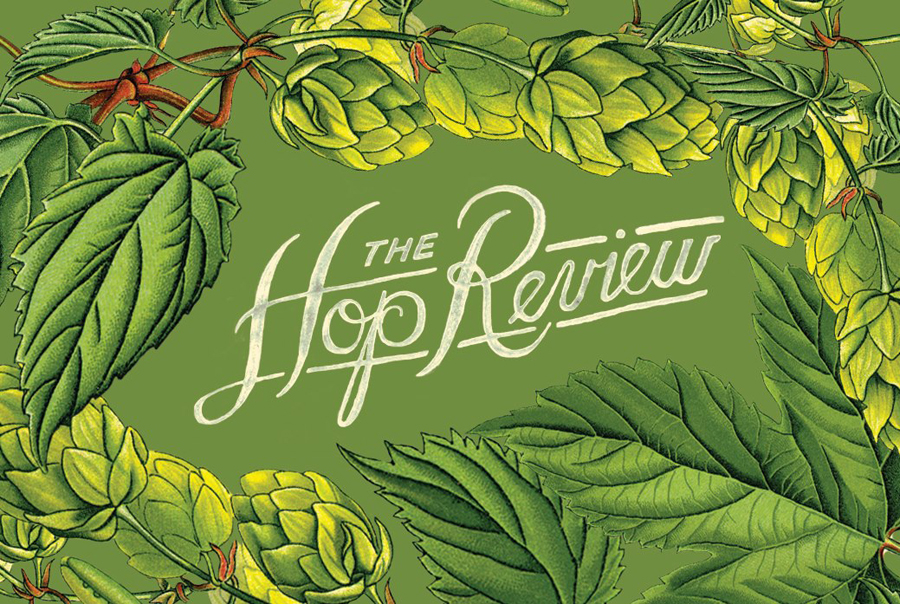
The hop illustrations which surround the logotype add a really nice level of finer detail with a good eye for light and shade, a bright but natural green colour palette and a retrospective influence that is appropriately reflective of the long history of home and microbrewing. These are enhanced by a full bleed across the front panel of the business card and complemented by the period agricultural sensibilities of curved baselines and slab-serifs of the reverse.
Together these two assets leverage the artistry of hand illustration and script writing to bring a small-scale locality and craft to a digital format and convey the skill associated with brewing.
