Kontoret by Werklig
Opinion by Richard Baird Posted 6 September 2013
Created by consultant Ray Lindberg with the intention of setting new standards for flexible work environments, Kontoret provides low-cost office space by the hour, with wireless internet, printers and coffee, to freelancers, chief executives, local businesses and international travellers in the centre of Helsinki.
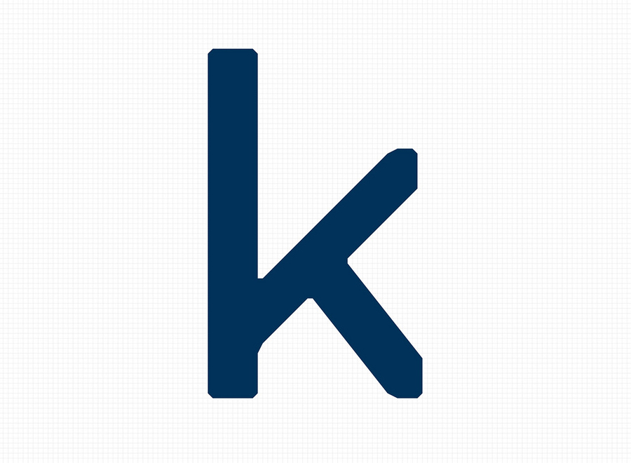
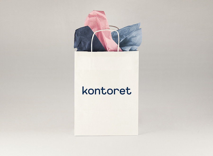
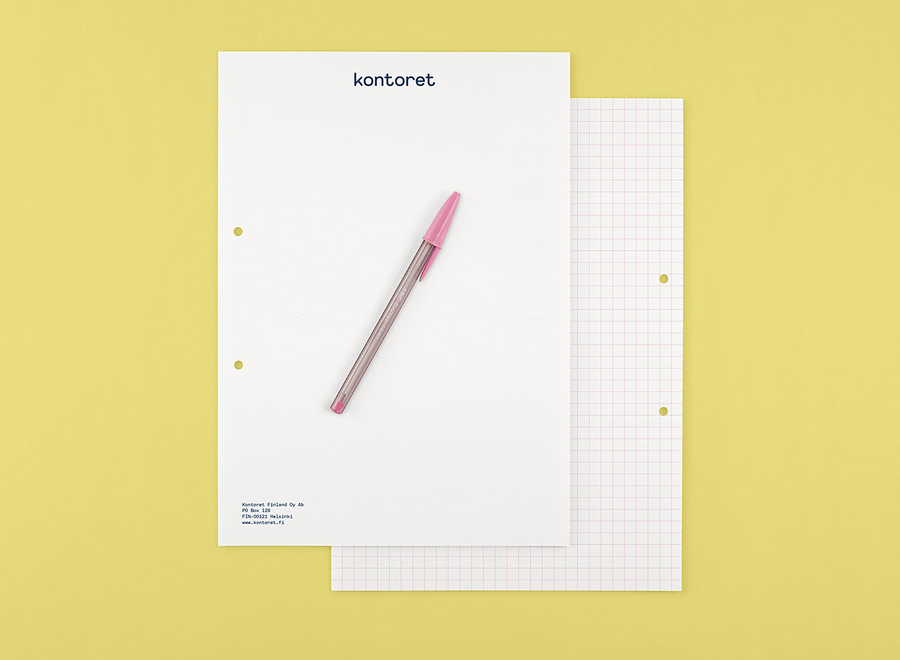
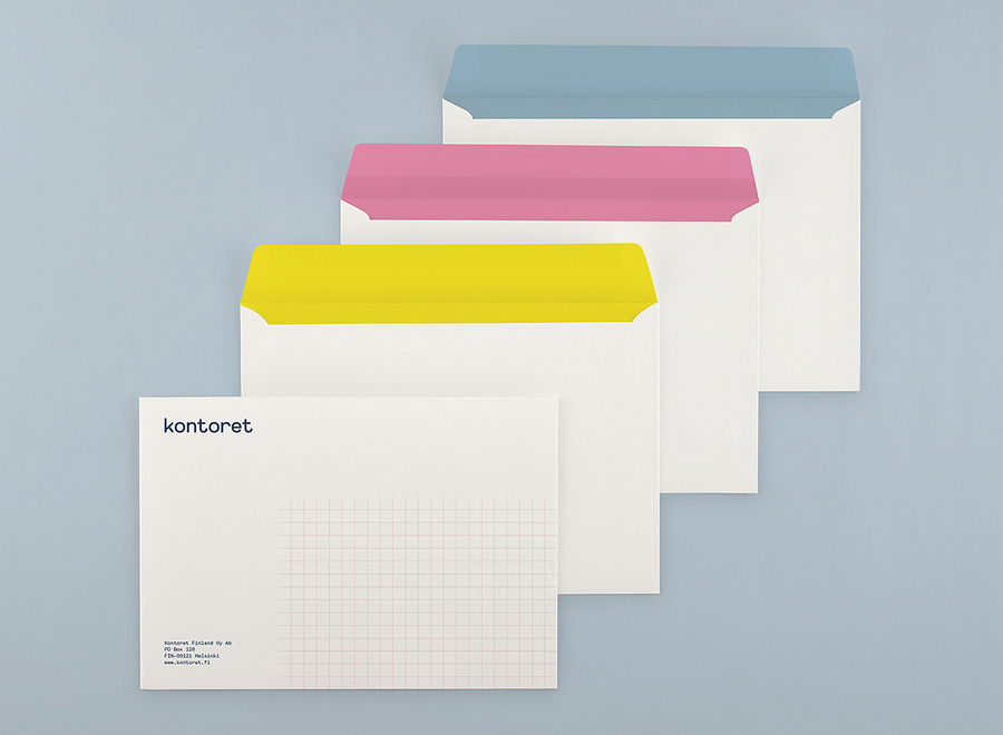
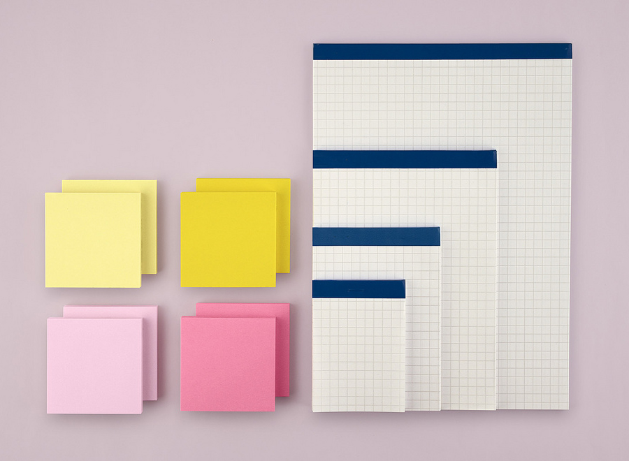
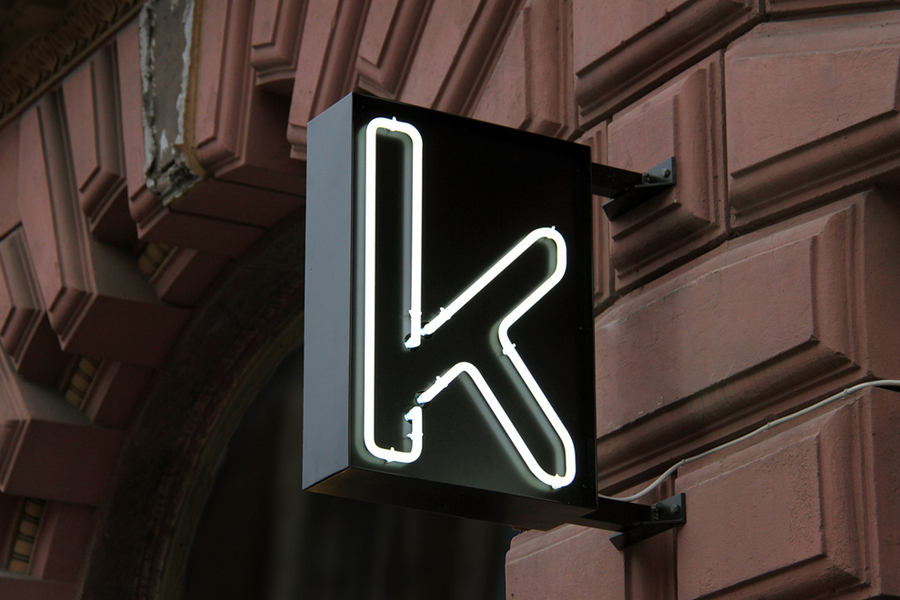
Inspired by the “essence and basic needs of office work and the aesthetics of the classic office environment”, design agency Werklig created a new grid-based identity for Kontoret drawn from the typeface Replica Mono, a custom set of icons and utilises branded office tools such as Bic pens, Post-it notes and Stabilo Boss highlighters to establish a “brand identity with a strong link to the traditional office environment with a minimalist Scandinavian twist.” This extends across neon signage, window decals, bags and stationery.
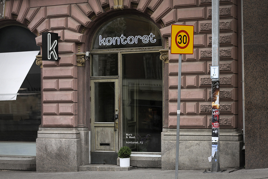
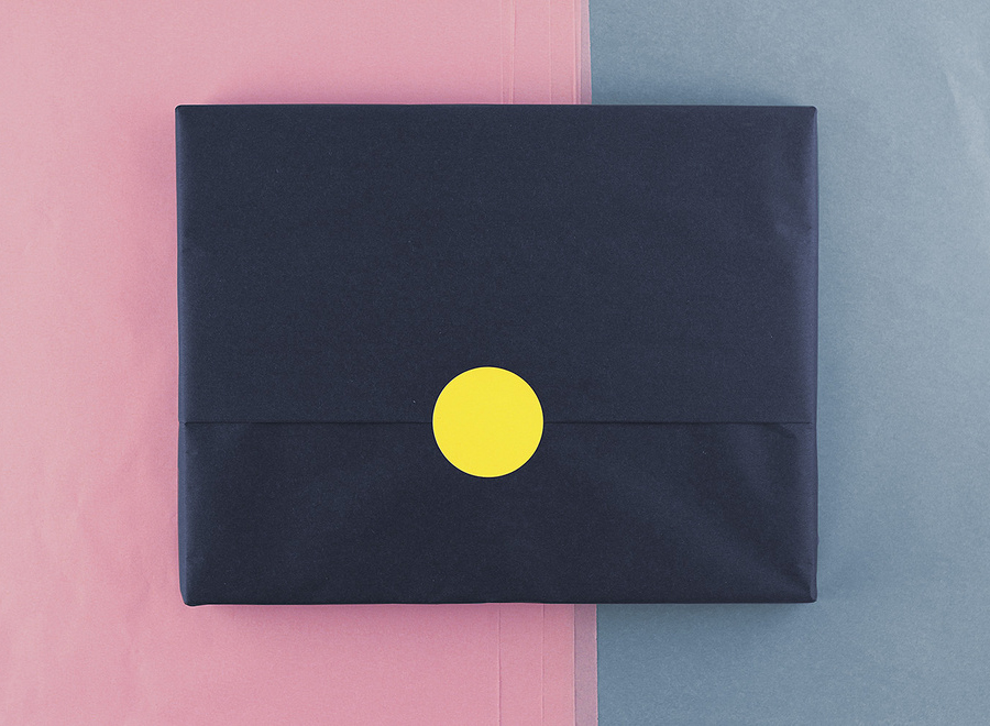
The result is a simple but solid solution founded on the clear utility of characters and iconography with shared geometric constraints, a limited colour palette and the use of grids across the stationery and website. While the lowercase letterforms, heavy line work, crafty pastel tones, tissue paper and stickers – enhanced by plenty of white space add a subtle, accessible dimensionality to this utility, it is the intelligent leveraging of the familiarity and lasting high quality people associate with established stationery products that really provides a level of experienced based detail not often seen in smaller identity projects.
Design: Werklig. Opinion: Richard Baird. Fonts Used: Replica Mon
