Adrián Key by Face
Opinion by Richard Baird Posted 10 September 2013

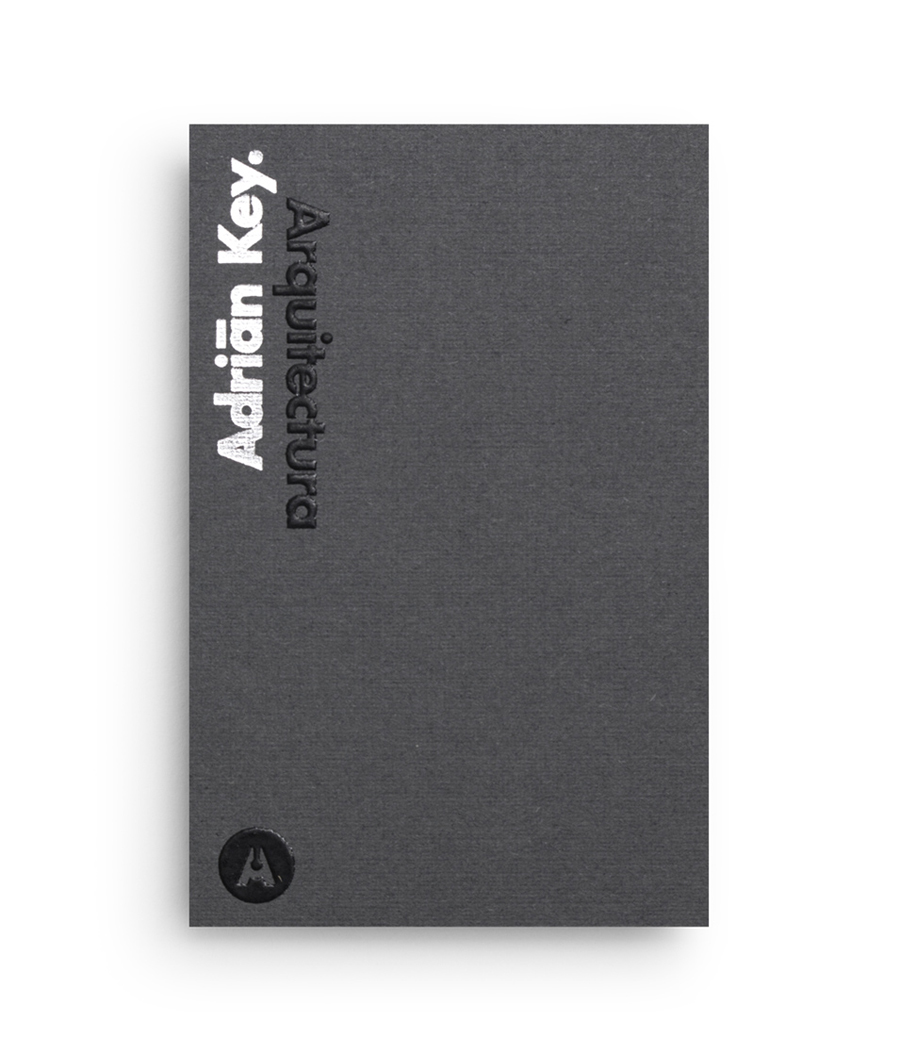
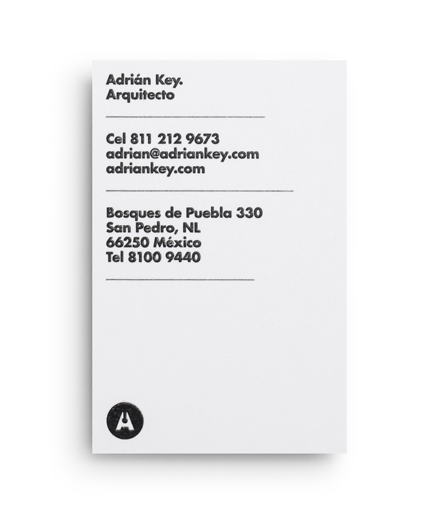
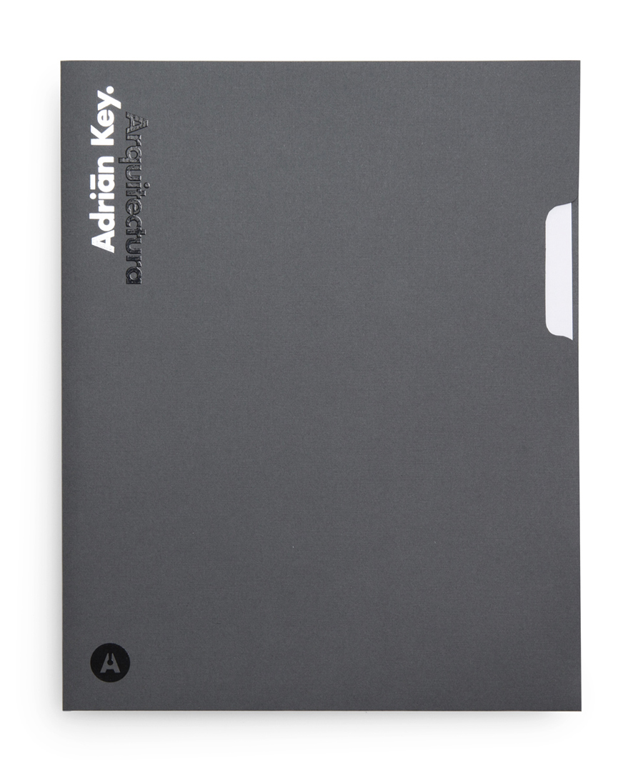
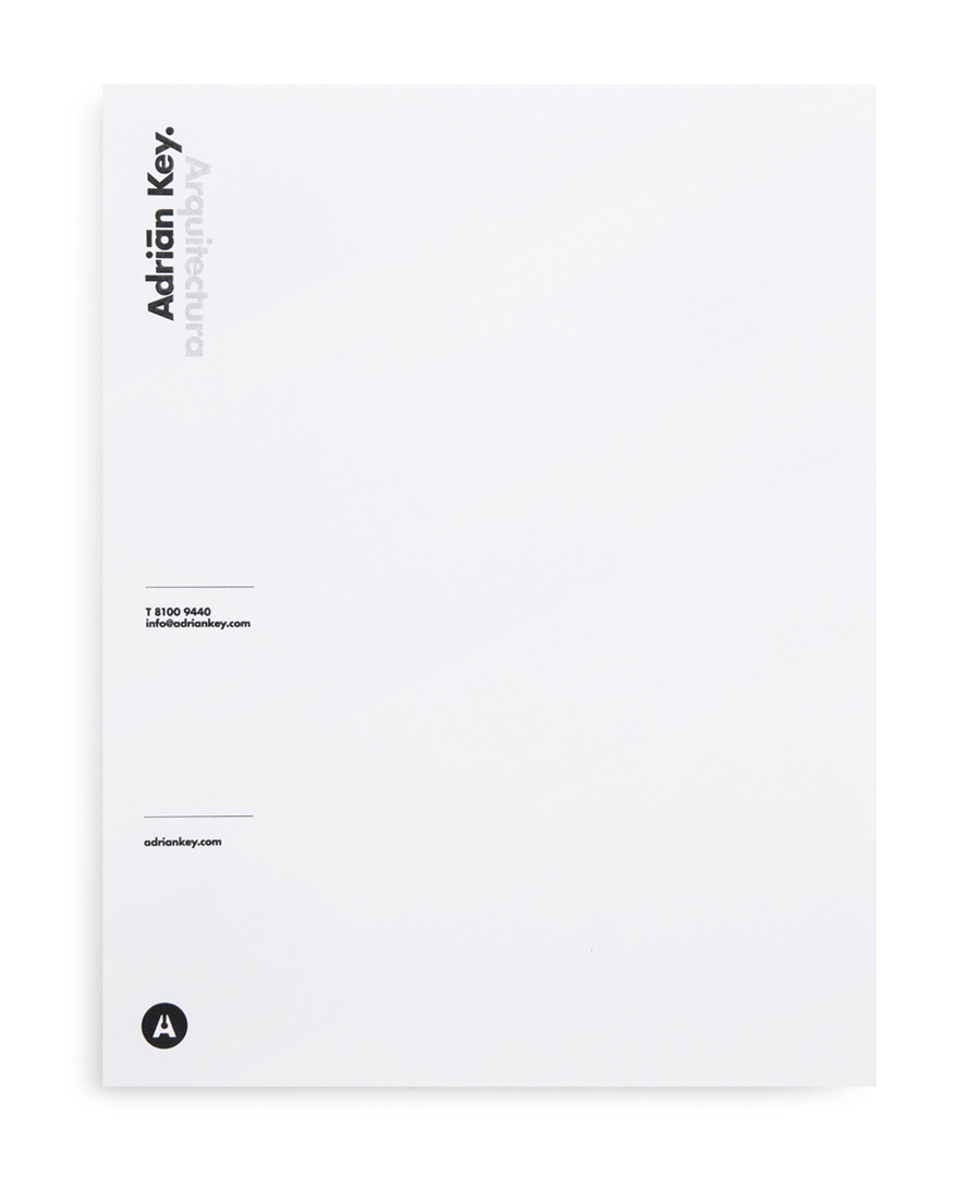
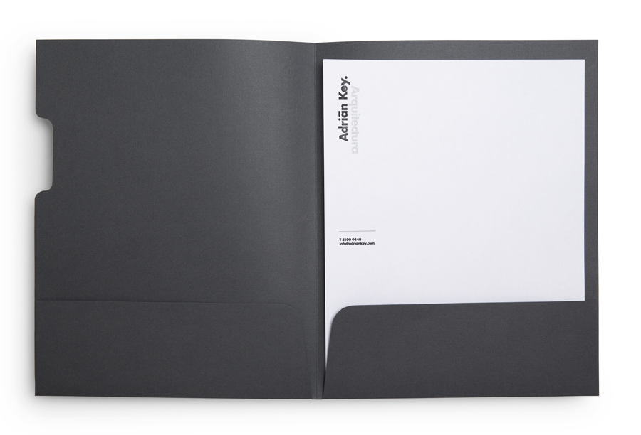
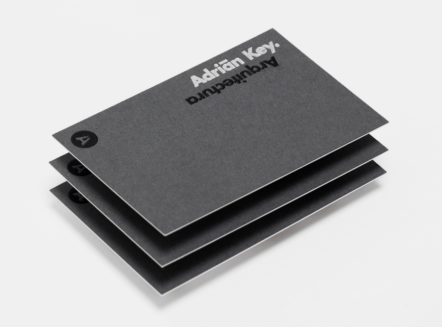
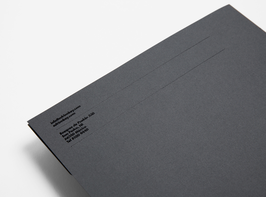
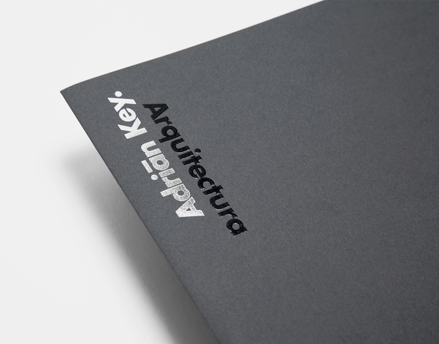
Adrián Key is a San Pedro based architecture firm and architect working with the rich and famous from “one of the most exclusive corners of northern Mexico”. Design agency Face Creative developed a new visual identity for the firm with a “clean, simple aesthetic with bold and modern touches, an icon that cleverly encases the name of the brand in its design, and a collection of stationery that reflects the brand’s focus on material and layout excellence”.
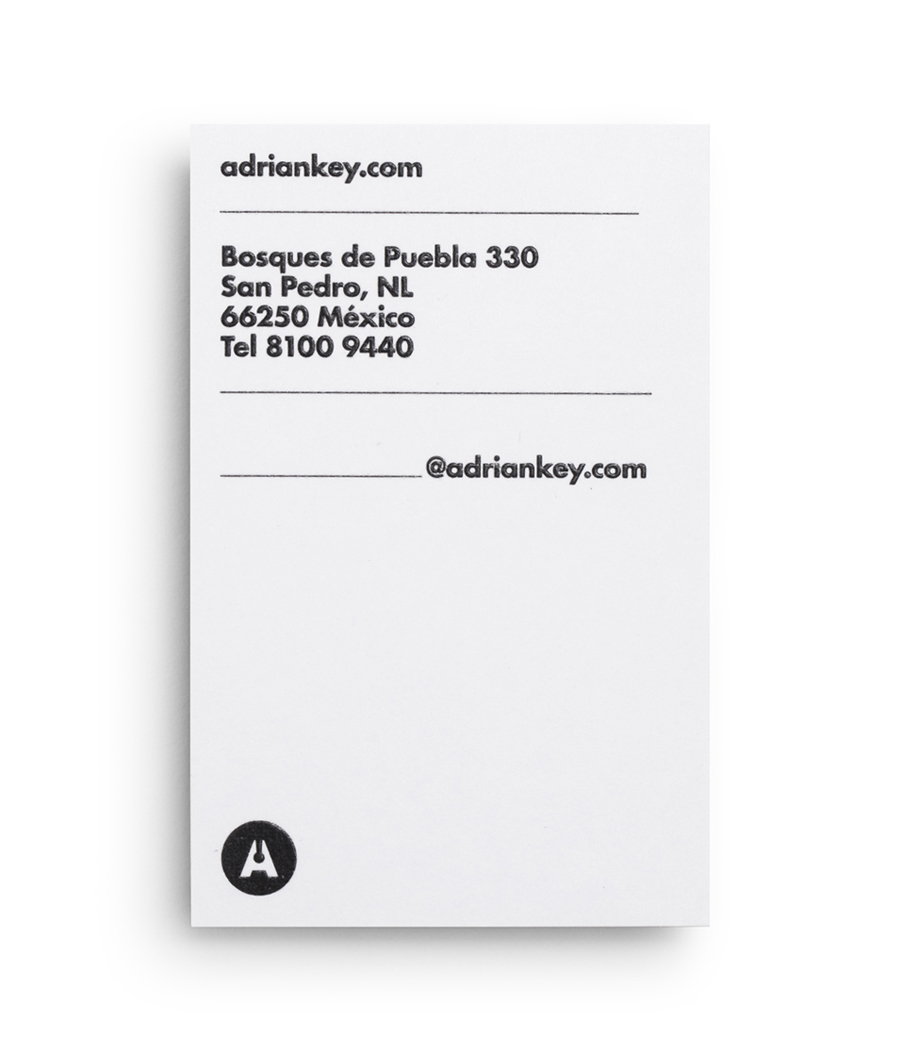
Face’s solution takes the bold and efficient qualities of a sans-serif logotype, a choice typically utilised within the industry, and gives it a distinctive and unusual high rise sensibility in its vertical orientation – an approach that continues to resonate through the stacked and portrait layout of the collateral. Executed with the high tactile quality of a raised thermographic ink, the shine of a silver foil print finish and set across the cool concrete grey and fine fabric-like detail of the duplex business card and folder, the visual identity feels communicatively multi-faceted, managing to neatly resolve Adrián Key’s modernistic philosophies and keen eye for material quality.
