Vibe Select by Studio Constantine
Opinion by Richard Baird Posted 26 September 2013

Vibe Design Group are described by Studio Constantine, the design studio behind the brand identity of Vibe’s new sub brand Select, as a “multi award-winning Melbourne based architectural design practice” who produce “fiercely contemporary and conceptual buildings for the top end of the Australian residential market.”
Studio Constantine worked with Vibe in the process of “productising and branding a new consulting service, parallel to the main design practice” intended to “open up Vibe’s design thinking and experience to a design conscious market that would normally be prohibited by budget” through a service that “comprises of a 2 hour troubleshooting consult, a package of tailored reference and inspiration material, and an introduction to a network of high-end suppliers, built over years of experience in the market. All for a set price.”
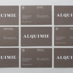
The studio describe their design solution as needing to “relate to the pre-existing Vibe Design Group aesthetic and identity, yet sufficiently separate to distinguish the consulting service from the design practice” which was achieved by typographically referencing the Vibe identity through a lowercase ‘select’ and utilising a monochrome colour palette to keep the whole suite ‘understated’, ‘stylish’ and ‘contemporary’.
The typographic limitations imposed by the parent brand are evident within the logotype, although well-spaced the letterforms of Avenir appear largely without character where perhaps it could have benefitted from some small detail that reflect the philosophies of the business. However, the juxtaposition of all uppercase logotype and all lowercase superscript establishes a clear duality, is subtly expanded upon in print, and provides a distinction between contact information and the names of each contact. This also works well to balance a sense of accessibility (a key component in Vibe’s new proposition) with a familiar corporate formality.
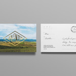
A bold serif with a notable combination of fine and heavy line widths, a black card with a white ink screen-print finish, and an unusual mix of landscape and portrait business cards continues to develop the duality and contrast established by the logotype as well as high quality, while the full bleed photography across the brochure adds a layer of finer detail and colour.
Design: Studio Constantine
Opinion: Richard Baird
Fonts Used: Avenir