Alquimie by Thought Assembly
Opinion by Richard Baird Posted 30 September 2013
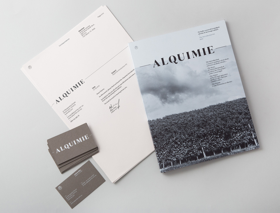
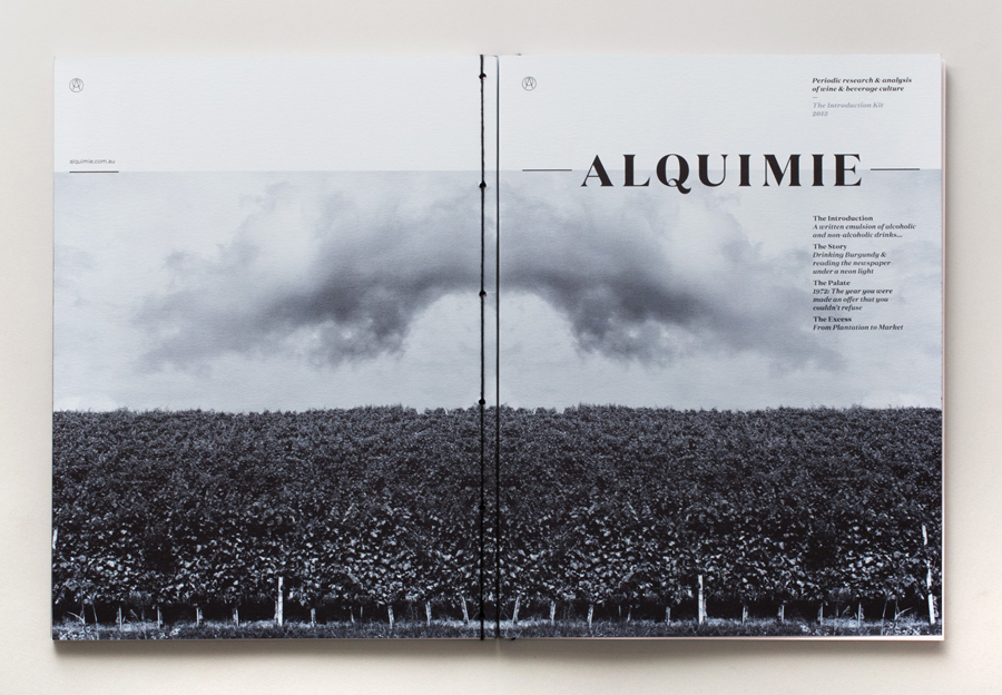
“Released quarterly as a printed magazine, Alquimie is a written emulsion of alcoholic and non-alcoholic drinks. Covering wine, beer, spirits, bitters, coffees and other solutions of interest; Alquimie explores the liquids themselves — their origins and stories. Working with photographer James Morgan, the inaugural edition of Alquimie included over 160 images across 152 pages.” – Alquimie
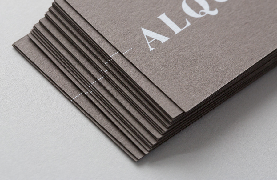
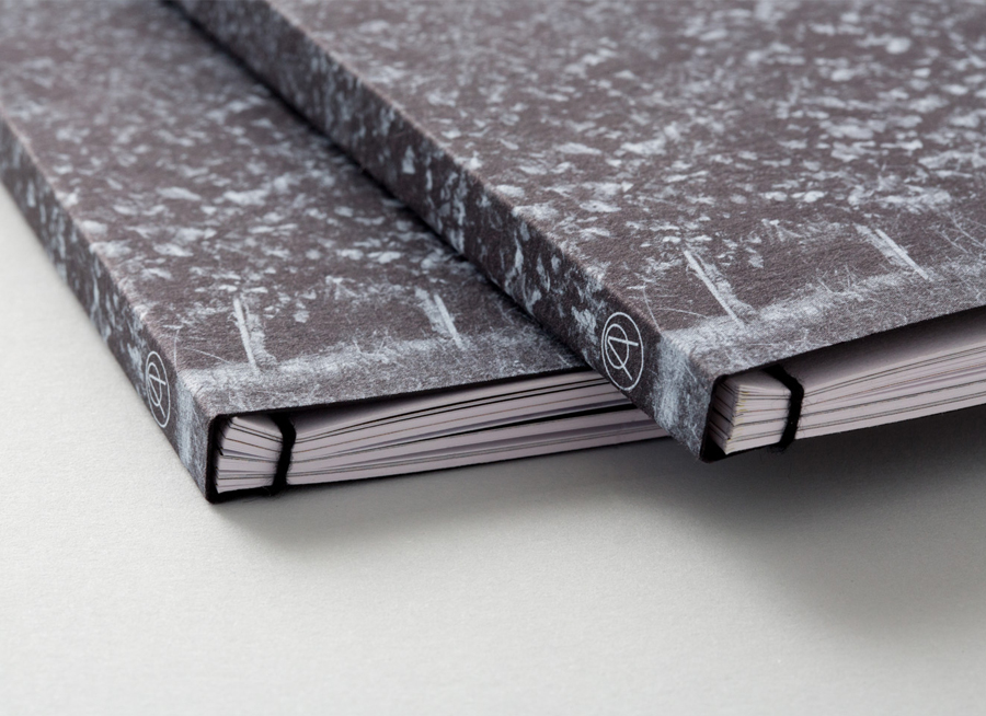
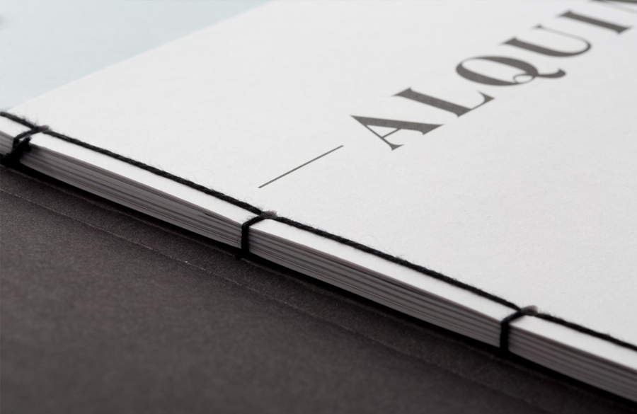
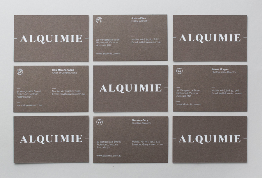
Melbourne based graphic design and visual communications studio ThoughtAssembly, responsible for developing and managing Alquimie’s name, brand identity, print and art direction, utilise the thick white ink and warm concrete grey substrate of the business cards, a traditional, open, hand-sewn detail of the magazine, tinted photography and the well spaced uppercase serif characters of the logotype to hint at the history and craft the publication looks to uncover, its authority and high quality.
