September’s Top 5 Projects 2013
Opinion by Richard Baird Posted 1 October 2013
September’s highlights included two new projects from Bielke+Yang, new architectural brand identities from Studio Constantine and Commando Group, as well as new packaging from Victor Design and Bond.
However, there were five projects that really stood out for me this month that have made it into BP&O’s top five, a feature that brings together what I believe to be the most interesting of the month for another opportunity to be seen and shared. These include an interesting brand identity project from Werklig that leverages the equity of established stationery brands to convey quality, the laser cut scorched paper detail employed by Hey to convey the heat and craft of glassware manufacturing, and the illustrated detail utilised by Bureau Collective to convey the personal bar service provided by Cocktails & Bitters. I have ordered these from five to one with my favourite project presented last.
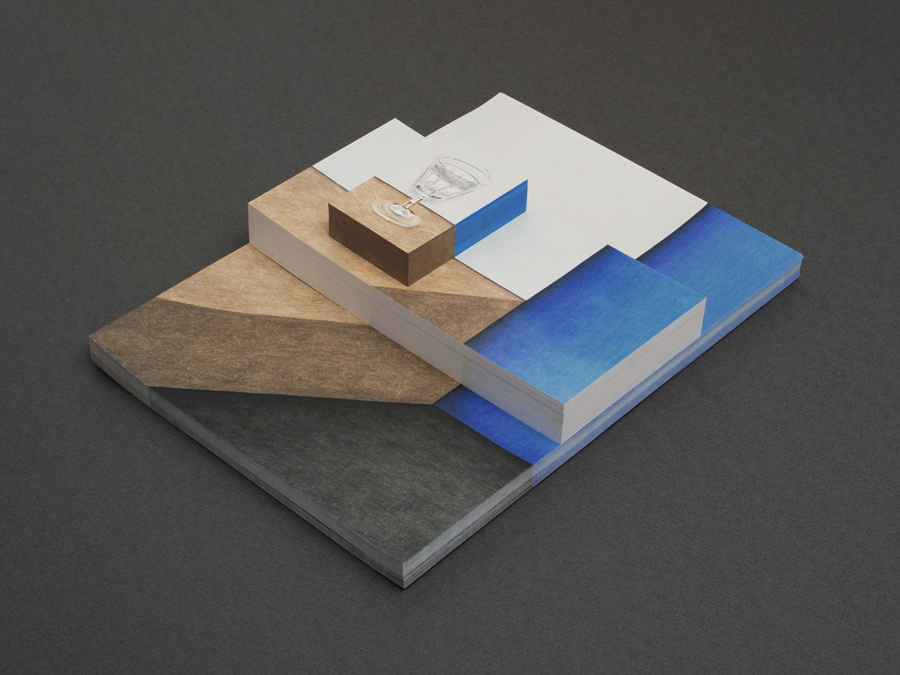
Cocktails & Bitter is the identity of professional Swiss bartender Philipp Grob whose service is described by Bureau Collective, the design agency behind his new visual identity, as a “special and individual bar experience” “for gourmets, connoisseurs and explorers.”
Bureua Collective’s solution, which includes a logotype, straightforward typography and illustrative detail created by Janine Wiget – the antithesis of the noise, bustle and slick impersonal finish of modern cocktail bars – focuses on an individualised and crafted experience with a personal touch that works well to convey the “classic art of cocktail preparation”
Read the review here.
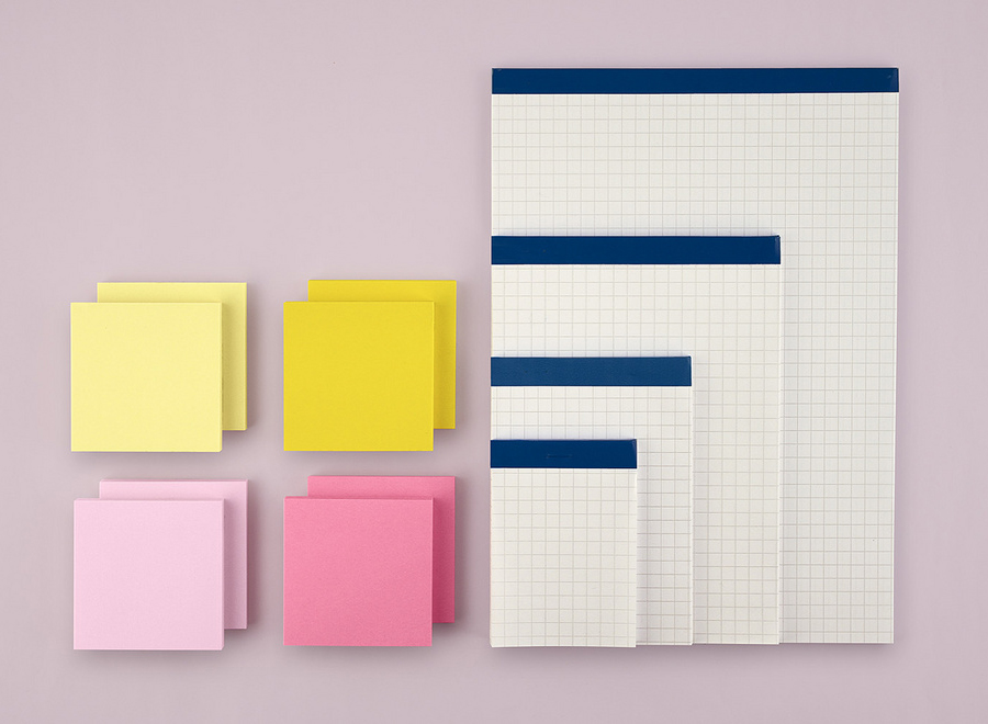
Created by consultant Ray Lindberg with the intention of setting new standards for flexible work environments, Kontoret provides low-cost office space by the hour with wireless internet, printers and coffee, to freelancers, chief executives, local business and international travellers in the centre of Helsinki.
Inspired by the “essence and basic needs of office work and the aesthetics of the classic office environment”, design agency Werklig created a new grid-based identity for Kontoret that includes a logotype, a custom set of icons and utilises branded office tools such as Bic pens, Post-it notes and Stabilo Boss highlighters to establish a “brand identity with a strong link to the traditional office environment with a minimalist Scandinavian twist.”
Read the review here.
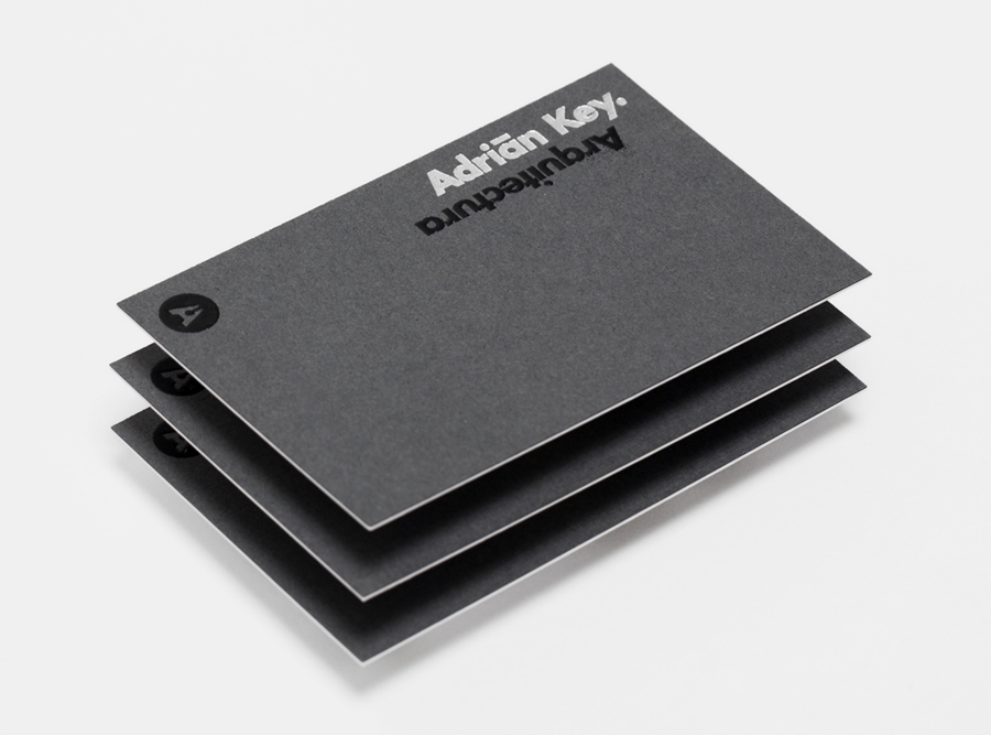
Adrián Key is a San Pedro based architecture firm and architect working with the rich and famous from “one of the most exclusive corners of northern Mexico”. Design agency Face Creative developed a new visual identity for the firm with a ”clean, simple aesthetic with bold and modern touches, an icon that cleverly encases the name of the brand in its design, and a collection of stationery that reflects the brand’s focus on material and layout excellence”.
See more here.
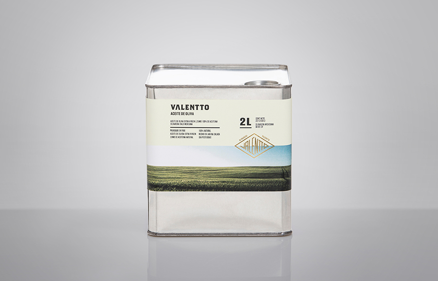
Valentto is a Mexican cold-pressed virgin olive oil produced by Olivarera Italo-Mexicana – a Mexican Italian collaboration – created for commercial kitchen and restaurant use. Multidisciplinary design agency Anagrama recently developed a new brand identity and packaging solution for Valentto that juxtaposes the natural detail of Italian landscapes alongside the industrial utility of a square tin structural choice, described by Anagrama as being “reminiscent of an old-school automobile oil canister”, to reflect the origins of the company, the natural quality of the oil and its target market.
Read the review here.
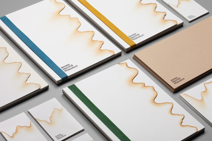
Jeremy Maxwell Wintrebert is a glassware designer and manufacturer currently working in France with a free hand glass blowing philosophy mastered while traveling internationally across the US and Europe. Spanish design agency Hey recently developed a new visual identity solution for Jeremy that captures the heat, craft and art of glass blowing through a smart combination of colour and laser cut detail that gives the print work a scorched paper quality – an interesting way to capture the process of molten glass manipulation – the craft qualities of uncoated unbleached materials, coloured rubber bands and hand emboss detail and the juxtaposition of a stencil based industrial utility cut into the classic detail of a serif type choice.
See more here.

