Creagent by Bond
Opinion by Richard Baird Posted 3 October 2013

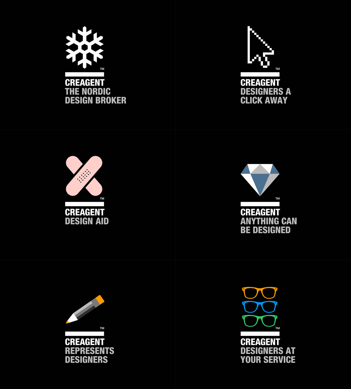
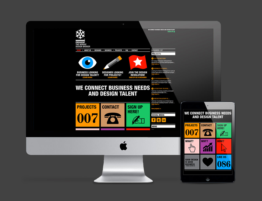
Creagent is a Finnish ‘design broker’ that provides a “unique pool of talented designers from all fields and a wide range of expertise to match various business needs.” Creagent’s new brand identity and website, developed by multidisciplinary design studio Bond – currently on a roll with new work for Allsorts and the University of the Arts Helsinki – utilises a bold, brightly coloured set of pictograms and sans-serif slogans to “communicate the value of design.”
The pictograms for the most part are well rendered and coloured, the representative mix of Creagent’s Nordic scope and the ‘value of design’ are, without the slogans, communicatively a little loose, perhaps a touch generic and lack some of the wit of Designers Anonymous’ similarly styled brand identity. They are however cohesive in their illustrative simplicity, work together particularly well across the website and, in conjunction with the heavy, condensed, uppercase sans-serif – a choice that neatly mirrors the bold qualities of the pictograms whilst tempering their more playful nature with a subtle and efficient corporate sensibility – manages to make the service appear distinctive and accessible to both creatives and businesses looking to acquire creative talent.

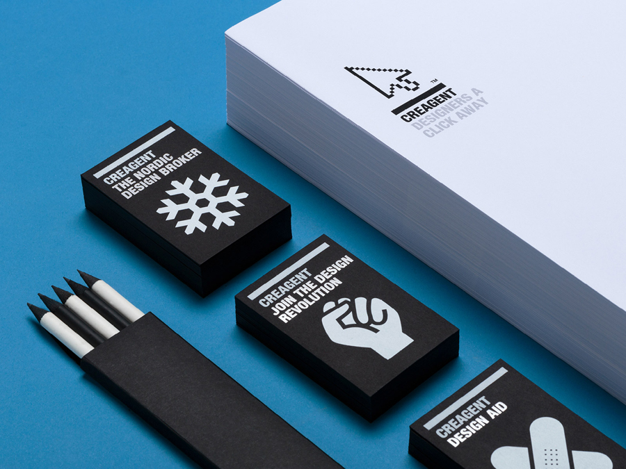
In print colour is lost in favour of a white and grey ink across a weighty black board, a combination that adds a tactile high quality to the identity whilst retaining the pictogram’s impact through their confident oversized application. Overall the concept is straightforward and absent subtlety but its 50/50 balance of graphic and typographic communication achieves a solid equality between creativity and its management.


