No. Six Depot by Perky Bros
Opinion by Richard Baird Posted 4 October 2013

“No. Six Depot is a family owned, small-batch coffee roaster and café nested in the beautiful Berkshires. Located in a historic train station on 6 Depot St, they serve teas, salts and coffee from small farms and roast on location. Their identity [designed by Perky Bros] juxtaposes a mix of unique rural and modern elements — drawing inspiration from their own backyard railroad and unique approach to keeping it simple and making it true.” – Perky Bros.
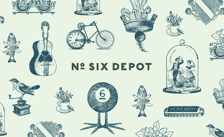
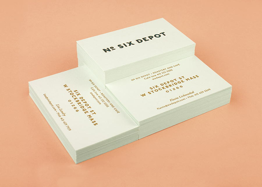
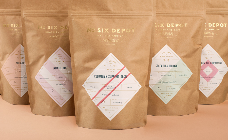
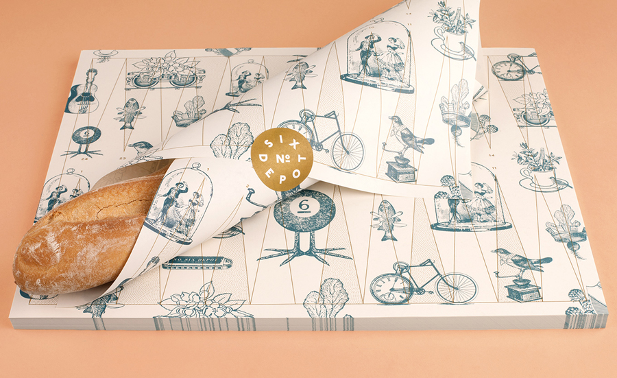
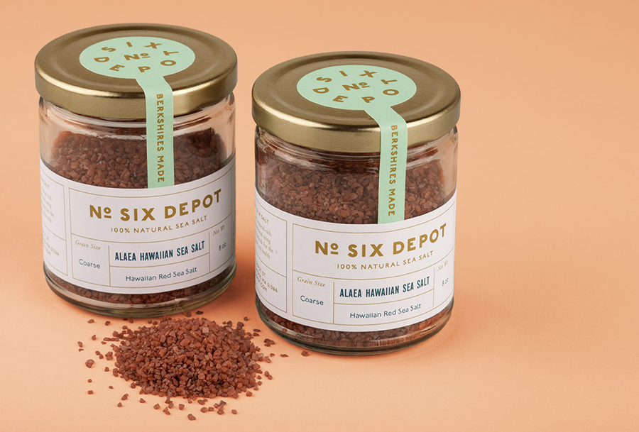
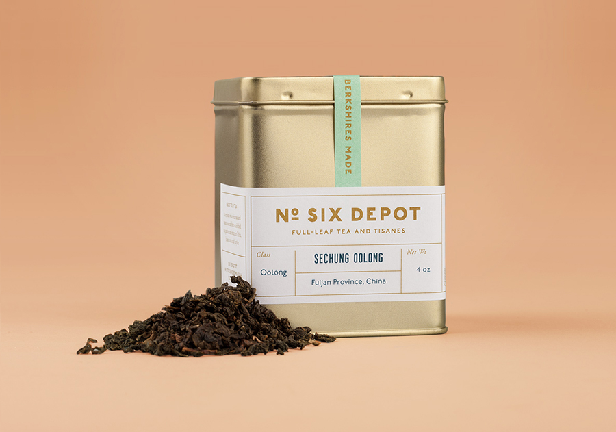
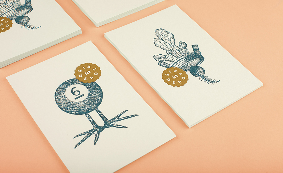
Perky Bros’ work for No. Six Depot is a fantastic example of a multi-dimensional brand identity design. The extent of the detail is impressive with each element, be that graphic design, material choice or print finish, contributes to a broad but cohesive whole. It is difficult to pick out a dominant feature as each is well-balanced but it is perhaps the illustrative work and the density of its rendering that really stands out. While the quirky compounded nature of these is a familiar direction they deliver plenty of character and have what looks like a period authenticity in the mix of stamp texture, etched detail and hand drawn elements, set out with a good eye for space and colour and works well as a clear reflection of traditional craft values.
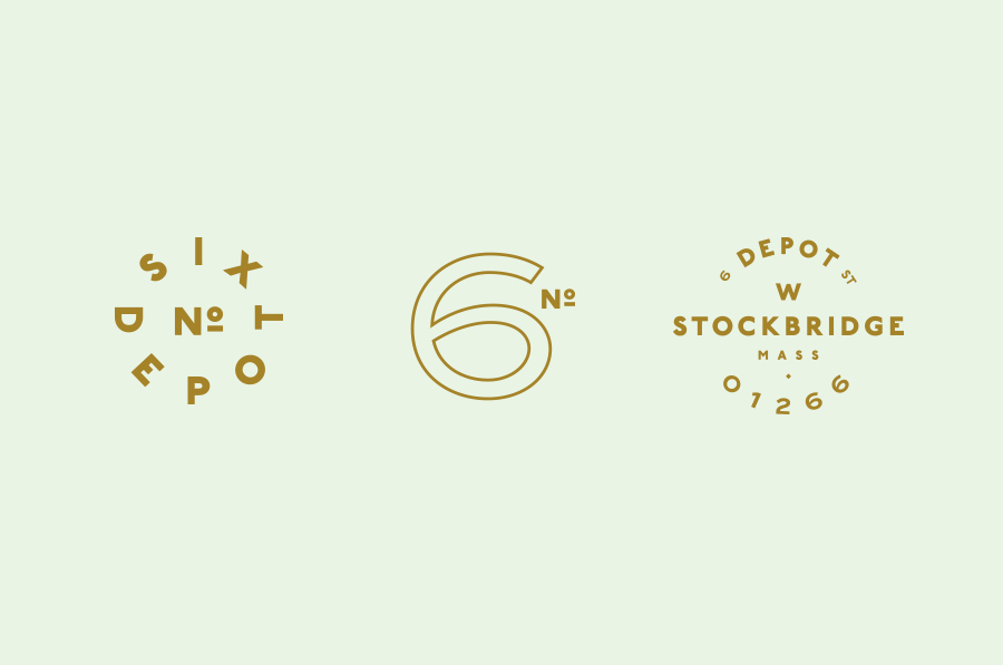
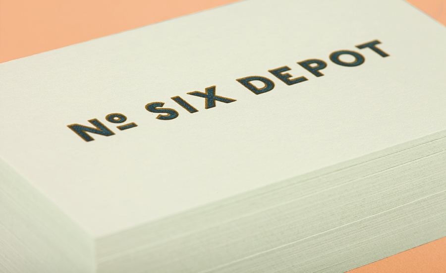
The generous spacing, ubiquitous underline detail and radial baselines of the sans-serif typography, although having a distinctly retrospective simplicity and structure, appear contemporary and on-trend in its application and precise execution, offering a good mechanical, industrial and functional contrast to the organic hand drawn detail of the illustrations.
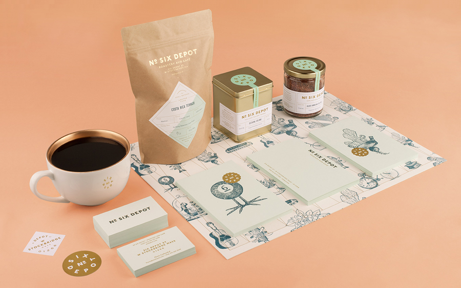
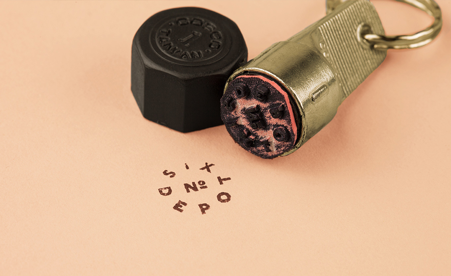
Stamps, stickers, unbleached uncoated papers, letterpressed green pastel substrates and blind emboss all contribute to a strong sense of craft, local industry and a slight homespun utility in the ease of the label’s application across the packaging, whilst retaining an overall high quality that also resonates well through the structural choices and utilisation of gold foil and metallic ink.
The result is a confident combination of familiar and understandable design cues that clearly draws inspiration from the past but gives each a contemporary polish and a collective, communicative cohesion.
Design: Perky Bros. Opinion: Richard Baird. Fonts Used: P22 Underground, Montefiore & Adobe Garamond.
