Checklist by Anagrama
Opinion by Richard Baird Posted 9 October 2013

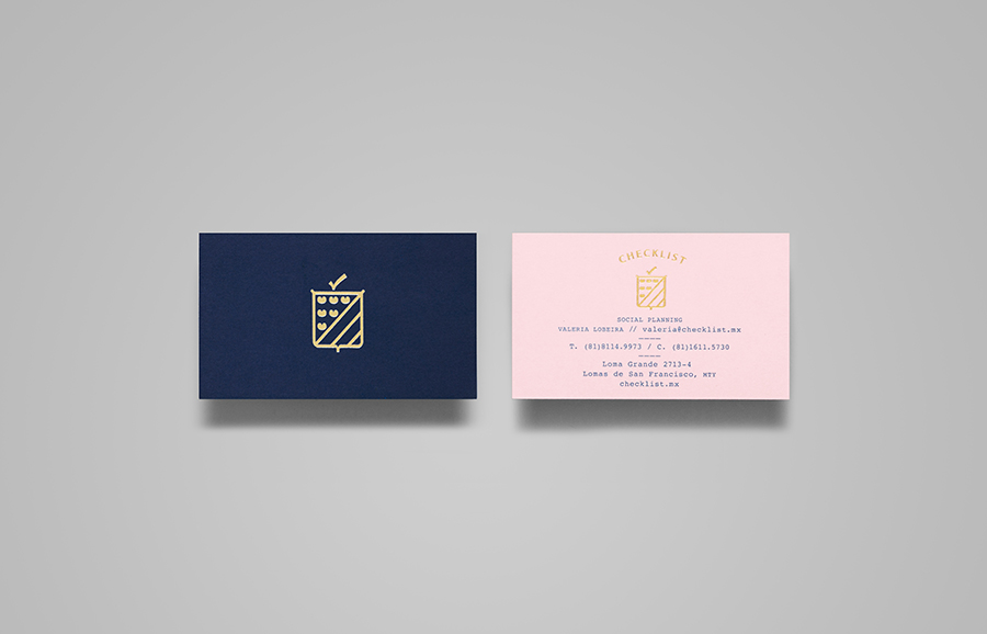
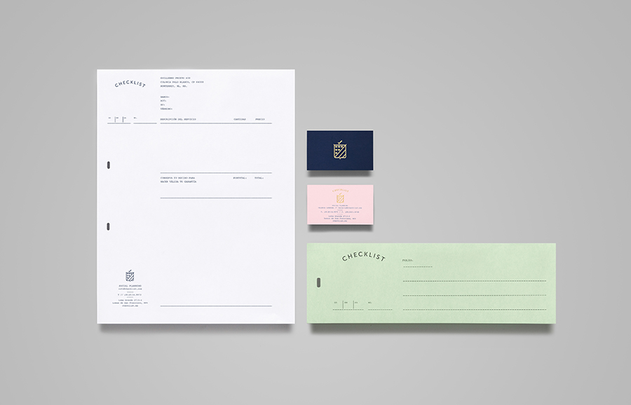
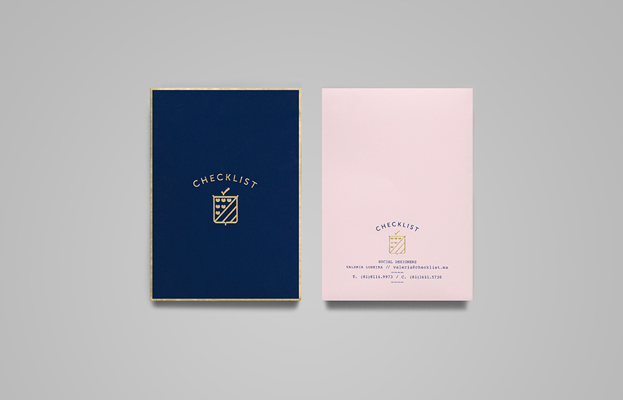
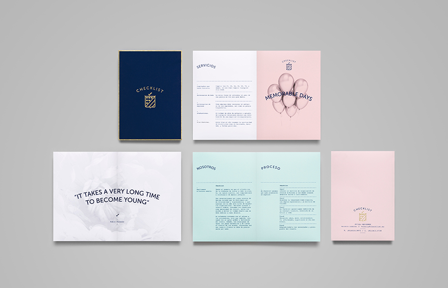
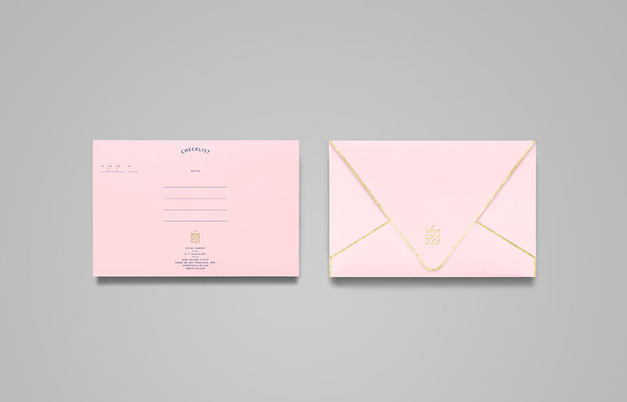
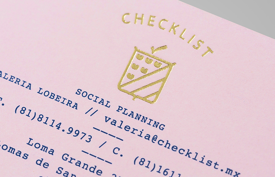
Checklist is a Mexican event planning business that specialises in ‘milestone occasions’ such as birthdays, anniversaries and graduations as well as corporate events. Checklist caters ‘exclusively for their client’s unique needs’ and can also provide options that are environmentally friendly. Design agency Anagrama recently devised an ‘institutional’ visual identity solution for Checklist that mixes the age and authority of a heraldic shield, the premium aesthetic of a gold foil print finish, the playful craft qualities of pastel coloured papers and the utility of a slab-serif typeface.
“The combination is meant to convey commitment and trustworthiness, but with a youthful feminine touch that ensures that every detail is never overlooked but always cared for. The pastel colors are gentle, cozy and soothing, the deep blue serious and convincing. The type selection, reminiscent of 1950’s secretarial typewriting, goes hand in hand with the conservatory institutional and feminine attention to detail concept.” – Anagrama
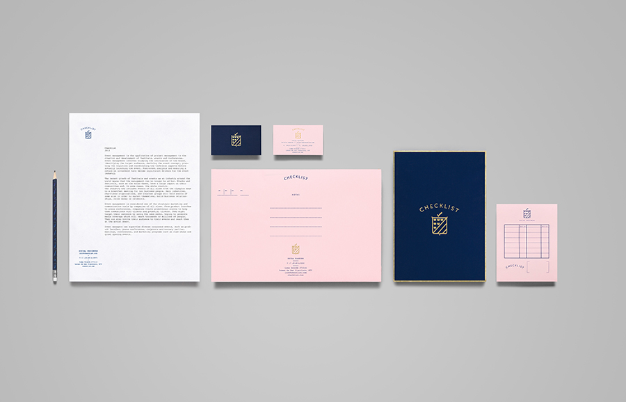
The eco-option really stands out for me as a unique service proposition but unfortunately it appears absent from Anagrama’s visual identity solution. However, like a lot of their work, there is still a good level of communicative detail and aesthetic distinction. There is something in the way that the agency have rendered and executed the logo-mark – in particular the unusual form of the hearts – that gives it an authentic sense age which works well to convey experience in a universal manner. The checkmark, a contemporary detail, has been worked into the shield well without compromising the retrospective aesthetic.
The coloured papers for me have a bit of duality, Anagrama have utilised them to introduce what they describe as a ‘jovial’ and famine quality but these particular tones remind me of tax forms, a sensibility that also resonates through the use of a typewriter typeface and a fairly neutral, generously spaced, uppercase sans-serif, lending the identity a subtle utility. The gold introduces a straightforward and understandable high quality that, executed across the pastel paper, appears a little unusual but very distinctive.
