Meteorologisk Institutt by Neue
Opinion by Richard Baird Posted 18 October 2013
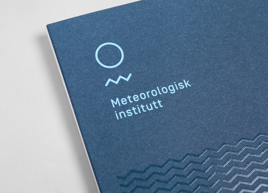
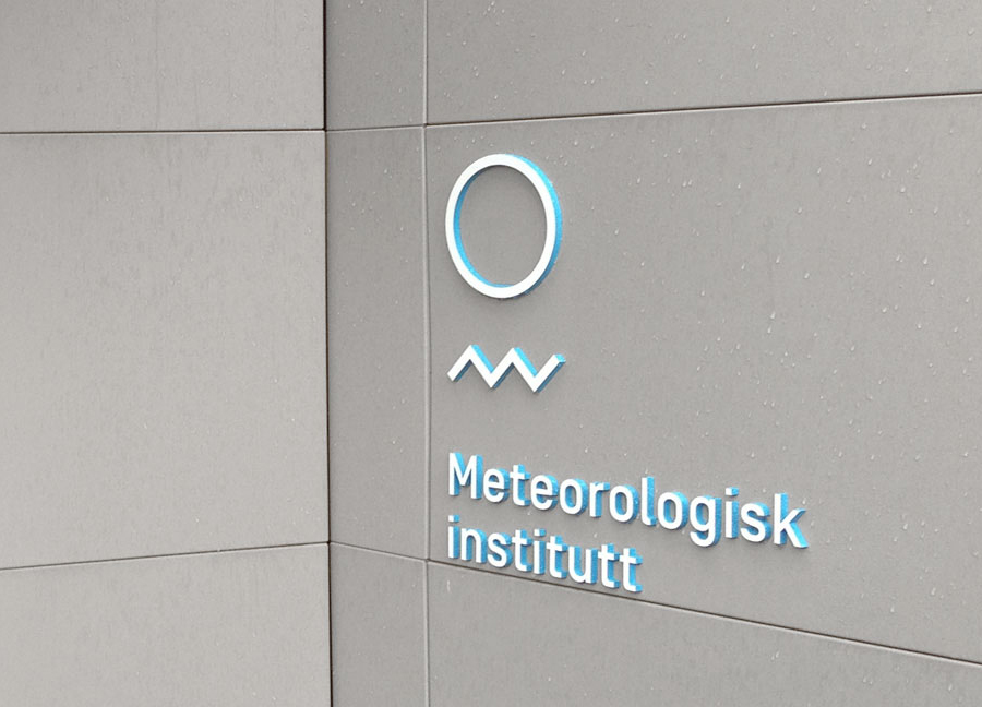
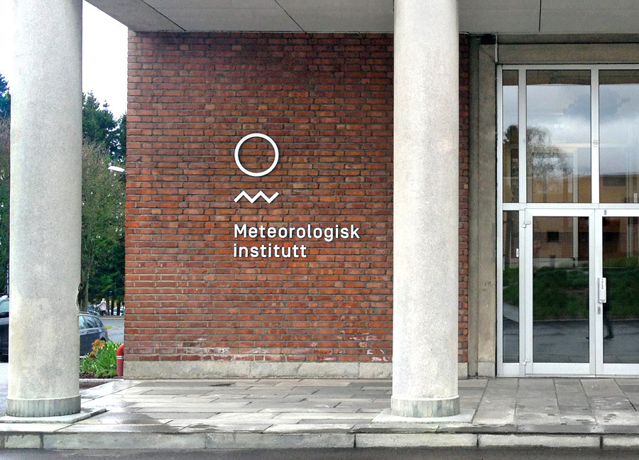
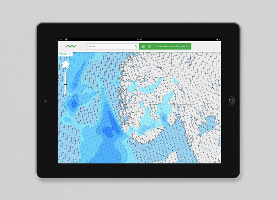
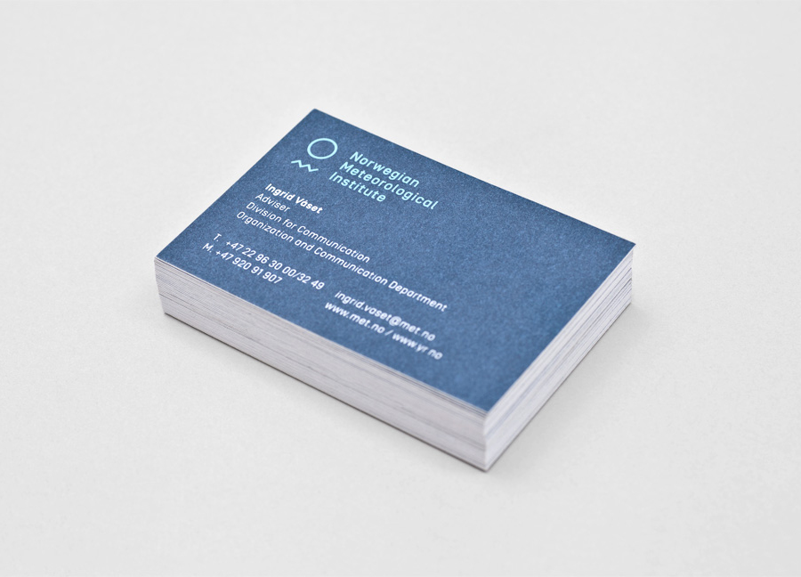
Meteorologisk Institutt provides meteorological data to Norway’s military, civil services and the general public with the intention of safe guarding life, property and the environment. Design agency Neue developed a new visual identity solution for the institute that mixes geometric shapes, material and print choices and the humanistic and environmental detail of photography to achieve communicative and aesthetic contrast and capture the data drawn from the harsh Nordic weather and the impact its gathering has on the people of the country.
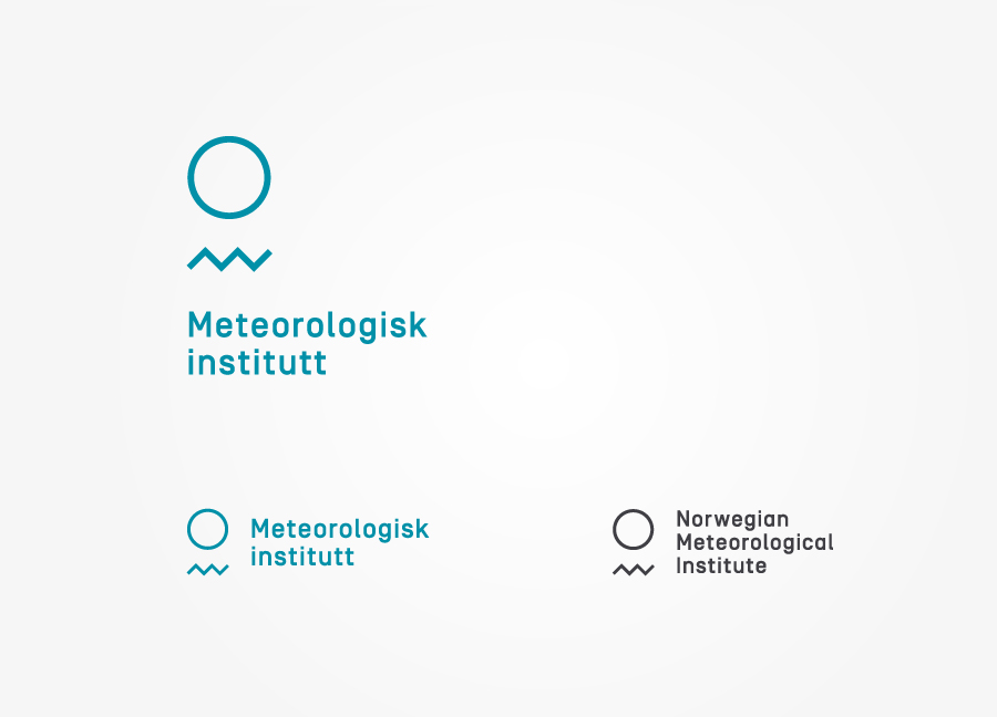
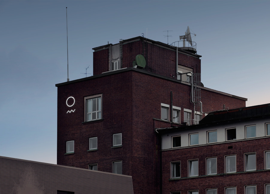
Although Neue attribute the sun, moon, sea and mountains to its forms, the two components of their new identity system functions equally well as an elemental distillation of the earth and the free-flowing data that emerges from it. There is a lovely contrast and communicative duality created by the smooth curves of the earth and the sharp peaks of the saw wave that although I might be reaching have a sense of fine and stormy days, low and high data traffic periods. These basic geometric shapes resonate well through the sans-serif characters of the typography with a technological efficiency and a similar cohesive single line weight and solid sense of space.
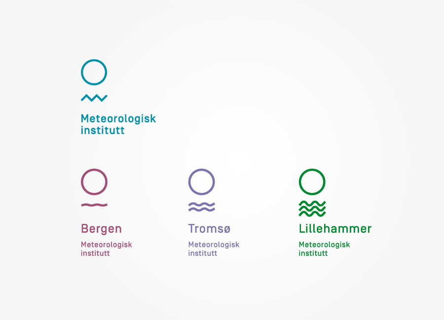
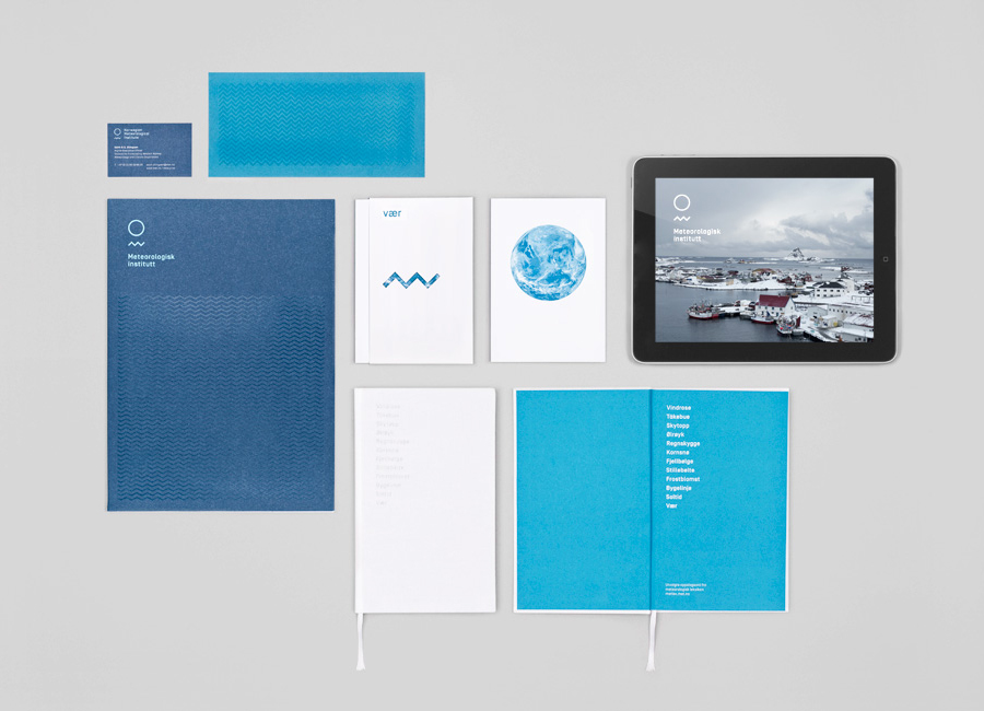

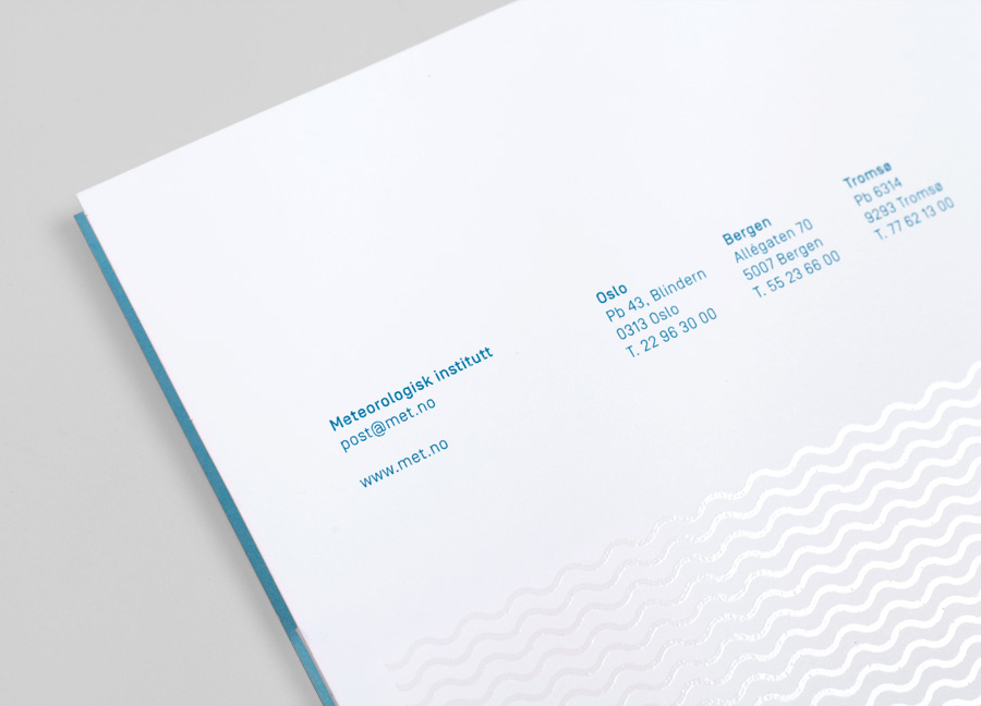
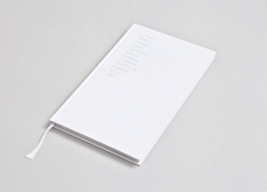
The print work adds a second layer of detail by utilising a number of interesting material and print finishes. For me, choices like the UV varnish (the glassy surface of the sea), blind deboss across a white book cover (foot prints set in the snow), uncoated boards and papers (rough and natural textures) and the slightly weathered blue ink hint at Nordic weather conditions and environment in a nuanced, intelligent and interesting way. This reflection of environment continues through a cold colour palette of icy and deep sea blues and greens, and the snow white and cloudy grey of the photography.
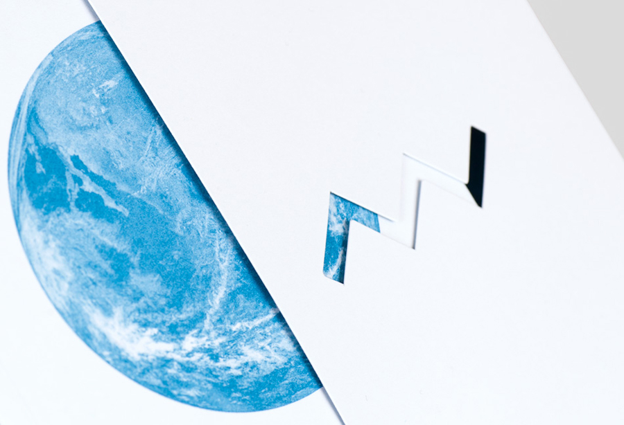
The die cut window of the folder creates a smart sense of data flow as its contents is added and removed, reinforcing the communicative value of the elelement utilised within the logo.
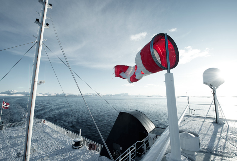
The photography provides fine organic detail to the structure of the logo. These works well to highlight the environmental complexities reduced down into manageable and understandable data streams embodied by the logos. The images above and below, while only two of what may well be a series, are appropriately reflective of some of the situations the data is utilised.
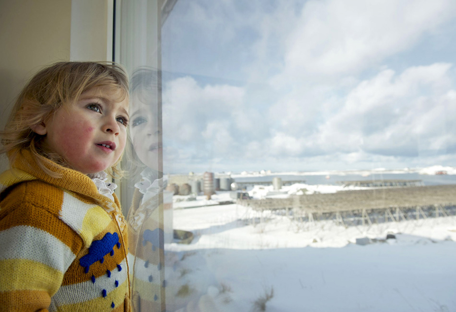
An image of the child perhaps provides the strongest communicative and evocative element of the Neue’s solution. It introduces a strong humanistic counterpoint to the cold data of the visual identity. The child looking out onto a snow covered field from the safety of the indoors is a very powerful distillation of both human vulnerability and the safety information provides.
Design: Neue. Opinion: Richard Baird. Fonts: Simplon.
