Partick Dental by Freytag Anderson
Opinion by Richard Baird Posted 21 October 2013

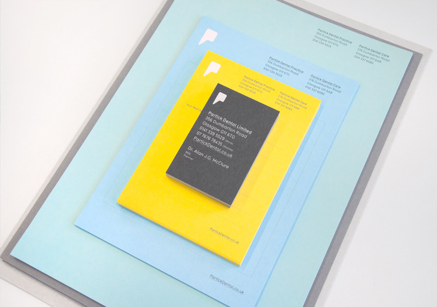
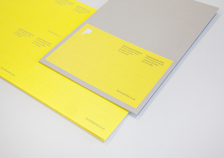
Design studio Freytag Anderson were recently commissioned by Glasgow based Partick Dental to create a “fresh and vibrant visual identity” for their local practices. The studio saw the opportunity to create a clear concept that would avoid the “usual clichés associated with the industry” and have an inclusivity that would strike a solid balance between minimal, contemporary, inviting and established, through a communicative combination of mark, type and material choice.
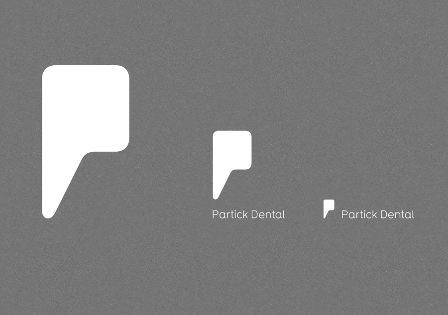
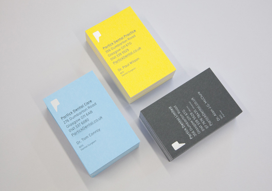
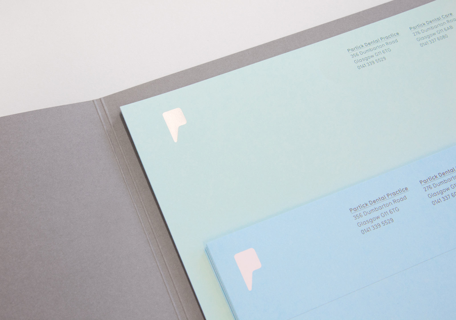
Based around a simple but clever mark that blurs the lines between a P, speech bubble – perhaps a nod to consultation – and a tooth, Freytag Anderson’s solution establishes a minimal but familiar foundation without appearing too literal or expected.
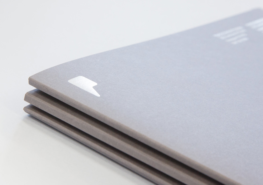
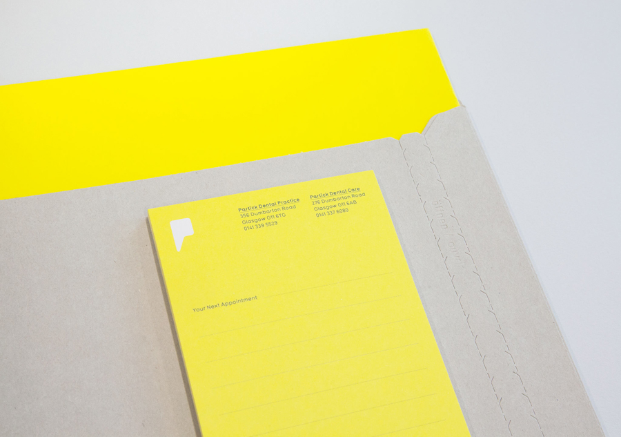
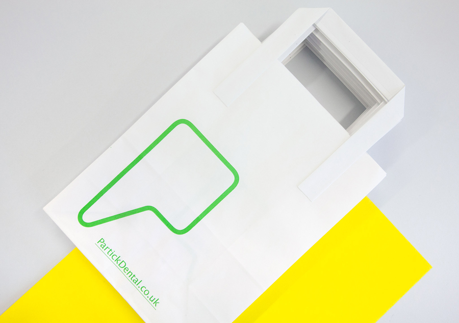
Although featuring prominently and consistently in print alongside a fairly straightforward approach to layout, the identity avoids appearing too logo-centric through the details of a light and underlined accompanying typeface – a choice that delivers contrast to the bold form of the mark and adds a layer of precision, technicality and authority – and a colour palette and material choice that, rather than a clinical white, mixes the fresh and minty sensibilities of green and blue pastels, the energy and vibrancy of a bright yellow, and the urban qualities of a light and dark concrete greys. The high quality of these dyed uncoated substrates is matched by a sliver/white print treatment, a detail more conventional in its presentation of cleanliness, but one that feels appropriate for a dental practice.
