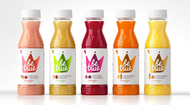
Be True Smoothies by Studio In
Opinion by Richard Baird Posted 30 October 2013

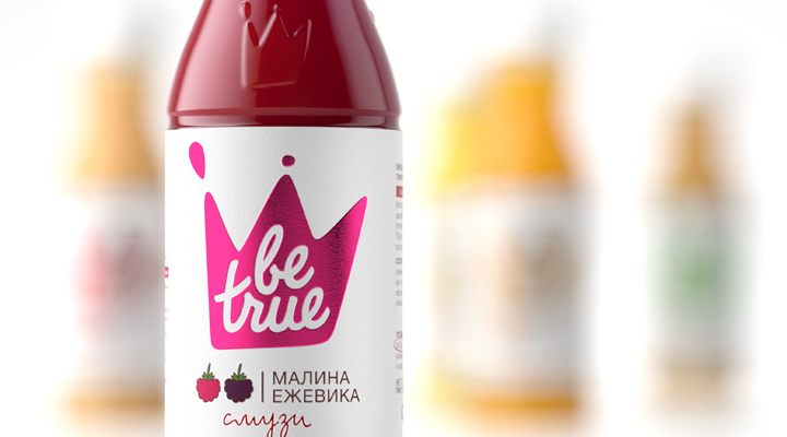
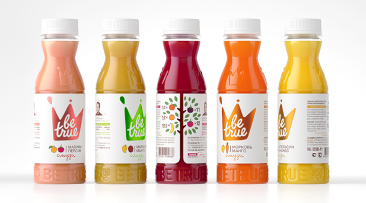
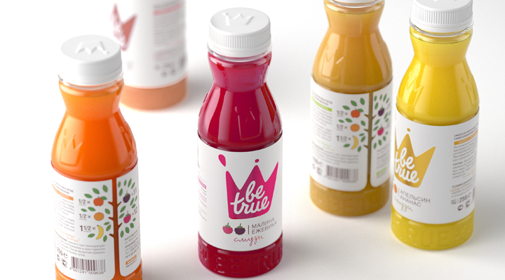
Studio In have recently completed the rebranding and repackaging of Russian smoothie brand Be True. The new design solution rightfully drops the Innocent-esque sketch and similar bottle choice in favour of a coloured foil splash and crown logo executed across a textured paper and a plastic structural design with raised surface detail. This combination of paper, print and structure, a union typically seen in the spirit category where spend is higher, is fused with the established and communicative industry conventions of organic form, a well rendered script logotype, hand drawn illustrative detail, bright contemporary colour and energy – enhanced by plenty of white space – as well as a neat, playful, die cut tree element to effectively convey honesty, natural ingredients and premium quality with a more proprietary finish.
