Pikseli by Werklig
Opinion by Richard Baird Posted 14 November 2013

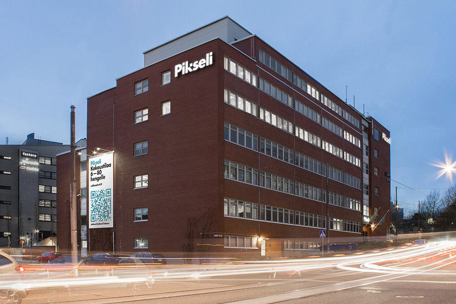
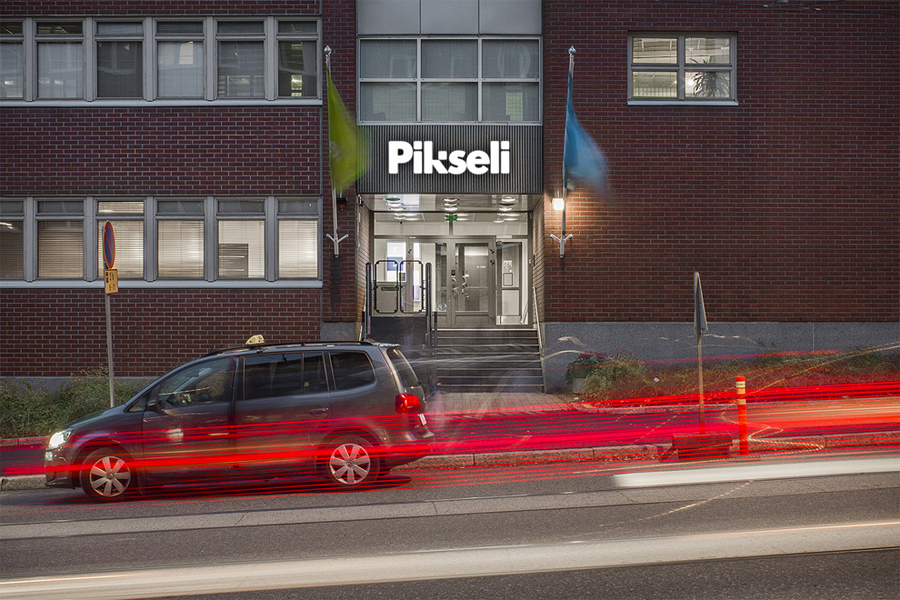
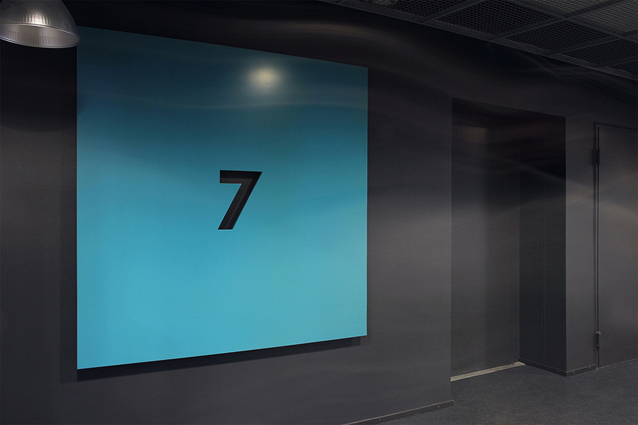
Originally built in the 1980’s by wireless pioneer Digita Oy, Pikseli is a building, located in the Vallila district of Finland’s capital city Helsinki, that provides office space to companies working within the digital industries. Design agency Werklig, commissioned to develop a new visual identity for Pikseli to attract new tenants, created a solution that takes the tiny universal screen unit of a pixel and gives it a bold oversized quality as signage throughout the building.
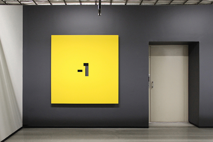
Seeking inspiration from the digital theme we concentrated on a “smallest” possible unit, the pixel (“pikseli” in finnish). And instead of going for the most obvious, pixelated images and patterns, we scaled the pixel up and turned it to the main element of our design. Every application of the identyty is based on one single pixel. And when going big, we went BIG. The square floor signs measure 1,6 meters per side and the facade of the building was decorated by the nation’s largest QR code directing passers-by to the website.”
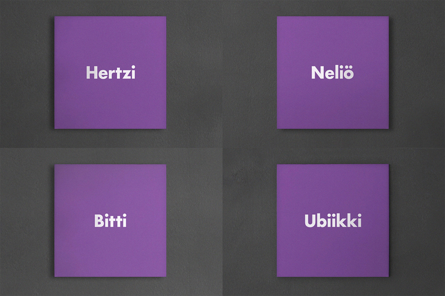
“The colour scheme was designed to partially fit the visual identity of Digita, presently occupying three of the eight floors of the building. The amount of colours was chosen according to the amount of floors in the building, and each floor was given it’s own colour. This is visible throughout the signage system.” – Werklig.

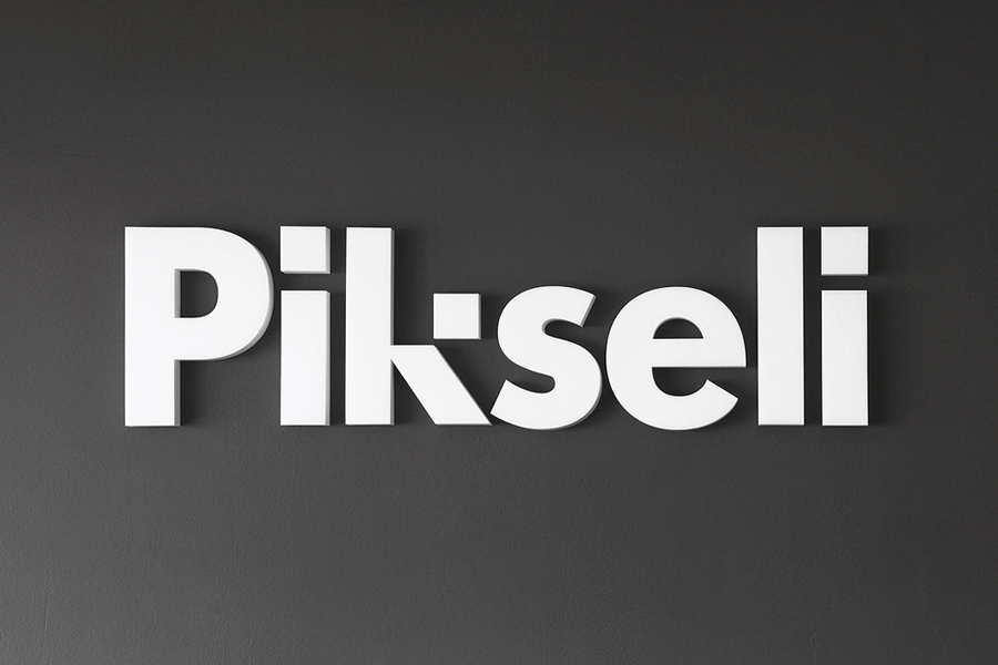
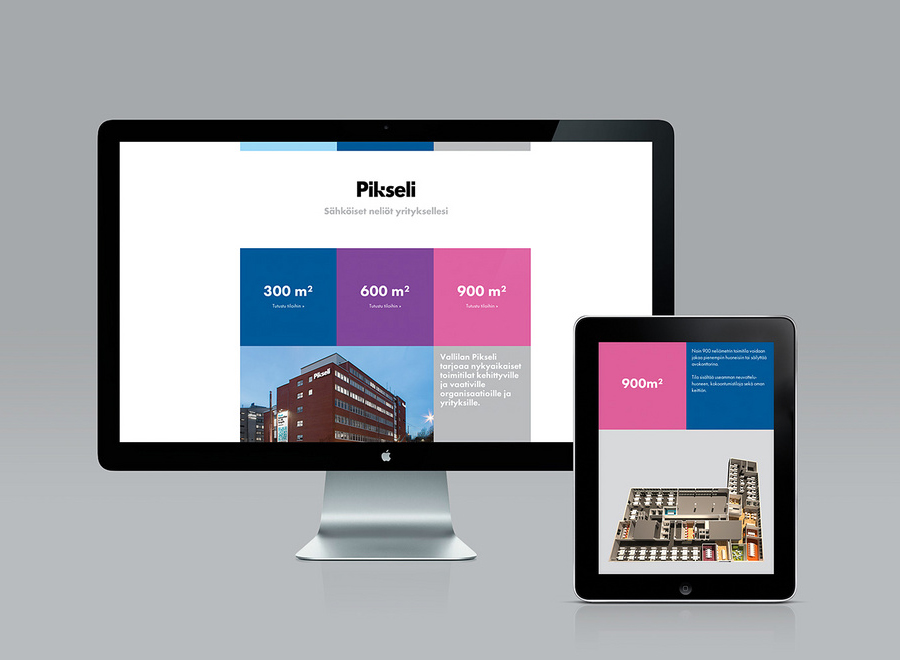
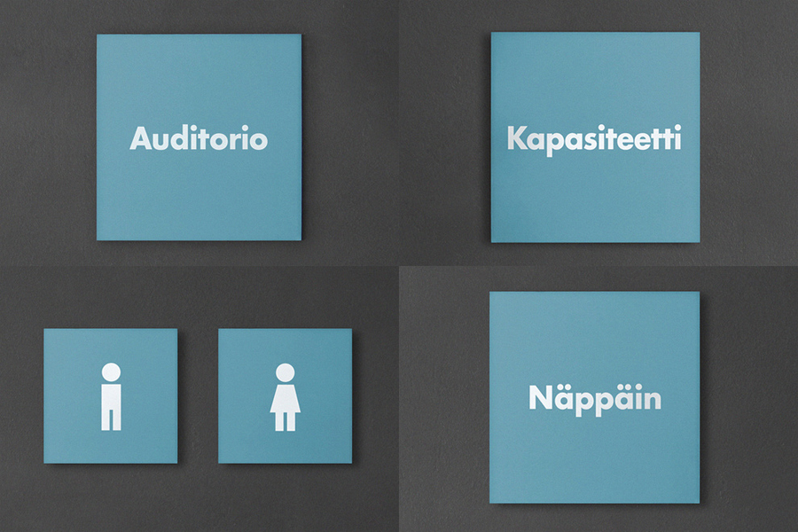
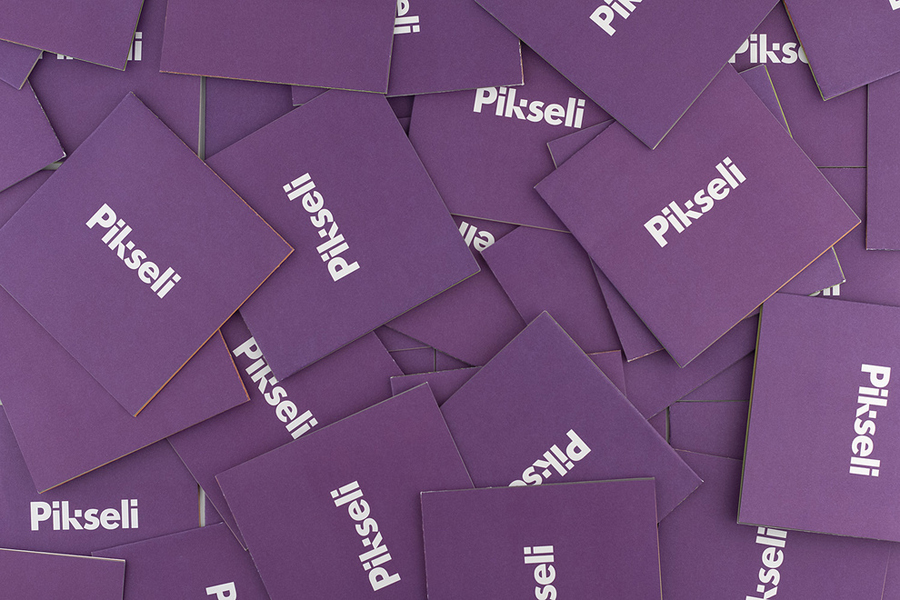
Werklig have done a pretty good job of extracting a creative and proprietary quality from a ubiquitous concept, from the simple pixel shift detail of a straightforward but well executed sans-serif logotype to the consistency of large square signage utilised on each floor of the building, the shape of the business cards and the tiles of the website. This confident appropriation of an element form provides Pikseli with a simple but smart duality, one that at its smallest represents all on-screen content and at its largest interior space. These assets share a bright, flat and on-trend colour palette that adds a contemporary accessibility that is reflective of today’s digital experiences.
The result manages to infuse something that has a small and often momentary existence with a very distinctive, physical quality and permanence, a juxtaposition that feels appropriate for functional office spaces created for digital businesses.
