Fieldwork by Fieldwork & Hey
Opinion by Richard Baird Posted 19 November 2013

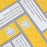
Fieldwork is a Manchester based digital design and branding agency who specialise in “crafting engaging experiences across digital, web and brand”. Their visual identity, a utilitarian mix of stencil cut logo-mark, a bright yet economical single colour palette, weighty boards and sticker detail, is now complemented by the launch of their self-initied print and digital project A Guide To Making Things, illustrated by Hey.
On their identity, Fieldwork explain that they “needed a visual identity flexible enough to work across anything from project proposals and invoices, through fun prints and publications, all the way to super geeky stuff like code projects and gadgets.”
“After establishing some guiding principals about how we want to work, who we’d most like to work with, and what we want to work on, we wrote a short and simple manifesto for Fieldwork, and collected some visual inspiration based around those ideas. Through a process of iteration, we developed the simple identity you see on this page and across the website. Then we worked on a collection of visual materials to bring the character of our company to life. It’s a work-in-progress, and always will be.”


Fieldwork go on to describe A Guide To Making Things as a celebration of their first year, “we wanted to send something nice to friends, fellow makers and people who do good things.”
“Working with the lovely folks at Hey, who illustrated these ideas for us, we made 100 copies of the printed version. This is the digital version, and we have lots of copies. Fieldwork began one short but eventful year ago. Since then, we’ve grown from two to four people, moved into a new studio, and been lucky enough to work with inspiring folk on some great projects based around things we really care about. We want Fieldwork to be about working with good people and making good things, and it’s important to us that we keep the thoughts printed here in mind throughout the journey.”

The illustrations that make up the A Guide To Making Things project – a mix of geometric form, contemporary colour and heavy white borders in print – add a neat layer of detail within the context of a simple Fieldwork visual identity. So while originally considered a little logo-centric for BP&O now has a stronger illustrative element that contrasts with but makes the most of the stencil cut utility of the mark and enhances it with simple shapes and flat colour. On a communicative level the project works well to reflect Fieldwork’s commitment to both client work and in-house projects, balance and convey an appreciation of illustrative, print and digital craft, alongside a modern collaborative mentality.