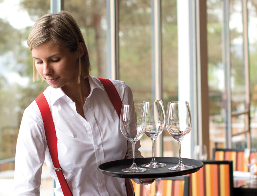
Ingierstrand Bad by Uniform
Opinion by Richard Baird Posted 26 November 2013
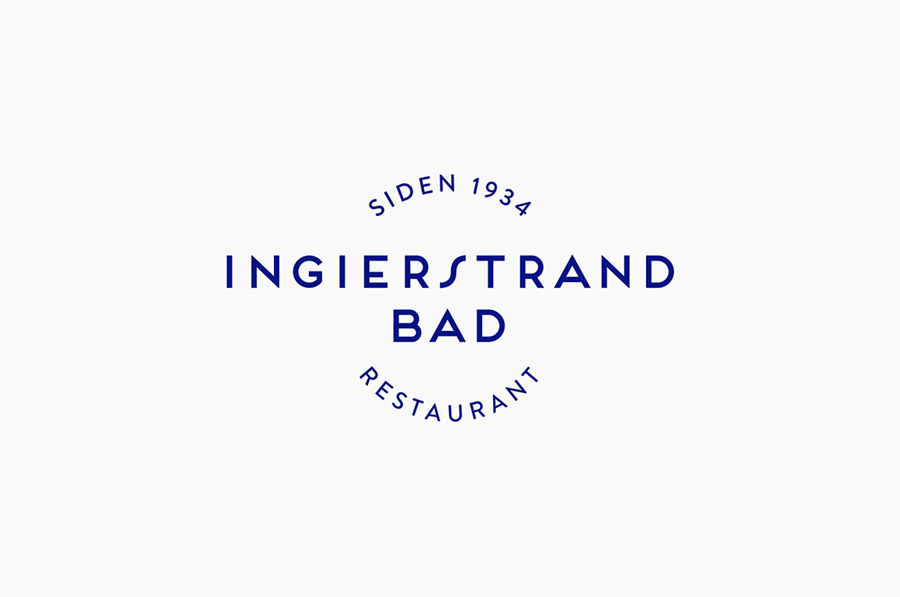
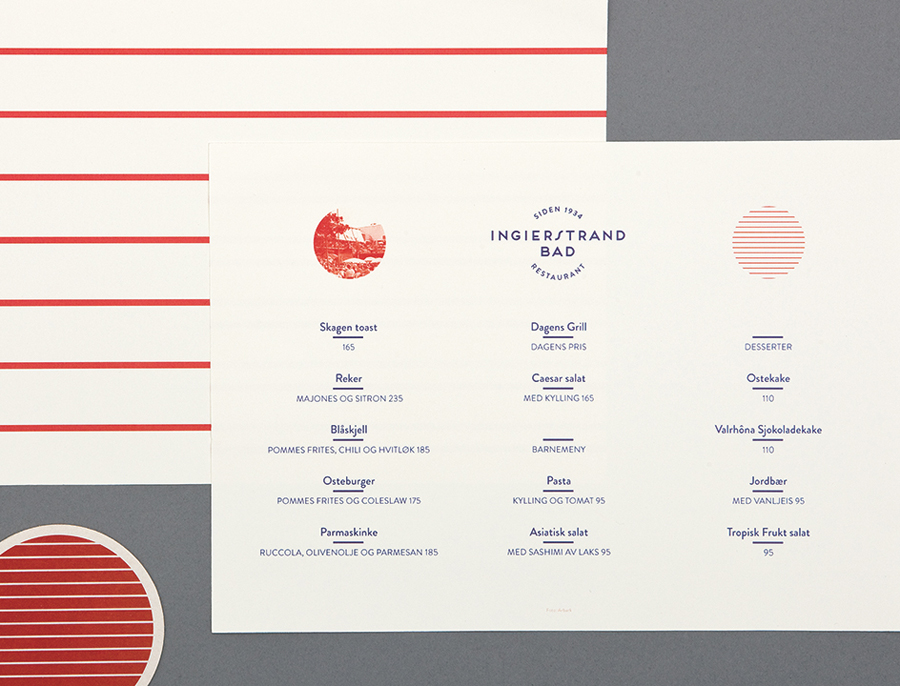
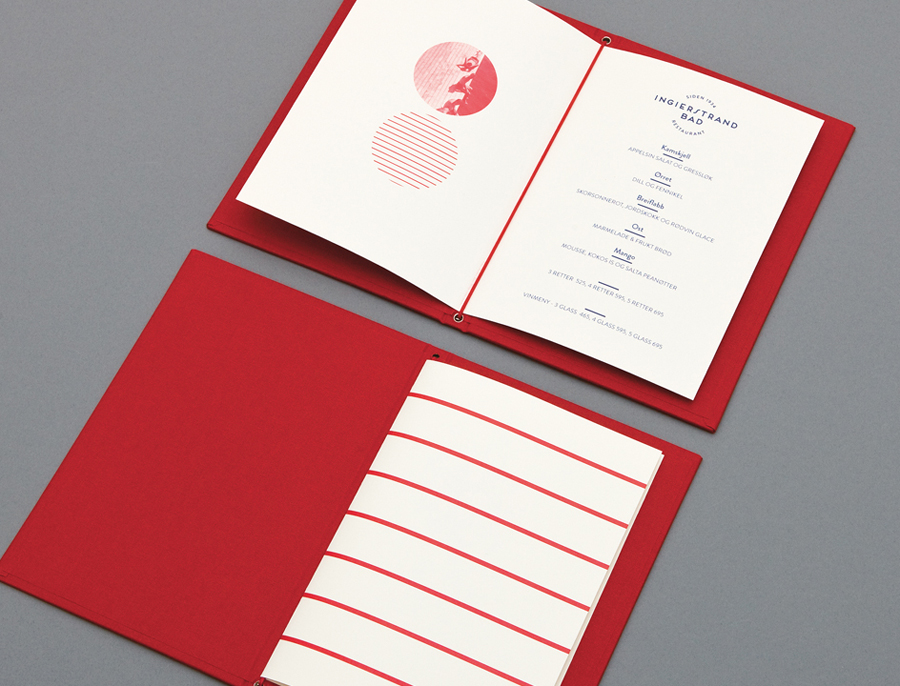
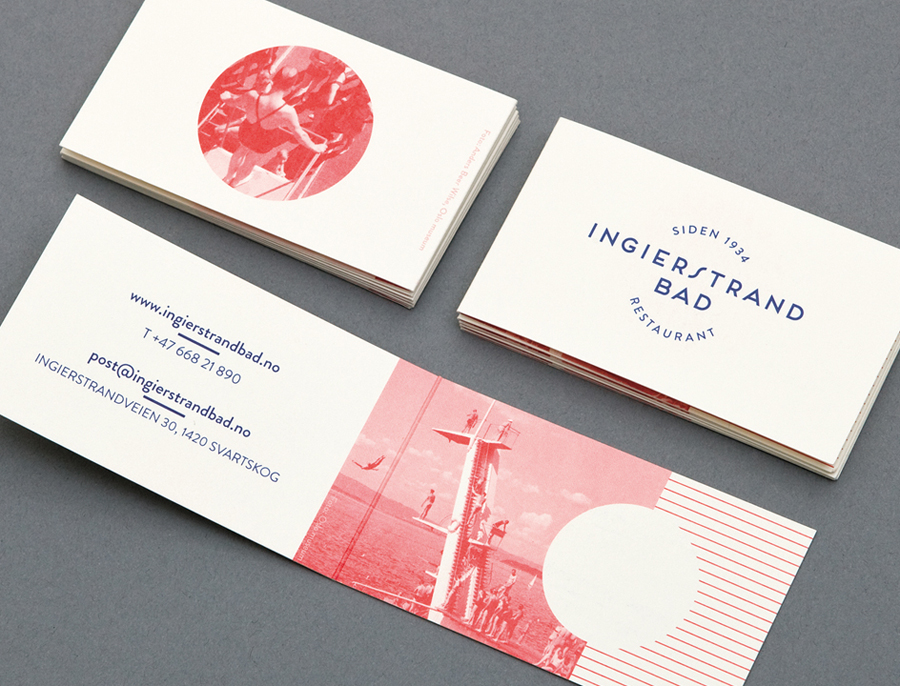
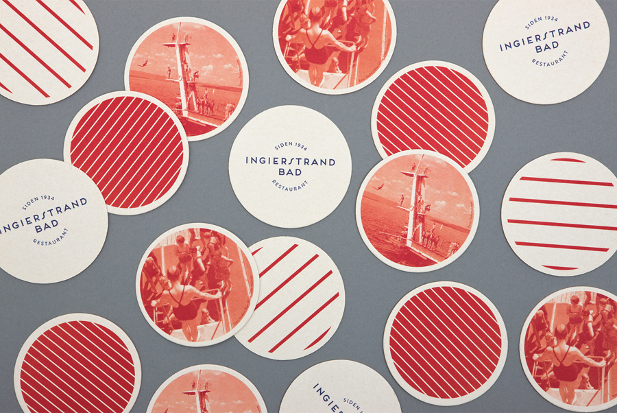
Ingierstrand Bad is a newly refurbished restaurant located on the shore of Norway’s Oslofjord that balances the area’s history as a 1930’s summer retreat with a contemporary dining experience. Oslo based design agency Uniform recently captured this juxtaposition of past and present through a new brand identity solution for the restaurant that mixes vintage photography, cream substrates, geometric forms, two inks and the Art Deco sensibilities of the logotype, resolved with a contemporary consistency, eye for space and simplicity.
Although the sharp terminals, consistent mono line weight and decent spacing of the logotype’s characters, the curved baselines, uppercase consistency and the distinctive qualities of the E’s and the S may well be perceived as a familiar and on-trend choice today, it gains a lot from the authentic history of the venue, effectively conveyed by the nostalgia of vintage photography, itself given an on-trend red tint.
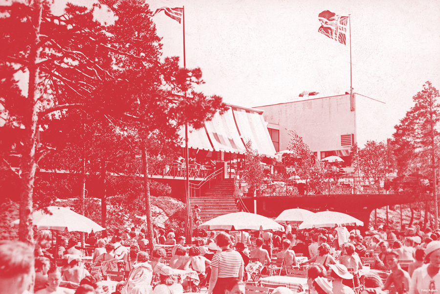
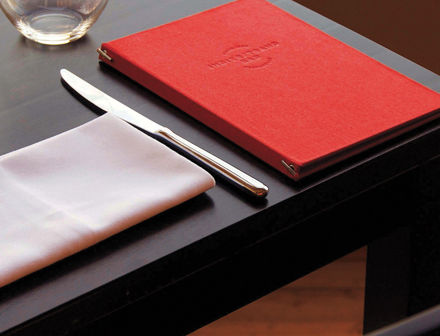
The logotype sits well within the context of the print work, especially the coasters, with a lovely navy blue. Its geometric forms are complemented by a recurring circular motif of lines – which also appear as part of the uniform – and containers creating a strong contrast to the organic richness of the photography, and the finer quality of the menu’s blind deboss textile cover
I am sure it is tempting to build a lot texture and detail into contemporary restaurant experiences, have a look at Work In Progress’ project for Tjuvholmen Sjømagasin, a seafood restaurant also owned by the same group as Ingierstrand Bad, but this really benefits from having few but well executed assets, the period economy of the colour palette and the unmistakable retrospective approach to typography.
