La Peñita De Jaltemba by Savvy
Opinion by Richard Baird Posted 11 December 2013

La Peñita De Jaltemba is a seafood restaurant located in Playa del Carmen, a city on Mexico’s Caribbean coast. Design agency Savvy, working in collaboration with Isauro Huizar and Tomás Guereña, recently developed a new brand identity and interior design solution for La Peñita based around the fictional story of a lost tribe of Jaltemba which then informed the ‘graphic and spatial language’ of the restaurant.
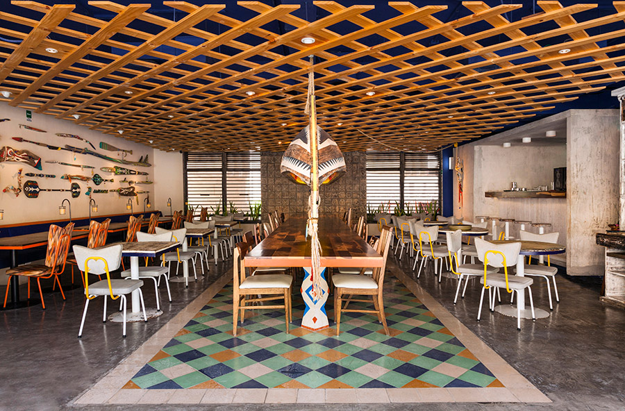
“According to the legend, the Jaltemba tribe were avid fishermen and farmers who valued life and the sea. Strong believers in the conservation of the earth’s balance, their lives were ruled by rituals and traditions. One of these traditions was the capture of the Great Tuna, where only the most experienced men would adventure out to the sea, in small rowing boats, making up one same arm and mind. Back in the village, the tribe would share the fruits of their joint efforts sitting around the ‘Great Table’ as a symbol of fraternity, union and abundance.” – Savvy
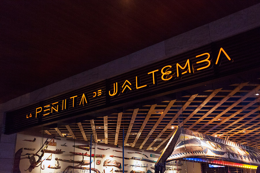
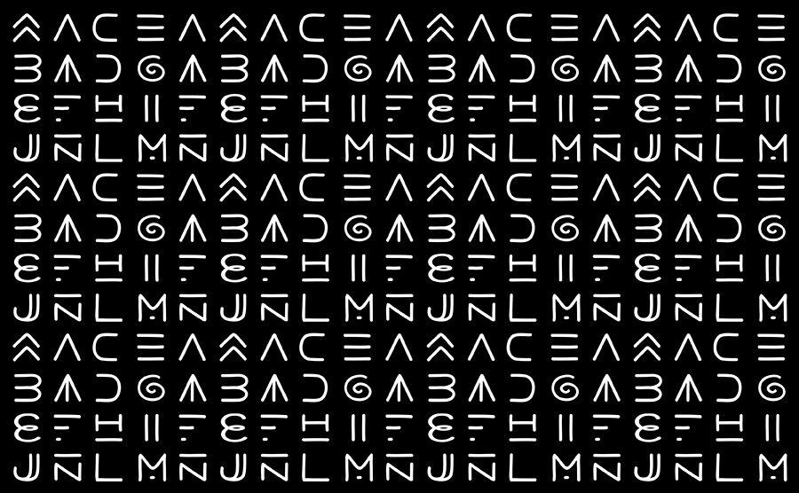
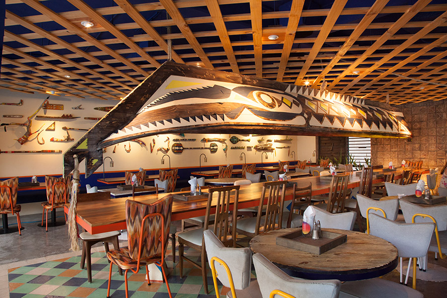
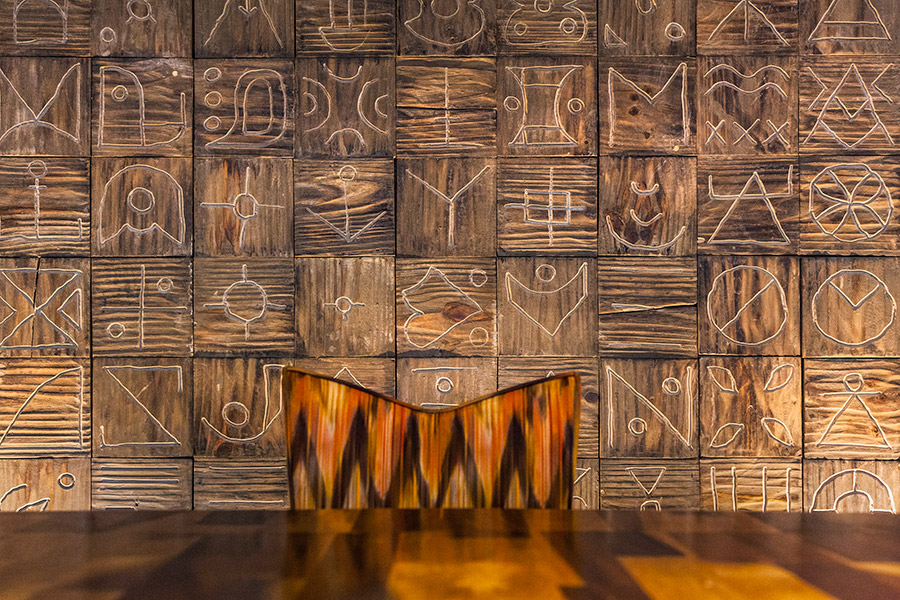
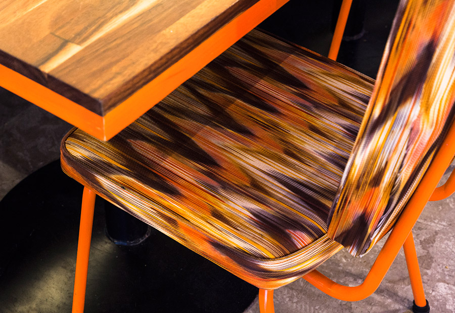
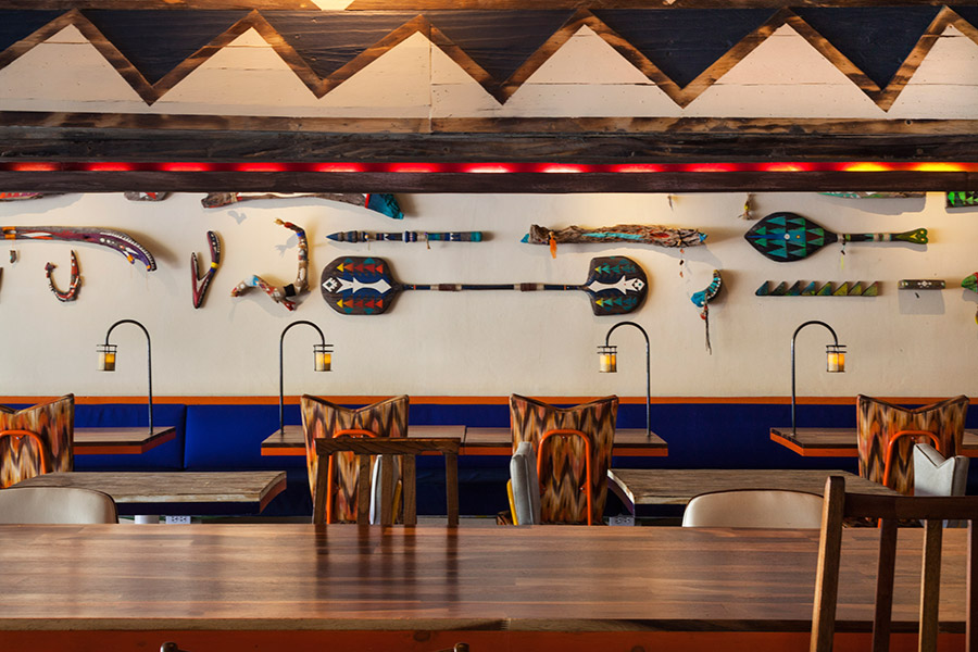
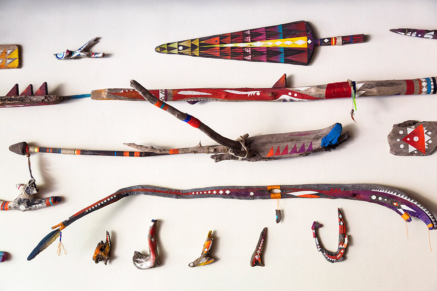
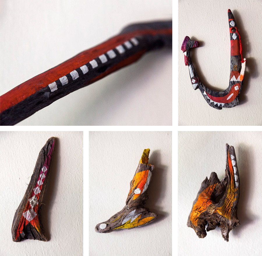
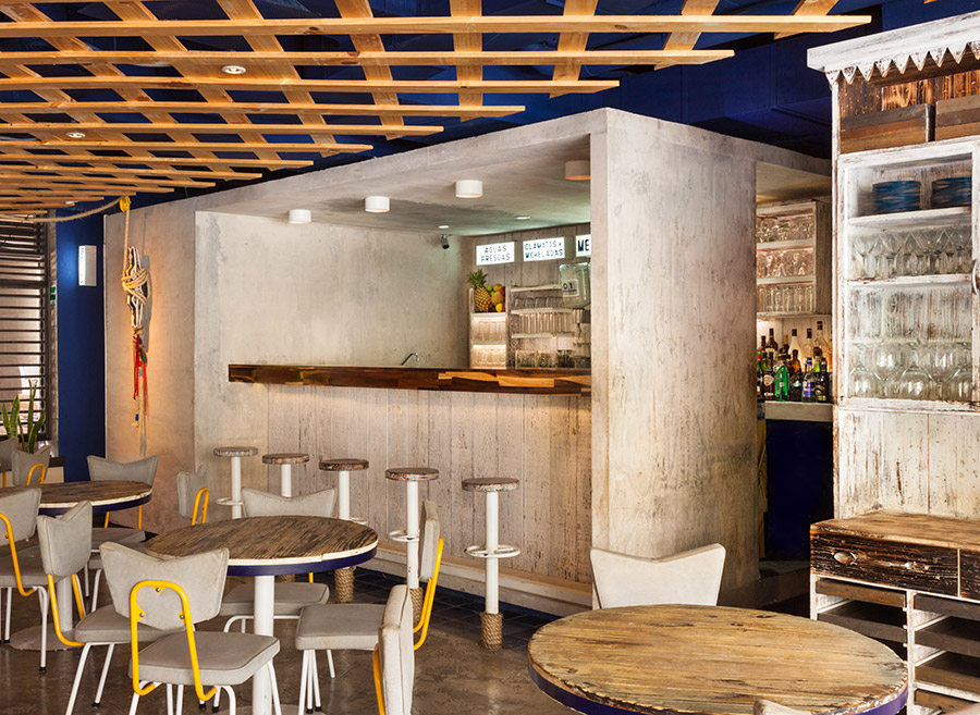
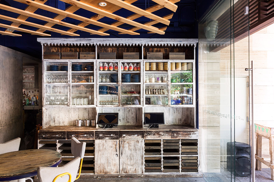
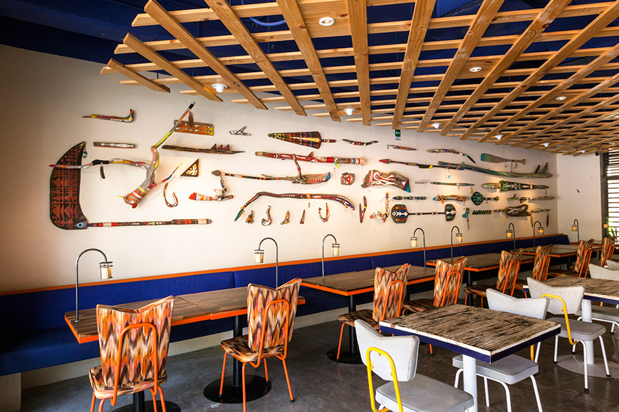
The interior design reflects the Jaltemba tribe story, the theme of seafood and the coastal location through details such as a wood carved canoe light suspended from the ceiling, murals that depict ceremonial offerings, fishing tools crafted from materials collected from the shore, a nice mix of sun-bleached and corroded woods both uncoated and varnished, and walls etched with custom glyphs and symbols that reflect the dialect of the tribe and which also form the basis of the logotype. The earthy colours and textures of the woods are juxtaposed alongside brighter gradients inspired by the sunsets of Jaltemba, these appear on the canoe’s interior, as murals across the walls and as colourful fabrics and patterns of the furniture.
“The bar is an element that contrasts with the rest of the space since it doesn’t have such a tribal approach. It has rather a more industrial touch, which reminds us of a cargo vessel – trapdoors provide access to the toilets. The counter bar reflects much of its function through a modular grid which divides it into individual areas: flavoured water, cocktails, equipment, mezcal, etc.” – Savvy

For a themed restaurant there is a lot of original detail to this project and is a good example of brand identity being led by the most important, communicative and experiential aspect of the brand, in this case interior space. While the graphic treatments, glyphs, symbols and logotype appear solid and distinctive with a nice combination of fine lines, brush strokes and etched elements it is the material textures, objects, furniture and hand painted colour that really deliver a strong sense of brand identity.
It is unclear to what degree the story is made apparent to visitors (be that on-line or in print) but it makes for an approach that neatly binds everything together as one cohesive but multidimensional experience, clearly inspired by tribes of the country, with a level of consideration that borders on authentic, regardless of its fictions origin, and that neatly extends across both the visual and tactile treatments.
