BP&O
BP&O Plus

Mellbye by Heydays

Opinion by Richard Baird Posted 17 December 2013
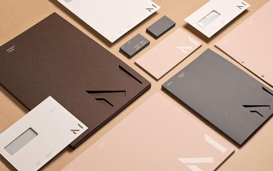
Stationery with blind emboss and die cut detail designed by Heydays for architecture firm Mellby

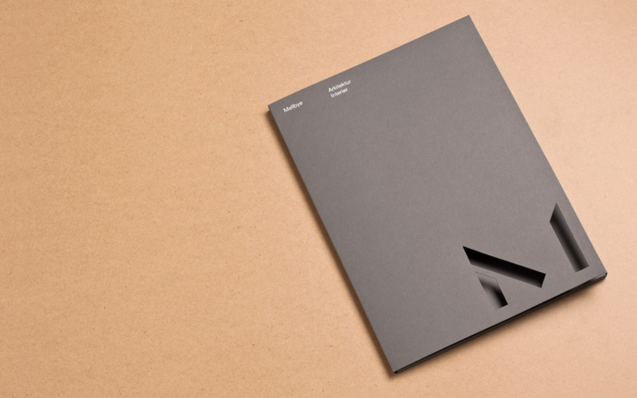
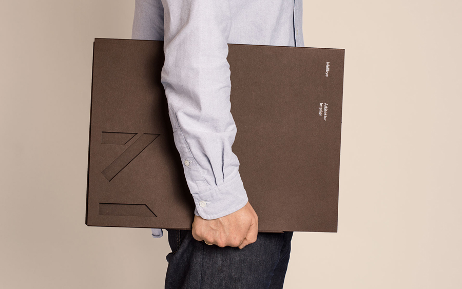
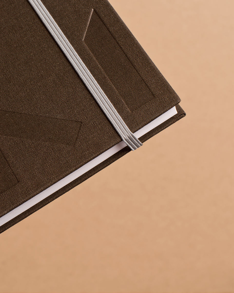
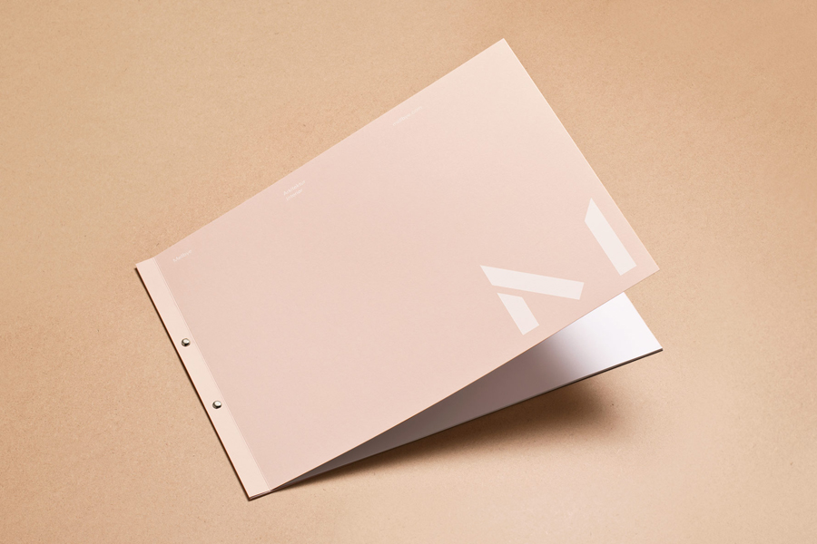
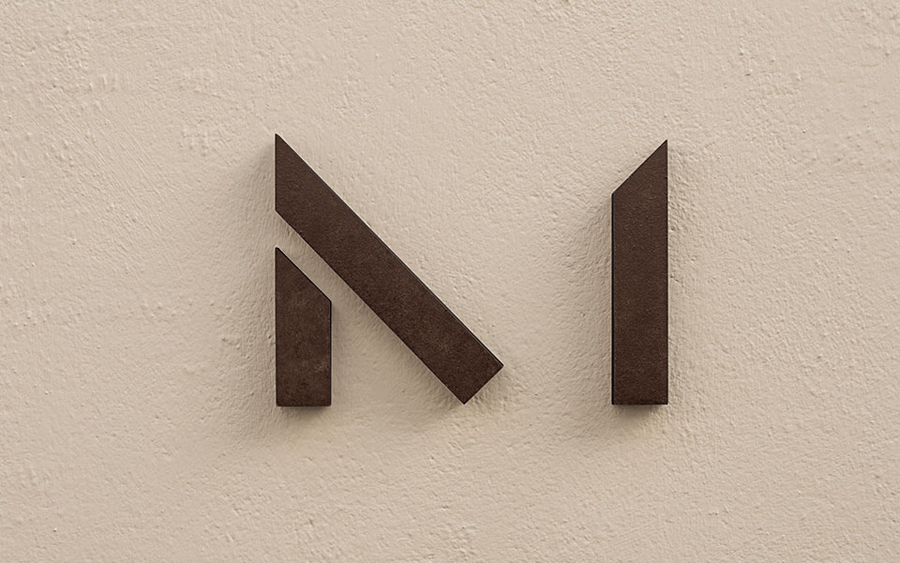
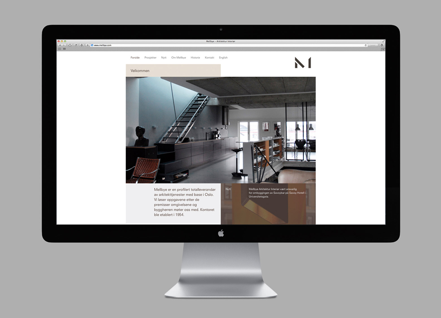
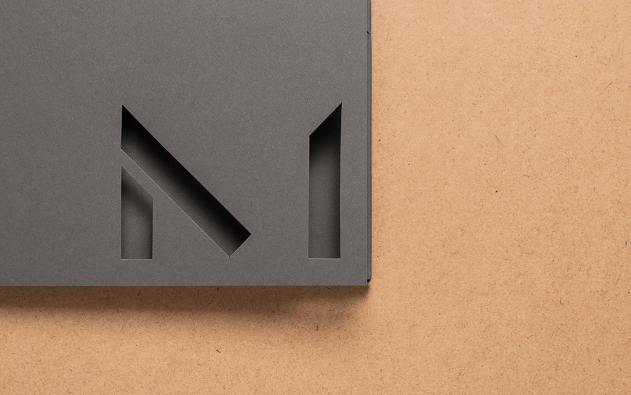
Mellbye is a Norwegian architecture firm founded in 1954 with a “mindset anchored in modernism”. Design studio Heydays created a new brand identity for the firm based around a geometric M symbol built from the initials of their two main services, architecture and interiors. Executed as a combination of blind deboss and die cut detail across a earthy and urban mix of brown and warm grey uncoated boards and fabric, and alongside a contemporary white ink print finish and grid-based layouts, the result is a modernistic reduction of form but expansion of meaning surrounded by a familiar architectural utility, form and texture.
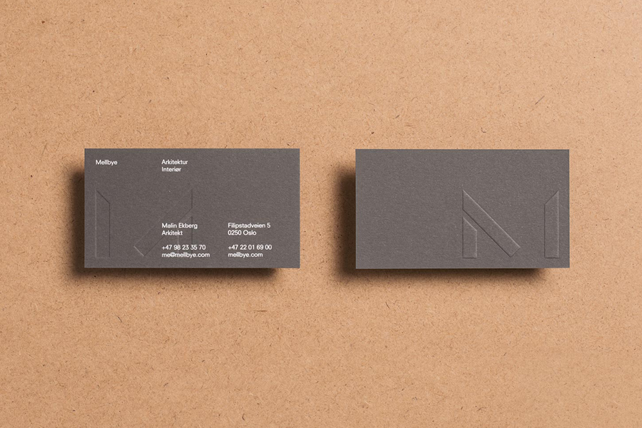
Logo designed by Heydays for architecture firm Mellby Logo and business card with blind emboss detail designed by Heydays for architecture firm Mellby Logo and folder with detail designed by Heydays for architecture firm Mellby

Logo and folder with detail designed by Heydays for architecture firm Mellby

Logo and folder with detail designed by Heydays for architecture firm Mellby Notepad with blind deboss detail designed by Heydays for architecture firm Mellby Logo and folder designed by Heydays for architecture firm Mellby Logo designed by Heydays for architecture firm Mellby Logo and website designed by Heydays for architecture firm Mellby