Maréna Beauté by We Are Bold
Opinion by Richard Baird Posted 6 January 2014
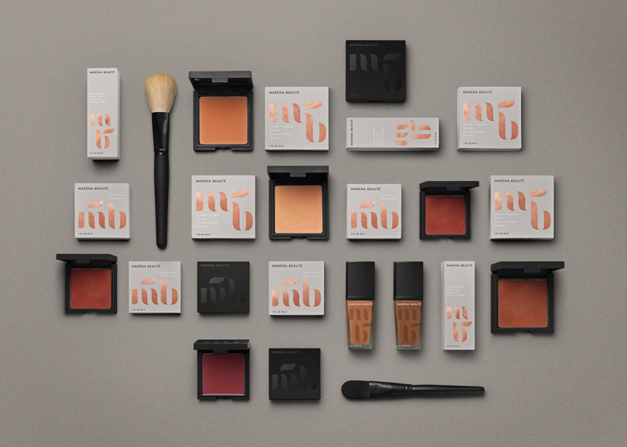
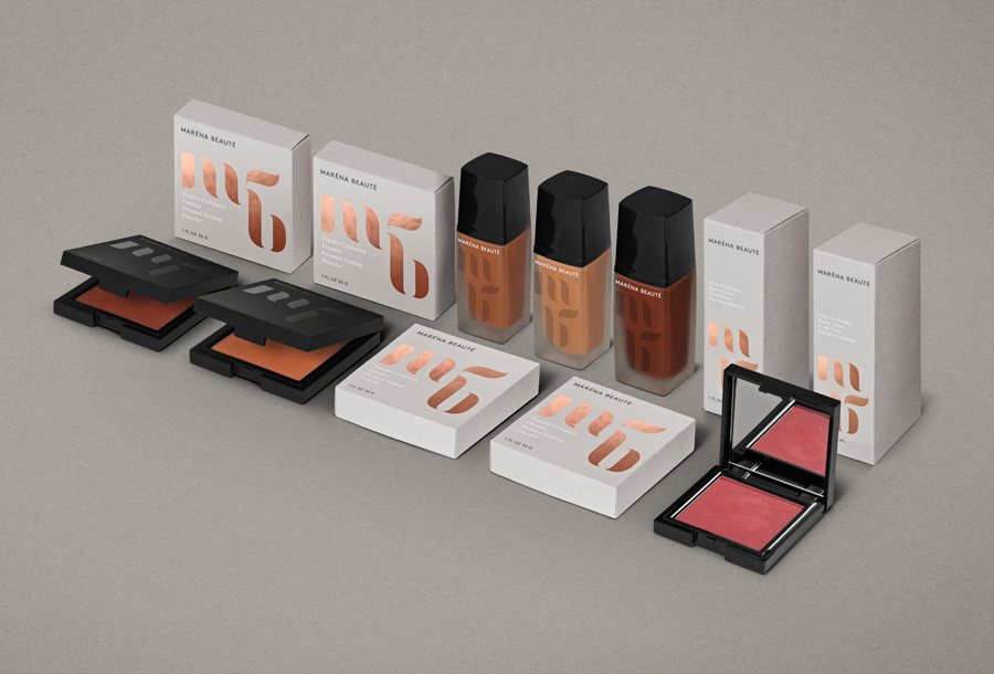
Maréna Beauté is a new Swedish cosmetics brand, founded in 2013 by make-up artist Diarry Maréna, that creates high quality products for people with dark skin types. Stockholm-based design studio We Are Bold were commissioned by Maréna to develop a brand identity solution for her range of foundations, powders and blushers—which included a monogram, logo-type and packaging design—that would appeal to a market currently underserved by other premium cosmetic brands.
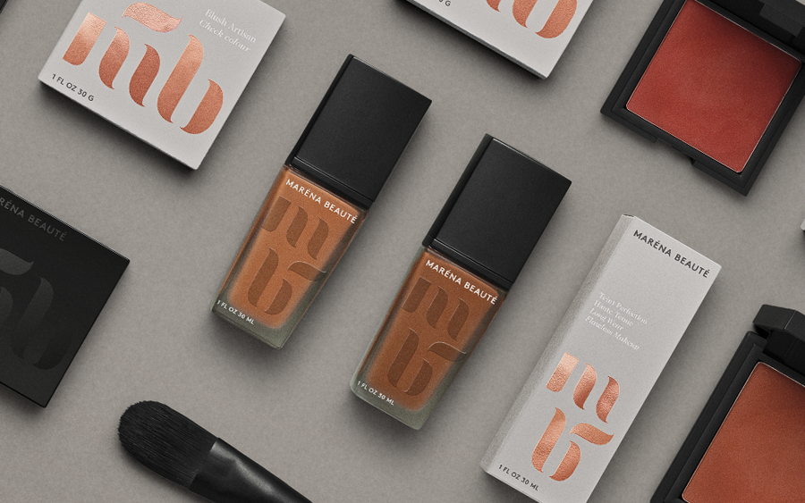
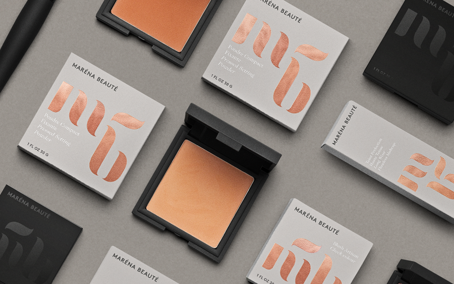
“We aimed to create a sophisticated and stylish packaging concept with possibilities for dynamic development. The main elements of the identity is a wordmark and a monogram inspired by the soft pliable brushstrokes from when applying make-up. The elements in the monogram can be used in different ways, serves as a recurring graphic element throughout the identity. The tranquil and earthy color palette makes room for product development in new colors. The copper foil provides a sophisticated and subtle connection to the exotic origin of the brand.” – We Are Bold
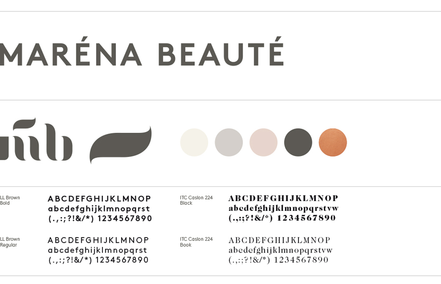
By juxtaposing the bold, uppercase, geometric and sans-serif characters of the logotype, robust black and white structural choices with a mix of matt and gloss surface textures alongside the flourishes and detail of a lowercase monogram, ITC Caslon and a copper foil print finish, Bold’s solution neatly combines a professional, reliable make-up artist utility with the perceived premium qualities established by the high street and the very personal origins of the brand.
This personal element, established by the monogram, also resonates well through a product naming convention that reflects “Diarry Maréna’s childhood and the cultures and cities she and her family grew up in” and the more specific group the line intends to cater to.
Although providing variation to a consistent logo-centricity, the monogram’s mixed alignment across the packaging feels a little less effective than the one set across a single line, however, the brush strokes that inspired its form are evident, its stencil-like breaks urban, and its solid rendering make for a strong and distinctive identity.
