Peter Ahrens by Studio Jubilee
Opinion by Richard Baird Posted 16 January 2014

Independent London-based design agency Studio Jubilee have recently updated their website and portfolio. Their brand identity work for South Australian photographer Peter Ahrens—which included a new logo-type, website and stationery set—really stood out for its use of a weighty fluorescent white material choice and tactile print process to enhance a reductionist single font approach.
The project is accompanied by a great write-up, published below, that brings to the forefront the level of physical detail and nuance which underpins what is a limited set of assets to complement Peter’s philosophy and offer contrast to the detail of his work which will be appropriately positioned at the heart of communication. To some this will seem basic but to those familiar with material weights, letterpress print finishes and hierarchical communication this is a solid example of a contemporary restraint.

“Peter’s work combines reductionism with beauty, documenting the sublime landscapes of Australia. We reduced and refined our approach to this project, resulting in a finished identity that really is reductionist and minimalist in style. Which is fitting — this new identity allows Peter’s work, the photographs, to take centre stage. The identity is a solid and consistent backdrop. It’s confident, considered and clear.”
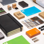
“The design revolves around some beautifully set type, and a rectangular marque in the 4:3 format of his photographs. We designed some truly luxurious business cards on super thick 600gsm stock, hand letterpress printed by Blush in Flintshire. Combined with matching letterheads and invoices, the new stationery reflects the high end nature of Peter’s work”
“We gave Peter a comprehensive brand identity guideline document, covering everything from the use of colour, typography and written style, to ensure his identity remains clear, consistent and effective. We’ve also designed a new portfolio website for Peter to showcase his work, which is currently under development. Look out on our blog for its launch.” – Studio Jubilee
Design: Studio Jubilee
Opinion: Richard Baird
Fonts Used: Graphik