Bambudda by Post Projects
Opinion by Richard Baird Posted 28 January 2014
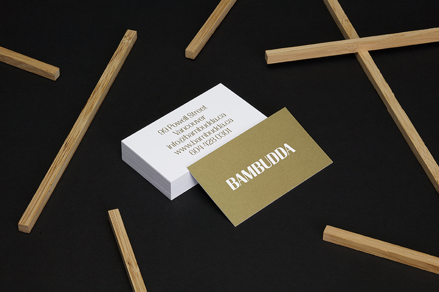
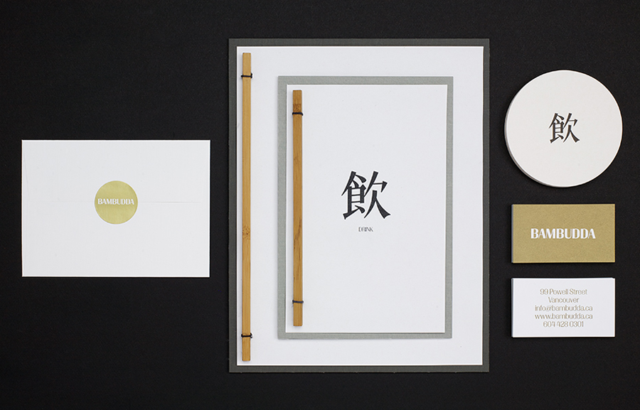
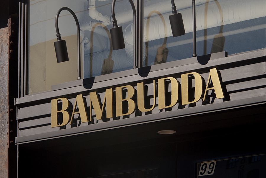
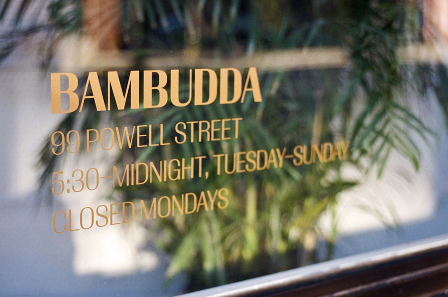
Bambudda is a contemporary Chinese restaurant, located in Vancouver’s Gastown district, with a menu that mixes Hong Kong and southern Chinese cuisine with a modern interpretation of Dim Sung. Design agency Post Projects recently developed a brand identity for the restaurant—which included a logo, menus, stationery and website design—based around a simple but unexpected logotype set in Timonium.
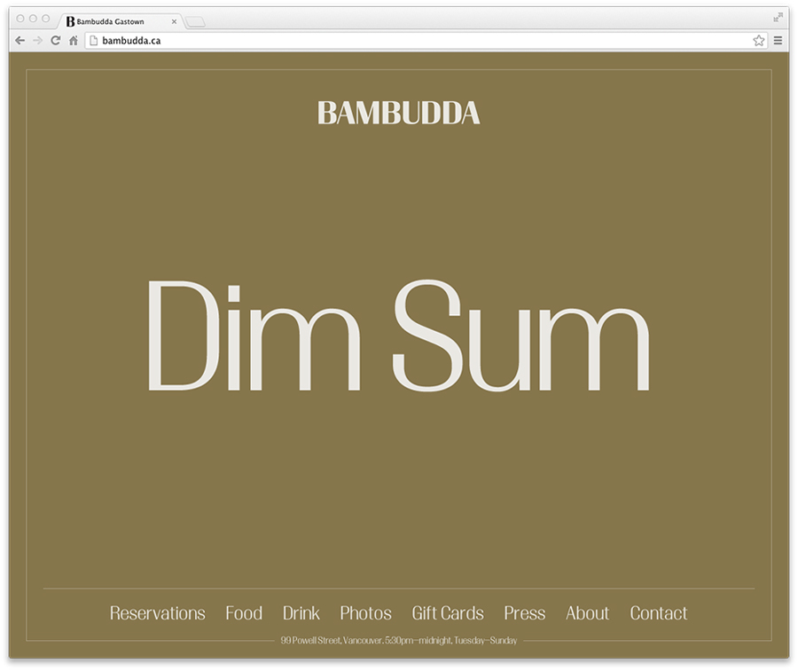
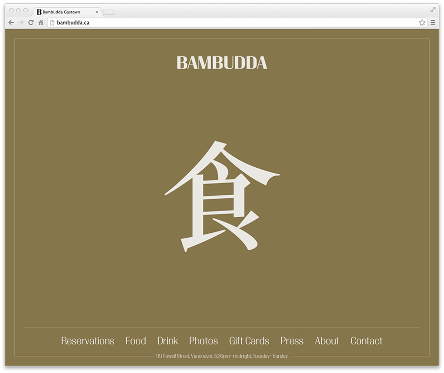
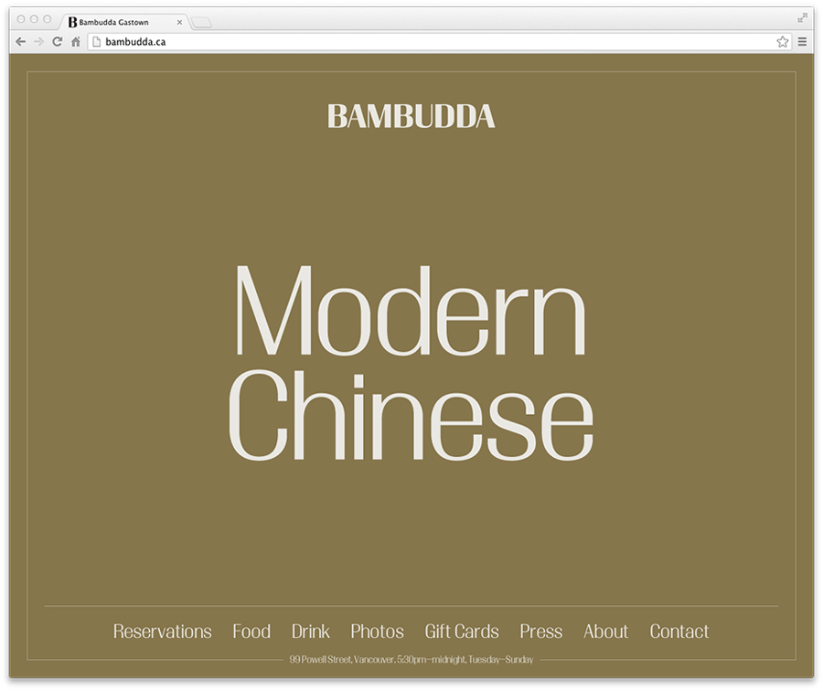
Timonium’s jazz associations and retrospective influences are given new life through the unexpected context of a Chinese restaurant. Outside of the familiar characters of the uppercase logotype, the brand identity really benefits from the more distinctive details contained within Timonium’s lowercase letters. These are enhanced by an over-sized across the website and printed as a gold metallic spot colour on the back of the business cards.
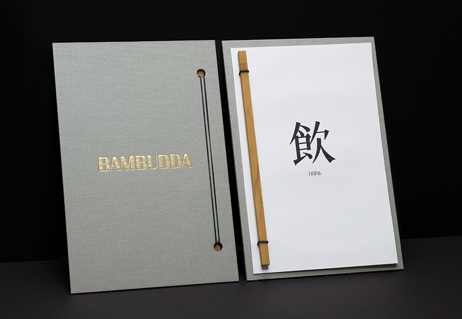
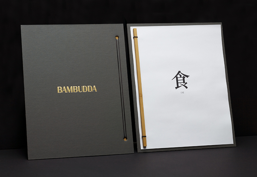
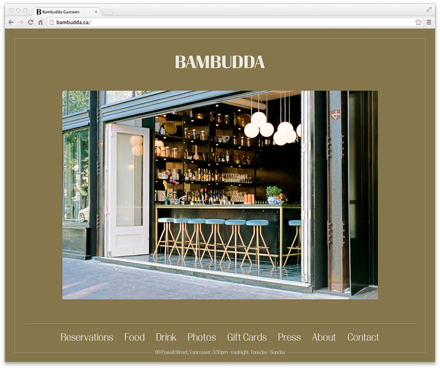
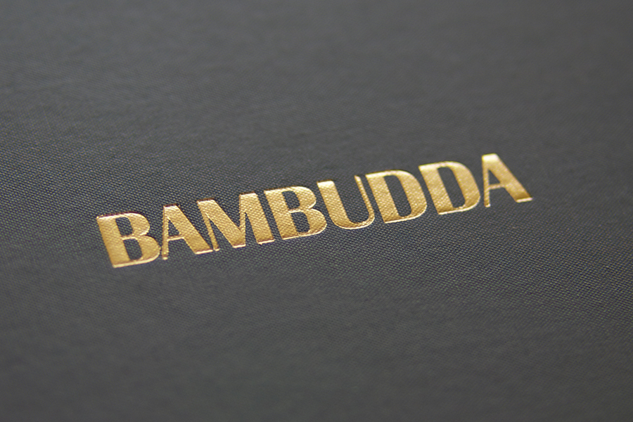
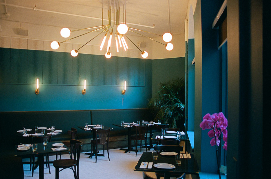
The font choice feels appropriately reflective of the classic furniture, lighting and colour palette that makes up Bamdubba’s interior, as does the fabric and bamboo textures of the menu, a gold foil print finish, and a website that features some solid interior photography by Jennilee Marigomen.
The result is a brand identity that resonates well with the interior experience, draws distinction from a confident cross-pollination of familiar typography and complements these with a limited but high quality combination of material choice and print finish.
Design: Post Projects
Photography: Jennilee Marigomen
Interior Design: Ste. Marie Art & Design
Opinion: Richard Baird
Fonts Used: Timonium
