MHM Architects designed by 26 Lettres
| Author: Richard Baird | Filed under: Architecture and The Built Environment, Logo Reviews | Tags: Architecture Logos, Blind Emboss, Brand Identity, Brand Identity Design, Brand Identity Reviews, Branding, Branding Blog, Brochure Design, Business Card Design, Canadian Design, Catalogue Design, Copper Ink, Designed in Montreal, Emboss Detail, Embossed Business Cards, Logo Design & Branding Blog, Logo News, Logotypes, Metallic Spot Colours, Monogram Design, New Logo, Sans-serif Logotypes, Stationery Design, Stencil Cut Logotypes, The Best Architecture Logos, The Best Brand Identities of 2014, The Best Business Cards of 2014, The Best Logo Designs of 2014 |Comments Off on MHM Architects designed by 26 LettresMHM Architect is the studio of independent Canadian architect Maxine H. Marcovitch who, working with a team of professionals, trade and closely with clients, creates “beautiful, innovative, and unconventional architectural spaces.” The studio’s new brand identity, developed by 26 Lettres and which included a logotype, blind embossed business cards, portfolio with open stitch detail and website, delivers a familiar but appropriate resolution of architectural cues.
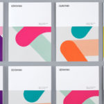
The monogram makes the most of the geometric qualities of Maxine’s initials by rendering them as uppercase letterforms with stencil cut detail and utilising these in print as an oversized element to convey a simple, confident and structural integrity that could easily be perceived as beams and braces or reflective of space and layout. The structure established by the monogram continues through to a grid-based arrangement of the business cards and the uppercase, single point size and weight of a non-hierarchical approach to typesetting.
A combination of blind emboss and metallic copper strokes, forming illusory contours and the aesthetic detail of the tote bags, as well as the open stitch of the portfolio, neatly unite tactile surface texture, light and shadow, the copper of pipes and a truth to production that feels appropriate for an architecture studio.
The result is a relatively straightforward combination of few assets but there is enough detail, spread across type, material and finish to keep it from becoming logo-centric or communicatively one-dimensional.
Follow BP&O:
RSS
Facebook
Twitter
If you liked this then you may all like:
Support BP&O
Thank you to everyone who has visited BP&O since its beginning in 2011. As many of you know, BP&O has always been a free-to-access design blog that seeks to offer extended opinion on brand identity work. It has sought to be the antithesis of the social media platform that often disentangles form, context and content. Writing articles can take 2-4hrs and are carefully researched.
I am passionate about design writing and believe that spending time to write about work, rather than just posting images, furthers design discourse. If you have enjoyed this article, have been with the site from its early days and would like to help contribute to its future, please consider supporting the site with a small PayPal donation. This will go towards the costs of hosting, CDN (to make the site quick to load) and Mailchimp, and cover some of the time it takes to research, write-up, format and share posts.