Obbio by Mayuscula
Opinion by Richard Baird Posted 11 February 2014
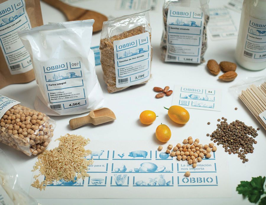
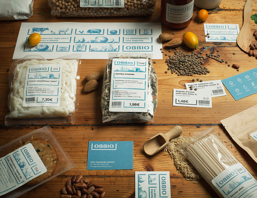
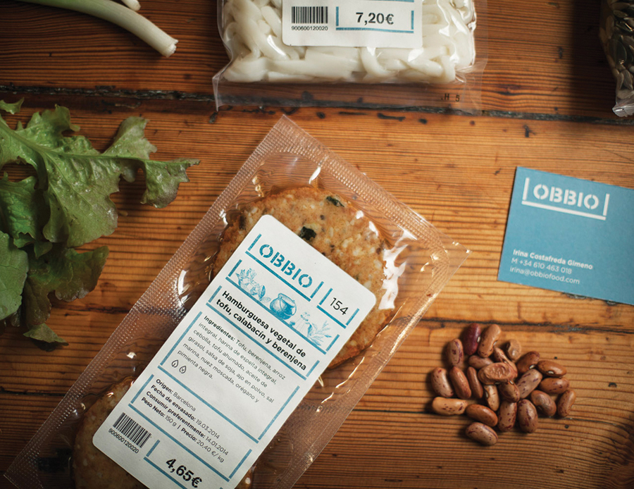
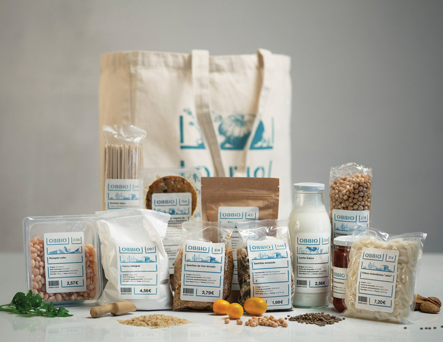
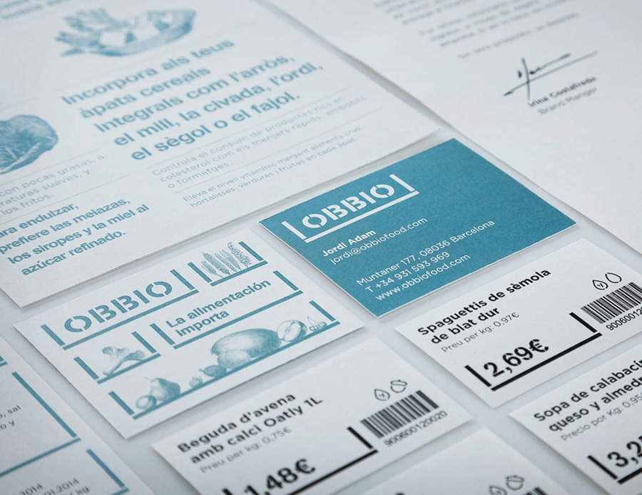
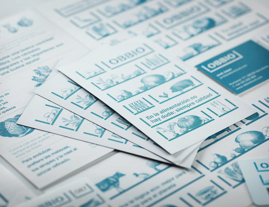
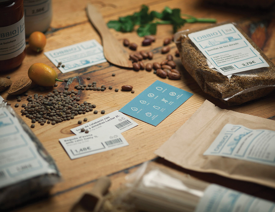
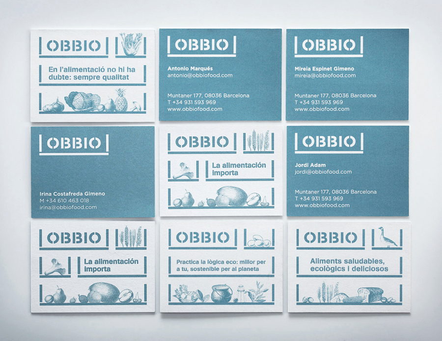
Obbio, a compound of obvious and bio, is a high quality organic supermarket built on a warehouse concept “where traditionally goods were sold without intermediaries.” Designed by Mayuscula, Obbio’s brand identity—which included logotype, illustration, packaging and signage design—juxtaposes etched illustrative detail alongside the utility of a modular grocery box device and stencil cut typography to resolve traditional values and modern convenience.
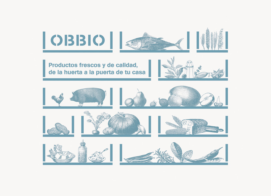
Contrast is a common but effective tool in brand identity design, deriving both a communicative and aesthetic impact by intentionally combining disparate elements. Often a difficult balance to achieve this has been well utilised and resolved here by Mayuscula.
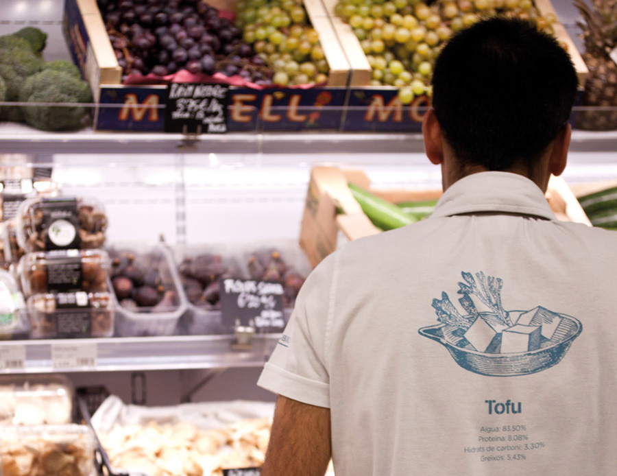
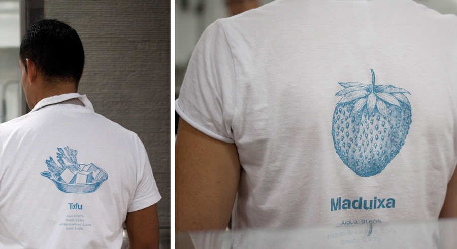
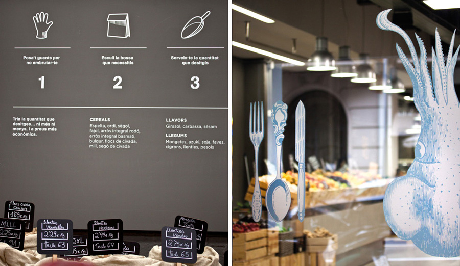
The etched illustrations are well drawn with a retrospective appreciation and variety. They appear authentic, as though they were pulled from historic stock, but benefit from a consistency that comes with being drawn specifically for the project. Their style continues to be associated with traditional values such as honesty, locality and high quality which is reinforced by the use of animals rather than cuts of meat and wheat sheaf alongside bread.
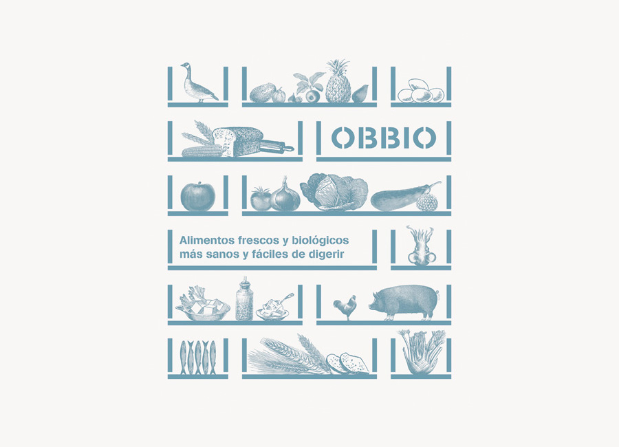
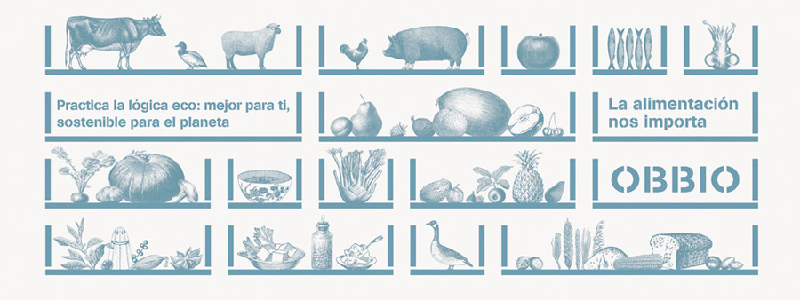
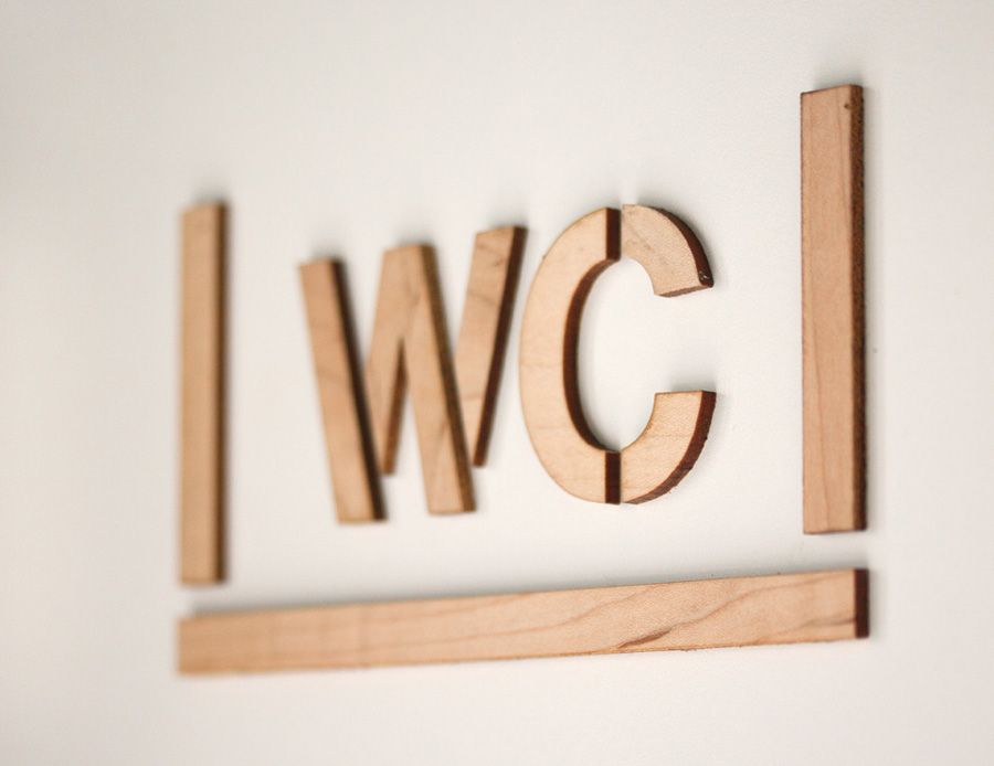
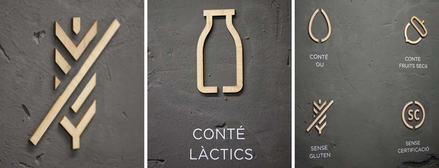
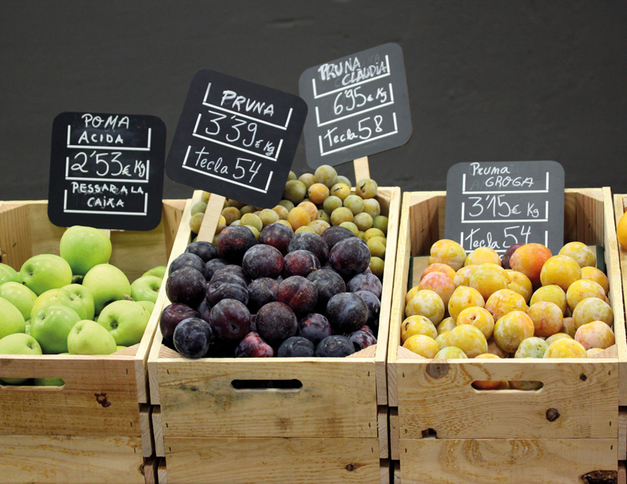
The heavy line weights and stencil cut detail of the sans-serif letters and trays, drawn from the warehouse concept, establish a consistent and practical frame that effectively contains the natural hand drawn detail of the illustrations, product information across the packaging and informs the approach to iconography. While the ink appears a touch desaturated, missing a sense of freshness, its single economical choice resonates well with the utility of the type and unites the two aesthetics. These themes are then complemented by further assets such as wood cut signage and iconography and hand written chalkboards.
The result is a distinctive and well resolved aesthetic disparity that neatly balances the traditional values and perceptions of the past with the convenience expected of the present in a very clear way.
