The Best of BP&O — February 2014
Opinion by Richard Baird Posted 3 March 2014
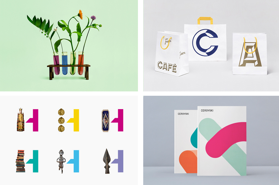
Highlights last month included new packaging from Marx Design for coconut water brand The Coconut Collective, an animated logo by Alphabetical for production studio Giant Owl, the restraint of Shaz Madani’s print and brand identity solution for photographer Giles Duley, and the bright colour palette, industrial robustness and fine technicality of Mash Creative and Hype Type Studio’s packaging work for uBear.
However, there were five projects that really stood out for me that have made it into BP&O’s top five, a feature that brings together what I believe to be the most interesting of the month for another opportunity to be seen and shared.
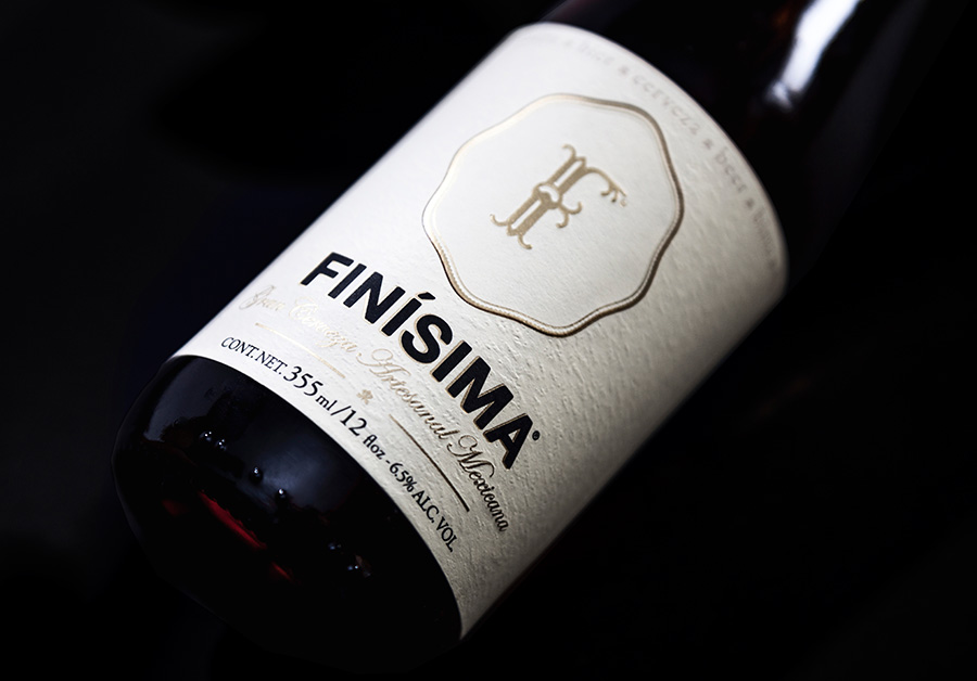
Finísima is the latest ale to emerge from the independent brewing category and is described as being for both those unaccustomed with the world of artisanal beer and the connoisseur.
The ale’s packaging treatment, created by Mexican design studio Savvy, reflects its artisanal origin “without sacrificing the reach and reception of more commercial brands” by combining familiar craft aesthetics with those of an established premium nature.
See more of the project here
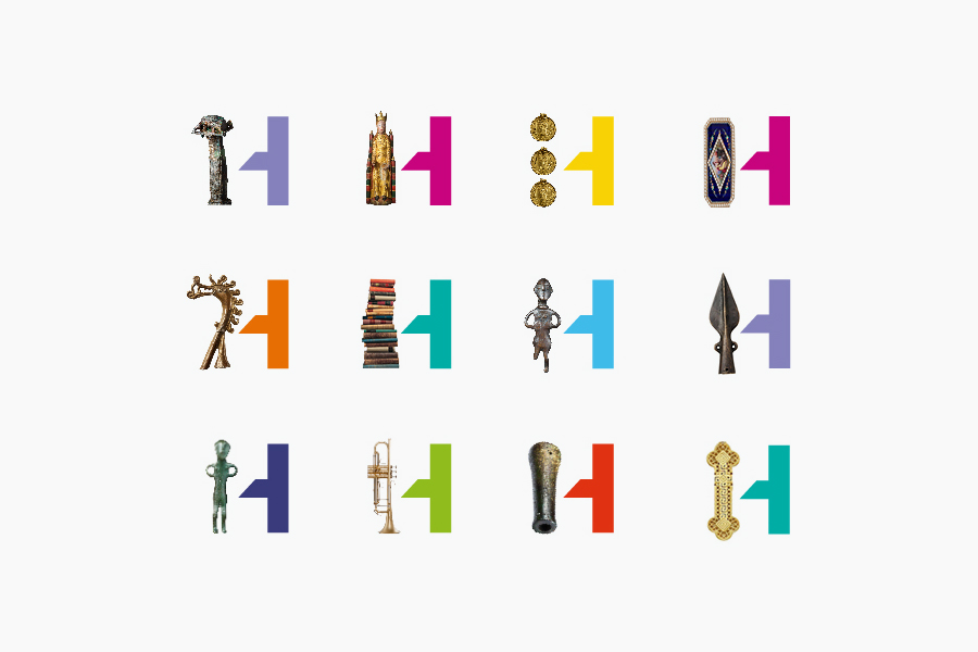
The Swedish History Museum is one of the country’s largest museums with a collection of over 10 million objects from a history that spans thousands of years. The museum also functions as a venue for lectures, concerts and a variety of activities.
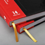
Stockholm-based design studio Bold were recently commissioned to develop a new brand identity for the museum that would revitalise the visitor experience, position it as Sweden’s number one storyteller and arouse curiosity and interest in Swedish history. The studio’s solution, which included a logo and logotype, pictograms, print communication, book and interior and exterior signage, is an acute juxtaposition of past and present achieved through the union of disparate type, image, colour and texture.
See more of the project here
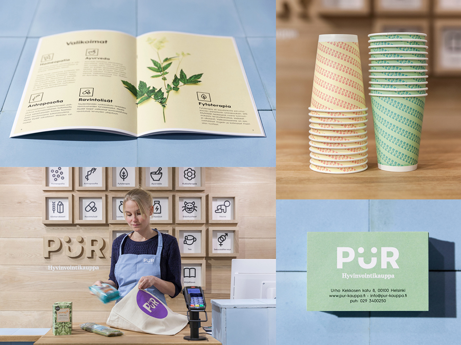
Finnish design agency Bond have published their brand identity work for health store PÜR—which included logo and interior design, website, photography, advertising and marketing collaterals.
Bond’s approach, a blend of bold sans-serif typography that leverages a playful typographical quirk, earthy material detail, iconography, a pastel colour palette and still life photography, delivers a strong communicative resolution of reliability, nature, accessibility and effectiveness, delivered in an engaging and multi-dimensional way.
See more of the project here
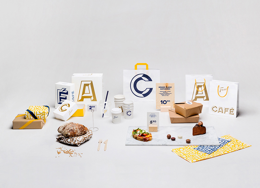
Established in 1891 by Karl and Berta Fazer and located in Helsinki district of Kluuvikatu, Fazer began life as a French-Russian conditory that has grown to become one of Finland’s largest food companies, working within the bakery, confectionery, and work-place restaurant sectors. Summer 2013 saw the return of Fazer’s café chain to Helsinki with locations in the centre of the city and in the districts of Munkkivuori and Tampere with more to follow.
Design agency Kokoro & Moi worked with Fazer to develop a new brand identity for its café chain—which included logo, print, packaging, interior design and a clothing range—based around the bespoke typefaces Fazer Grotesk and Fazer Chisel drawn from signage that hung above Fazer Café’s original Kluuvikatu location.
See more of the project here
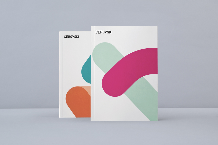
Cerovski is a young Croatian print production studio that revels in the challenge of “nebulous finishing, microscopic editions, absurd materials and crazy deadlines”.
Design agency Bunch recently developed a new brand identity for the studio—which included a custom logotype and typeface, website, and a variety of printed collateral—that delivers a distinctive contrast of utility and creative flourish, technology and individualised service, through stencil cut type, a number of material choices and print finishes, and a personalised but digitally generated daily planner.
See more of the project here

